When & How To Use Pastel Colors In Your Marketing Designs
Can subtlety make a statement? “Yes,” say pastel colors.
The biggest strength of pastels lies in the subdued notes they carry. One look and you feel instantly relaxed. And with this calming effect, these colors might also remind you of a lot of things in nature, like a quaint sunset sky.

When it comes to branding, colors have an undeniably strong position. After all, 84% of consumers consider color as a deciding factor while buying things. So, for an attribute that has such a strong role in persuading people to buy do you think muted colors like pastels will really make an impact? Short answer: yes!
Are you wondering how to try a pleasant palette for your brand? Let’s find out.
But Before That, What Are Pastel Colors?

Pastel colos are softened versions of the fundamental colors. The easiest way to come up with an array of pastel colors will be to use milder tints of the six primary colors, red, blue, yellow, green orange, and purple.
And in case you are wondering, tints are colors obtained by mixing white with solid colors (hues). The amount of white you add influences how much you tone down the color. Pastels ideally have a lot of white but the character of the original color is retained. So, they look neither too dull nor too bright.
So, you still have all the variations you find in solid colors and you can still create contrast.
Picking Popular Pastel Colors for Your Designs
If you are having trouble picking the safest pastels for your brand, here are some dainty options to begin with:
1. Sky blue (Hex: #87CEEB)

Considering how common this color is in nature you can use it while marketing eco-friendly products or even for your spring marketing representing clear skies.
2. Pistachio green (Hex: #93C572)

It has a soothing effect on the eyes and works wonderfully for brands that wish to focus on nature or organic products. For more ideas on how to use different variations of green in marketing, here is a blog you might like.
3. Canary Yellow (Hex: #FFFF8F)

Yellow is an overall happy color. And if you wish to keep the tone of the visual low but also capture the glee of yellow, then Canary woks.
4. Salmon (Hex: #FA8072)

Want to combine the energy of red and orange but without causing a strain on the onlooker’s eyes? Salmon balances the liveliness of red and orange with its soft and happy appearance. We also have a blog on using red in marketing if you wish to know more about using a strong red palette for your brand.
5. Mauve (Hex: #E0B0FF)

Slightly more prominent than lavender mauve retains the luxurious nature of purple. From florals to backdrops, this color adds a new dimension wherever you use it.
6. Rose Quartz (Hex: #F7CACA)

Pantone name of this color is Rose Quartz and it’s also called coral candy. If this color looks familiar to you it is because it was declared Pantone Color of the Year 2016, as a combination with Pantone Serenity.
7. Serenity (Hex: #95AAD3)

This was the other color recommended as a combination with Rose Quartz. It also goes by the name Polo Blue and has a subtle vintage connotation to it. You can also use it to mimic the sense of trust that blue color is known for, in general.
So, there are plenty of choices to explore. But where exactly can you use pastels for your brand?
Pastel Colors in Branding
Pastels do not lack contrast. And pastels almost never go out of style. So, you can use them almost everywhere. As your primary brand colors or supportive colors to bring your marketing materials to life. We’ll give you a few examples. So, you can see for yourself how pastels look in different visual assets.
1. Logo design
There is an inherent feminine feel to pastels, especially softer shades of pink. That’s why you might find it in the logos of brands dealing with women’s fashion, skincare, or even beauty products.
Victoria’s Secret uses its lettermark and wordmark logos in most places. But you might also notice the color version of this logo with a pastel background in some places. It consistently incorporates pastels across its digital channels including its website.
Image:
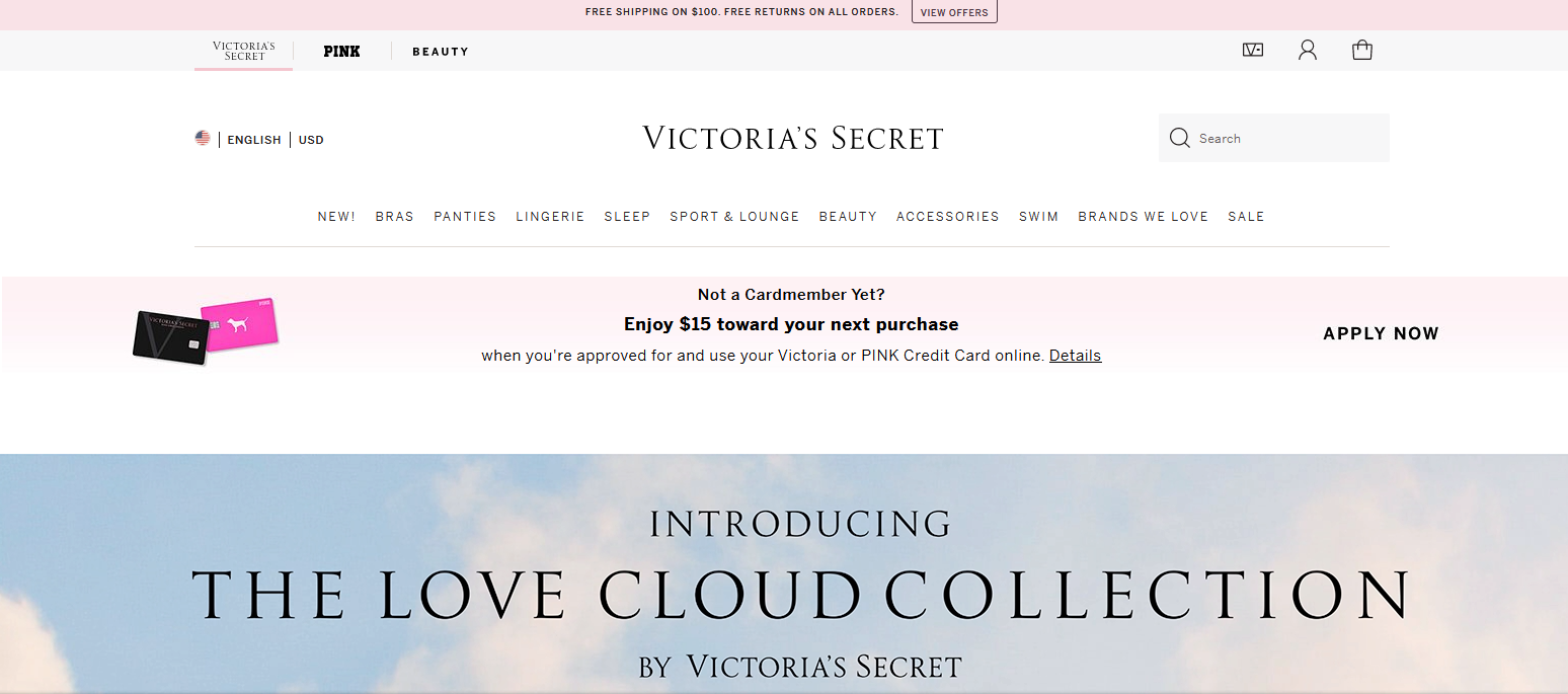
Kimp Tip: Your logo colors are pretty much used as the primary colors in branding. So, you should be sure about the color you choose and its association. Choose colors that kindle the same emotional response as your brand does.
Having trouble finding brand colors that make an impact? The Kimp Team is here to help.
2. Brochures

In places like brochures where there is a lot of text and visual content, you might want the accent colors to be gentle on the eyes. Using pastels in brochures, as in the above image, helps you create color-based sections and visual contrast without distracting the reader.
3. Flyer

Nearly 26% of people who receive flyers through direct mail toss them away and for door drop flyers, the number shoots up to 85%. This is not entirely because flyer marketing is dead. It is mostly because of designs that do not excite.
In the gadget-heavy lifestyle that people lead today, most customers appreciate physical experiences. So, if you wish to give your flyer designs a makeover, using pastel colors will be a great choice. In the world of red, blue, green, and black, pretty flyers in salmon pink or Pistachio green will definitely make heads turn.
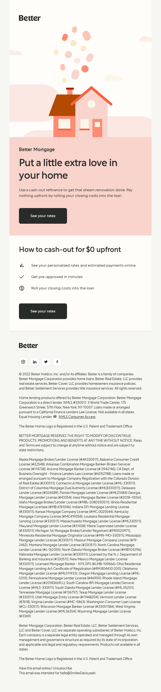
4. Packaging

At the beginning of this blog, we had pointed out the calming effect of pastels. This is one thing that many marketers easily cash in on. Take the above image for example. For a relaxing scented candle, pastels work brilliantly.
Packaging provides a sample of the experience that customers are likely to get with the product. So, colors are pretty important in packaging design. When used right, they make the customers feel the emotions that your product is likely to trigger. Pastels are perfect for packaging if you are selling aromatherapy products, relaxing skincare supplies, and more.
5. Business Card
Another printed asset of a brand that many misconceive as an outdated marketing tool is the business card. But this is still an effective way to strengthen your networking efforts. According to Adobe, nearly 88% of business cards are tossed away within a week. And this was back in 2016. Imagine the situation now!
So, you need a captivating design and clear CTA on your card to be sure that yours is among the 12% that does not get lost. Picking unique color palettes for your business card design is another way to do it. Take a look at the below example that shows how beautiful business cards can be designed with pastel colors.

A card so pretty as the one above will be hard to ignore! And the color easily resonates with the beauty and wellness segment to which the brand belongs.
6. Video design
If you thought that pastels are only for static images, take a look at the below video. It shows how using pastels in a whole video can make the design more enjoyable and unique.
Pastels make the whole design appear pleasant and this makes it easier to stay on the video and observe the message in it, until the end.
7. Email
From lead nurturing to gathering customer feedback, there are so many ways in which brands use emails. But let’s face it. Every customer you target is likely to receive lots of marketing emails in their inboxes. So, strong visuals make sure that your email stands out.
Black strongly pops out on pastel backgrounds, as in the above example. So, using pastels in your email makes it possible to ensure that the text content gets noticed.
8. Social Media

The above image is a snapshot of the Instagram aesthetic of Casper Sleep, an American brand selling sleep products. Pastels with their soothing effect therefore perfectly capture the essence of the brand.
Even if you do not want to create a whole aesthetic out of it, for your regular social media posts to pop out, pastels are pretty colors to work with. These colors draw attention even in a colorful feed and thus make your customers stop scrolling and notice your post or your ad.
As you can see, pastels can be used almost everywhere in graphic design. It all depends on what kind of interpretation you chart out for your design. But why should you consider the use of pastels in your marketing visuals?
Benefits of Pastels in Graphic Design
1. Pastels are not intrusive
For product images, your product is the hero. The backdrop and the whole setup for product photos should not distract attention away from the product. The colors, details, and shape of the product should be the prime elements of focus.

To be sure that there are no colors that interfere with the impact the product color is supposed to create, you can use pastels. You can use pastel colors as the background color in flat lays and mockups. So, the product pops out.
It works even when you have to advertise products in neutral colors like brown, white, beige, and black. This way, there will be a mild pop of color in the image but the focus will still be on the product.
Kimp Tip: Product photos and demo videos are the secret ingredients that get customers to buy a product on an ecommerce site. For Amazon Graphics and demo videos, you can incorporate pastels as the background color so that all the attention will be on the product.
Want Amazon Graphics and product demo videos all created in one place? Try the Kimp Graphics + Video subscription.
2. These are cheerful colors
Pastels are positive colors that look cheerful almost everywhere. So, when you have to create ads for indicating an upcoming celebration or when you need a festive email, pastels will be great choices.
Pastels with red undertones, for example, work well as main colors in Valentine’s Day promotions.

3. Pastels can be used more than just in marketing design
Pastels appear almost everywhere from the world of fashion to interior design. Considering how timeless these colors are, you will find them used in event decorations. Venue decorations for baby showers, bridal showers, and even weddings often incorporate pastels in some form.
So, when you have to design print banners for such events, you can always incorporate pastels to make them look coherent with the venue decoration. This makes it easier to create print designs like banners, place cards, and even event signage without breaking the harmony of the decor.

4. They make monochromatic designs look good
Monochromatic designs have their own strengths in marketing. Pastels add depth to colors and make it easier to create monochromatic themes.
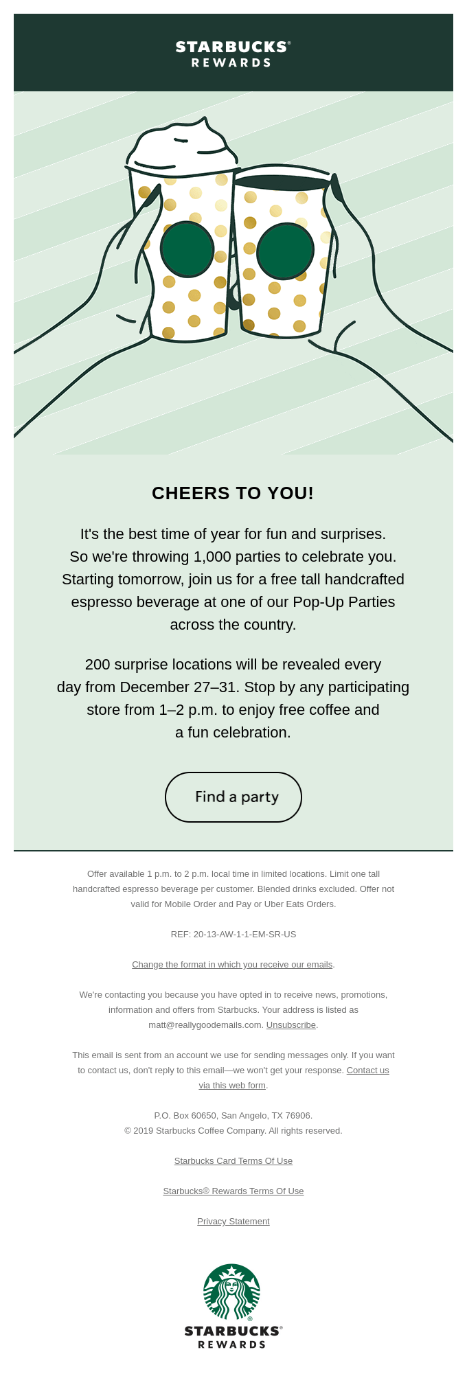
In the above email, Starbucks only uses green and tints of green. The pastel makes the illustration pop. And it ensures that the branding is on point as the email only uses the primary brand color of Starbucks.
5. Pastels create a harmonious palette
When it comes to combining pastels you can use the same concepts of color harmonies you use for solid colors. You can choose analogous, triadic, complementary, and split complementary combinations. The difference here is that when combined, pastels often create a harmonious blend. As a result, the overall design looks colorful, yet mild.
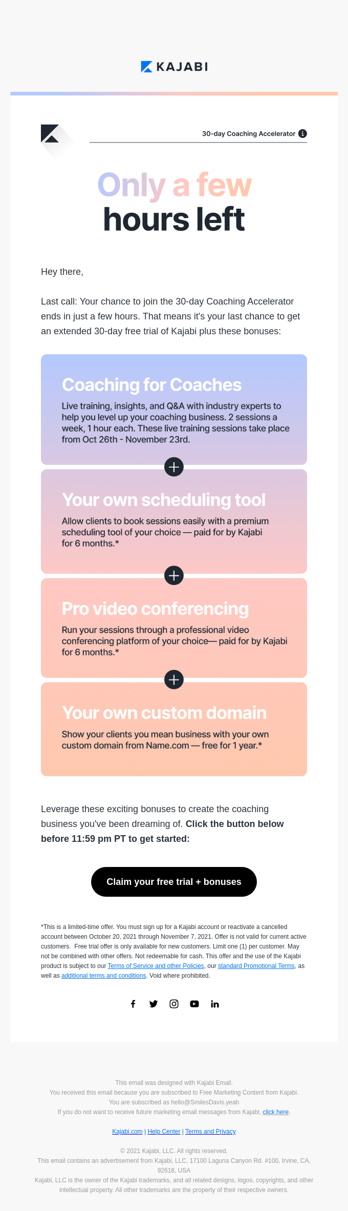
The above email uses different pastels to differentiate the text sections. But the use of gradient pattern let the colors flow smoothly into one another and thus maintain a well-balanced design.
6. Pastels are seen as delicate colors
There is a visual softness that makes them special. And this can be used by skincare brands. You can use the delicate nature of pastels to show how pampering your products are.
Kimp Tip: Most skincare brands use pastels in their packaging design. But not all of them consistently use these colors in their ads and social media posts. So, if you wish to show that your brand is different, identify the right pastel shade for your brand and then consistently use it in your emails, social media, and print ads too.
Struggling to make your marketing visuals look coherent? Sign up for a Kimp Graphics subscription today and have a single team design all your visuals, for a more consistent look.
7. Versatility in pastels
By playing with how you combine different pastel shades and what kind of contrasting colors you use you can experiment with different themes. Pastels can look fun and playful in an eclectic design.

Pastels are favorites when it comes to decorating children’s nurseries and you will also find them in kids’ fashion. So, pastels can be wonderful choices for marketing kids’ products. The above image shows the vibrant packaging design by a Portuguese brand, Home Sweet Sushi. And this design was created particularly for the kids’ menu by the brand.
An ad from the 1950s featuring a pastel palette

The vintage vibe of pastel colors cannot be forgotten. A quick search for vintage decor will bring to you a colorful array of images featuring pastel wallpapers and more. The above image shows an ad from 1954. Recreating a similar vintage effect is easy with pastels.
By combining pastels with retro fonts like Beauford or Charcuterie you can easily create a retro-themed ad or social media post.
Give Your Designs a Pastel Makeover With Kimp Graphics
As you can see, you can use pastels in so many different ways and create so many different moods with them. But with all this, you should also be sure that the core message is conveyed. For that, you also need to combine contrasting colors for the text and CTA. For your seasonal campaigns or as regular brand colors, our design team is here to help you use the right amount of pastels to breathe life into your designs.
Sign up for Kimp’s free trial and give your marketing visuals a new look.