How To Use Red In Design & Marketing For Maximum Impact
Red – the color of love, prosperity, and also apparently danger? How unique, right? How can a single color have so many connotations and that of seemingly opposite meanings?
But, it is true and we see proof of this across the world and in different cultures.

While this is a very interesting fact, it makes the usage of this color extremely challenging for designers. Be it interior decor or marketing design, using the color red in design has its own advantages and disadvantages.
So when it is so tricky, do brands skip it? Well, if you took a look at your social media feed or your competitors’ advertisements, you will know that it is far from that case. In fact, red can easily be in the top five colors that brands like you use in their marketing campaigns. And, this is because red brings engagement and conversion – two things every brand wants.
To put it simply, red is the color everyone wants but not a color everyone knows how to use well. And, if you too want to experience the power of red via your marketing and designs and aren’t sure how – you have made it to the right place.
This blog by Kimp gives you the lowdown on red and how to leverage its power in your marketing campaigns for maximum impact.
Why use red in design and marketing?
First off, let us address this – why is red so important that brands so often try to incorporate it in their marketing campaigns? Is there any merit to it? Will the hard work you put in reap results?
The answer is indeed yes. There are many factors to the success of designing with red in marketing and advertising. Understanding these empowers brands to make qualified decisions and choose the right color for their brand. Colors play a vital role in the success of any campaign, and one misstep can hamper your efforts to date.
Knowledge is power here, so let’s see what makes red so engaging and impactful.
Red color psychology
Often the response of the human brain to colors is pretty generic. Blue calms everyone while red excites people. Be as it may, red triggers a lot of different and varied emotional responses in people. While some feel that red makes them happy and reminds them of their favorite food, red also signals danger to many. This makes the study of red color psychology very interesting.
Red is easy to see from long distances. So stop signs wouldn’t have the same impact if they were in another color. Red also prompts instant attention and action from its viewers. These sudden stimuli and responses trigger many to consider red as a sign of danger or at the least something to beware of.
A similar connection between the color and the human response has also made red the color of energy. The quick action it brings out in us makes us feel it to be a source of energy.
Weird, isn’t it? Red makes you stop, but red also energizes you to keep it moving.
Interestingly, red is also the color of the blood and has a long-standing association with bravery, courage, and power. You see red in military flags and fire trucks signifying the same. Royal garments, the red carpet, and the stunning red dresses we see everywhere bring out a feeling of power quite well, too.
It is probably the only color with such varied and conflicting triggers for the human brain. You can evoke any emotion you seek with the right shade of red. Even more important for you is to know how to design with it for the best results.
Red’s cultural meanings
What is the significance of cultural contexts while studying the impact of a color? Well, colors by themselves don’t have any meaning. It is how we react to them and perceive them that brings out the meaning of any color.
Most of our lived experiences come from our families, friends, and the cultures we grew up with. Many of these become our subconscious biases, even if we don’t know. Do you consider a particular color lucky or unlucky? This might be why.
For example, while brides wear white on their wedding day in many cultures, red is usually the color brides adorn in Asia. Now, a customer from Asian culture will connect red to weddings, brides, femininity, and more. This is in complete contrast to a customer from Africa, where red is the color of grief.
But, overall, red is associated more so with beauty, femininity, sensuality, and bold nature across many cultures. We can spot this in the many red dresses that every fashion label launches season after season.
Red’s performance metrics
Well, the initial question was why use red in design and marketing? While the anecdotes and psychological meanings are great, it still poses a significant challenge to prove its mettle. We know you want to know how effective red is in everyday operations and conversion. And, we have this data ready.
Red shows a very prominent impact when you use it in CTAs and other significant buttons in your marketing. The Shutterstock AI has discovered that red and other colors belonging to the red family make up 30% of most clickable colors. This is a huge number for a single color.
This color became so popular in 2020 that even ads containing red fruit images, red scenic images, and red food images started getting a higher click rate.
The potential for your brand when you use red is huge. And understanding the color red and its significance in marketing holds the potential to change how you do business.
The many shades of Red
In the previous section, we spoke of how different shades of red mean different things across cultures. This is a very significant point, and before we go any further on how to use red in design and marketing, you need to understand this.
Red is part of the primary color set. Red, blue, and yellow – all are primary colors. However, red combines with other colors to give us secondary and tertiary colors. Red has a wide range of tones (when you mix it with white for a lighter shade), shades (when you mix it with black for a darker color), and hues to leverage.
All these colors are most commonly known as red. In the color wheel, red occupies a very dominant space and goes from a warm orange to a darker purplish crimson, so to say. This color wheel will show you the variety of red holds in itself.
Now that you have this information, let’s take a look at how this affects a brand’s marketing and advertising performance.
Brick red is one of the most common reds and has a very engaging presence across all mediums – print, website, social media, and so on. In terms of the content type, it works best in the video. As a result, content with barns and outdoor settings have seen a higher CTR than most others.
Sunrises and sunsets featuring red and warm orange tones also have a high CTR, with the rate going up by 210% between 2018-2021.
And the color that gets the most clicks of all? It has to be red-violet. It works brilliantly in photos, images, video ads, and so on.
Looking to create videos from the most stunning red-based images you have after seeing this statistic? Book a call with the Kimp Video team and sign up today! We will take it from there.
Leveraging Red in Design and Marketing the right way
We know that red in design works really well and has the potential to bring you the leads and conversions you have been looking for. But the case still remains that it is nothing less than a challenging color. With such a wide variety of reds available in the color wheel, it can be a task to pick the right one for your designs in marketing.
Given how important this color can be for you, Kimp brings you a list of design tips that can help you hack your way into the success that comes with red.
This section will solve all your queries about using red, and if you want to implement them, Kimp’s design subscriptions are just a click away.
Designing branding with red
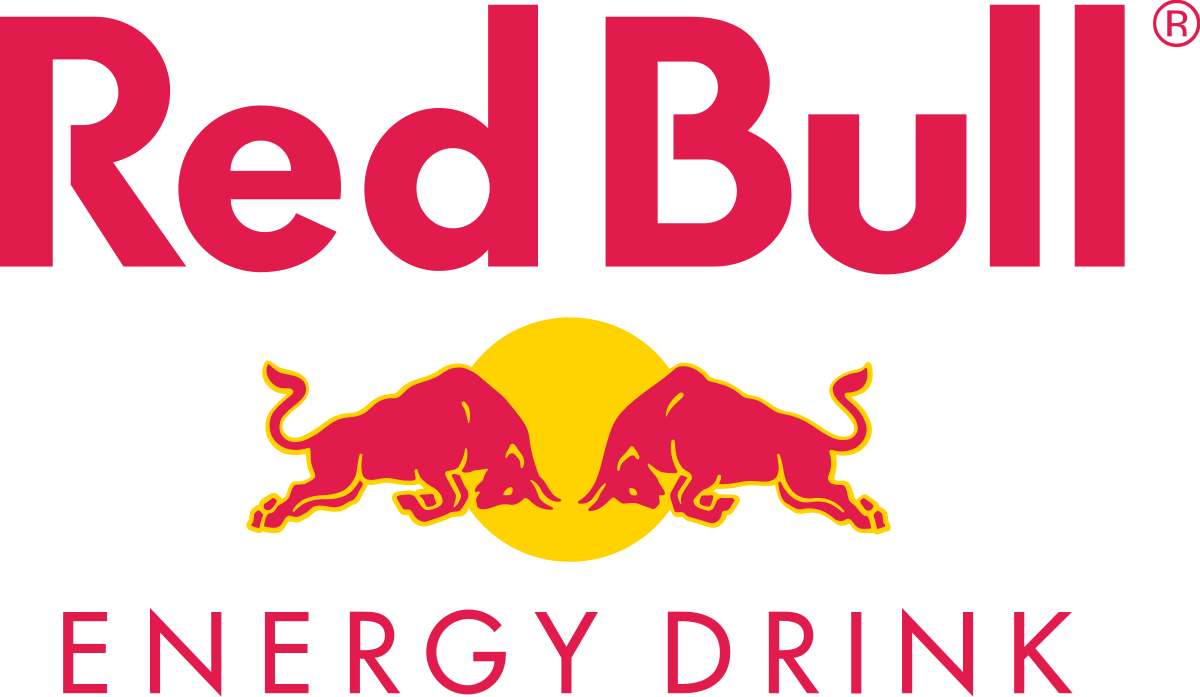
Let’s start at what’s at the heart of all successful marketing campaigns, and that is a stellar brand identity. If you have a striking and powerful brand identity, success is yours for the taking. Some of the most famous brands have red logos, and we all love them. McDonald’s, Dominos Pizza, Pizza Hut, Colgate, and Netflix are just a few examples.
Branding has three major components, and it is time to explore how to design them with red:
1) Red logo designs:
Red logos can be a great brand asset to have. You want customers to remember your brand’s visual identity wherever they go, and red is the most striking color you can use. The only thing to remember is that it is also a color that becomes too much too soon. And not everyone likes red.
So, for a great red logo :
- Understand your target audience and analyze if an outright red logo is a right choice. If not, you can pick other colors in combination so that you can mellow it down but grab your audience’s attention.
- If you have a packaged product, understand how the packaging design and logo interact before you pick the right shade of red for your logo design.


2) Red website designs
While we love using red in design, an outright red website might be a tad too much. If you feel that this is the color for your brand personality, then you do need red on your website. So what do you do?
Well, by the power of negative space and visual hierarchy, you can have your cake and eat it too. Get a homepage and website designed that celebrates your brand color without going overboard.
Want to build a balanced and well-designed landing page that features red for your brand? Sign up for the Kimp Graphics subscription to get your designs done for a flat fee.

3) Red Packaging designs
Red is great for spotting a product from a distance. Especially if you have a product that often stands on crowded shelves with a lot of foot traffic. Even if your logo design does not have a prominent red color, you can still experiment with red for your packaging designs.
If you have a food-related product, the bright brick red is a brilliant choice. For feminine and personal care products that relate to bold and energetic personalities, pink and red shades bring about the best effect.
Even tech products such as gaming gear and wearables can adopt red packaging. Overall, if you have a young target audience and you want to bring out energy and excitement in them, go with a red packaging design.


Kimp Tip: Red features in the RGB color scheme and CMYK color scheme, so choosing a print-friendly red color shouldn’t be too much a challenge. But since print toners can change the output, work with your design team to get mockups before you go live to make sure everything looks just right.
Looking to spruce up your packaging design with some red in unique way? Check out Kimp Graphics’ guide on using illustrations in packaging design for some ideas.
4) Choose the right color combination
Red is a difficult color to tame, and most times, you should not try to tame it too much. But what happens if you need to use red in a place that’s not right for such a bright presence. Or maybe there is another color that needs to shine. Well, then you play with color combinations to get the effect you are looking for.
Some prominent color combinations with red are:
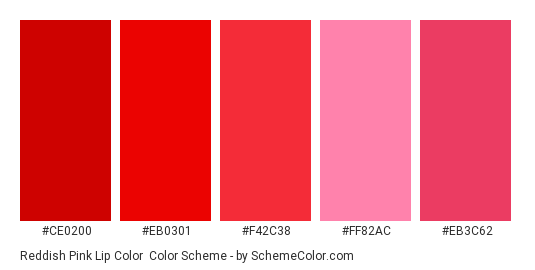
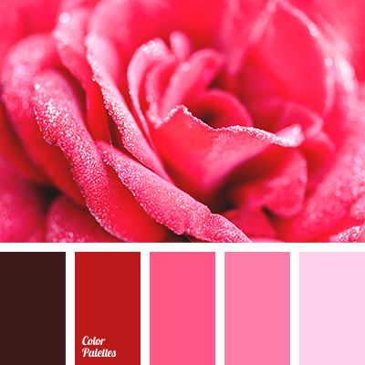
- The red in pink palette color combinations make the overall effect mellower, giving us some of the most aesthetic color schemes.
- Do you want red to shine without overpowering the whole design? We suggest pairing red with some neutral colors such as white, gray, black, and beige, to name a few. You can see its effectiveness in the example below. This brings in negative space and makes red shine, but not in a very in your face way.

- Color Block and Color Pop color schemes are trending right now. In these color combinations, you can pair red comfortably with other bright colors such as yellow, green, and blue without the overall design becoming too cluttered.


With the unlimited Kimp Graphics and Kimp Video subscriptions, you can get as many revisions as you need to find what color combinations work best for you. And this is at no additional charge – all part of the subscriptions.
5) Use red in the right places
What do we know about red so far? It is great for clicks, brings you attention, and can even lead to better conversion rates. Based on all this, we have a few Kimp Tips on how you can include red in your everyday campaigns, even if you don’t design with red entirely.
- Having Red on CTA buttons can improve your clicks and also grab the user’s attention right off the bat. The scannability of a design increases by a lot when the customers know what you expect from them. They may even skip what you wrote and just click to get the form submitted. Great, right?
- If your headline is more important than the CTA, then we recommend adding some red to the text or accenting elements to draw the eye there.

- Images with red in them are widely popular because they still appeal to the customer’s emotions without overpowering the entire space. So include berries, watermelons, apples – or shapes or elements that have those bursts of color – in your ad designs. This also works for packaging designs, as you see from the example below. Even if there are more colors there, red still takes up considerable attention.

Maximize the Impact of Red in Design and in your marketing with Kimp
Color is a kingmaker in marketing. It can just change the vibe and aesthetic of your designs within a second. Red, especially, is a big powerplayer. Once it is added, there is no way the attention goes anywhere else.
Using red is a great idea to grab users’ attention and also display your brand personality to your audience. Your customers will know who you are in an instant with the right shade of red.
But picking the right one and using it to maximize its impact is a tricky job.
Kimp offers its two unlimited design service subscriptions (Kimp Graphics and Kimp Video) to help get this challenging task off your to-do list.
Our expert team is here to use red judiciously, yet innovatively, for your marketing and branding needs. And our subscriptions offer unlimited design requests and revisions at a flat monthly fee, so the budget is never an issue in the way of achieving your goals.
So why wait? Sign up for our free trial and experience our design team’s expertise before committing.