Color Trends: The Untapped Gold Mine in Social Media Design
If we ask you to visualize a happy scene, would it be in grayscale or bursting in colors? We’re sure your favorite colors are going to be part of the scene. That’s the kind of connection we humans have with colors. No wonder, colors hold a strong position in a highly visual space like social media.

We know that colors are important in social media design. But if you have to use the well-known color trends of the year, how do you do that? Let’s find out. But first, we’ll tell you why colors are crucial aspects while designing for social media.
Colors and social media design
We can safely say that colors make the marketing world go round. So much so that almost 90% of first impressions depend on colors alone! And brands are very particular about the first impression. Because it ends up being the last impression about the brand in many cases.
Naturally, brands go the distance in understanding color psychology to trigger all the right emotions with their designs. Here are some reasons why colors matter in social media design:
1. Colors grab attention
You might know this already but we’ll give you an example. Take a look at the below image.

Though there are lots of elements in the above design, your eyes probably went to the yellow case first. That’s because colors have the power to draw your attention. On social media, it is a fight for attention.
Instagram alone sees nearly 95 million new posts per day. Your target audience might therefore have an overwhelming amount of content on their Feed. The right colors have the scroll-stopping effect that makes them stop and look at your post. And done right, colors help you bring the right people to your page.
2. Keep them coming back for more
Getting people to visit your page is not enough. You should also have something solid that will make them come back for more. Or better yet, hit that Follow button. For this to happen, you need a strong aesthetic. Colors have a huge role to play in creating an Instagram aesthetic.
On Facebook and other social media platforms, colors help build a connection. When your customers see a particular color appearing a lot in your posts, they start connecting your brand with the color. This way they will know when they see a post from you.
3. Set the mood for your Feed
People often see yellow as a happy color. And you see a lot of red appearing on fast-food restaurant decor and menus. Blue instills a sense of trust and professionalism. All of these are observations based on color psychology. And marketers are very particular about these associations.
That’s why even if you come across color trends, you should consider the emotions or cultural associations for that particular color. And then evaluate whether these associations will align with what your brand stands for.
For example, consider a kids’ fashion brand that uses pastels and other happy colors in all of its marketing visuals. If suddenly, black happens to be trending everywhere, and the brand creates all-black posts, do you think it will work? It won’t. So, be clear about the mood you want to set for your social media pages. And stick with this mood. Whether you want to change your brand colors or simply go with the trends, do not deviate from this mood.
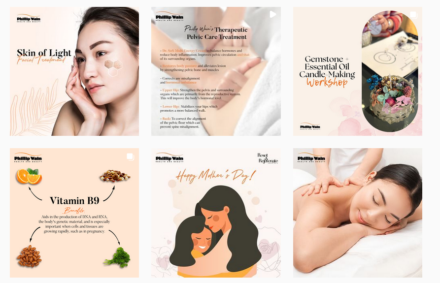
In the below social media image, the soothing colors go perfectly well with the core theme, yoga.

You will see similar calming colors on the brand’s Instagram page quite a lot. That’s how you set the mood for your page.
Having seen how colors affect the experience on social media, let’s talk about the need for adopting color trends in social media design.
Why color trends are important for brands
Have you ever wondered how color trends emerge? Today color forecasting is a huge segment. Color trends emerge mainly based on cultural and political scenarios around the world.
For example, a lot of stress and anxiety prevailed during the pandemic period. Calming colors and grounding neutrals felt like the apt colors to use on a large scale. That’s one of the reasons why earthy neutrals have been part of the 2022 color trends.
So, color trends take into account the current mental state of people around the world. Considering that social media is a place for all things trending, using color trends in social media design would be a good idea.
After all, you want customers to look at your business as one keeps up with the trends. Or in other words, one that is continuously evolving.
Now that we have established why color trends are good for social media design, we’ll tell you how to use them. Because you cannot let these color trends affect the existing harmony in your social media aesthetic. Or even push your brand colors to the back seat for that matter.
6 tips to use color trends in social media design
Your social media profile picture will most likely be the only constant on your page. The rest of the dynamics change depending on what’s happening in your brand. And what’s happening in your industry as well. So, there is ample scope for using color trends on your social media page.
1. Create trendsetting ads
Social media ads are both for targeting new customers and retargeting existing customers. Either way, the idea is to grab eyeballs. And what better way to do this than to use colors that everyone is talking about. Or colors that most people are using on social media following a recent trend.
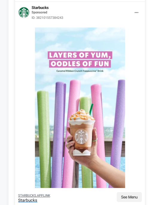
For example, pastels have been trending this year. And for spring and summer seasons these are great colors. So, the below ad from Starbucks feels summer-ready. It thus feels relevant and therefore easily grabs attention.
2. A cover image that sets the vibe
On Facebook and YouTube, the cover image is perhaps the first thing people notice when they visit your page. So, if they find trending colors there, they know that you have updated the content on your page recently. They know that you are active on social media.
And customers love to follow brands that always have something new to share and some fresh content to intrigue them.

Kimp Tip: When your Facebook cover image predominantly wears the trending colors as the core aesthetic, remember to add your brand logo somewhere. The bottom right corner makes it easy to notice. Or you can add a simple frame within the cover image or a banner for the text on the image. And you can use your brand color in these details. This way, your visual consistency remains unaffected even when you embrace trends.
Want to create stunning cover images for your brand’s social media page? Get a Kimp Graphics subscription today.
3. Use them in your Reels
Most creators on Instagram and Facebook are in favor of Reels. Because these bite-sized videos are the best ways to reach a new audience. They have the potential to introduce your brand to people who have never heard of it before.
So, when you use the trending colors in your Reels, people stop and take notice. They will be curious to know more about the brand that proactively keeps up with the trends.
And the best part is that you can choose to hide Reels from your grid. So, if you are worried that the colors might interfere with the current aesthetics, you can simply toggle this option on. Another simpler way to do this will be to create a custom thumbnail that includes your brand colors or something in line with the rest of the posts.
When you choose a Kimp Graphics + Video subscription, all your video and graphic design needs will be taken care of at a flat rate. So, you can have both the videos for the Reels and the thumbnails and the rest of the images designed in the same place.
4. The Story is a place for exploring trends
Did you know that there are over 1 billion Stories posted on Facebook apps every day? So, the competition is tough out there. You need to have the best tricks up your sleeve. And one among them will be using trending colors. Colors that instantly have people’s attention.
Like Reels, Story is another place where people look for trends. And if your brand can feed your customers’ enthusiasm through well-crafted Stories featuring color trends, your idea will be a hit.
With a catchy design like the one below, getting clicks on the CTA button will be an easy job.

5. Use brand colors in text overlays
You feel compelled to use trending colors. But then you know that you cannot leave out your brand colors. That’s when the confusion begins. Where do you use the trending colors and where do you use your brand colors? After all, you do not want to create a busy design simply because you wanted to try some new trends.
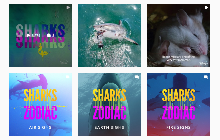
When this confusion arises, here is an example to remember. The below posts are from the Instagram page of NatGeo.
You might notice two things from the above posts:
- When you create a series of posts on a particular theme or topic, colors help you create strong templates. By maintaining a template the brand managed to connect related posts. So, even if there are other posts coming in between, your audience will still be able to go back to the old ones in the same series.
- And for a TV channel showcasing nature’s colors, consistently projecting its brand colors might be a bit of a task. But NatGeo does it effortlessly. By using it on the text overlaid on the images and videos.
These are great ideas to use in social media design. When you have to make a trending color the eye-grabber in your design but still wish for your brand color to be present in a visible space, use it as the font color.
Kimp Tip: When you choose the background color for your design based on color trends, always compare it against your brand color. One of the pet peeves in design will be using poor contrast between foreground font and background colors.
Or do it the easy way. Leave it to the pros! Choose a Kimp subscription today.
6. Don’t forget the native colors on the platform
You might have a brilliant blue-dominant design. But will someone instantly distinguish it from all the blue on Facebook? This is one little detail you cannot afford to ignore. Every social media platform has its own colors. And you see them everywhere. From the menu icons to the interaction buttons, you will find these colors in several places.
So, when you choose a color palette for your social media design based on the trending colors of the year, be mindful of the native colors of the social media platform too. Do you want your designs to blend in or pop out? If you want them to pop out, stay away from colors that make them look too similar to the colors of the social media platform in the picture.
With all these little ideas in mind, you can create visually appealing posts for your brand’s social media page. And thus keep your page looking fresh and all dressed up in the latest trends. That’s one way to impress your audience on social media.
Adopt color trends in your social media design with Kimp
When you are working with an external design team, it takes a bit of an effort to explain to the external designer your requirements. But when you work with an unlimited design service like Kimp, you get a dedicated team of designers. So, the same designers work on your projects one after another. Therefore, even if you want to explore new color trends, they will know your brand well enough to be able to use the colors without losing out on your brand identity. This makes it easier to use trending colors in your social media design without worrying about the effects on your branding.
Register now for a free 7-day trial.