Color Psychology: Using Green In Marketing + Design Tips
Did you know that the human eye can spot and discern more shades of green than any other color?
It’s no wonder brands, big and small, love to use it. From the bright Mountain Meadow green of the Spotify logo to the dark Kaitoke Green shade in the Lacoste logo, you will see a wide spectrum of greens.

But, green has both positive and negative sides to it. That’s precisely why some marketers endlessly debate whether to use green in marketing. However, when you use it right, this fresh color of nature and growth can breathe new life into your branding and marketing efforts.
Colors are kind of a big deal in marketing. When you pick the right color and consistently incorporate it in your marketing, it improves brand recognition by almost 80%. This includes:
- The primary color in your logo
- The color that appears predominantly in your marketing campaigns
- A color that you use in your social media aesthetics
- Packaging design color schemes
Knowing that a lot depends on the colors you use in these places, should you include green in marketing your brand? Short answer, yes. And the long answer? Well, let’s unravel the many layers of perception surrounding the many shades of green to understand this better.
The many interpretations of ‘green’
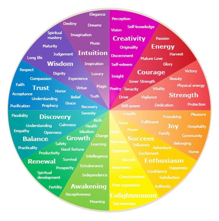
Color psychology shows us how each color triggers a different emotion in human beings. And according to color psychology, most people perceive green as a color of growth, and good luck.
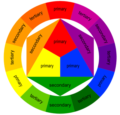
One interesting aspect of green is that it is a combination of a cold color (blue) and a warm color (yellow). So, your green can be customized depending on how much blue or yellow is in the mix. It all depends on the position of the shade of green you choose on the color wheel. A shade closer to yellow will be warmer and more ‘fresh’ and ‘cheerful. And shades closer to blue will be darker and the cool tone might make them appear more ‘sophisticated’.
Now, let’s talk about some of the most common interpretations of green. Understanding this will be useful when you try to use green in marketing, to convey a specific message for your brand.
- Green is a color of nature – nothing speaks of growth and vitality better than a light shade of green similar to that of tender leaves.
- We easily associate green with a ‘Go’ signal, like those at traffic junctions. So, you can use green to ask people to take an action, like in the call-to-action button.
- What do lush green mountains mean to you? Relaxation right? Green can evoke serenity, a calming effect.
- Green arrows strongly symbolize forward and upward movement in any data visualization model. There’s a sense of positivity attached to it.
Green in different cultures
The cultural aspect of different visual elements is crucial especially when your business is expanding to new locations. So, when you choose green, or any color for that matter, you should also know that different colors mean different things in different cultures.
So, how do people around the world see and connect with green?
- In many European and American countries, the cloverleaf is a symbol of good luck and so is the color green. So, using cloverleaf green in your marketing will receive a warm welcome in these countries.
- The populations of several parts of Asia see green as a color of fertility.
- In Japan, the leafy green shade close to the color of matcha tea kindles a sense of calm.
- In ancient Egypt, there was a belief that the Greek God, Thoth, was a guide of the souls of the dead. And people believed that these souls eventually reached “a green hill of everlasting life and eternal wisdom” with the support of Thoth. As a result, green indicates wisdom in several parts of Egypt and other countries.
- Wearing a green hat in China could be an expression of infidelity. So, when you plan your campaigns for your audience in China, you might want to avoid using a green hat anywhere in your designs.
Kimp Tip: People in some parts of the world take color symbolism quite seriously. So, when you design your ads or run your social media campaigns, you need to be sure that your designs reflect and respect the local culture. Be sure to study the color symbolism in the regions you’re targeting, in particular.
If you need help with creating professionally designed ads, and more, for a global audience, the Kimp Team is here to help.
Perks of using green in marketing

Brands that do not yet have a primary color might find green to be easy to work with. Even if you do have a primary color, if you need secondary colors to accent your digital content, green will be a powerful color to add to your list.
If you are wondering why green deserves a special mention in the applications of color psychology, here are a few benefits you should know about:
- Green is a gender-neutral color and most people like green, or at least do not hate it. Though color-based stereotypes for different genders are increasingly frowned upon, some colors are consistently seen as feminine and some as masculine. So, if you want your marketing to be a hit across different genders, green is a great choice.
- Human beings easily distinguish one shade of green from another. So, if you have to go with a monochromatic campaign, a green palette would be a lovely choice.
- From young green and subtle neon shades that reflect the energy of the youth, to the regal green shades that indicate luxury, you get to explore so many different hues. There is a green for every mood.
- Green is only the fifth most popular color in logos since just 7% of global brands use them. So, if you do plan to use it in your logo, there might be fewer brands to compete with than with other colors like blue and red.
- Green is a timeless color. You will see different shades of green grabbing a place in the trending colors list year after year, both in graphic design and interior design.
So, if you have plans of using ‘green’ in your marketing, give those plans the green light. And have your competitors go green with envy!
How Green Shapes Brand Personalities
To help you figure out how to use green for your brand, let’s see how brands usually associate green with different brand personalities.
1) Green as a symbol of freshness
Green makes a great color for supermarket chains and stores that sell fresh produce, herbs, and healthy ingredients of different kinds.
Whole Foods has emerged as a reliable supermarket chain. It is probably the first place many people think of if they are planning to buy fresh, preservative-free products for their kitchen. The green in the brand’s logo accurately reflects the range of organic food and natural ingredients the brand sells.
The other kind of businesses that might expand this meaning would be vegan restaurants or even health and wellness brands. Have you seen the green KFC logo take over the conventional red one, for the new plant-based range named Kentucky Fried Miracle? It’s a great example of how brands are using green to clearly show their shift to a vegan or vegetarian menu.
2) Green for a forward-thinking brand
Green is a positive color and many people easily associate it with growth and progress. Optimistic technology brands, especially those who are always innovating and creating something new can use this connotation of green.

Android’s green bot logo is the perfect example. It is a unique shade of bright and energetic green nicknamed ‘Android Green’. This unique green aptly captures the unique personality of this forward-looking brand. Earlier, the wordmark was also green but went through rebranding a couple of years ago. Now the bot remains green and the wordmark black.
It is worth talking about the shift towards black from green here because this decision was made as a way to improve readability. This is a valuable lesson to capture. Some light shades of green might be hard to distinguish, especially for people with visual impairments. When you use green for your brands, think twice before picking it for text content.
3) Green to indicate a positive change
Tender shades of green make us think of fresh growth or spring. Brands that bring a change or even one that is undergoing a major change in direction might find this to be an appropriate color to use.
Acer’s bright, somewhat lemony green is a good example of using green to denote change. A decade ago, the brand decided to revamp its business model. This was the time when it started focusing more on the tablet segment in order to keep up with the changing gadget preferences. And to back up this shift, the brand chose a refreshing green logo with smooth rounded fonts.
The lively green perfectly captured the brand’s progressive approach. Back then, light green was also not common in branding. Making full use of color psychology, the brand consistently incorporates green in its social media aesthetics and packaging design as well.

Need help designing consistently branded designs, like Acer’s? Ranging from social media posts, to print designs, and so much more, a Kimp Graphics subscription helps you get it all for a flat fee.
4) A Green that reminds us of fields and farming
Grassy green is a slightly darker shade of green when compared to the light greens of Acer and Android. It immediately gets us to think of lush green farmlands. It might even remind you of fresh-cut grass or a well-maintained lawn.
So, what better color than green, to represent a brand that focuses on the outdoors or farming equipment. John Deere’s grassy green is perfect for a brand known for its tractors and lawnmowers.
John Deere’s range of equipment has always had an abundance of green in them. With the major rebranding that took place in 2000, the logo became green too.
You might also notice from the picture above that in the green logo, the deer that was landing on its front legs was replaced by a deer that is leaping. On the whole, this logo design which combines both a meaningful color, and action, aptly summarizes the brand’s shift to new technology in farming.
And when you advertise agricultural products, green is going to be the predominant color that appears on the screen, naturally. So, green works really well for John Deere, or any other brand in the farming industry for that matter.
5) Green to feel close to nature

What does the emerald green logo of Land Rover remind you of? Forests? Wilderness? That’s precisely what the brand has been about. Vehicles built for the wild outdoors. This particular shade of green in Land Rover’s logo also comes as a tribute to the British Racing Green from the country’s motorsports.
And like John Deere, maintaining brand colors in videos becomes easy for Land Rover too. Take a look at the campaign below and you will understand what we mean.
You will find many hues of dark green appearing in most of these ads shot in the hilly terrains. And thus Land Rover effortlessly manages to capture its brand color in its campaigns. This is one main reason why choosing a logo color based on the niche of your products and services works well.
You will find many hues of dark green appearing in most of these ads shot in the hilly terrains. And thus Land Rover effortlessly manages to capture its brand color in its campaigns. This is one main reason why choosing a logo color based on the niche of your products and services works well.
Kimp Tip: Just like adding a splash of a color in your images, you can also add color schemes to videos. Just be sure that the visual balance and the core message are not lost when you add green or other colors to your videos.
Need help crafting branded videos for your brand? With Kimp’s video design services you can have visually appealing and engaging videos designed by a professional team for a flat monthly fee.
6) Go for an eco-friendly approach with Green
We call it ‘going green’ for a reason! When companies launch eco-friendly campaigns, you’ll likely see the color green somewhere in them. Green logos are also common among brands that handle environmental services, like Green Options, an Australian landscape management company.
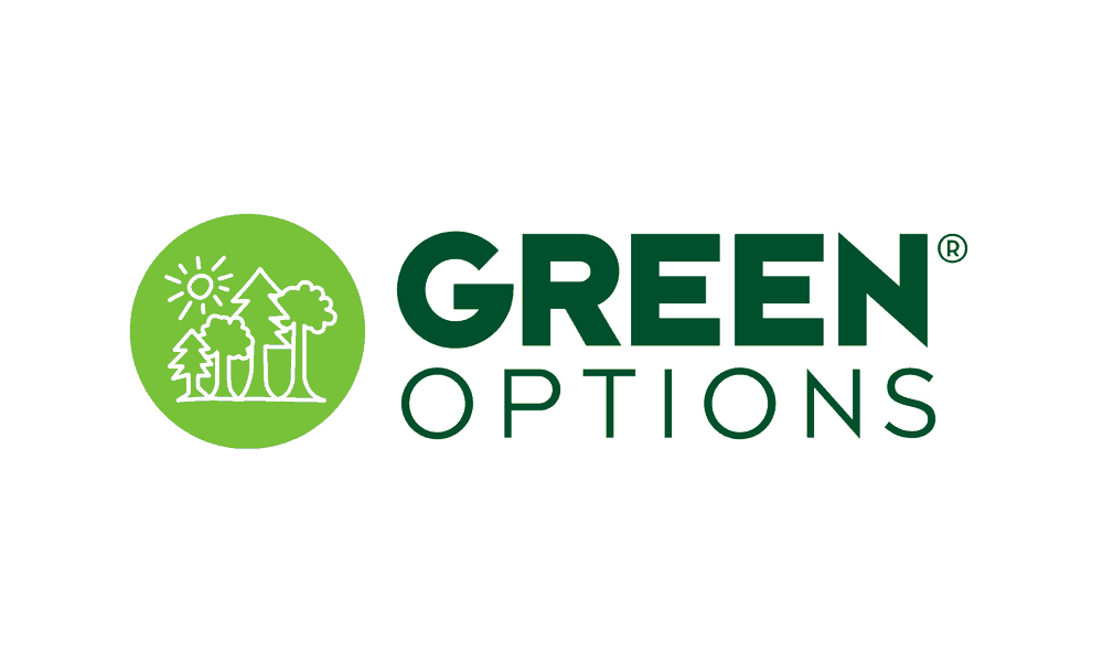
The green in this logo symbolizes the brand’s focus on policies and procedures that focus on the environment and sustainability and its efforts in conserving the environment. That being said, if you do plan to use this meaning of green in your marketing, you should be sure that you have sustainability as the core focus in your business model.
Some brands that use green to talk about environmental sensitivity end up receiving backlash if their business model is not aligned with the marketing effort. Greenwashing is the term used for this. It is where all the branding efforts project the brand as an eco-friendly business but its business model does not really support this idea.
British Petroleum is one such brand that received a lot of criticism for greenwashing. The brand installed many solar panels in most of its gas stations. And the rebranding came with a new logo. The yellow in the logo is for the sun, or solar energy in this case. The green is for the brand’s green initiatives. But since the brand predominantly deals with oil and gas, both of which increase pollution, a lot of people criticized BP’s rebranding.
Choosing the Right Green for Your Brand
So, there are many different meanings that brands convey using green. But how do you know which shade of green to use? Let’s talk about some of the most popular and powerful green shades to use as inspiration.
1) Pastel green

Livelier than mint green, pastel green looks youthful, and merry. The best part is that the versatility of this green shade lets you create nostalgic designs or even some contemporary pastel palettes.
2) Mint green

This is a very relatable color, one that people find around them easily. As a result, if you want to increase brand awareness it comes in handy. It works particularly well with light and warm colors.
3) Greenery

Greenery is a green shade with a subtle hint of yellow in it. This was the Pantone Color of the year in 2017. Marketers look forward to the yearly Pantone color picks as these give an overview of what’s trending.
4) Pistachio green

Designers like to balance the softness of this green shade with dark colors like black for a sophisticated touch. The ‘close to nature’ effect this color creates makes it a suitable choice if you want to convey a feeling of ‘safety’ in your design.
5) Jade green

Just like the gemstone, this color is pretty rare in marketing. And its inherent feeling of luxury makes it suitable for brands that wish to use green as a symbol of luxurious experiences.
Kimp Tip: Each of these greens evokes a different feeling. But most of these shades won’t get the job done on their own. With good design, you can add subtle emphasizers in the form of symbols or illustrations and complementary or contrasting colors. With these additions you can be sure that the intention behind choosing the shade is actually clear to your customers.
Need help finding the right green for your brand? Consider a Kimp Graphics design subscription. You get unlimited requests and revision which means you can test out your designs with different shades of green and color combinations, all for one flat fee.
Green in marketing – best practices
There are so many places where you can make your primary brand color conspicuous lik:e
- CTA buttons
- Social media templates
- Symbols in the logo or even the text
- Backgrounds in videos

Wherever you use green in your marketing, here are a few things you should always remember:
- Be careful about the background and foreground color combinations. For example, some shades of green are not legible on a white background. But simply switching places and using white text on a green background can improve visibility.
- A large green CTA button on a white background often draws attention and gets clicks. But when you do use green in CTA buttons, avoid using it in other places as it might distract attention away from the clickable button on the page.
- If you do not know what colors to combine with green, try complementary colors like red or even triadic combinations like orange and purple with green.
Kimp Tip: A brand can never have just one color to represent it everywhere. There will likely be a primary color that features dominantly. But you should also have supporting, secondary brand colors that help add emphasis and variety. Your text, backgrounds, and symbols will all use a combination of these primary and secondary brand colors. So, be sure that you come up with a visually appealing palette.
Make the most of color psychology in branding with Kimp Graphics
When customers associate brands with certain colors, brand recall happens faster when they see the color. But for this to happen you have to consistently use the chosen color in your digital and print designs. Kimp’s unlimited graphic design service helps you do this across a variety of design types to promote your brand. All for a flat monthly fee.
Need help with creating consistently branded marketing videos too? We’ve got you covered with the Kimp Video subscription! Kimp Video can help you get social media videos, product demos, logo animations and so much more designed.
Ready to tap into the power of color psychology for your brand with Kimp? Sign up for a free trial to get started.