The Art of Clothing Brand Logos: Lessons From Popular Fashion Brands
You’re standing in front of your closet, trying to choose the perfect outfit for the day. What you pick isn’t just a combination of clothes; it’s a statement. One that’s meant to accurately define your personal style. A piece of your identity. This means that fashion brands act as the curators of our self-expression, crafting pieces that tell the world who we are without us saying a word.
So, can a fashion brand, whose purpose is to craft clothing that enables its customers to showcase their individuality, opt for a plain and uninspiring logo that fails to reflect this distinct identity? Clearly, the answer is no!

Some of the most popular fashion brands have logos that make you fall in love with the brand, even before you’ve tried on their clothes. But what’s their secret sauce? That’s what we’re here to discuss. In this blog, we’ll be talking about the design and ideas for clothing brand logos. We’ll be taking cues from some of the globally popular clothing brands as well as some regional favorites from all over the globe.
Best clothing brand logos + design & branding lessons
1. Uniqlo
Uniqlo is a Japanese brand that now has a global presence in the fashion industry. Uniqlo uses a simple and versatile wordmark logo where the brand name is the primary element in focus.
Founded with the vision of creating apparel that’s both comfortable and chic, Uniqlo’s logo embodies this ethos. The brand is popular, particularly in the casual clothing segment. Aligning with this, the logo design also carries an overall casual aesthetic.
Let’s now look at some design and branding tips to take away from the Uniqlo logo.
KIMP Tips:
- Uniqlo’s logo is a testament to the power of minimalism. Its clean, sans-serif typeface reflects the brand’s commitment to simplicity and quality.
- Color is a crucial factor in clothing brand logos. In the case of Uniqlo’s logo, the white on a red background reflects the colors of the Japanese flag. Thus the logo pays homage to its origin country.
- The simplicity of the design is what makes it possible to connect the Japanese version of the logo to the English version without confusion.
Want to delve deeper into Uniqlog’s branding strategies? Check out our blog here!
2. Tommy Hilfiger

Founded in 1985, Tommy Hilfiger is one of the most popular American clothing brands. It has the reputation for redefining the fashion industry in America by celebrating the “classic American cool” style.
One look at the logo and you’ll instantly understand the connection. The Tommy Hilfiger logo, like the Uniqlo logo, resonates with the origin country. In this case, the blue-red color scheme captures the brand’s American roots.
Clothing brand logos that tell a story do not always have to be elaborate. They can incorporate symbolism to achieve this effect. In this case, the white-red portion of the logo comes from the International Code of Signals’ flag “H”. Originally this flag means “I have a pilot on board”. However, the brand connected the flag to the brand name initials “H”.
In addition to all these evident details, here are some design tips to grab from this logo.
KIMP Tips:
- From the typeface you choose to the way you style it everything about the typography in your logo affects the overall impact. In this case, the clean san-serif font used in the Tommy Hilfiger logo reflects the modernity of the brand. Whereas the use of all uppercase characters shows the brand’s bold approach.
- Adaptability is a must-have trait for clothing brand logos. Accordingly, much like its clothing designs, Tommy Hilfiger’s logo is versatile and adaptable. It seamlessly fits across various mediums, from clothing tags and storefronts to digital platforms.
3. The North Face
Originating in San Francisco in 1966, The North Face was founded by two hiking enthusiasts, Douglas Tompkins and Susie Tompkins Buell. Today it is one of the most popular brands in America for outdoor clothing and adventure gear.
The North Face logo stands as a symbolic representation of the brand’s mission. It features a distinctive brandmark, a half dome. This is meant to visually represent the unique granite monolith in Yosemite National Park. Therefore, the logo pays homage to the brand’s commitment to providing high-quality outdoor gear and apparel for adventurers and athletes.
KIMP Tips:
- The North Face logo is a good example of symbolic storytelling. This strategy helps clearly communicate what the brand stands for through clothing brand logos.
- The bold red used in The North Face logo captures the excitement the brand associates itself with.
- The wordmark and the brandmark in the logo are aligned intuitively establishing a clear visual balance in the design. This depicts the aesthetic value of balance in logo design.
4. Zalando
Zalando is a German fashion brand that has a special place in the dynamic European fashion industry. Zalando uses a combination mark logo which is simple and modern making the design perfect for a fashion e-retailer.
Orange, in the perspective of color psychology, is often associated with movement and happiness. Therefore, it makes a bright and beautiful choice for a brand that’s meant to deliver the joy of online shopping.
Finally, if you look at the evolution of the Zalando logo, the brand has continued to retain the core aspects of the design so as to maintain brand recognition. However, one of the most notable changes has been the switch from a gradient pattern in the logo accent to a solid color. This new version creates a flat design that is both versatile and timeless.
KIMP Tips:
- The clutter-free design of the logo makes it suitable for the visually crowded online realm. Considering that Zalando is an ecommerce brand, this effect is indispensable.
- The use of lowercase letters in the logo makes the brand appear more approachable.
- The shapes used in clothing brand logos can define the brand’s personality. In this case, the abstract triangle with rounded edges reflects modernity and uniqueness.
Want to come up with creative interpretations of relatable symbols to represent your brand? Work with experienced illustrators and create a unique design to go with your logo.
5. Zara
Founded in 1975, Zara is a Spanish fashion retailer. Its distinctive wordmark logo is a seamless blend of chic and contemporary mirroring the brand’s focus on fast fashion.
The timeless minimalistic design that Zara uses shows the brand’s understanding of the pulse of its audience and the nature of the ever-evolving fashion realm.
KIMP Tips:
- In clothing brand logos, serif fonts exude elegance and sophistication. In this case, Zara’s contemporary serif font mirrors the brand’s commitment to sophisticated yet affordable fashion.
- Zara uses a monochrome logo to let the brand name and its clothes take center stage.
- The slightly overlapping letters in the Zara logo add a unique twist to the design making it memorable. This shows how even the smallest details like kerning manipulation can help create a unique and memorable logo.
6. Moncler
Founded in France, and headquartered in Italy, Moncler is known for its unique range of read-to-wear outerwear. The brand name itself comes from Monestier-de-Clermont, a French village. So, the wordmark logo commonly used by the brand is a nod to the brand’s name and its origin stories.
Moreover, the fact that the purpose of founding the brand was to create jackets to protect the workers in the region from cold makes the brand name an even more relevant brand identifier.
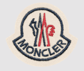
In addition to the wordmark corporate logo, the brand also uses an embroidered monogram featuring a rooster. This again ties the brand back to France since the rooster is a popular symbol that French Kings used as an emblem to represent courage. This shows the significance of a visual element in your brand identity. Moreover, the embroidery detail is reflective of the craftsmanship of the brand.
KIMP Tips:
- The monogram version of the Moncler brand identity shows the power of adding an extra layer of meaning through textures (embroidery detail in this case) to the core symbol (the rooster in this case).
- The use of the French tricolor on the monogram pays homage to Moncler’s French roots, while the red, white, and blue evoke a sense of patriotism and pride.
- The clean serif font in the corporate logo of Moncler reflects the rich heritage of the brand accurately. In general, serif fonts are known for their elegance making them suitable for brands with a rich history.
7. Paul Smith
Paul Smith is a British fashion label created by Sir Paul Brierley Smith. The brand is particularly known for its unique combination of classic and eclectic styles in fashion.
His brand logo, a reflection of this artistic approach, prominently showcases the brand’s name in a playful and distinctive handwritten-style font.
KIMP Tips:
- This is one of the few clothing brand logos that feature a script font. Script fonts are particularly suitable for brands created by fashion designers. In such instances, the design label is meant to resonate with the personalized styles and individuality of the designer. A script font can accurately deliver that effect.
- For branding, this designer label uses a combination of a versatile minimalistic monogram featuring the designer’s initials and the signature script font wordmark. This gives a distinct recognizable identifier to add to clothing tags and other branding elements. Similarly combining a monogram logo and a wordmark to represent your brand helps expand the versatility of your brand identity.
8. Beyond The Vines
A relatively new entrant in the fashion industry, Beyond The Vines is a Singaporean fashion label created by a couple who wanted to make good design accessible to all.
The brand uses a derivative of green which goes well with its idea of accommodating the “pulse of contemporary culture and our natural atmosphere”. That is green (a color associated with nature) but with a twist (for contemporary culture)!
KIMP Tips:
- The unique pastel color that the brand uses is not very common in branding. And yet pastels are perfect in the fashion realm. This shows that when it comes to standing out in a crowded industry, your brand color can be a good distinguisher.
- The unique symbol used in branding, the two circles, identify with the brand’s design philosophy, namely duality – “create boldly, design simply”. This shows that in clothing brand logos, you do not need the most elaborate or complicated symbols to tell your brand’s story or depict your brand’s ethos. Even the simplest relatable elements can be seamlessly integrated into the process.
9. Sass & Bide
Sass & Bide is one of the most popular women’s fashion labels in the Australian market. The idea of the brand is to break free of conventional fashion and create pieces with a unique Australian touch.
Sass & Bide has been credited with helping to shape the Australian fashion landscape. Furthermore, the brand has a strong following among celebrities and fashionistas alike. Keeping its diverse target audience groups in the picture, the brand uses a minimalistic logo. On another note, it also allows the quirky styles in the catalog to shine through.
KIMP Tips:
- When you wish to create a timeless design, monochrome logos work well. Moreover, they are versatile and appear equally impactful on all backdrops. Evidently, this can be a huge plus for fashion labels. Taking this into account, the monochrome design of the Sass & Bide logo works.
- The brand also uses a clean sans-serif typeface in lowercase letters. This design not only boosts the readability of the logo but also makes it easily scalable.
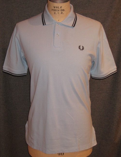
10. Fred Perry
We come to the close of our list of clothing brand logos with this combination mark logo that is both simple and meaningful.
What started out as a simple sports t-shirt concept now stands as a popular name in the casual fashion segment. Fred Perry is a British fashion label named after its founder Frederick John Perry, a renowned British tennis player.
The brand uses a combination mark logo with the brand name in a simple sans-serif font accompanied by a laurel wreath. This emblem is derived from the original Wimbledon symbol as a way to tie back to the brand’s connection with tennis. The emblem appears on most products from the brand as an embroidered detail in several cases.
KIMP Tip:
- The laurel wreath brandmark has evolved into a signature brand element for the Fred Perry brand. This proves that clothing brand logos are more than just brand identifiers. They become pivotal elements in the brand’s catalog. Monograms and emblems of the brands, for example, can be used as patterns on various products. This is something that fashion brands need to be wary about. Because they need to create an emblem or monogram that looks good when integrated as seamless patterns or as official seals on their products.
- The visually simple design of the logo renders timelessness to it. Since the time the fashion label was created, it has continued to march steadily in the world of sporty and casual fashion. This shows the strength of simplicity in logo design.
Create fashionable clothing brand logos with KIMP
From all the clothing brand logos in our list you’ll notice a few common points:
- Versatility is key – adaptability happens to be the common trait in the logos of several well-known brands.
- Symbolism speaks volumes – you need your clothing brand logo to tell a story without complicating the design.
- Typography sets the tone of your design – choose fonts that reflect your clothing brand’s unique style.
- Color psychology is pivotal – the type of colors you choose influences the way your brand is perceived.
- Simple is stunning – minimalism in clothing brand logos like Sass & Bide, and Moncler show how simple logos can have a timeless appeal.
If you are venturing into logo design for your fashion brand or working on rebranding, keep these tips in mind. As can be seen from these examples, your logo is a critical element in your brand’s identity and storytelling. So, you need a unique design to represent your brand. A professional design team can help you create such a design.
Moreover, with unlimited design subscriptions like KIMP, in addition to logo design, brand guidelines, and other branding designs as well as marketing designs are all covered for one flat monthly fee.
Register now for KIMP’s 7-day free trial!