Wordmark Logos: Leveraging Typography to Tell Your Brand’s Story
When we talk logos, there is the allure of symbols and the intrigue of abstract elements. Amidst these overwhelming choices, there’s one other type that stands out with its bold statement of simplicity – wordmark logos.
They stand out because they forego the bells and whistles, focusing on the core of your brand: its name. Think of tech giants like Google, versatile ecommerce players like eBay – you’ll find wordmark logos in almost every industry. And the best part is that, given their directness, they work for businesses of all sizes!
So are you starting a new business and want to establish your brand name in a big way? Perhaps you’re a seasoned entrepreneur looking for a logo refresh that’s simple yet impactful. Or maybe you’re just curious about how these text-based designs work their magic.
Whatever your reason, you’re in the right place. In this blog, we’ll be delving into the craft of building wordmark logos. So, are you ready to drop the clutter and embrace the power of typography in brilliant wordmark logos? Let’s get cracking.
- Design Tips & Tweaks for Stand-Out Wordmark Logos
- 1. Colors as a tool of distinction
- 2. Font variations to enhance visual appeal
- 3. Creating a custom typeface to reflect your brand
- 4. Add custom details for a creative twist
- 5. Adjust the typographic measurements
- 6. Infuse visual balance into your wordmark
- 7. Make creative use of negative space
- 8. Experiment with the alignment of the characters
- 9. Microtweaks in the form of kerning adjustment
- 10. Use a combination of design tweaks
- Craft Memorable Wordmark Logos With KIMP
Design Tips & Tweaks for Stand-Out Wordmark Logos
One of the very first questions that comes with respect to wordmark logos is – how do you create something unique? Because there’s just text. A wordmark logo is just your brand name. So how can you make this text alluring, a distinctive identity of your brand? The key is to apply just enough creative manipulation! Let’s now look at some of the most commonly used design tweaks in wordmark logos.
1. Colors as a tool of distinction
Your logo color palette can take your logo from a simple text to a bold statement. Because colors have emotions; hence choosing the right colors that align with your brand’s personality makes a wordmark logo fit into the brand’s identity seamlessly.
Take Google for example – the vibrant color palette of the Google wordmark aligns with the vibrant and young personality of the brand. It captures the dynamism and forward-thinking nature associated with Google.
In the case of the eBay wordmark logo, the colors capture the diverse range of products the brand caters to. And in a way, the colors also align with the diverse demographics and the global reach of the brand as well!
KIMP Tips:
- Similar to the above examples, find the ideal color palette that speaks your brand’s language. But when you do have to go with a multicolored logo, stick to 3 or 4.
- Keeping accessibility in mind, choose colors that contrast with each other but are not overly saturated.
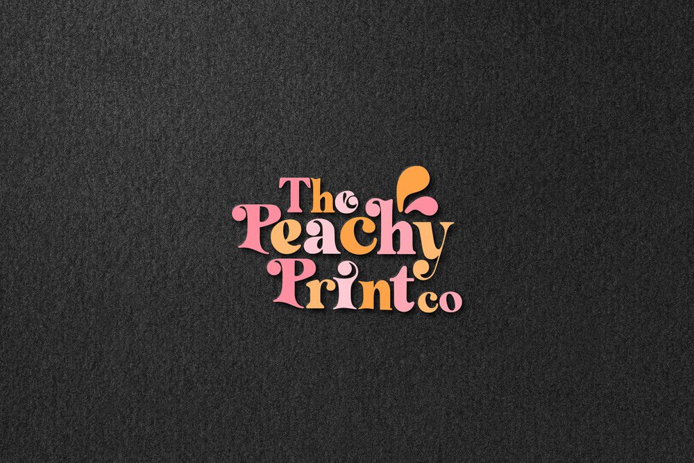
- Prioritize color harmonies to ensure an aesthetic and stable color combination in your logo. The below wordmark logo uses colors to make an impact but the analogous color scheme creates a sense of harmony.
2. Font variations to enhance visual appeal
Fonts variations are handy in boosting the aesthetic appeal of wordmark logos without creating clutter. This can be in the form of choosing different font families or typefaces, as you can see in the below design. This wordmark logo uses a sans-serif font to elegantly complement the script font in it.

The other option is to use varying font weights or styles within the same font family. Like the Bed Bath & Beyond logo. The different font widths inject personality into the design.

KIMP Tips:
- When pairing fonts from different families, ensure that you choose fonts that complement each other. You do not want fonts with contrasting personalities.
- Prioritize readability when optimizing the font styles and widths to create an element of intrigue.
- Make sure your font selection reflects your brand personality and appeals to your target customer.
3. Creating a custom typeface to reflect your brand
Since the font you choose makes or breaks your wordmark logo’s aesthetic, the best way to break the monotony will be to create something unique. A bespoke typeface that captures the spirit of your brand.
Can you tell that the below wordmark logo belongs to a pet brand? That’s the power custom typefaces and custom-lettered wordmark logos can have.
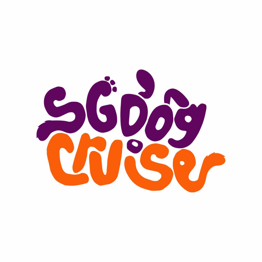
With a custom typeface, you have complete control over every detail. Letterforms can be meticulously crafted to tell a specific story, embody brand values, or even incorporate hidden symbols. As you can see in the above example.
No wonder several big brands craft signature typefaces for their wordmark logos. Take Disney for example. Their bespoke typeface has become an inseparable unit of the brand’s identity.

KIMP Tips:
- When designing the typeface, define and plan its applications. Design with scalability and versatility in mind.
- Even when you add hidden details to represent your brand, ensure legibility.
- Custom typefaces are not easy to create. Work with professional designers to create something that accurately represents your brand.
4. Add custom details for a creative twist
If creating a custom typeface is not in the scope, you can always add creative details to make your wordmark logo unique. These can be altered strokes or custom decorative flourishes added to personalized a typeface. These details make your wordmark logo stand out from the others that use the same or similar typeface.
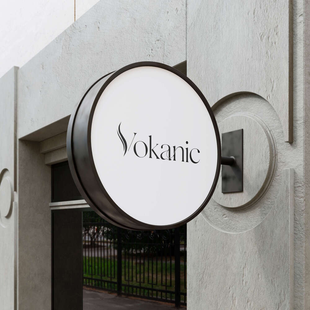
In the below wordmark logo, the customized stroke in “V” and the custom flourish added between “a” and “n” add to the creative flair of the design.
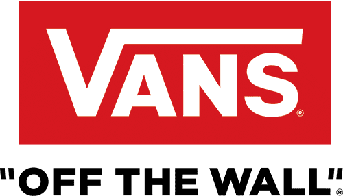
These details can also be simple. Like the elongated bar from the letter “V” in the Vans logo. This makes the logo visually interesting despite using a common font.
KIMP Tips:
- Ensure that the details you add merely enhance the logo and not overpower the design or distract attention away from the brand name.
- When deciding the visual style of the creative details or flourishes, keep your brand’s aesthetics in mind. The Vans logo, for example, has a flourish that’s simple and modern whereas the previous example is more elegant.
5. Adjust the typographic measurements
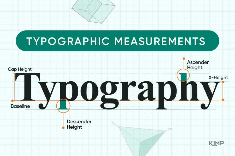
Even when you choose a standard font that fits your brand well, you can still add your custom touch in the form of typographic measurement adjustments. This can be the manipulation of the baseline or x-height for example.
The below logo is an interesting take on wordmark design and the creativity shows in the unique positioning of the letter “O” and the modified cap height of “E”.
The Toys”R”Us logo is also a vibrant wordmark that has a fluid baseline. As a result, the overall text appears bouncy and lively which makes perfect sense for a toy brand whose target audience is kids.
KIMP Tips:
- Ensure visual harmony when adjusting the baseline and character heights.
- Do not make drastic changes to the height of the characters that can affect the readability.
6. Infuse visual balance into your wordmark
For wordmark logos to be aesthetically appealing, visual balance is one of the key factors. Visual balance ensures that the design looks stable and professional. It is also pleasing to the eye and therefore suitable for word mark logos irrespective of the typeface used.
Take the Braun logo for example. This wordmark logo uses a simple and modern sans-serif font. The key detail used to adjust the aesthetic appeal of the logo is the character height variation. The visual balance in this design compliments the gradual height variation and makes the logo look symmetric and refined.
KIMP Tips:
- Balance isn’t merely symmetrical. There can also be asymmetrical balance, radial balance, etc. Find out the right type of balance that suits your brand.
- When choosing the ideal type of visual balance in your design, prioritize visual hierarchy so that the key details are visible prominently.
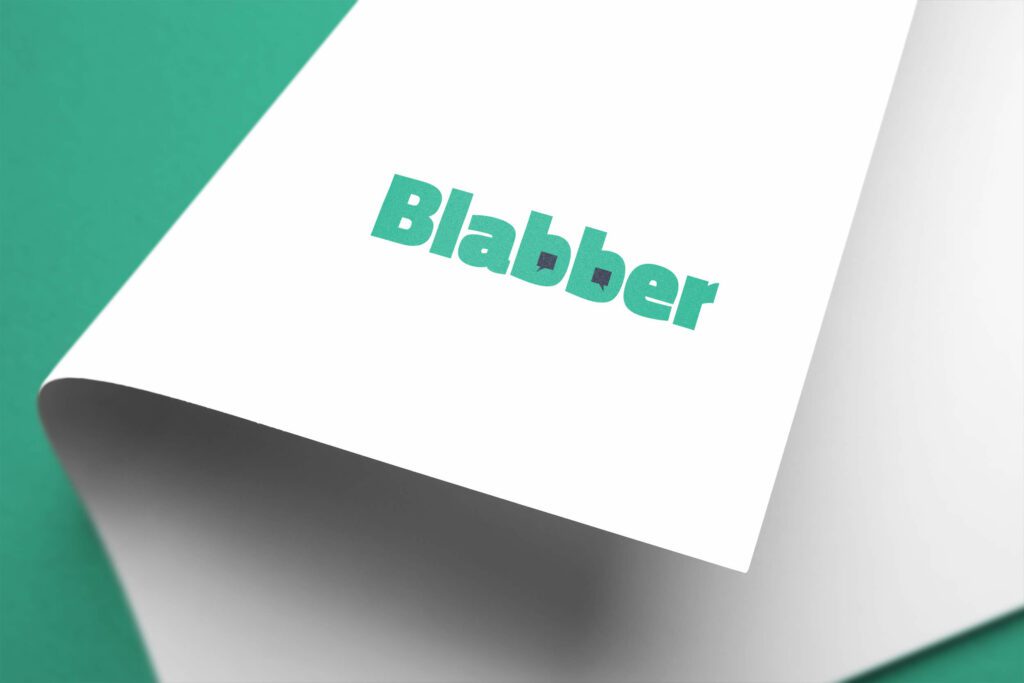
7. Make creative use of negative space
Negative space is the space that’s intentionally left blank in a design. In wordmark logos this can be the space between letters or the space in the counters of letters, etc. What if you could sneak in some additional details within these negative spaces? You are left with a memorable and impactful wordmark logo!
A good example here will be the FedEx logo. The creative formation of the arrow between the letters “E” and “X” exemplifies the magic that the intuitive use of negative space can create.
In fact, you can embed such details within characters as you can see in the below design. In this case, the conversation bubbles in the counters of the B’s are the element of interest.
KIMP Tips:
- The first thing to remember when adding symbolic details within counters and apertures is that you need fonts with clearly distinguishable strokes so that the readability isn’t affected.
- Equally important is the process of testing the logo at different scales to ensure that the chosen negative space manipulation is clear wherever the logo is used.
8. Experiment with the alignment of the characters
Another intriguing twist to give to the standard wordmark logo is to play with the alignment of the characters. In general, you find the horizontal alignment of characters in a wordmark logo. Vertically aligned letters, circular arrangement or even a slanting alignment will help add a refreshing take.
For instance, look at the slant in the logo of Virgin Group. The script logo with the slat makes the logo expressive and unique.
To summarize, changing the alignment of your brand name is an effective way to make your wordmark logo aesthetically pleasing and interactive as well.
KIMP Tips:
- To begin with, choose the right type of alignment that resonates with your brand. For example, the traditional horizontal alignment looks stable but vertically stacked letters can look modern and unconventional. Whereas circular alignment can represent inclusivity or a collaborative spirit and slant alignment can be bold and adventurous.
- Even if you choose an unconventional alignment, ensure visual balance to maintain harmony in the design.
9. Microtweaks in the form of kerning adjustment
Kerning is the space between letters – the foundational element in typography. However, did you also realize that this can become an interesting element when it comes to experimenting with the aesthetics of a wordmark logo?
Yes, take the Zara logo for example. With traditional kerning, this logo might have looked like an ordinary wordmark. For the purpose of making the logo intriguing, the design here uses a tight kerning with the letters overlapping slightly.
In similar fashion, you can also use loose kerning or slight adjustments to kernings between individual pairs of characters to play with the visual balance in the design and the overall aesthetics.
KIMP Tip:
- Be extra cautious when working with serif fonts because overlapping of the serifs and base strokes of some characters might result in a cluttered stroke.
- Certain letter combinations, like “A” and “V” benefit more than others when adjusting the kerning. Identify such pairs that can result in an interesting twist to your design.
10. Use a combination of design tweaks
In the event that you are aiming for a statement look, it’s still possible with wordmark logos. You can achieve this by using a combination of two or more of the design tweaks we discussed so far. Like color variations combined with unique font combinations or negative space manipulation combined with kerning adjustments etc.
For example, take a look at the below logo. From vertical stacking of letters to creative color accents, the design combines a variety of little tweaks to create something unique and refreshing. Now that’s the kind of customization you can expect when working with professional design teams.

KIMP Tips:
- Start by choosing the right fonts and colors for without them, no amount of styling can save your design.
- In the end, wordmark logos are all about establishing your brand name – so ensure legibility when combining several little design changes.
Craft Memorable Wordmark Logos With KIMP
Now that we have spoken about the ways in which you can make slight to drastic changes to your brand’s wordmark logo, are you ready to explore your options? Working with a professional design team can make things so much simpler.
You do not have to worry about missing the mark with respect to font pairing or customizing typographic nuances to make your design stand out. A designer can help make the intended changes without compromising on the stability of your overall design. Moreover, if this is an unlimited design service team that you are working with, there’s also hassle-free revision. Because your subscription covers unlimited designs and unlimited revisions.
Curious about the effectiveness of unlimited design services in your logo design process and branding? Set up a call with the KIMP team and find out more!