The Strategic Art of Lettermark Logos: Balancing Simplicity and Style
Can a bunch of letters represent your brand identity? Can they convey its essence, its values, and its spirit? The answer is a resounding yes. Lettermark logos. Logos created based on a few letters – often the initials of the brand. They offer a powerful and versatile way to represent your brand in a simple yet impactful way.
But with such a minimalist approach, a question arises: can lettermarks be truly remarkable? Won’t they get lost in the sea of complex logos? Here’s the secret: lettermark logos have the potential to be as impactful and unique as you want them to be. The key lies in understanding how to harness their full potential. And that’s precisely what this blog is about!
But first, let’s talk about the strengths of lettermark logos – the benefits that make them a popular choice among brands like BMW, HP, BBC, etc.
Lettermark Logos: Unveiling the Benefits
When you can create something decorative and aesthetically appealing using symbols or embed your mascot to stand out or even create an abstract logo design to represent your brand, why would you go for something that simple like a lettermark logo? Because there’s more to it than meets the eye! Here are some benefits you should know about.
Versatility
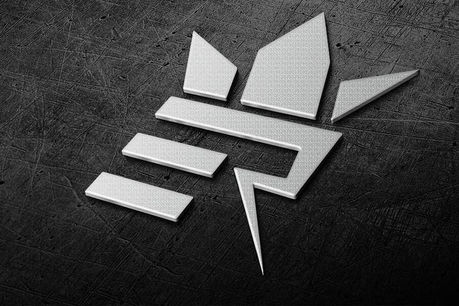
Lettermark logos are versatile meaning that you have true creative freedom to design the look and feel of your logo. While we often associate lettermark logos with simplicity, you can also create something ornate and elegant with intricate details consisting of just a few letters.
For example, the elegantly designed lettermark component in the logo below makes a sophisticated monogram to use in branding.

Whereas, the H&M logo is a simple, sleek, and modern lettermark.

The above two logos depict that lettermark logos can wear exactly the kind of visual appeal you envision for your brand.
Scalability
One of the biggest perks of working with lettermark logos is that they are easily scalable. Shrink them or enlarge them, they can still convey the same message as effectively. As a result, they are brilliant choices for brands that wish to create an omnichannel presence.
Take the BBC logo for example. This abbreviation for the British Broadcasting Corporation has been the core component of the brand’s identity for decades now. The previous iterations of the logo were only slightly different from the current version. This timeless symbol has helped represent the brand across various media.
When the logo appears as a small app icon on a smartphone screen or as a brand representative on a large billboard, you see that the design remains equally impactful.

The BBC logo exemplifies how lettermark logos can help maintain recognizability in any format and any scale.
Timelessness
When designed well, lettermark logos can be timeless. For instance, the Louis Vuitton monogram is a testament to the timelessness of well-crafted lettermark logos. The monogram has been in use for more than a century now.

In this case, the LV monogram aligns with the Louis Vuitton brand. It resonates with the elegance and luxury associated with the brand instead of going with what’s in trend. As a result, the Louis Vuitton logo has managed to stand the test of time.
To achieve such timeless appeal with lettermark logos, choose elegant fonts with minimal accents like the logo design here. Ensure that the font and the accents along with the overall color scheme align with the brand’s unique personality.

Logo design by KIMP
In addition to all these benefits, lettermark logos also make it easier for customers to better remember, recall and recognize a brand in a crowded space. But all that relies on the design of the lettermark logo. So, how can you ensure that you create something truly memorable? Let’s explore some design tips to begin with.
5 Design Tips for Crafting Stunning Lettermark Logos
Tap into the power of typeface
Unlike most other types of logos where there are some visual elements illustrations or symbols to communicate the message, lettermark logos ideally only contain letters. Therefore the typeface in which these letters appear can make or break the design.
Therefore, the very first step in designing an effective lettermark logo is to choose the right typeface. It is a decision that influences legibility; it’s about selecting a font that embodies your brand personality and grabs attention. Because in a lettermark logo, the typeface you choose will become the soul of your design.
For example, take the CNN logo (Cable News Network). The font does the heavy lifting in this design. We’re sure that people who are familiar with the logo will be able to instantly recognize the signature font as well. Of course, in addition to using a unique typeface this design also creatively alters the kerning in the text (more on that later).
So, if you have the resources and the budget to create a bespoke typeface, go for it. If you think that’s an expensive affair, work with an unlimited design service that can take care of not just the font customization for your logo design but also the rest of your branding collateral.
Identify the role played by colors
While the typeface you choose can lay the foundation for your lettermark logo, the colors you choose influence the mood of your design, and the emotions it evokes. A complicated color palette messes up the harmony in a minimalistic design. Whereas an irrelevant color palette messes up the connection between the logo and the brand personality.
In summary, choosing the right color palette for lettermark logos can significantly influence brand perception and recognition.
Take the Netflix N lettermark icon for example. Introduced in 2016, this lettermark has now become a distinctive supplement to the core Netflix logo and identity. It’s a simple single-letter icon. So, what makes it so special? It’s the color variation and the shadow details. The combination of Netflix Red and Symbol Dark Red with the shadows creates an interactive three-dimensional design.
Without the red, the logo might have lacked the excitement that the Netflix logo conveys. Without the color variation, the lettermark might not have turned out to be as impactful and unique. This exemplifies the power of a good color palette in lettermark logos.
KIMP Tips:
- Begin by understanding color psychology.
- Pay attention to color harmonies for an aesthetically appealing and well-balanced design.
- Say no to complicated color palettes and misleading combinations. A simple palette with subtle variations, like the Netflix icon red palette, will do the trick.
Experiment with how the letters interact with each other
In lettermark logos, the way the letters interact with each other can significantly affect their visual impact and brand message. The first idea will be to experiment with different kerning details. For example, the ESPN logo.
Featuring the abbreviation for Entertainment and Sports Programming Network, this lettermark logo uses a catchy font that sets it apart. But the visual detail that makes this logo even more interesting is the lack of spacing between the letters “S” and “P”. They practically fuse together and this creative twist adds an element of intrigue to the logo.
If you want to move beyond the kerning details, you can also come up with creative ways in which the letters in your lettermark logo interact with each other- how they connect or interlock with each other. For instance, the lettermark in the below design consists of vertically stacked letters where the strokes of the letters appear seamlessly connected. This makes the lettermark unique and memorable.

KIMP Tips:
Not sure how to find the right placement and interaction for the letters in your logo? Here are a few things to consider:
- Tightly spaced letters create a sense of unity, strength and stability whereas loosely spaced letters sometimes communicate sophistication or even modern aesthetics. If you wish to keep it simple and professional choose moderate spacing.
- Overlapping letters can appear playful and unique.
Experiment with diverse styles to identify what works best for your brand.
Add a touch of abstraction to make your lettermark more intriguing
Though lettermark logos are simple, they do not have to lack substance. You can create lettermark logos with a touch of abstraction – packing a deeper layer of meaning into the design.
The Beats logo shows how you can do this. While the logo looks like the brand initial “B” at first glance, together with the circle it also resembles a head wearing a pair of headphones. This metaphorical representation of what the brand caters to is a brilliant way to make the lettermark logo more memorable.
Additionally, this logo also makes the most of the available space by creating a negative space within the red circle to carve out the “b”. This ensures that the additional symbol added along with the letter does not increase the size of the logo drastically.
Go with a flat design
Most brands that choose to go with a lettermark logo make this decision in favor of going minimal. Flat designs can further enhance their effectiveness. Flat designs emphasize clean lines, simple details, and solid colors – a perfect match for a lettermark logo.
Additionally, a flat design also means versatility. It makes scaling the lettermark logo easier and preserves the effectiveness of the logo across various platforms.
To explain this better, we’ll take the logo of the American Broadcasting Company (ABC) as an example. The below image shows the evolution of the ABC logo.
As can be seen in the image, the past few iterations of the logo have all had shadows and highlights that created a skeuomorphic or 3D design. However, with the recent rebranding, the brand chose to go with a flat design. The decision was made in order to ensure that the brand was ready to stay fresh and relevant to all digital, social, and other applications.
In addition to the use of a flat design, this logo also exemplifies the impact of shape psychology in logo design. The circle is associated with a sense of community which makes it a good choice for a broadcasting company. The brand also uses a typeface with geometric letterforms that further enhance the modern and minimalist aesthetic of the logo. This focus on simplicity ensures that the logo is easily recognizable and scalable across various media.
Summarizing the Lettermark Logo Design Checklist: The Do’s and Don’ts

- Do choose the right colors for your lettermark logos and keep the overall color palette simple and relevant to your brand. If you wish to keep it minimalistic, a monochromatic palette with simple gradients works well.
- Do invest in unique fonts. Iconic logos like the logo of the New York Yankees (featured above) show that in most cases, a statement font can create the intended impact effortlessly. Additionally, when it comes to choosing the typeface category, understand whether you are looking for something modern or sophisticated or vintage depending on the personality defined for your brand. And depending on the overall visual identity of your brand. You cannot have a lettermark logo that looks out of place when compared with the rest of your branding and marketing designs.
- Don’t ignore scalability. Because omnichannel marketing has become the need for the hour. So, a versatile and scalable logo is one that can accurately and cohesively represent your brand in all your campaigns on all the chosen platforms.
- Don’t choose lettermark logos when your brand name is still not established. If you are unsure if just a few letters can create the intended impact, you can initially use combination logos with a distinct lettermark component complemented by a wordmark that tells what your brand is. As you see in the design below. On consistently using combination designs like this one you will soon be able to apply the lettermark independently in several places.

Design Spectacular Lettermark Logos With KIMP
In conclusion, lettermark logos can elevate your brand identity in so many ways. It all depends on how creatively you balance the basic design elements like fonts and colors and how you add a creative flair to your design. Working with a design team can make this so much simpler. And if this design team is part of an unlimited design service, like KIMP, then you also get the benefit of working with the same team for consistently designing all your branding and marketing collateral.
Ready to unlock the full potential of your brand’s creative vision? Sign up for our 7-day free trial and experience the benefits of working with a dedicated design team within an unlimited design service.