Dunkin’ Donuts Logo: 5 Lessons From A Branding Success Story
When you are in the mood for a donut, what’s the first restaurant you can think of? Many Americans would respond in harmony – Dunkin’ Donuts. Well, the brand goes without the “donuts” in its name today. And yet it has its own special place in the fast food industry. In this blog, we’re going to discuss the Dunkin’ Donuts logo and brand – the story of strong brand identity and robust marketing strategies.
Talking about the story behind the how and why of the business’s origins will be a good way to familiarize ourselves with the Dunkin’ Donuts brand. That will be a good way to make sense of the brand’s journey over the years and its brand identity. So, let’s dive into the backstory of Dunkin’ Donuts.
- Dunkin’ Donuts – a quick glimpse into its origins
- 1. Setting the stage with a strong brand identity
- 2. Adapting to changing markets
- 3. Rebranding lessons: The journey from Dunkin’ Donuts to Dunkin’
- 4. Nurturing customer loyalty
- 5. Embracing consistency while staying relevant
- Design your Dunkin’-inspired brand campaigns with KIMP
Dunkin’ Donuts – a quick glimpse into its origins
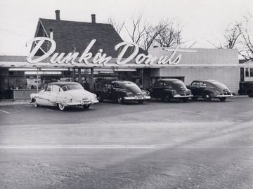
It all began in 1948 when Bill Rosenberg decided to create a business out of the widespread love for dunking donuts in coffee.
Before Dunkin’ Donuts, Rosenberg owned a catering business selling food to factories. On noticing that about 40% of his catering business’s revenue came from donuts and coffee, he opened a restaurant selling the best of both of these! That was how Open Kettle was born, in Quincy, Massachusetts. It had a simple yet enticing menu of donuts and coffee.
It wasn’t until 1950 that the name was changed to Dunkin’ Donuts, a decision that would eventually become a hallmark of American culture.
The restaurant’s early success prompted Rosenberg to begin franchising in 1955, marking the beginning of Dunkin’ Donuts’ journey to becoming an international brand.
Fast forward to 1963, Dunkin’ Donuts opened its 100th location. This was also the year Bob Rosenberg, Bill’s son, took the helm as CEO.
Over the next five decades, the restaurant flourished and expanded to the extent that the 5,000th restaurant was opened in the year 2000 coinciding with the Dunkin Donut brand’s 50th anniversary.
The brand then progressed rapidly opening 5,000 stores by the year 2000. Today, there are over 13,200 restaurants in more than 40 countries around the world.
The steady progress of the business and the strong presence of the Dunkin’ Donuts brand in the competitive restaurant industry can be credited to the strong branding and marketing strategies fueling the business. So, let’s talk about some valuable branding lessons to take away from the Dunkin’ Donuts brand.
1. Setting the stage with a strong brand identity
Brand name and the first logo
Over the years, the Dunkin’ Donuts logo has changed in many ways. However, it is the brand name that sent a ripple. Do you know how the brand name came into existence?
Reportedly, Bill Rosenberg asked his team to come up with a new name for his restaurant (then named Open Kettle). At this time, his architect drew inspiration from the idea of “dunking donuts in coffee” and came up with the name “Dunkin’ Donuts” for the restaurant that was serving them both.
The above story is relevant here especially so that you understand the rebranding of the Dunkin’ Donuts brand, which we’ll discuss in a minute.
With the brand name finalized, the first logo was launched and was in use until the 1960s. This was a simple wordmark logo in brown (reminds you of coffee, doesn’t it?)
KIMP Tip: Crafting a brand name that communicates your story and makes it easier to remember and recall your brand is the first step in strong branding.
Bringing more color into the brand
The second Dunkin’ Donuts logo introduced the iconic candy pink the brand still uses in its visual identity. And this time, it was a more visually rich logo with a coffee cup icon and the brand name illustrated within what looked like a donut.
On the whole, the design conjured the image of dunking a donut into coffee. The design not only established the brand’s new visual identity but also clearly told its audience what the brand was about.
Since this was the time when the Dunkin’ Donuts franchises were expanding rapidly, a logo that visually captured the essence of the brand worked well.
The orange and pink Dunkin’ Donuts colors that most of us are familiar with became a crucial part of the brand in the 1980s. This was also when the signature wordmark in a friendly thick monoline font (Frankfurter typeface) was introduced.
The below video is an old Dunkin’ Donuts commercial featuring this updated wordmark logo.
KIMP Tip: Today, the signature orange-pink identity of the Dunkin’ Donuts brand is a cheerful identity that most customers instantly recognize. This is a reminder of the need for a strong brand color palette.
2. Adapting to changing markets
The Coffee Cup Icon
The Dunkin’ Donuts logo from the 2000s is perhaps one that most of us remember. The one with the coffee cup. This was the time when, to keep up with the changing market dynamics, the brand was pushing its coffee and beverages. Naturally, bringing the coffee cup imagery back to its logo was a strategic move.
Additionally, this was the decade when the Dunkin’ Donuts brand’s focus on on-the-go culture took shape. The business adapted its store layouts, making them more conducive to quick service and catering to customers seeking convenient coffee options during their daily routines.
KIMP Tip: Pivoting your business to adapt to the changing market dynamics is a good idea, a shrewd way to survive in competition. However, for this to happen, your brand identity should also evolve slowly to reflect the change in the course.
Need help tweaking your brand identity to reflect a rebranding effort? Get KIMP!
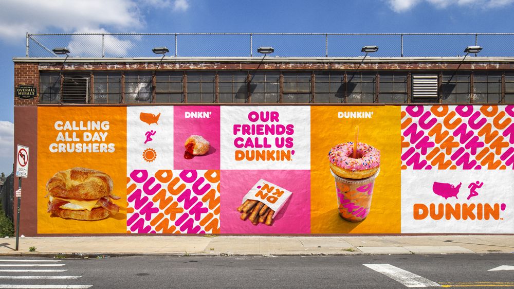
The “America Runs on Dunkin'” Campaign
To imprint its new brand identity and also to represent the changing focus, the brand also came up with its renowned America Runs on Dunkin’ campaign. This eventually came to be a well-known slogan to identify the brand.
The below video is a commercial promoting the Dunkin’ Donuts brand’s cookie range.
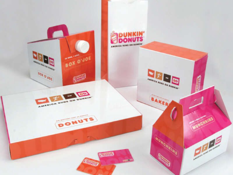
The idea of the campaign was to capture the “fun and quirky celebration of life”. To tell the story more effectively, there were custom icons created to go along with the Dunkin’ Donuts logo. These icons appeared on the packaging, ads, and other promotional graphics.
KIMP Tip: Brand storytelling is the most reliable way to foster strong customer relationships. And visuals hold a special place in brand storytelling. Some brands use mascots for this. Educational institutions like universities might use official seals that tell the origin stories. In the case of Dunkin’ Donuts, the signature icons created for the campaign achieved this. So, to tell your brand’s story effectively, create a cohesive set of visuals representing your brand identity.
3. Rebranding lessons: The journey from Dunkin’ Donuts to Dunkin’
A change in the brand name
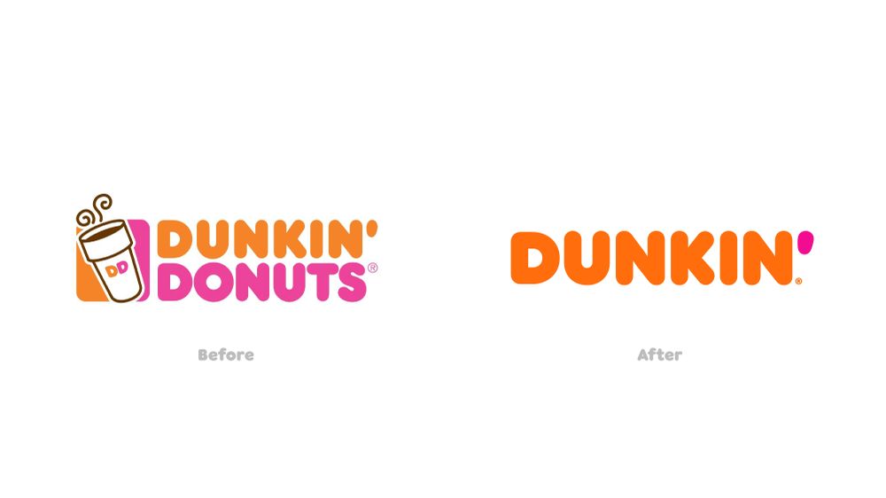
After almost 68 years of sticking with the brand name, Dunkin’ Donuts decided to drop the “Donuts” in its name. The move was to welcome a more open, more diversified menu that the brand began catering to.
Dunkin also announced the same in a creative way to keep its social media audience informed.
It’s official: We’re going by Dunkin’ now. 🤗 After 68 years of America running on Dunkin’, we're moving to a first-name basis. 🧡 Excited to be #BFFstatus with you all 👯☕️🍩 #firstnamebasis #besties pic.twitter.com/hmzd2Bamlm
— Dunkin' (@dunkindonuts) September 25, 2018
The corporate logo and various brand elements have been refined to reflect the change. But still, the old name Dunkin’ Donuts as well as the old logo continue to be in use in some places.
The changed brand identity
Without losing its familiar identity design, the brand simply dropped the word “Donuts” from the logo retaining the font and colors. The trimmed-down minimalistic Dunkin’ logo used currently has a contemporary feel.
Moreover, the current design is a versatile one that works effortlessly on all media – print and digital.
In this case, the rebranding worked because it was not the only thing that changed about the brand. Over the past few years, Dunkin’ has established itself as a “beverage-led, on-the-go” brand. While donuts are still special to the brand, there has been a stronger focus on its beverage line-up. The simplified menu has been tailored to suit the current consumer consumption trends in the fast-food industry.
Process changes
Around the time the rebranding was happening, the Dunkin’ brand was busy refining several processes as well. These changes were to align with the changing objectives of the brand.
For example, Dunkin’ Donuts strengthened its mobile ordering system to keep up with the on-the-go lifestyle it was focusing on. As a part of this, Google Assistant support for mobile ordering was introduced.
Google Assistant now supports Dunkin’ Donuts mobile ordering https://t.co/Am2S9ZdbHp pic.twitter.com/LqGraTmNTp
— The Verge (@verge) March 14, 2018
Additionally, a few updates were made at the Dunkin’ stores in order to make this transition smoother and more practical. This includes adding QR codes outside respective stores for customers to quickly order without stepping in and so on.
KIMP Tip: Good rebranding involves a more holistic approach. That is when the processes along with the brand identity undergo changes to accommodate the changed vision.
4. Nurturing customer loyalty
Building and maintaining customer loyalty is a critical aspect of effective branding, and Dunkin’ Donuts has excelled in this arena with its Dunkin’ Rewards program.
🐣Easter Spin to Win🐣
— Dunkin' UK (@dunkindonutsUK) March 21, 2023
Buy any Easter drink, scan your DUNKIN’ Rewards app, and you could win a free donut!
Valid 20th March-10th April. pic.twitter.com/o6WnzIraSG
Dunkin’ Donuts launched its Dunkin’ Rewards program (formerly DD Perks) to incentivize customer loyalty. This customer-centric initiative encourages repeat business and fosters a sense of belonging among Dunkin’ enthusiasts.
One of the strengths of the Dunkin’ Rewards program is that there are rewards tailored to suit the customer’s preferences and shopping patterns. Dunkin’ leverages customer data to send personalized promotions, making customers feel valued and understood.
Such customer-centric reward programs strengthen customer loyalty. And a loyal customer is the best brand ambassador.
KIMP Tip: Customer loyalty programs are timeless entities that can strengthen your branding strategy. The key is to personalize them to reflect your brand values and resonate with your target customers.
5. Embracing consistency while staying relevant
Strategic brand partnerships
To stay relevant to the market and to stay accessible to its customers, the Dunkin’ Donuts brand has actively been choosing its brand partners in various markets. The choice of brand partnerships depends on the local favorites. This has helped the brand stay ahead in the ever-changing landscape.
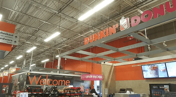
Take the Dunkin’ Donuts – Home Depot partnership for example. As a part of this, the brand announced full-service Dunkin’ Donuts stores within Home Depot stores in various locations.
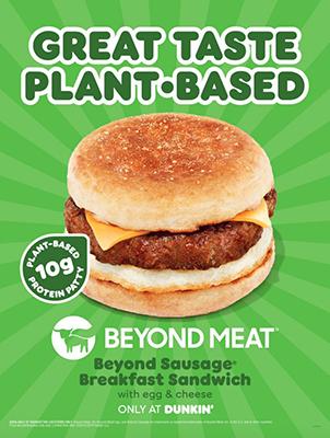
Another example is the partnership with Beyond Meat to introduce plant-based meat items on the menu. This not only showed the brand’s diversification of its menu but also its interest in targeting new markets. This approach was to tap into the rapidly evolving plant-based meat market.
KIMP Tip: Strategic brand partnerships are a way to test new markets and expand your brand;’s visibility by tapping into the credibility that other brands have built over the years. These have turned out to be fruitful for the growth of the Dunkin’ brand.
Evolving menu
Embracing seasonal trends or local favorites – Dunkin’ knows the ropes. The brand has a knack for listening to its customers and populating its menu with their favorites.
For example, the below post shows the kind of news coverage the brand received for its new lineup of summer-ready drinks.
Dunkin’ shakes up lineup of iced drinks, adds new food items to menu https://t.co/5UpM7DEmFL
— Boston 25 News (@boston25) April 26, 2023
A couple of years ago, to keep up with the espresso consumption trends Dunkin’ expanded its menu and spent around $60 million on equipment to improve the coffee-making process and the quality of the coffee at The Dunkin’ restaurants. This was also a measure to tackle competition from other big players like Starbucks.
Our new hand-crafted espresso drinks speak for themselves… #Dunkin pic.twitter.com/JXarg3NJCZ
— Dunkin' (@dunkindonuts) December 9, 2018
Consistent tone of voice
While the Dunkin’ Donuts brand was evolving and adapting to all these trends, it made sure to stay consistent with its visual identity. As we discussed a while ago, the logo colors, brand slogans, and brand typeface were all retained when the logo design underwent changes.
Additionally, the other constant has been the brand’s tone of voice. Dunkin’ Donuts’ ads have always been witty and playful. Let’s compare the brand’s ads that are decades apart.
Take a look at some of the old commercials from Dunkin’ Donuts. These were from the “Time To Make The Donuts” campaign.
And now here’s a recent ad from Dunkin’. The name has changed but the tone of voice hasn’t! Still witty, still relatable!
KIMP Tip: Everything from your brand visuals to your copy should reflect your brand’s tone of voice. Remember to include details about it in your brand style guide.
Need help putting together your brand guidelines? Get KIMP!
Design your Dunkin’-inspired brand campaigns with KIMP
Cohesive visual identity across various platforms and a relatable visual theme have always been part of the Dunkin’ Donuts brand. This is a critical factor for consumer brands, especially in the restaurant business.
If the Dunkin’ Donuts brand journey inspired you, are you ready to incorporate the acquired branding lessons into your branding strategy? Then you also need stunning visuals to complement your efforts and streamline your brand’s journey toward the changed objectives. That’s where an unlimited design subscription like KIMP can simplify things.
So, what are you waiting for? Register now for a free KIMP trial!