10 of the Best Simple Logos From Around the World
In a world where complex designs often vie for attention, have you ever wondered why some of the most iconic brands opt for simplicity in their logos? How do these seemingly straightforward lines and text manage to stay etched in our memory for years on end? The answer lies in the mesmerizing charm of simplicity – a charm we’re about to unravel as we delve into the fascinating realm of simple logos.

These sleek and unassuming designs may seem basic at first glance, but they hold a remarkable ability to convey a brand’s essence in the most effortless way possible. Imagine distilling a whole company’s identity into a few clean lines and bold typography – that’s the artistry of simplicity!
Are you ready to change your perspective on logo design? Then let’s get cracking the code of simple logos!
10 simple logos of famous brands + design/branding lessons
1. Apple
When it comes to simple logos that have stood the test of time, the iconic Apple logo reigns supreme. Designed by Rob Janoff in 1977, this minimalist emblem has become synonymous with innovation, elegance, and user-friendliness – the very essence of the Apple brand. Over the years, the logo has undergone subtle refinements, but its core elements have remained true to its original form.
Key takeaways
- The bitten apple instead of a conventional whole apple illustration adds an unexpected twist, an element of interest in the design without cluttering the logo.
- The fuss-free design makes it suitable as an icon to embed on a variety of gadgets like iPhones, iPads, and MacBooks.
- Earlier, the logo was introduced in a multicolored design reflecting the brand’s innovation and diversity. But as the brand transitioned to sophistication, the monochrome version was introduced and today it fits the brand perfectly.
- Simplicity in the Apple logo is also a symbol of the user-friendly designs that the brand is known for.
2. Nike

The Nike Swoosh logo, born from the creative mind of Carolyn Davidson in 1971, has a special place in the world of simple logos.
The fluid design of the Nike logo captures the athleticism, excellence, and empowerment that the brand is known for. It symbolizes movement making it perfect for the sports brand.
Key takeaways
- Simplicity has helped the Nike logo stay timeless in an industry that’s known for its volatility in trends.
- Despite being simple, the relevance of the symbol to the values the brand represents makes it easier to relate to the brand.
- For a global brand like Nike, a brandmark logo that works beyond language barriers makes perfect sense.
3. Uber

In 2018, Uber experienced a significant brand pivot as a response to a series of controversies and challenges that affected its reputation. To address these issues and signal a new direction for the company, Uber underwent a rebranding. As part of this rebranding, Uber introduced a new logo (the wordmark logo used currently) and visual identity.
Key takeaways
- The simple wordmark logo works well in the fast-paced digital era.
- It looks simple and easily recognizable across various platforms. This is important considering that the brand primarily relies on its mobile app for transactions and also deploys print and outdoor ads in its marketing efforts.
- The modernity of the logo is also a symbol of the accessibility the brand aims to bring.
KIMP Tip:
The below image shows the evolution of the Uber logo over the years.
Notice that almost all the iterations since 2011 have been symbols of simplicity. But what makes the recent logo particularly unique is its typography. It’s a contrasting shift from the uppercase characters in the previous version. The use of lowercase fonts with more rounded characters is to promote the brand as more “approachable” and “friendly”. This comes as a reminder to pay special attention to the fonts you use in your logo design.
Need help creating simple wordmark logos with the right fonts to deliver the message and evoke the right emotions? Get KIMP!
4. McDonald’s
The clean golden arch of McDonald’s is a good example of how you can create a recognizable symbol and tie it back to your brand (the initials of the brand name in this case). And the brand achieved this through consistent branding and the incorporation of the logo at its restaurants (think of the golden arches welcoming you at a McDonald’s store).
The evolution of the McDonald’s logo shows how the brand has slowly but steadily been progressing toward a simpler cleaner design over the years. It achieved this by trimming of the excess details and retaining only the most distinguishable aspect of the design.
Key takeaways
- McDonald’s makes its logo work by efficiently supporting it with other brand identity elements like the brand colors, for example.
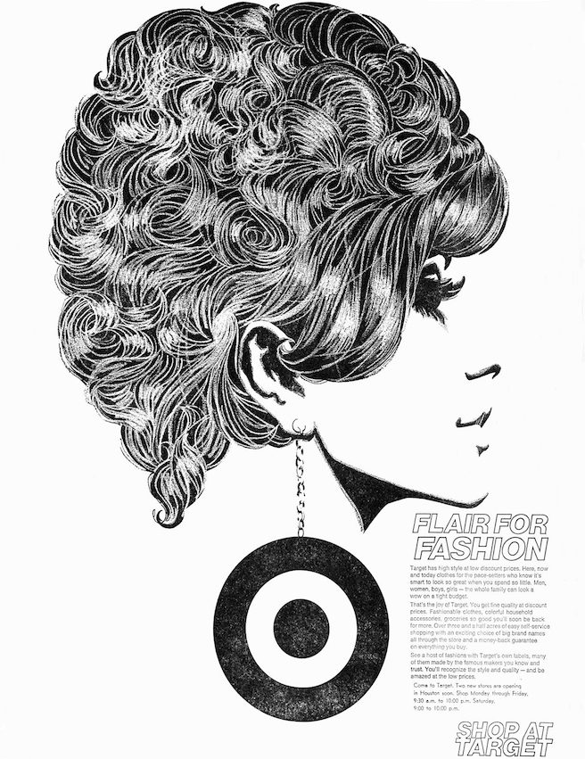
- Additionally, the brand plants the logo into its audiences’ minds by consistent and creative incorporation of the symbol into its ads. Like the below ad for example!

That proves the fact that for simple logos to work, you need cohesive marketing designs that add more meaning to the simple lines and curves in your logo. And how do you do that? By working with professional designers who can help craft a simple logo for your brand from scratch.
5. Target

Introduced in 1962, the Target logo has become an iconic symbol of retail excellence and accessibility. The idea for the Bullseye in the logo was proposed as a visual emphasis on the brand name and it worked.
Like McDonald’s Target has also had a flair for innovatively blending its logo design into its ads. And this is one of the reasons behind the signature bullseye becoming a globally recognized logo.
Key takeaways
- Consumer brands like Target are meant to foster a strong community. Therefore friendly and warm symbols like circles make a great choice.
- The Target logo works because the imagery in the logo isn’t random. It connects well with the brand name, just like the case of the Apple logo. So, if you are fascinated by simple logos but do not know how to find the right inspiration for them, look at your brand name!
- The simplicity of the logo in this case also proves to be useful in making the brand appear more “approachable” and user-friendly!
6. FedEx
Designed by Lindon Leader in 1994, the FedEx logo is an exemplary design when it comes to packing meaning into simple logos. While it looks like a simple wordmark logo at first, the arrow that’s cleverly embedded in the negative space between the characters “e” and “x” adds a unique twist.
The arrow aligns with the dynamic goal-oriented nature of the brand. Additionally, the forward movement it depicts can also be seen as an indicator of progress. Both of which are good for the brand identity.
Key takeaways
- The clever inclusion of the arrow imagery in the negative space shows that you do not have to complicate the logo design in order to add an element of interest to it.
- The fuss-free typography and unique color palette in the FedEx logo make the design overall timeless and versatile.
- Along with the simplicity of the logo, the uniqueness of the brand color palette is another strength because it helps differentiate the brand in its industry. Because most brands in the logistics industry use red or blue in their logo.
7. BBC

From the time of its introduction, the BBC logo has not undergone any drastic changes. It has always been a lettermark logo with the brand’s initials displayed in black squares. However, these subtle changes that the design has seen include the spacing of the letters, choice of fonts, and font styling. This evolution shows that innovation can be introduced gradually without alienating existing audiences.
The simple design of the BBC logo makes it adaptable and equally impactful on the various media that the brand is now present – including traditional TV broadcasting and social media.
Key takeaways
- For a brand that exists beyond geographical boundaries, a simple logo works. Because sometimes complex visual representations that impress the audience in one region might have no meaning in another.
- The logo’s enduring design has become synonymous with the BBC’s reputation for quality broadcasting. A professional well-designed logo is undoubtedly seen as a representation of your brand’s reputation and quality.
8. National Geographic

If a tall yellow rectangle makes you think of the National Geographic channel, then it’s proof that the brand’s logo is a hit. The connection of the yellow rectangle to the signature yellow border you find on the cover page of the National Geographic magazine is what makes the logo an even more memorable one.
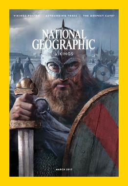
The use of a well-recognized symbol in the logo strengthens the brand’s universal appeal. It transcends borders and languages, serving as a symbol of cultural exchange and a portal to diverse corners of the world
Key takeaways
- The evolution of the National Geographic logo will also show you a picture similar to that of most logos on our list – the design has not changed much. That’s a common trait with most simple logos because once you trim the clutter and create a minimal yet impactful visual representation of your brand, there’s no need to make big changes!
- The 2005 rebranding of the National Geographic brand replaced the serif font in the previous version of the logo with a sans serif font. This aligned with the brand’s evolution and the changing media landscape as well! That shows how you can look for inspiration for your logo design not just from your brand but also from what’s trending in your industry.
9. Google

The Google logo is proof that simple logos don’t have to be boring. After a few versions of strange-looking logos, the most recent version of the Google logo was introduced (in 2015). The clean modern design perfectly suits the rapidly growing brand and the kind of digital transition it brings.
In addition to the simple logo, the brand has strongly established its vibrant color palette as the brand identifier. This is what makes the logos of its various products like Gmail, Drive, and others instantly recognizable.
Key takeaways
- Most logos use not more than 2 colors because too many colors end up causing clutter and confusion. However, in the case of Google, the multicolored version of the logo has worked from day one and has perfectly resonated with the diverse offerings of the company. This shows that the color choices and the decision about the number of colors to use in the logo depend entirely on the brand. What works for one might not always work for another!
- Additionally, the logo incorporates a flat design in contrast with the skeuomorphic (3D design) appearance of several previous versions. This shows how a simple switch from 3D to flat design can simplify a logo a great deal. In fact, Google is not the only brand that went from a detailed 3D logo to a simple flat design.
10. Dunkin

The sense of warmth and the happy tones that the Dunkin logo carries makes it a unique one on our list of simple logos. The simple design and the lively colors together make it a suitable one to represent the comfort associated with a “favorite neighborhood coffee shop”.
In 2019, the company rebranded, altering its name and logo to match its expanded product range. The word “Donuts” and the coffee cup imagery were both trimmed off of the logo for a more open and versatile interpretation. Amidst this rebranding, in order to ensure brand recognition, the signature color palette was retained. This resulted in the simpler contemporary Dunkin logo we see today.
Key takeaways
- Colors make or break the impact of simple logos. And they help add an emotional depth to the design as well. In this case, for a coffee and donut brand, you need a cheery and fun mood for the logo design and that’s what the Dunkin color palette achieves.
- Uppercase letters in a wordmark logo can establish the authority of a brand. To achieve this and show its dominance in its industry while also mellowing down the tone a little, Dunkin uses a font with rounded edges. This reflects the friendly and approachable essence of the brand.
5 reasons why these simple logos work
On analyzing the logos of these well-known brands, here are some of the benefits of simple logos that we can arrive at:
- Instant recognition – a simple logo makes it easier for customers to recognize a brand and instantly differentiate it in a crowded industry.
- Universal appeal – simple logos without ambiguous details end up having a strong impact on diverse demographics making them suitable for global brands.
- Effortless communication – with simple logos, conveying the brand’s message becomes simpler and more effective.
- Trust and authority – simple logos when planned and executed well have an air of elegance about them which helps establish reliability and authority for the brand.
- Versatility – simple logos are versatile and therefore suitable for brands with a wide range of product or service offerings.
For all these reasons and more, if you wish to explore simple logo designs for your brand, get a KIMP Graphics subscription and work with a team of designated designers to shape your brand identity!
Craft simple logos for your brands with KIMP
Evidently, in the realm of branding, simple logos stand as formidable champions, etching their mark with unrivaled recognition. However, you should also note that their efficacy lies in the art of well-crafted minimalism, where every line and curve speaks volumes. Because simplicity done poorly can fall into the category of clichéd anonymity. To take the most ordinary idea and craft an extraordinary logo to represent your brand, consider a KIMP Graphics subscription.
Ready to start a subscription to transform your design workflow? Sign up for a free 7-day trial now!