Inside the Wonderfilled World of The Oreo Logo & Brand
In the world of cookies, Oreo has a special place of its own. For some, it’s an indulgent delight. Others find it a source of solace in their comfort food. Many cherish the nostalgia of their childhood, recalling the days of twisting, licking, and dunking Oreos into a glass of milk. Some even rediscover their inner child when sharing Oreos with their own kids. What does Oreo mean to you? Chances are, you resonate with these sentiments.
But how did a simple chocolate sandwich transform into a timeless treat? How has one brand managed to stand tall amid the constantly growing competition and for over a century, no less? The answer lies in intuitive marketing and the strength of the Oreo brand. These are the very reasons why the Oreo logo often grabs your attention first when navigating an aisle packed with cookies and treats.
Today, let’s go back in time exploring the incredible story of the Oreo logo and brand. And by the time we close the blog, you’ll be taking away valuable marketing and branding lessons from the Oreo brand.
Oreo – a quick glimpse into its origins

The journey began in 1912 when the National Biscuit Company (now Nabisco) introduced the “Oreo Biscuit” to the world.
Back then, Nabisco came up with the idea for a Trio consisting of Oreo, Mother Goose Biscuits, and Veronese Biscuits which the brand sold as biscuits of the “highest class”. Fast forward to a century later, Oreo is the only one that managed to survive the market.
Did you know? The street where Oreo cookies were originally created is now known as “Oreo Way”
One of the reasons why Oreo is so popular is that it popularized the concept of cookie sandwiches. But yes, Oreo was not the first one to introduce the idea. There was yet another brand called Hydrox that was making cookie sandwiches since 1908.
Nonetheless, Hydrox ceased operations in 2003, whereas Oreo has maintained its dominance in the market. This emphasizes that enduring competition is often more critical for long-term success than simply being the pioneer.
So, what was Oreo’s secret to survival? Let’s find out.
Decoding the details of the Oreo brand
Evolution of the Oreo brand name
The brand name itself underwent several changes before the current name “Oreo” came into the picture. Initially, the product was marketed as Oreo Biscuit which then became “Oreo Sandwich” and later “Oreo Crème Sandwich” before finally adopting just “Oreo”.
These rebranding attempts were to communicate to the customers what the product was. Such drastic name changes are not common these days. However, in the era of “biscuits” a “cream sandwich” was a novel concept. It’s the concept that popularized this biscuit. Naturally, the brand wanted to leverage the name.
Amidst all this, the origin of the name “Oreo” itself is not very clear. There are speculations that it could have been a combination of “re” from the word cream sandwiched between two “O”s as in the cookie. Some theories point out that the name was perhaps derived from the word “or” which in French means gold – as a nod to the packaging that the biscuit was first sold in.
A few branding lessons to take away from Oreo’s name evolution are:
- A name change can spotlight a product’s unique selling point and refresh its appeal.
- Once you start exploring diverse markets, the key is to identify a name that resonates universally. The shorter brand name “Oreo” achieved this for the Oreo brand.
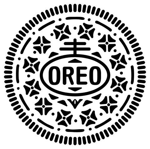
The Oreo logo evolution
Did you know that the current Oreo logo is the 12th iteration in the line-up? Yes, in its 100-year history, the Oreo brand has had 12 different logos. The below image gives a snapshot of the logo changes that happened over the years.
The first logo, as you can see, was a simple one in ornate vintage fonts. The idea was to establish the name “Oreo” and this design clearly achieved it. The second iteration featured the actual cookies in them so as to introduce to the audience what the brand was all about.
This was the stage where Nabisco started using red in the Oreo logo as a connecting factor to the red in the Nabisco logo. Oreo’s association with the Nabisco brand was an essential factor to establish since the Nabisco brand had already created a place for itself.
Since the 1930s Oreo has been using simple wordmark logos. The changes in the designs have been in terms of the main typeface and orientation of the name.
A few quick logo design lessons to take away from the Oreo logo evolution:
- Changing your brand color is a big step that has to be executed gradually. In this case, in order to introduce blue as the brand color, it was first used in combination with the red in the logo before switching to blue entirely.
- Every single logo since the 1930s featured a clear clutter-free layout. Considering the amount of information that needs to be featured on food packaging, a simple logo feels like the most sensible approach. This shows the need to consider the context when deciding the layout and overall design of your logo.
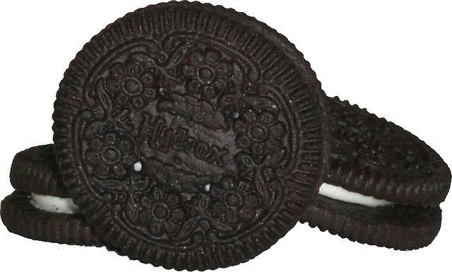
Signature cookie design
The iconic cookie design of Oreo is as popular as its logo. Therefore, we can safely say that the cookie design itself is a crucial brand element. This design helps differentiate Oreo cookies from the rest of the cream-filled chocolate cookies in the market.
When it started out, the Oreo cookie featured a simple wreath on the outside and the Oreo brand name at the center. The below packaging that replaced the first bulky packaging in which the cookie was sold features the original Oreo cookie design.

The second design was a more intricate one as seen featured in the packaging below.

The current-day Oreo cookie design has become a visual signature of the brand. This design was introduced in 1952 by William A. Turnier.
The details in the current-day Oreo cookie emboss is something that has puzzled its audience for a long time now. The antenna-topped oval which is the main component is from the Nabisco logo. Whereas the 4-petaled flowers arranged in radial symmetry are often compared to 4-leaved clovers. While there are many such speculations behind the design, there is no solid evidence behind the details in it.
Now that we’ve spoken about the signature elements that define the Oreo brand, let’s move on to the branding and marketing strategies that have helped shape the brand’s image.
The Oreo brand’s recipe for success – applying the 4Ps of marketing
The traditional marketing mix is said to consist of 4Ps – product, price, place, and promotion. Let’s quickly look at how Oreo has mastered the art of applying these principles to create a winning formula.
Product
Oreo’s product (its cookie sandwich) is the heart of its success. The brand’s commitment to maintaining the quality, taste, and consistency of its cookies is unwavering. By sticking to its classic version and carrying on the signature recipe, the brand continues to connect with audiences of various generations.
At the same time, to keep up with the changing trends, and to meet the changing requirements of its target audience, the brand has continued to introduce several new flavors in its lineup. The below post announces a recent addition to Oreo flavors.
It’s really happening…OREO Red Velvet is available now 🚨 pic.twitter.com/GdQO2H7RkU
— OREO Cookie (@Oreo) September 12, 2023
In essence, Oreo’s approach retains existing customers while also wooing new ones with its exciting flavors.
Price
Despite starting out as cookies known for their quality, the brand has always prioritized affordability. By offering various pack sizes and price points, from single-serve packs to family-sized options, Oreo makes its products accessible to a wide range of consumers.
Place
A great product offered at a great price is of no use to customers if the distribution channels are not convenient to them. Accordingly, Oreo has a diversified distribution channel. From grocery stores to ecommerce retailers and vending machines, Oreo’s wide-reaching distribution ensures that its products are within arm’s reach for consumers worldwide.
In the below campaign, the brand installed vending machines that allowed users to customize their Oreo cookies based on X (formerly Twitter) trends.
Promotion
Promotion is perhaps the strongest P of the Oreo brand. Because there have been engaging TV commercials and viral social media campaigns blending creativity and emotional appeal. All of these have helped keep the Oreo brand in the spotlight. Let’s look at the promotions of Oreo in detail in the next section.
Oreo’s iconic campaigns + marketing lessons
The secret of Oreo’s success has been its creative and engaging marketing strategies. These strategies have helped keep the brand close to its customers throughout.
Oreo’s Dunk In The Dark campaign
Of course, we had to start the list with the campaign that broke the internet – the one that became a Twitter (now X) sensation. Dunk In the Dark was a simple social media post posted on the Oreo brand page during the Super Bowl blackout in 2013.
The buzz this post created showcased Oreo’s wit and agility on social media
Power out? No problem. pic.twitter.com/dnQ7pOgC
— OREO Cookie (@Oreo) February 4, 2013
KIMP Tip: The above social media post shows that even the simplest of designs can create a viral post – when timed right and when the idea is clear in it. The above design works because of the apt use of colors (the black and white gradient represents the partially lit stadium when the blackout occurred). Additionally, featuring the Oreo cookie helped instant brand recall. Which in turn proves the need for consistent branding.
The Oreo Daily Twist campaign
The “Oreo Daily Twist” campaign, launched in 2012, was an innovative idea that strengthened the Oreo brand presence on social media. The core idea was to celebrate the brand’s anniversary. Running from June 25 to October 2, the campaign consisted of a series of social media posts. The campaign finale was aired at Times Square.
The below image shows a few of the designs featured in the Daily Twist campaign.

The “Oreo Daily Twist” campaign resonated with audiences worldwide, as it combined universal themes with local cultural references. Additionally, it earned a lot of media coverage and recognition for the brand within the marketing industry.
KIMP Tip: Every single social media design featured in the above campaign harmoniously combines the intended theme and the Oreo theme. This is what made the ads visually memorable. Staying on brand while adopting various themes creates that effect for your brand.
The Twist Lick And Dunk game
The “Twist Lick Dunk” game is an interactive digital experience created by Oreo that brings the joy of eating Oreos to life in a virtual setting. This game was introduced as part of Oreo’s marketing campaign, emphasizing the iconic ritual associated with enjoying Oreo cookies. It shows the power of gamification in marketing and how it can boost engagement.
Accessible across several platforms, the game was created to mimic the real-life process of eating Oreos. Players shared game content on social media amplifying the user-generated content reserve of the Oreo brand.
Beyond the gaming experience, the “Twist Lick Dunk” game served as a branding tool. As you can see, having a strong brand identity and slogan helps expand your creativity when promoting your brand.
Wonderfilled
Now for one of the most popular campaigns that comes to your mind when you look at the Oreo logo – the Wonderfilled campaign.
Introduced in 2013, this has become an inseparable part of the Oreo brand. It all started with a simple illustrated video celebrating joy, creativity, and the simple wonders of life. In this case, the fresh new diversion from conventional product-focused advertising worked in favor of Oreo.
To date, Oreo continues to share fun posts aligned with the Wonderfilled theme.
Or even engaging posts like this one below:
Screenshot the moment the OREO lands perfectly to complete #Wonderfilled pic.twitter.com/xJzXVubiEK
— OREO Cookie (@Oreo) July 24, 2017
In sum, the “Wonderfilled” campaign by Oreo is a testament to the brand’s ability to shift from selling cookies to selling joy and wonder, by tapping into the universal emotions of happiness and nostalgia.
KIMP Tip: If you look at successful ongoing campaigns from most brands, there is one thing in common – there is a simple relatable idea at the core of the campaign. This is the case with Oreo’s Wonderfilled campaign as well.
Keeping such long-term campaigns alive is not an easy job in the crowded social media space. You need to have a good mix of static posts, illustrations, short videos, and animations similar to what Oreo does with its Wonderfilled campaign visuals.
Looking for a design team that can create these visuals for your campaign? Get a KIMP subscription.
When KitKat and Oreo played the game of Tic-Tac-Toe
It all began when KitKat challenged Oreo to a game of tic-tac-toe in response to a user’s Tweet.
The fight for @Laura_ellenxx's affections is on. @oreo your move #haveabreak http://t.co/EN8YAfnNMZ
— KITKAT (@KITKAT) March 13, 2013
What truly changed the mood of the conversation was Oreo’s witty light-hearted response that won the hearts of not just its own customers but also those of KitKat’s.
Sorry, @kitkat we couldn't resist … #GiveOreoABreak pic.twitter.com/iMXjChetOa
— OREO Cookie (@Oreo) March 13, 2013
This social media banter between Oreo and KitKat shows how brands can effectively engage their customers on social media. Such friendly discussions also play a huge role in humanizing the brand by letting its personality shine.
The above response from Oreo is yet another example of Oreo’s strong command over the social media realm. In fact, it’s the brand’s timely responses that solidify the brand’s social media game.
Create your Oreo brand-inspired marketing and branding designs with KIMP
In exploring Oreo’s marketing and branding strategies, we’ve seen how the brand maintains harmony in variety and consistency. Through all its campaigns and the way it has managed to imprint the Oreo logo in its customers’ minds, the brand has shown the strength of visuals in marketing and branding.
As a takeaway, remember that robust visuals not only establish your brand but also carry it forward across marketing campaigns. To meet these ever-evolving design needs, consider a design subscription, like KIMP.
Not sure how this will change your design workflow? Sign up for a free trial and find out yourself.