The KFC Logo: Key Takeaways From A Finger Lickin’ Good Brand
What started out as a simple eatery in a filling station storeroom now stands as the epitome of branding in the fast-food industry. A brand that revolutionized the restaurant business and successively achieved a global status! Yes, we are talking about KFC.
The success of KFC and the strong stance it holds in the ever-changing market are proof that strong branding and marketing strategies can add to the resilience of a brand. Therefore, today we’ll be analyzing the KFC logo and brand to take away useful branding lessons.
Without further ado, let’s go!
KFC – a quick glimpse into its origins
To truly understand the essence of the KFC brand and its iconic logo, we must briefly understand its history.
The story began in 1930 when Harland Sanders, began serving country ham and steaks at a Shell filling station on US Route 25. By 1936, his success earned him the title of Kentucky colonel.
Once his restaurant expanded, and fried chicken became his signature dish, he was looking for a way to reduce the cooking and serving time without reducing the quality of the fried chicken. That was when he introduced the pressure fryer method – innovation number 1.
By 1940, he created and perfected a signature recipe with 11 herbs and spices – innovation number 2. This KFC Original Recipe continues to be the secret recipe still used in all KFC restaurants.
As you can see, the strong foundation of the KFC brand came from the innovative measures that Colonel Harland Sanders adopted since its inception. Additionally, when he decided to widely adopt the franchise model for KFC in 1952, he popularized the franchising model in the restaurant industry. (This was also roughly the time when Ray Kroc began employing the franchise model for McDonald’s)
All of these daring steps and the consistent processes like the decision to stick with the original recipe, can be attributed to the KFC brand’s success. Of course, the brand identity of KFC has stood as a beacon, guiding the brand to where it is now. Deeply rooted in quality, innovation, and commitment to Colonel Sanders’ vision this brand identity has evolved over the years.
All of these factors give us enough reasons to analyze the KFC brand and KFC logo to look for valuable branding lessons.
The evolution of the KFC logo
The face of Colonel Sanders has become an iconic element, a distinct visual reminder of the brand. But was it always there? How has the logo changed over the years and how has the KFC brand been preserved through all these changes? Let’s find out.
The first Kentucky Fried Chicken logo
The first KFC logo was introduced in the year 1952 when Colonel Sanders began actively creating franchises for his business. This way, there was a strong logo, a visual identity for the franchises to use (in addition to the signature recipe) in order to preserve the original brand.
The logo was a combination mark featuring the brand name and a Colonel Sanders caricature. Though a simple design on its own, it is the relevance of this design that makes the logo special.
What are these details that make the logo relevant to the brand? We’ll tell you.
- In 1952, when Colonel Sanders franchised his recipe to Pete Harman, a critical milestone for the brand emerged. Because this was when, Rodney L. Anderson, a painter hired by Harman, came up with the moniker “Kentucky Fried Chicken.”. Colonel Sanders decided to go with this name for the brand and therefore a logo that featured this name was the wisest move at that point in time. In fact, wordmark logos prove effective for new businesses to imprint their names in the market and to familiarize their audience with the name, the brand.
- The second detail is the use of the Colonel Sanders caricature. This helped put a face to the brand, to preserve the roots – to celebrate the man behind the signature recipe that the restaurant continues to be recognized for until today. Similarly, brands benefit from adding a signature visual element that tells the brand’s story.
The 1991 rebranding and the new KFC logo
The year 1991 marked the introduction of the first KFC logo featuring the shortened name KFC” rather than the full name “Kentucky Fried Chicken”. This was the first major rebrand for the KFC brand since its inception.
The KFC brand achieved a few things with the help of this rebrand:
- They were able to incorporate a shorter, easier-to-remember name for the brand.
- They were able to shift the focus away from the term “fried” so as to avoid being constantly associated with unhealthy fried dishes.
- And finally, with the restaurant beginning to serve more than just “fried chicken”, removing this component from the logo was relevant.
To present this change in dynamics for the brand, a fresh logo was introduced.
A few quick design takeaways from the 1991 KFC logo.
- Radical changes to the brand call for radical changes to the logo design. The introduction of the red color to the KFC logo in 1991 was one such. And red is known to be an exciting color and also a popular one in the food industry.
- While the logo underwent a major change, the one distinct element in it, the Colonel Sanders illustration, was retained. This helped preserve the brand’s identity during the transition period.
KIMP Tip: The KFC logo is a good example of the benefit of adding an element of visual interest, an imagery to the logo. This unique element makes your logo easier to remember and easier to recall as well.
Need help drafting logos with a custom illustration to represent your brand? Get a KIMP Graphics subscription.
The current KFC logo
The next few iterations of the KFC logo involved a few minor changes in terms of the positioning of the Colonel Sanders brandmark and the KFC brand name. The present-day KFC logo has been in use since 2018. This was the time when the brand introduced a set of fresh graphics for branding including the signature KFC stripes.
The flat minimalistic design of the current-day KFC logo carries an air of modernity representing the ever-evolving brand. At the same time, the serif font in the logo and the illustration keep the brand’s history intact.
Having delved into the core element of branding – the logo – let’s talk about other pivotal aspects. While the logo holds immense significance, it’s equally vital to complement it with supporting brand elements that amplify its value and significance. Let’s see how KFC does that.
The building blocks of the KFC brand
The KFC brand tagline
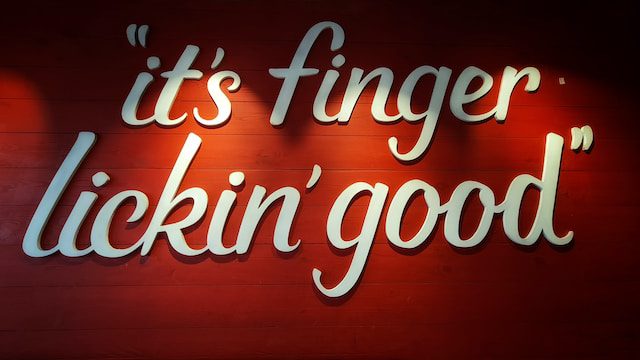
The phrase “It’s finger lickin’ good” was trademarked by KFC in 1956. Did you know that there is a story behind this tagline?
Reportedly, a KFC franchisee from Phoenix, Dave Harman, used to voice TV commercials. One of his commercials featuring his restaurant manager, Ken Harbough, received mixed responses from the audience. The reason was that Dave Harman was seen “licking his fingers” in the background in the commercial. The story goes that when one of the disgruntled customers called to complain about this, Harbough replied, “Well, it’s finger lickin’ good”. And that marks the beginning of the association of this phrase with the KFC brand.
After this incident, and after the trademark, it began to be widely incorporated in several KFC advertisements. However, KFC briefly dropped this tagline. Do you know why? We’ll get to that in our next section where we discuss popular KFC campaigns.
The KFC brand packaging
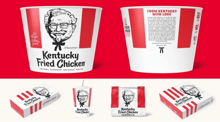
KFC’s takeaway packaging design has been one of the most popular designs in the fast-food segment. However, what makes it even more special is that the packaging design has also evolved as the brand continues to evolve.
When your brand evolves, a revamped logo is not enough. You also need other core branding elements like packaging to reflect the fresh identity. While KFC’s old packaging was great, its recently revamped packaging takes a more modern approach that resonates with its modern and crisp logo.
There is one other major detail to note about this new packaging. According to KFC, “It offers fully certified sourcing of paperboard by either the Sustainable Forestry Initiative or the Forest Stewardship Council (FSC)”. This initiative comes as a responsible move from the brand considering that the brand has been criticized for sourcing the paper pulp for its packaging from rainforest wood.
Branding beyond the restaurant walls
KFC goes beyond the restaurant realm to solidify its brand presence, evident in its merchandise line that flawlessly integrates its iconic brand elements. This strategic move not only extends KFC’s brand presence but also fosters a sense of community, inviting the audience to become part of the KFC family.

KIMP Tip: KFC’s merchandise line is proof that merchandise marketing works for brands that wish to strengthen their authority in any segment. Beyond imprinting your brand identity in your audience, branded merchandise also helps create a sense of belonging and thus nurture long-term relationships with your customers.
Need help designing branded merchandise to firmly present your brand’s visual identity and boost engagement? Get a KIMP Graphics subscription.
Campaigns that gave the KFC brand a boost
In addition to the strong brand elements, the consistent use of these brand elements and the seamless integration of them into various KFC campaigns have helped strengthen the KFC brand. Let’s now look at some of these campaigns that helped imprint the KFC logo and brand in the minds of the audience across generations.
1. Old commercials featuring Colonel Sanders
Some of the earliest KFC commercials, like the one above, featured the legendary Colonel Sanders himself. These campaigns skillfully showcased the Colonel’s persona, allowing customers to connect his iconic image with the brand’s components – from packaging to the logo. By prominently featuring the founder, KFC not only paid homage to its roots but also created a relatable face for its identity.
2. The signature KFC “Get a Bucket of Chicken” jingle
A few decades ago when TV commercials were the most popular options to get across to a wider group of audience, the competition was stiff. Therefore brands had to get really creative. One of the creative steps back in the day was the inclusion of a catchy and memorable jingle. For KFC it was the “Get a Bucket of Chicken” ad and jingle that popularized the brand.
By featuring children, the above commercial also turned out to be effective in the brand’s efforts to target a family audience.
3. Colonel Sanders Cat Climber
Who doesn’t love cat videos, right? In a stroke of creative genius, KFC introduced the “Colonel Sanders Cat Climber” commercial, a delightful blend of feline charm and KFC’s iconic imagery.
This playful video ad was to promote a live event featuring adoptable cats playing with the functional and entertaining Colonel Sanders Cat Climber. The live event was to raise awareness and encourage the adoption of the cats from the Heaven on Earth Society of Animals in Los Angeles.
Standing for a cause ✅
Preserving the brand’s unique personality ✅
No wonder, the campaign became a big hit!
KIMP Tip: A brand’s mascot benefits the brand only when the brand manages to impart unique personas to it and to consistently use it for delivering the brand’s message. KFC does that perfectly by seamlessly incorporating the Colonel Sanders mascot keeping his legacy alive.
To create a unique brand mascot and supportive promotional graphics featuring this mascot, one KIMP subscription is all you need!
4. When Reba McEntire became Colonel Sanders
The ad aligns with the rest of the KFC ads in the fact that it is fun! Besides, it is the unique twist that made the ad even more fun – featuring the country music legend, Reba McEntire.
The ad received a lot of positive responses on the internet. Additionally, the ad also gave the brand a creative and effective way to reach a new niche audience segment – country music fans. While you might have your own ways of targeting your audience segments, planning some campaigns that focus on niche audiences can be a cost-effective way to try new markets.
5. When KFC dropped its tagline
Remember we spoke about KFC briefly dropping its tagline? Now it’s time to talk about this campaign. If you haven’t guessed it already, we are referring to the brief period when the KFC brand announced dropping its tagline during the pandemic.
According to the brand, using the tagline during the pandemic didn’t “feel right”. While people had mixed feelings about the campaign, it was indeed a sensitive move. In fact, it was a good way for the brand to maintain customer engagement and initiate conversations during a time when dining out was not a possibility.
Bring your KFC-inspired campaigns to life with KIMP
From sculpting the brand identity to creating campaigns that carry the identity forward, the KFC brand has been meticulous with its branding strategies throughout. This is one reason why the KFC logo and brand have remained prominent in the competitive fast-food industry. In fact, the strong branding strategies are also why the brand was able to bounce back from all the challenges it faced along its journey.
Notice that there is a strong visual identity at the crux of it. To create this visual identity for your brand and to tell a story with your logo just like the KFC logo, an unlimited graphic design subscription might be just what you need.
Ready to explore the benefits of unlimited design? Sign up for a free KIMP trial!