The McDonald’s Logo & Brand: Exploring the Golden Recipe In Branding
What’s the secret behind a humble Californian burger joint’s meteoric rise to an international fast-food empire? How did a splash of yellow trigger instant brand recognition? Get ready to unravel the story of the McDonald’s logo and brand.
From the various iterations the McDonald’s logo has seen to the mascots that carry the weight of branding on their shoulders, we’ll be talking about all the nuances of this brand that any marketer would love to hear about. Let’s begin with a quick backstory of the brand.
- McDonald’s – a quick glimpse into its origins
- McDonald’s logo – stepping back in time
- Analyzing the design and brand-relevance of the Golden Arches
- An overview of the McDonald’s brand mascots
- Lessons in glocalization from the McDonald’s brand
- Bring your McDonald’s brand inspired campaigns to life with KIMP
McDonald’s – a quick glimpse into its origins
Before we talk about the brand let’s talk about how it all started.
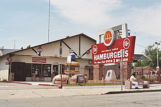
In 1940, brothers Richard and Maurice McDonald opened a modest drive-in called “McDonald’s Famous Barbecue,” serving up a simple yet satisfying menu to patrons in their cars. Realizing their profits mainly stemmed from hamburger sales, the McDonald brothers revamped their carhop drive-in model in 1948 and introduced a simpler menu.
By 1952, they realized that they need to scale up and came up with the first new building for their restaurant featuring the Golden Arches.
In 1954, Ray Kroc who was selling Prince Castle brand Multimixer milkshake machines to one of the McDonald’s restaurants, was intrigued by the business. He came up with the proposal to franchise their successful San Bernardino restaurant. Despite a little skepticism in the beginning, the McDonald Brothers gave in to the idea.
With this Ray Kroc secured rights to establish McDonald’s franchises across the US, excluding some areas already licensed by the brothers, with a promise to share a small percentage of sales. This marked the beginning of Kroc’s ambitious expansion plan and the birth of a fast-food empire. Today McDonald’s stands as one of the leading fast-food chains in the world with more than 36,000 restaurants in more than 100 countries.
A key ingredient in this recipe for success? The art of branding. Let’s now talk about the foundational block in branding – the logo!
McDonald’s logo – stepping back in time
Can you imagine McDonald’s without the Golden Arches? Did you know that the McDonald’s logo did not always feature the Golden Arches? Yes, while the company itself came into existence in 1940, the Golden Arches were only introduced in the 1960 version of the logo!
Let’s talk more about the story behind these Golden Arches and how they have evolved over the years.
First McDonald’s logo
The first logo was a medley of fonts, a simple wordmark logo establishing the brand name. Given that the restaurant was still in its initial stages and not widely popular, a simple brand name logo worked well in establishing the name.
The first McDonald’s logo with the Golden Arches
The first-ever association of the Golden Arches with the McDonald’s brand happened with the first-ever building designed for the restaurant when the McDonald brothers decided to scale up. This building featured a lot of aesthetic elements but the eye-grabbing one among them was the pair of “25-foot yellow sheet-metal arches trimmed in neon”. Designed by architect Stanley Clark Meston, these Golden Arches became a strong brand identifier really soon.
No wonder, when the brand rebranded in 1960, the Golden Arches were incorporated into the logo design!
Every McDonald’s logo that came after that carried the signature “Golden Arches” and the icon soon became synonymous with the brand.
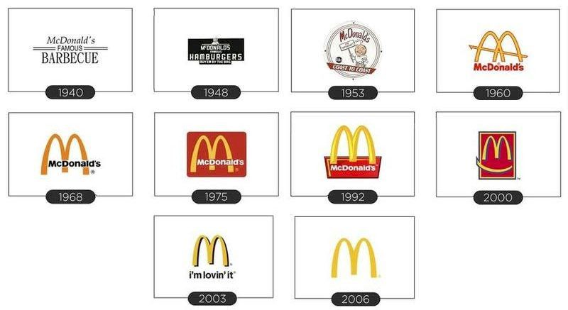
As you can see from the various iterations of the logo, the appearance of the brand name is one element that has been changing over the years but the “Golden Arches” have always been an integral component. And over time, this consistency has helped people instantly relate the icon to the brand.
KIMP Tips: So, what kind of branding lessons can you take away from the logo evolution of McDonald’s?
- When it comes to rebranding choose and retain brand elements that your target customers like and recognize.
- Timelessness for a brand can only be achieved with consistent use of the brand elements.
Let’s now take a deeper look at the Golden Arches and the design psychology that made it an impactful identifier for the McDonald’s brand.
Analyzing the design and brand-relevance of the Golden Arches
A lesson in simplicity
If you go back to the image that shows the McDonald’s logo evolution you’ll notice one striking detail. The logo has been getting simpler. Simple logos work!
It is because of this simplicity that the McDonald’s logo lends itself to easy recognition and scalability across various mediums. There is also the added advantage that the Golden Arches resemble the M from the McDonald’s brand name. This is what makes the design a stroke of genius. All of these put together make the Golden Arches a timeless identifier of the brand.
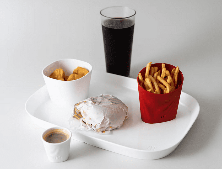
The appetizing brand colors
The vibrant yellow hue of the arches is more than just a design choice; it’s a strategic application of color psychology. Yellow is associated with positivity, happiness, and, interestingly, appetite stimulation. This choice not only brightens the brand’s image but also taps into the subconscious, enticing hungry customers to indulge.
Universality in design
A global brand needs a design that transcends cultural and language barriers. The simple and stunning McDonald’s logo achieves just that! The logo’s visuals speak volumes about the brand without the use of words and therefore gets recognized no matter where the restaurant is.
Having spoken about the key brand identifier of the McDonald’s brand let’s now move to the other well-recognized brand element – the mascot.
An overview of the McDonald’s brand mascots
Having a brand mascot is one of the most effective ways to humanize a brand. It also gives your customers a friendly face to associate your brand with. In the case of the McDonald’s brand, it’s Ronald McDonald the clown mascot. But there was one other mascot that the brand was using before it pivoted to the friendly clown.
The first McDonald’s brand mascot – Speedee
By 1948, once the McDonald’s restaurants started gaining more popularity, the McDonald brothers brought in the Speedee Service System. In fact, the new McDonald’s restaurant building they designed was to implement efficient and fast delivery based on this model. The restaurant also featured signage with a character named Speedee, a chubby character wearing a chef’s hat. Speedee became the first mascot of the McDonald’s brand in the coming years.
Speedee along with the golden arches became the distinguishable representatives of the McDonald’s brand.
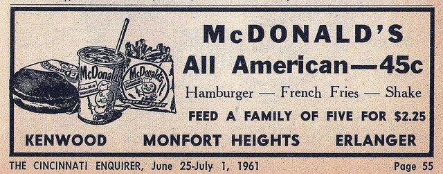
Speedee appeared on store signages, takeaway packaging as well as in print ads promoting the brand until the 1960s. The below image shows one such vintage ad from McDonald’s featuring Speedee in the packaging.
As a symbol of efficient and swift service, Speedee embodied the essence of McDonald’s commitment to providing quick and satisfying meals. However, things changed when the brand’s franchising model kicked off and the branding took a more modernized approach.
Ronald McDonald

Speedee was replaced by a new mascot in 1963 as a measure to move to something more friendly and relatable. The brand wanted to create a new mascot to target a broader group of audiences, namely families, especially, children. No wonder, they went with a clown – something that easily appeals to the younger audiences.
Take a look at a 1963 commercial featuring the new mascot Ronald McDonald the clown.
The timing was good because this was the time the fast-food market was getting competitive. Consequently, the brand was in need of a mascot that could create a positive brand image. And the cheerful and vibrant clown hit the mark.
Ronald McDonald’s persona emphasized happiness, playfulness, and community involvement. His presence in commercials, events, and various charitable activities helped portray McDonald’s as a brand that cares about people and brings joy to communities.
In addition to all these, the mascot worked mainly because it added to the entertainment value. Here’s how:
- The brand started adding Ronald McDonald statues in its restaurants.
- Four issues of a comic based on Ronald McDonald were sold between 1970–1971.
- A mini-series titled The Wacky Adventures of Ronald McDonald featuring the mascot was created.
- There were also three video games built around the character.
All of these helped imprint the McDonald’s brand mascot in the minds of the consumers and thus create a strong identity for the brand.
KIMP Tip: The brand’s use of Ronald McDonald in its marketing campaigns is proof of the effectiveness of brand mascots in marketing. So, if you are looking for a more humanized approach to your branding, start working on a mascot for your brand.
Need help designing a custom mascot? Get KIMP!
Lessons in glocalization from the McDonald’s brand
As you can see from the brand elements and their evolution, the meteoric rise of McDonald’s from a local burger joint to a global fast-food giant didn’t happen by chance. It was meticulously orchestrated through a series of strategic moves that carry invaluable lessons for brands aiming to conquer the world. What can brands looking to go global take away from the success of McDonald’s? Let’s find out!
1. The foundational steps laid through the franchising model
Ray Kroc’s franchising model was the initiator for the expansion of the brand. This decentralized approach expedited global expansion while enabling adaptation to diverse markets and cultures. Brands seeking global presence can take a leaf from McDonald’s book by empowering local partners to champion their identity on a global stage.
The first international McDonald’s restaurant opened its doors in Canada in 1967, officially signaling McDonald’s entry into the global market.

2. Understanding and respecting local cultures
McDonald’s has perfected the art of “glocalization,” an approach that champions global expansion while embracing local culture. This not only involves introducing menu items that resonate with local tastes but also adapting operations to respect and honor local customs. By fostering this genuine connection, McDonald’s has managed to create a global brand that feels like a hometown favorite.
McDonald’s India stands as a prime example of this successful strategy. The below post features a menu item called the “Piri Piri McSpicy Paneer Burger,”. This is crafted to suit the dietary restrictions observed by some Indians in the Shravan season.
With this, the brand proves that thoughtful localization isn’t just about taste but also about respecting cultural values. This approach has undoubtedly contributed to McDonald’s resonance with diverse communities across the globe.
3. Mindful local partnerships
McDonald’s collaborations go beyond just picking popular local brands. In several regions, the brand has implemented region-specific processes to abide by local laws. This is one of the biggest business survival techniques to take away from the McDonald’s brand.
For instance, in France, local laws define that restaurants with more than 20 seats should use reusable serving containers. To abide by this, McDonald’s France has collaborated with Ellum Studio, a popular French design studio to create reusable tableware while still staying on-brand.
KIMP Tip: There are two big lessons for brands to take away from this:
- Local partnerships are not just about selection but about adaptation.
- Second, design isn’t just about aesthetics; it’s about survival. Businesses can embrace McDonald’s lessons by not only choosing the right allies but also by creatively navigating the global landscape while staying true to their core identity.
Need help creating customized designs for your various markets? An unlimited subscription makes things simpler!
4. Celebrating local communities
Just as McDonald’s tactfully selects local brands and respects local regulations, its dedication to local communities is equally commendable.
Consider the below social media post—a prime example of McDonald’s community engagement.
Teaming up with Art of Football, McDonald’s celebrated the FIFA Women’s World Cup alongside spirited local football enthusiasts in Nottingham. What’s truly impressive is how McDonald’s local branch actively rallied behind the local team, showcasing its global presence with a local heart. This harmonious blend not only fosters a deep sense of connection but also offers a branding and marketing lesson that speaks volumes.
5. Curating brand visuals with a local flavor
One of the most fascinating details to notice in all these collaborations is how McDonald’s manages to preserve its global brand identity while also adapting to the local flavors a little.
Take a look at the below outdoor ad for example. This ad was designed for McDonald’s Malaysia as a creative representation of a local landmark, Batu Caves. The use of a popular local landmark means that the ad instantly connects with the locals. The use of signature elements like fries and the well-recognized brand color combination of red and yellow preserve the brand identity.
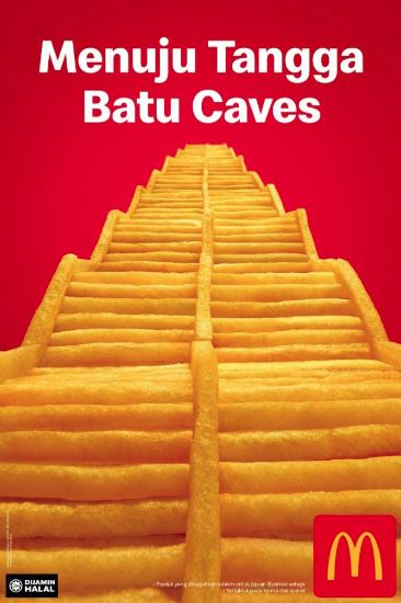
This was achievable only because of McDonald’s consistent branding in its visuals combined with the understanding of the local audience.
A designated design team that works on all your brand visuals comes in handy to achieve this level of consistency to establish your brand.
Bring your McDonald’s brand inspired campaigns to life with KIMP
In conclusion, achieving a market dominance akin to McDonald’s necessitates years of unwavering dedication and a steadfast commitment to branding. As you manage the former aspect, an unlimited graphic design subscription like KIMP can adeptly handle the latter, ensuring your brand’s constancy and coherence.
Register now for a free 7-day trial.