Beauty Branding: Decoding the Logos of Top Beauty Brands
At the heart of it all, beauty branding is about honoring and celebrating beauty—both the external radiance and the internal uniqueness. Beauty brands are not just about helping their customers look beautiful; they’re about enabling them to feel beautiful. They’re about helping them express their individuality with every stroke of color or dash of fragrance. In this realm where aesthetics and emotions reign supreme, everything begins with a beautiful brand identity.
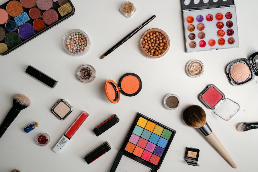
At the core of this brand identity is the logo. A beauty brand’s logo is the face of the brand’s philosophy, a representation of its commitment to its customers. In short, the logo of a beauty brand is meant to be a strong visual narrative that tells the brand’s story effectively and memorably.
Today we are going to talk about some beauty brands that have achieved this with their logos. And in the process, we’ll be taking away some useful beauty branding and logo design lessons. Are you ready? Let’s go!
Why branding and logo design are crucial for beauty brands
A beautiful logo is a must-have for a beauty brand for a number of reasons such as:
- To establish your individuality – in the ever-increasing competition, you need your beauty brand to stand out. Your logo helps in this by carving your unique brand identity.
- Build relationships by building trust – if you need to acquire customers and retain them for a long time, you need to earn their trust. A clear and memorable logo helps nurture trust.
- Connect through shared values – the logo of your beauty brand tells your customers what your brand stands for. When they see brands that share their values, they are more likely to connect with these brands.
- Boost sales through strong brand positioning – with a memorable logo in place, you can make it easier for customers to recognize your brand and recall it when it truly matters. That is, when they are making a purchase. Therefore, a strong logo is essential to drive sales by strengthening brand awareness.
- Boost your brand value – a logo shapes the way your customers perceive your brand. A consistent positive image means that your brand’s value in the market increases steadily.
Let’s now look at some of the well-known beauty brands that have managed to tap into these benefits through stunning logo designs.
Logos of famous beauty brands + design tips
1. Estée Lauder

There are very few beauty brands that have preserved their first logo for decades and Estée Lauder is one. However, as the brand has expanded, so has its identity. You’ll now see 2 different versions of logos being used by the brand.
The first is a sleek wordmark that represents the corporate symbol of The Estée Lauder Companies Inc., encompassing various brands. Given the extensive portfolio, this minimalistic logo aptly fits.
The second is an elegant monogram that graces consumer-facing designs like product packaging. With its sophisticated touch, it amplifies the product’s elegance, a quintessential for beauty brands.
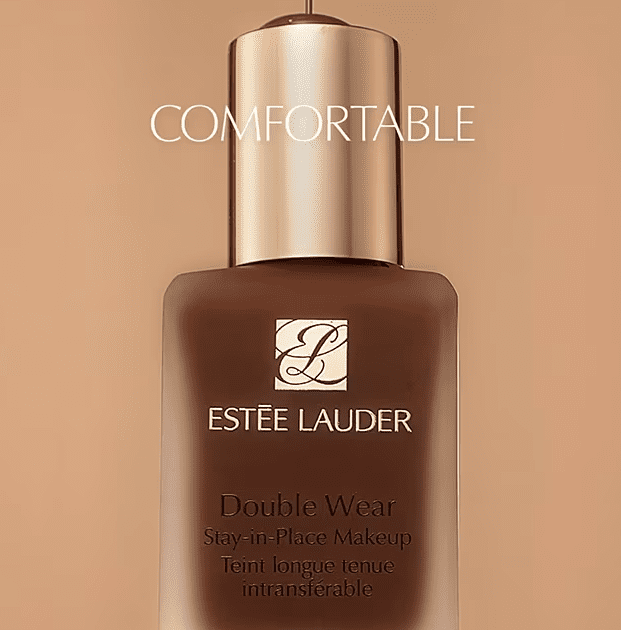
Design insights from the Estée Lauder logo
- The brand’s simple and timeless logo is a reminder to go for perpetual concepts rather than falling for trends when it comes to logo design.
- Selecting the right colors is crucial for an impactful logo interpretation. To achieve this, define the approved logo colors in your brand guidelines. In the case of Estée Lauder, both versions of the logo mostly appear in black or gold. These are great colors for a prestigious beauty brand.
KIMP Tip: To preserve your brand identity and use the right versions of your logo in the right places, define the rules in your brand guidelines. Also include details about placement, orientation, and combination of the elements in your logo for a more consistent beauty branding.
Need help designing your brand guidelines? Get a KIMP Graphics subscription!
2. Origins
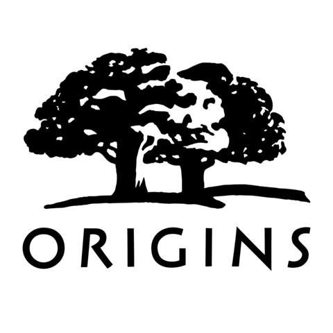
The next beauty brand we are going to talk about is a subsidiary of the Estée Lauder Companies. According to Estée Lauder, Origins is a “high performance active naturals skincare brand”.
The brand uses a combination mark logo with illustrated trees and a wordmark. This strategic integration of a nature-inspired illustration in the logo instantly conveys the brand’s affiliation with nature. And the green color of the logo reinforces this connection.
Design insights from the Origins logo
- When designing logos for beauty brands, it’s crucial to incorporate fitting imagery. Where can you draw inspiration for this imagery? Look to your business’s USP (unique selling point). For example, Origins stands out with its use of naturally-derived ingredients. Therefore, a nature-inspired element is a natural fit.
- As for the font, though it is a sans-serif font suitable for a consumer brand, it exudes professionalism. It signals that this is a brand to be taken seriously! That’s how you leverage font psychology to communicate your brand’s personality through your logo.
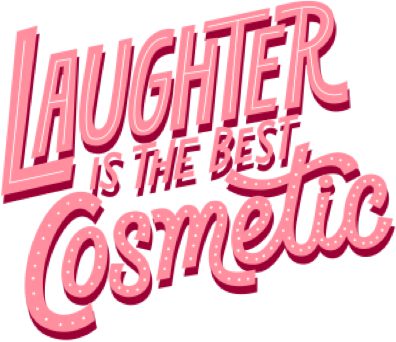
3. Benefit Cosmetics
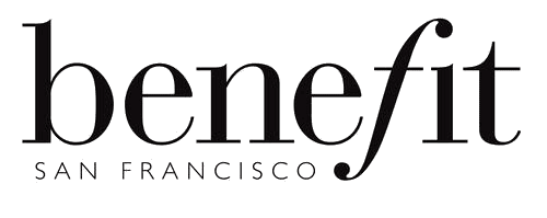
Benefit Cosmetics is known for its light-hearted approach to beauty. The brand uses a simple wordmark logo. Yet, there’s a twist that sets it apart. Notice the “f” leaning forward—it’s not just a letter; it’s a symbol of innovation.
This clever tilt adds a dash of uniqueness, mirroring the brand’s refreshing take on beauty. By defying the norm, Benefit’s logo represents the essence of a brand that’s always ready to redefine beauty norms.
Design insights from the Benefit Cosmetics logo
- Beauty branding relies on color psychology. Benefit Cosmetics nails this by incorporating various shades of pink in its designs. Pink’s pleasing and subtly feminine nature makes it a perfect fit for a beauty brand.
- Carve your brand identity so that it encapsulates your brand’s philosophy. Benefit Cosmetics achieves this by blending its logo and tagline, forming a complete personality. The tagline’s wording and font perfectly match the brand’s playful essence.
4. Fenty Beauty
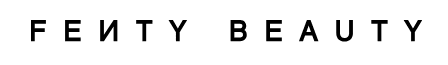
Born from the visionary mind of Rihanna, Fenty Beauty is a brand that embraces modern beauty inclusivity. To connect with diverse demographics and stay ahead in the evolving beauty industry, they use a sleek, contemporary logo. Furthermore, to keep things interesting, the logo uses a reversed “N” which can also be seen as a nod to the brand’s commitment to innovation.
To allow imprinting of the brand identity in various places, the brand complements the main wordmark logo with an aesthetic monogram logo. This uses a serif font contrasting the sans-serif in the main logo. As a result, it is the perfect ingredient required when the brand needs to add a touch of luxury to its products or packaging.
Design insights from the Fenty Beauty logo
- Fenty Beauty’s logo shows that simplicity can be a powerful tool to convey a brand’s values and mission.
- The logo’s minimalistic design ensures its longevity, reflecting the brand’s ambition to stand the test of time.
KIMP Tip: All the beauty brands we spoke about until now show the power of minimalistic logos. And as you can see, there are several ways to add a creative twist to the minimal aesthetic in these logos – either through unique illustrations as with Origins, or with memorable monograms, as with Fenty Beauty.
Illustrated imagery or monograms, a KIMP Graphics subscription can take care of your diverse logo design requirements.
5. MAC Cosmetics

MAC Cosmetics, another popular subsidiary of the Estée Lauder Companies, uses a lettermark logo. The MAC Cosmetics logo is a great source of inspiration for beauty brands looking for a simple yet impactful logo.
At first glance, it looks like any other lettermark logo but observe closely and you’ll notice that it’s strewn with interesting details.
- Notice the opened strokes in M and A – these are elements of surprise to break the monotony of lettermarks.
- The second detail is that the characters are all fused at the bottom giving a seamless appearance to the logo.
- Finally, the 2 dots appearing at the top help maintain the visual balance in the design.
Design insights from the MAC Cosmetics logo
- The strong, uppercase letters communicate confidence and authority, capturing attention effortlessly. Moreover, they also stand as a reminder that the brand name is an acronym for Makeup Art Cosmetics.
- The slightly elongated characters give the logo a futuristic appeal reflecting the bold and daring nature and philosophy of the brand.
6. Shiseido

Shiseido has a reputation for introducing Western-style pharmacy into the Japanese market. The brand’s essence is to combine Western and Eastern beauty and skincare philosophies which is reflected in the minimalistic wordmark logo.
Here, the brand name is the prime focus in branding because of its significance. It is a combination of “Shi Sei and Do” in Japanese translating to “house where everything is born”. Which figuratively represents the Earth. When your brand name has a story to tell, throwing the spotlight on it in your logo design makes perfect sense!
The other brand design associated with Shiseido is the camellia flower illustration. This appears on various product packaging designs. Camellia is known to represent inner strength and has also held cultural significance in Japan. It has therefore become an indispensable part of the brand’s identity.

Design insights from the Shiseido logo
- The stylized “S” in the logo adds a creative twist to the design without deviating from the minimalistic aesthetic. Additionally, this detail achieves the intended impact without taking up too much of the logo design real estate.
- The camellia flower adds a layer of symbolism, narrating the brand’s essence in a subtle yet impactful manner.
7. NARS
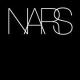
As you must have noticed from the above examples, most beauty brands stick to conventional typography and design by the rules. NARS Cosmetics chose to bend the rules with its unique wordmark logo.
Named after its founder François Nars, NARS Cosmetics is a bold and beautiful brand with a bold logo that complements its philosophy. The overlapping letters form the unique and distinctive feature of the NARS Cosmetics logo. The lightweight sans-serif font used in the logo ensures that the legibility of the letters stays intact despite the overlapping.
Design insights from the NARS Cosmetics logo
- In a way, the overlapping letters create a sense of movement and energy which resonates with the brand’s innovative approach. This shows how even with standard fonts you can add your touch of personalization.
- NARS Cosmetics is a fashionable beauty brand that is all about embracing raw beauty and making a statement. The fashionable twist to the wordmark logo and the elegant typeface chosen for the design together capture this idea perfectly.
- The logo’s monochromatic palette lets the brand’s products take center stage. This simplicity echoes NARS’ philosophy of enhancing natural beauty.
8. Lancôme

The Lancôme logo stands as a testament to timeless elegance and luxury. Founded in 1935, the brand has become synonymous with beauty, sophistication, and a touch of French allure.
The rose emblem that often accompanies the wordmark reminds customers of the brand’s French connection. Overall, the branding designs Lancôme carry an artistic flair that boosts the overall aesthetics of the brand.
Design insights from the Lancôme logo
- The conventional serif font used in the logo carries an air of elegance resonating with the brand’s luxurious offerings.
- Lancôme has a strong connection with roses which is evident through the illustrations and imagery that appear across various marketing designs from the brand. All of these take shape and help in building the brand’s identity because of the rose motif which is part of the core branding design. Consistency in branding thus helps strengthen brand recognition.
Elevate your beauty branding designs with KIMP
From the logos of the popular beauty brands, the strength of visual identity in beauty branding is clear. We can see from the success of these brands that logos serve as the gateway to a brand’s story, embodying its ethos and values. Yet, it’s just the beginning.
From taglines that resonate with the heart to monogram logo accents that add elegance, each element plays a pivotal role in building a comprehensive brand image. Consider the emblematic rose of Lancôme or the eloquent monogram of Estée Lauder. They become inseparable entities in their brand identities. Additionally, they help differentiate the brand in a crowded market.
Therefore, creating your beauty branding designs requires meticulous efforts from your side and the expertise of graphic designers. For the latter, an unlimited graphic design subscription seems like the most practical move. Because then unlimited designs are covered and unlimited revisions too! All of that at a flat monthly rate. Want to give it a try? Sign up for KIMP’s free 7-day trial!