7 Of The Most Renowned University Logos From Around The World + Design Tips
Like every other business in the world, universities need to lay the foundation for their marketing with a strong brand identity. Undoubtedly, this begins with a logo. Furthermore, a university’s logo is meant to be a powerful fusion of heritage and vision. It is meant to communicate the ethos of the institution.

From vintage crests to modern monograms, university logos around the world showcase a diverse array of styles while conveying a wealth of information. Yet, branding for a university is more than a mere emblem – it is the heart of its story. Today we are going to talk about some university logos that manage to justify this significance.
So, are you ready? Let’s begin discussing the significance of branding and logo design for universities and then talk about the logos of the most popular universities around the world.
Branding and logo design for universities – the key to crafting a lasting impression
A well-crafted identity is essential for any university to tell its story, to establish what makes it unique. And this is also essential in conveying its values and leaving a lasting impression on students, alumni, faculty, and the global community.
Therefore, university logos offer the following benefits to institutions:
- Create a strong identity for the university to stand out in the highly competitive realm of academia.
- Foster a positive image and pave the way for positive perceptions among the stakeholders including students and faculty. This is important in creating a sense of belonging, and a sense of community for better long-term alumni engagement.
- With distinct logos and relevant branding streamlined with them, it is easier to achieve a cohesive communication of the university’s values. After all, relationships are built on trust. Thus, especially with universities, nurturing relationships through shared values is the best branding approach.
Now, let’s look at the top university logos that achieve these feats effortlessly and effectively.
7 university logos that stand as signatures of intellectual heritage
1. Massachusetts Institute of Technology (MIT)
First, let’s delve into the logo of the Massachusetts Institute of Technology (MIT). The second image, the MIT seal, was the original logo used until 2003 post which the university introduced its all-new visual identity.
Founded in 1861, MIT aimed to establish a unique mark that mirrored its innovative, technological, and entrepreneurial essence. Its brand identity transformation began in 2003, driven by the desire to enhance visibility and communication consistency. That’s when the current wordmark logo complemented by the distinct monogram was introduced.
Crafted by type designer Matthew Carter the new MIT logo captures the institution’s core attributes. This wordmark logo graces digital platforms, print, social media, and physical spaces. While the cherished MIT seal retains its ceremonial role, the logo has become a dynamic representation of MIT’s progressive identity and enduring legacy.
Design insights from the MIT logo
- The modern sans-serif typeface resonates with the sense of innovation and progress that the institution is associated with.
- MIT uses a dual-colored logo that appears in combinations of the signature pink-red and black or grey. This contrasts with the traditional monogram color scheme used in the seal. This is a harmonious blend of old plus new – perfect to capture the heritage of the institution while reflecting its forward-thinking approach.
2. University of Cambridge
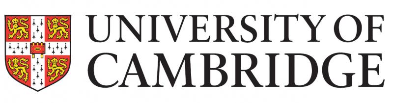
The University of Cambridge uses a logo that combines its coat of arms and a wordmark. In unison, they exemplify the institution’s rich history and enduring reputation. Moreover, the sophistication in the design represents the 800+ years of excellence of the university.
In the midst of various universities moving to more modern logos to adapt to modern times, the University of Cambridge still retains its coat of arms mainly because of its historical significance. Robert Cooke, Clarenceux King of Arms, granted the university its coat of arms in the year 1573 and it still remains an integral component of the university’s brand identity.
Design insights from the University of Cambridge logo
- The combination of red and gold captures the regal nature of the coat of arms while also making a bold statement. Furthermore, red can be seen as a color associated with passion embodying the institution’s fervor for intellectual exploration. And, gold stands as the perfect symbol of excellence and achievement, traits inseparable from the institution
- Considering that the university is seen as a beacon of knowledge and considering its traditional roots, the use of a serif font feels most relevant. Moreover, the legible traditional font also helps establish the university’s authority in the segment.
KIMP Tip: Every element in your logo should have a role to play. For instance, consider the coat of arms in the University of Cambridge logo reflecting the legacy of the institution and its identity! This way your logo manages to tell your brand’s story from the first glance.
3. University of Oxford
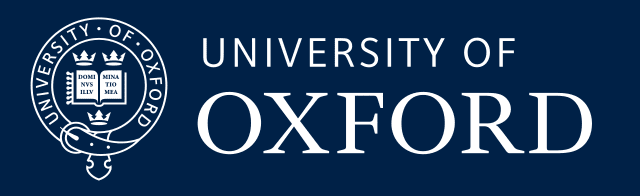
Featuring both a scaled-down version of the coat of arms and a wordmark, the University of Oxford logo is an elegant representation of the institution’s centuries-old heritage and academic distinction.
Like most universities with historical significance, the Univesity of Oxford also has its coat of arms for ceremonial use while it sticks to its combination mark logo on most other digital and print designs and branding.

Design insights from the University of Oxford logo
- Blue is a color associated with trust and it radiates professionalism. Additionally blue is also seen as a symbol of wisdom making it one of the most popular colors for university logos. The Oxford blue used in the University of Oxford logo is particularly elegant.
- The wordmark in the logo uses both sans-serif and serif fonts balancing the university’s contemporary approach and its historical roots.
4. Harvard University

The Harvard University logo appears like the perfect blend of innovation and tradition featuring a coat of arms and wordmark. The coat of arms stands as a testimony to the university’s commitment to knowledge.
Design insights from the Harvard University logo
- In addition to the colors, fonts, and symbols, the brand’s tagline is another impactful element to adorn a logo. It helps communicate what the brand stands for. Accommodating this idea, the Harvard University logo features the institution’s motto “VERITAS” which in Latin means “Verity” or “Truth”.
- A dynamic brand identity that accommodates the many faces of your brand makes perfect sense especially when your organization grows in scale and reputation. Therefore, when it comes to using the Harvard University coat of arms, you’ll notice 2 different versions being used. The image on the left is the most commonly used version. While the one on the right with the wreath is used in commemorative applications and some official occasions.
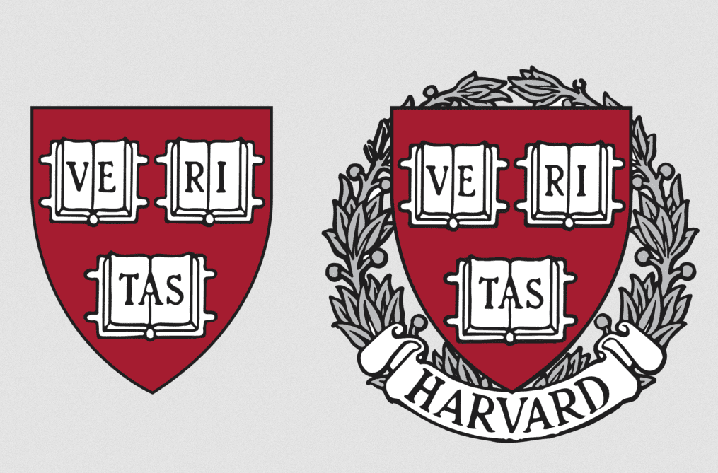
- The crimson used in the Harvard University logo is an attention-grabbing color which is also an intense hue representing the university’s strong reputation.
- To communicate gravitas, the logo incorporates an elegant serif font signifying Harvard’s timeless legacy.
5. Stanford University

You’ll notice that several university logos are dynamic with different variations appearing in different applications. This can also be said of Stanford University’s brand identity. You’ll notice the wordmark logo used in most digital applications including the official website and digital marketing materials.

The Stanford University seal, on the other hand, is for more formal settings, like office documentation, formal invites from the university, etc.
Finally, the third version of the logo is the monogram featuring an “S” intertwined with a tree. This often appears on merchandise and other designs intended to exude a more casual vibe. You might also find it in campus events and initiatives associated with student engagement.

Design insights from the Stanford University logo
- The colors chosen for university logos should be an embodiment of the university’s unique personality. And in the case of the Stanford University logo, the cardinal red captures the university’s spirit. Red being a color of authority and leadership, reflects the strong position that Harvard University holds in the segment.
- The best way to add more depth to your logo is to include symbols and imagery to reflect a unique element signature to your brand. In the case of the Stanford University logo, the tree that appears both in the monogram version and the official seal has a story behind it as well. When the seal was first designed in the early days of the university, the idea was to illustrate the ancient redwood tree on the campus. And today it has become an iconic element of the university’s visual identity.
6. National University of Singapore (NUS)
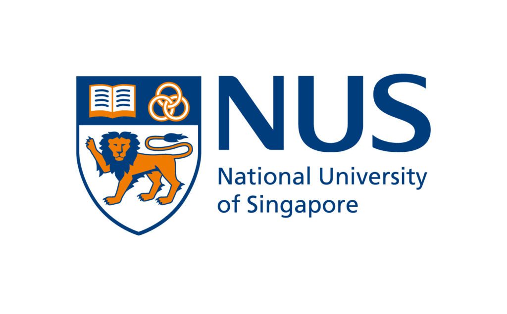
Like most university logos, the NUS logo features both a wordmark and a coat of arms. While the wordmark is minimalistic, the coat of arms turns out to be the eye-catcher in the NUS logo.
It is what the coat of arms features that makes this the most critical element of the logo design. The open book is from the crest of the University of Malaya in Singapore while the three rings are from the crest of Nanyang University. These three rings are also a visual representation of the university’s focus on “creating, imparting, and applying knowledge”. And finally, the lion in the logo is the national symbol of Singapore.
The current-day coat of arms used in the logo is a contemporary redesign of the traditional, slightly more intricate design. However, the core elements that define the meaning of the coat of arms still remain so as to keep the heritage of the university intact.
Design insights from the NUS logo
- Combination styles in university logos make it easier to create a cohesive visual identity while also allowing the flexibility to use symbolic representations and wordmark representations in various applications. The NUS logo also takes this approach.
- The NUS logo uses blue aligning with the industry norms.
- The use of a sans-serif font for the wordmark in the logo is indicative of the university’s evolution and the modernization of its identity over the years.
7. ETH Zurich – Swiss Federal Institute of Technology

There are very few monochromatic designs among university logos and the ETH Zurich logo is one of them. As a university known for its scientific advancements and several commercialized research, ETH Zurich uses a timeless wordmark logo.
The ETH in the logo stands for Eidgenössische Technische Hochschule Zürich in German which translates to Swiss Federal Institute of Technology Zurich which is the full name of the university. Since it holds the most prominent role in the logo design, the design uses a bigger uppercase font for the “ETH” part of the logo.
Design insights from the ETH Zurich logo
- The university’s commitment to inclusion and diversity is well-known and the minimalistic versatile design that can flexibly be incorporated into various places reflects this accurately.
- For university logos that are meant to stand as a symbol of innovation and modernity, sans-serif fonts are the most dependable options, and therefore the ETH Zurich logo also uses one.
- Simple logos have the benefit of being timeless. And another huge benefit is their global relevance. Meaning that they would be instantly recognizable on a global scale. ETH Zurich is a globally acclaimed university with students from all over the world and its simple logo works perfectly in favor of the brand.
- One additional factor to note is the university’s focus and advocacy of sustainability. The clean clutter-free contemporary logo perfectly aligns with this aspect as well.
KIMP Tip: Even with simple wordmark logos it is imperative to create an element of visual interest. This can be through font variations or subtle character manipulations. In the case of the ETH Zurich logo, it is the former.
Design timeless and sleek university logos with KIMP
All the university logos we discussed have at least one unique element that makes the logo the signature visual representative of the respective educational institution. To establish this deeper level of connection you cannot compromise on the originality of the logo design.
So, what’s one way to come up with a design that’s truly unique and visually stunning? Work with experienced professional designers. And on choosing an unlimited design subscription like KIMP, you get a chance to collaborate with such designers not just for your logo design but also for other branding designs and marketing designs for your brand.
Want to see how a design subscription can elevate your design workflow? Sign up for a free 7-day trial.