Font Psychology: How Font Choices Impact Your Designs
We speak a lot about symbolism and color psychology in marketing designs. More often than not, brands center all their decisions on these two major elements.
Right from logo to marketing communications, they leverage the power of color and symbols to convey their message.

But it so happens that even after all that, sometimes the audience cannot grasp the right message. And this leads to much disappointment and confusion for everyone involved. If you actually take a close look at this problem, the answer is not that difficult.
Yes, besides colors and symbols, marketing designs need to use the right font and typeface too. And if you have not realized it until now, we are speaking about the impact of fonts and font psychology principles on your designs.
While font psychology is a relatively unknown concept compared to color psychology, it is just as important, if not more.
The fonts you choose can have a significant impact on your audience, their comprehension of your brand’s personality, messaging, and more. It even impacts how they feel about a particular product or service. Or your brand as a whole.
Now you know why people can get so worked about fonts that they’ll argue online about them. Fonts can bring up a lot of emotions!
If this all sounds like a bit much, do not worry. Because this guide is here to break down font psychology for you. In this blog by Kimp, we will handle the major concepts in font psychology and ensure that you can pick the best fonts for your designs.
So with no further ado, let’s get started.
Font Psychology: Why do you need it in your Designs
Is font psychology a marketing myth? Do you really need it in your designs? Can it create a big impact, as everyone says?
Well, before we answer this, we would like to ask you a few questions:
Do you hate it when someone types a message in all capital letters because it feels like they are shouting? How do flowery, curved, and mismatched fonts make you feel? Do you have a favorite font type, and if so why?
If your answers to these questions involve some sort of emotional response, then you know that fonts can shape your perceptions in a big way.
As a marketer, or a brand manager, you want customers to take in your message 100% in the tone you intended. A small slip or a misunderstanding can prove very expensive.
Mehrabian’s rule of private communications states that 93% of all private communication is non-verbal. It is up to the medium and design style you choose to get the message across more than the words.
So while you spend hours choosing the right words for your marketing campaigns, it is time to pay attention to how you say those words too. And yes, the tone relies a lot on choosing the right font .
The Kolenda Font Mannequin theory also tells us that when people interact with various fonts, they dissect their attributes and end up associating those with the brand or the message they are reading.
This means that above all, for branding consistency, you must use the same design elements such as color, imagery, and font across all communications. And understanding how it makes the customer feel can have a drastic impact on your success.
Font Psychology: Picking the right font for your brand
We have discussed a lot on why you need to jump on font psychology right now for your brand. But we cannot stop there, can we? No. We also have to understand the relationship between each font and the brand it will eventually work for.
A word of caution, though, before we explore the concepts of font psychology in detail. Many of these concepts are based on how the experts perceive a general audience’s perception. But these can be very general, and for best results, we recommend you conduct thorough research on your target audience before you begin.
A small example is that popular articles on font psychology claim some fonts to be masculine and some to be feminine.
In an evolving world, this explanation may not work at all for more progressive audiences but may be apt for conservative audiences. It all depends on your target audience and who you want to attract with your brand.
The framework we give below is just that – a framework. If you want the fonts in your designs to fit your brand like a tee, then you have one extra step besides reading this blog.
Work with a designer, or get a design team with Kimp Graphics, and identify the best fonts for your brand.
Now let’s take a look at some popular fonts and their commonly associated traits.
Popular Fonts and their traits
In our previous blog on choosing the right fonts for your brand, we covered the various factors one must remember in this process.
One of them was the perceived traits of some popular fonts so that brands can choose the one they feel represents them the best. We relay a quick snapshot of that here for your reference. These traits and the factors we cover in the later sections will give you a comprehensive overview of font psychology and its workings.
Majorly, there are four popular font styles you see everywhere unless a brand uses a custom font style. They are:
- Serif fonts: Traditionally a font for the print media, customers often associate Serif with values such as stability, professionalism, tradition, and respectability, to name a few.
- Sans Serif fonts: The web design font or Sans-Serif is a favorite with Gen Z. They consider it to be sleek, modern, elegant, chic, and youthful.
- Script fonts: This font represents a handwritten and calligraphic way of writing. It is definitely artsier than the previous two and represents a playful, young, modern, and cool brand personality.
- Display fonts: Usually a customized and innovative version of a popular font type, display fonts represent a quirky, unconventional, and path-breaking personality.
Any other font style you see in the marketing world will combine these categories. Since custom fonts are a major design trend prediction for 2022, we expect that many new font styles will come our way.
Now that we know what fonts broadly represent emotionally, let us dig a little deeper and explore the application of font psychology in different designs.

Fonts across design types (as per Font Psychology)
Colors are easier to navigate than fonts, we feel. Why? Because there are three primary colors and a finite number of popular colors so picking one, or a set, for a brand becomes easy. You can vary it as you want, but the foundation work is pretty doable.
Fonts are a different ballgame altogether. Just by varying the weight or the style of the font, you can change the entire meaning of your messaging.
Not to mention that while brands can try to pick a singular font style for branding, marketing messages have to go fish every time based on the context and target audience.
So instead of telling you what each font means, (which is quite an exhaustive list), we show you how to leverage the principles of psychology in marketing designs.
Why are we doing this? Because like we said, we expect custom fonts to lead from the front in 2022.
Font Psychology and Branding
So, you want to design your branding? This includes things like logos, brand names, and any taglines you have. A great idea, given how visuals get across to the customers more effectively than text. And visuals have a great recall value as well. But now you are stuck on which font to choose or rather what the font for your brand should look like? It is a pretty important decision, given how it becomes an intrinsic part of your visual identity.
There are a few prerequisites for any font to become your brand’s font:
- It must be adaptable for digital and print mediums. You may choose a web-friendly font because right now all you have is an app, but this will create a lot of trouble when you need to advertise offline.
- The principal trait of the font style must match your brand’s personality. Yes, there is a lot of scope for marketing experimentation, but the basic traits must at least match. Customers often look for very simple things, and you don’t want to miss out on this advantage.
- The font must visually represent your brand’s personality in some form. It can be via symbolism, color, or the overall design – but it must, especially, since you use it in branding designs.
Kimp Tip: When customers interact with your designs, they take in all the elements all at once – color, shape, size, style, and symbolism. So it is important that you also choose a design that works overall and don’t just get hyper-focused on the elements.


As you can see, these two logos give off completely different vibes and the major difference between them are the fonts our team has chosen for them.
Font Psychology and Branded Communications
Okay, we all know that customers take brand communications seriously. They read, dissect, and put them on the internet for the world to see. So it becomes essential that you do it well.
Design, layout, and color will help you, but more often than not it is font selection that clinches the deal. When a customer sees your headline, it sort of sets the tone for how they perceive the rest of the message. Get it right from the first letter, just like how Netflix does with its series and movie titles.
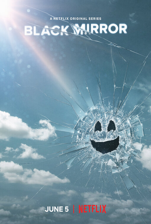
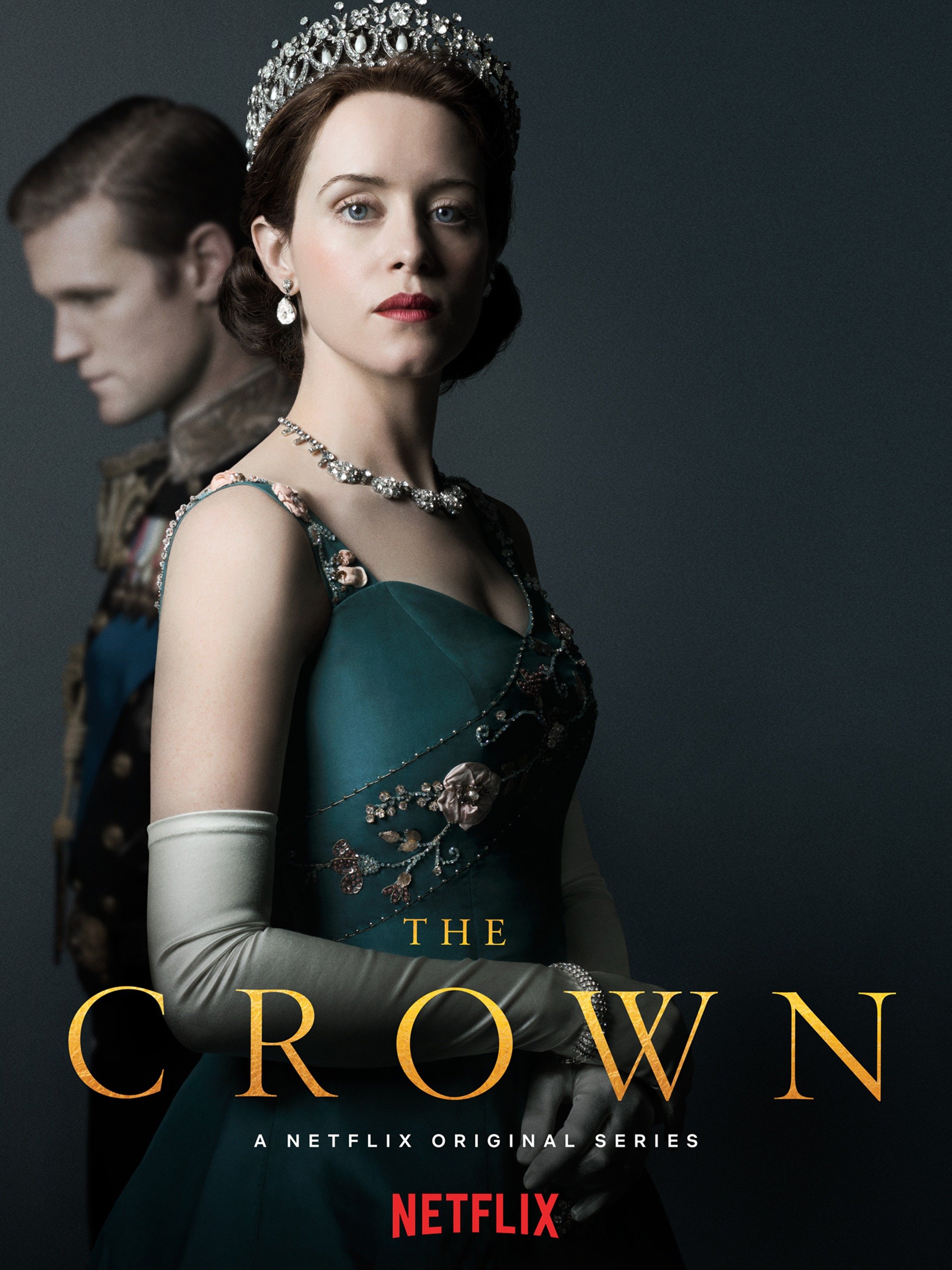
The font for “Black Mirror” is quite different and shows that this is an emotional show while the font for the “The Crown”’ suggests that it is a show about old values.
Official communications can be authoritative and straightforward with a serif font or be fun and quirky with a script font. It all depends on the message you want to convey.
Font Psychology and Marketing
After branding, where do you feature fonts? Marketing designs, right? So it goes without saying that the fonts you choose here must also draw from font psychology. Marketing, as a rule, borrows heavily from the field of psychology so that you can influence your customers effectively.
And fonts are a natural next step on that path.
Marketing is becoming increasingly visual, and that trend is here to stay. Especially in digital marketing, the attention span of customers is at an all-time low, and design is your only tool to catch their eyes. In the split second the audience comes across your content, design ensures it conveys the right emotion so that they stay.
This has three major parts:
Based on Target Audience
Just as we said in the introductory section, font psychology principles draw and build on audience reactions to various fonts. As the world changes, these perceptions also change. Your font choices have to also change accordingly.
For example, if you are marketing a health product to older men who are conservative and an older generation, your font must exude masculinity and strength above all. More than health, you want the font to convey traits like boldness, adventure, and passion.
But if you are marketing the same product to a younger, more nuanced generation, you can choose to show vulnerability mixed with strength and opt for softer font styles.
See what a difference knowing your target audience well makes?
Based on Brand Personality and the Industry
This is a typical suggestion and one that we covered in the earlier sections on branding design. But it so happens that you cannot use the same branded font for all occasions. Some do not work well in videos, animations, and so on. Or the product/message you wish to convey needs a little extra.
In such cases, we recommend picking a secondary communication font that reflects:
- brand personality
- industry standards
- important brand traits
Based on the emotions
This is our favorite section. Because it allows you to truly understand font psychology’s magic. And above all, understanding this section will help envision what your custom font looks like.
You can customize fonts based on how you want your customers to feel.
For example, for a joyous message, you can pick script fonts as the base and build on it to make it unique to your messaging. Customize it with your chosen color, style, and design style as per your brand style guide. Script fonts with their curves and loops make everyone feel happy and will be a perfect choice to convey excitement, happiness, and joy.
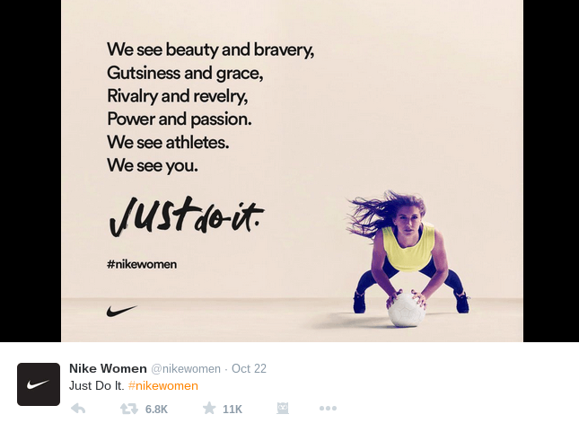
Similarly, have you noticed the font Nike uses in all their motivation posters and marketing campaigns? They use a collection of fonts but all of them fall under the sans-serif font family and are usually bold to signify the feeling of power. The combined impact of their imagery and the powerful hard-hitting fonts make it a killer combination.
But is it only for happy and feel-good emotions?
No. In one of their somber messages, ASPCA chose a minimalistic and simple sans-serif font that truly drove the point home.

Choosing an Impactful Font for your Designs
We find checklists extremely helpful, and we hope you do too. After covering the basics of font psychology and how you can leverage that in various designs, here is a quick checklist on choosing the best font.
- What is the primary trait of the font that you are looking to choose?
- Does it match your brand’s personality?
- Is there any gender that customers usually associate with this font? Does that benefit you as you pick this to represent your brand?
- Does the font work well with the other design elements?
- If it is a marketing font, does it pair well with the branding font you picked?
Answering these questions will take you one step closer to choosing the right font for your designs based on font psychology.
Leverage Font Psychology with Kimp
We learned a lot about fonts today. Who knew choosing fonts was going to be so complicated? Well, we now know that the font selection can completely make or break your designs.
So no more delaying or picking a generic font without understanding the hidden message or its impact on your brand’s success.
Work with the Kimp Graphics team to get the help of experienced designers to navigate such important matters. And you’ll get unlimited graphic design services which includes unlimited requests, revisions, user profiles, brand buckets, and more.
Sign up for the free trial now and explore the world of marketing designs and fonts.