Tim Hortons Logo & Brand: A Canadian Company’s Global Reach
Very few things in the world go well together like coffee and donuts. It’s a match made in culinary heaven. What brand do you think of when you hear “coffee and donuts”? Some might say Starbucks or even Dunkin’. But for Canadians, one name resonates deeply: Tim Hortons.
Renowned far beyond its Canadian origins, Tim Hortons has mastered the art of blending comfort, community, and culinary excellence. This makes it a great brand to look up to for branding lessons. At the forefront of this iconic brand stands its memorable wordmark logo. A graphic that has become an embodiment of the warm experience associated with Tim Hortons.
In a broader sense, Tim Hortons’ logo appears deceptively simple. Yet, the brand’s strategic connection to this simple design transforms it into something extraordinary. Curious to delve deeper? You’re in the right place. In this blog, we’ll be talking about the Tim Hortons logo, the stories and ideas behind it, and its significance in Tim Hortons’ branding strategy.
Tim Hortons – a quick glimpse into its origins
In order to understand the Tim Hortons logo and brand better, let’s first look at the brand’s backstory.
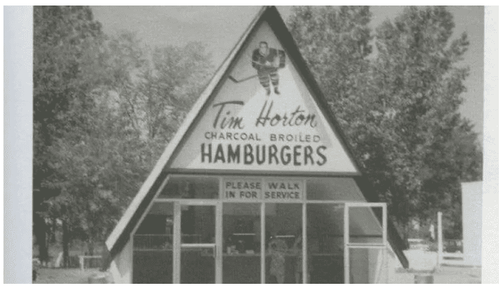
Before the donut phase of Tim Hortons, there was a less-known hamburger phase! In the early 1960s, Tim Horton, a Canadian hockey legend, partnered with businessman Jim Charade and opened a hamburger restaurant. Reportedly, going with Jim Charade’s idea, the business slowly pivoted to donuts and this was the most critical milestone for the Tim Hortons brand.
Back then the name of the brand was Tim Horton Donuts which eventually became Tim Hortons. The name itself was chosen with the idea that a celebrity name (considering Tim Horton’s popularity back then), would benefit the business. And today, the name has indeed become an iconic one in the food industry.
Ron Joyce, who joined as a franchise partner for Tim Hortons can be credited for the brand’s rapid expansion in the next few decades. Tim Hortons opened its 500th store in the year 1991, and its 2000th store in the year 2000. That’s the rapid pace at which the brand grew.
Today, with more than 5,000 stores all over the world, Tim Hortons generates an annual revenue of about $2 billion. How has the Tim Hortons logo and brand evolved through this growth? Let’s find out.
A brief overview of the Tim Hortons logo evolution
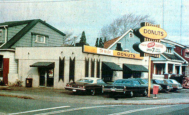
First Tim Hortons logo
The first Tim Hortons logo was an elaborate one that clearly communicated everything about the brand.
- It featured the brand name in a font inspired by Tim Horton’s own signature.
- Within the oval frame, there were illustrated donuts visually telling what the restaurant catered to.
- The addition of the word “Donuts” further emphasized the brand’s focus.
- Finally, there is the color palette of this logo – a combination of warm yellow and brown. The warmth of yellow and the association of the color brown with coffee made them both relevant to the brand. The other color in focus in this logo is red. This is supposedly a derivation from the association of red color with Canada.
KIMP Tip: As you can see from the first Tim Hortons logo, the colors, fonts, and imagery in your logo all have their own crucial roles to play in logo design. This was the case decades ago and will be decades from now as well!
Need help designing logos that capture the essence of your brand? Get a KIMP Graphics subscription.
When the logo dropped the “Donuts”
The second big iteration of the Tim Hortons logo was in the 1990s. It was then that the design took a major leap forward by dropping the visual and textual representation of “Donuts”. This rebranding was to embrace the company’s diversification in the menu.
By this time Tim Hortons had already become a familiar name in the Canadian fast-food industry. So the brand name wordmark and the rest of the logo design were retained in the logo. Another major update was the inclusion of the brand’s new tagline, “Always Fresh”. The brand has held on to its tagline since then, though it is no more part of the logo design.
The recent Tim Hortons logo
The present-day Tim Hortons logo is a simple wordmark with a traditional charm. It retains the script font from the brand’s early days. This way, the brand successfully resonates with its audiences from various generations. This is a custom typeface that was created to mimic the original logo and to carry the same impact when the brand name is written in English, French, and German languages.
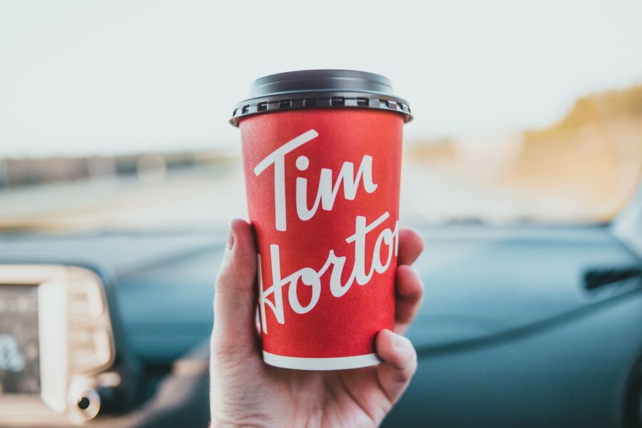
The color red has also become the primary brand color of Tim Hortons with the product packaging and social media aesthetics of the brand all prioritizing this color. Therefore, the logo retains this red color. Additionally, the sense of urgency and excitement that the red color creates makes it a relevant choice for the food industry, especially for fast-food businesses.
On the whole, the clutter-free minimalistic design is both timeless and globally relevant.
Having discussed the Tim Hortons logo, let’s now talk about other brand identity elements that define the visual representation of the brand.
Tim Hortons tagline
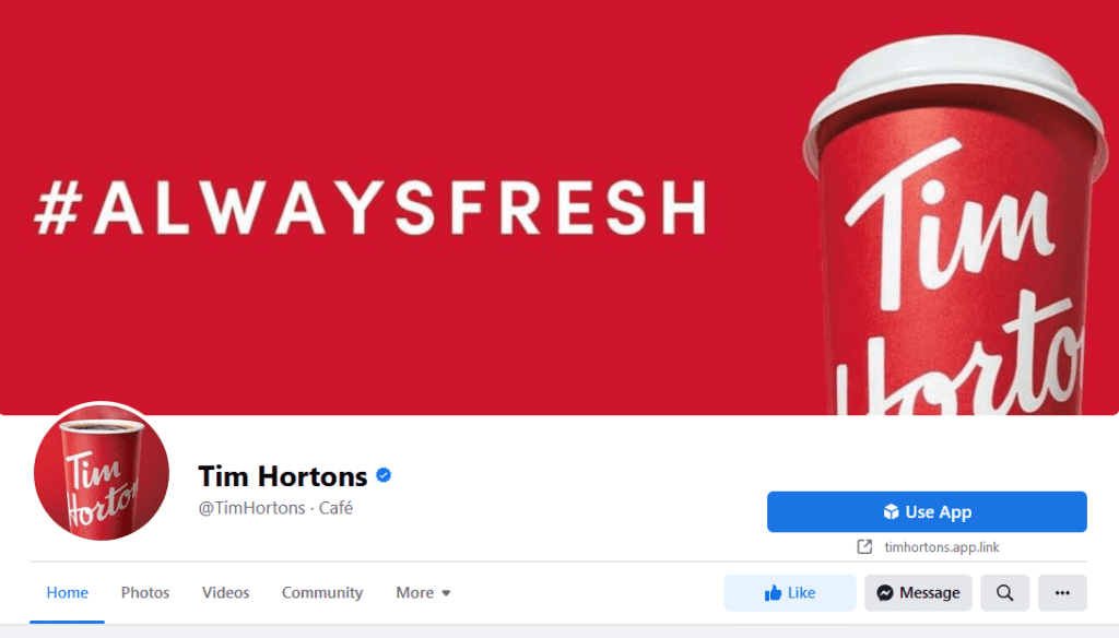
Like the logo, the tagline “Always Fresh” has also been a consistent part of the Tim Hortons brand identity.
This tagline speaks for the brand’s commitment to delivering high-quality, freshly prepared food and beverages to its customers. The tagline’s connection to Tim Hortons remains relevant to date. Take a look at a recent Tim Hortons video that emphasizes this tagline and how the phrase reflects the brand’s philosophy and practices.
As a visual cue, the brand consistently displays the tagline in several places including its cover image on Facebook and Banner image on its official YouTube channel. Seeing the tagline sprawled across the brand page on various digital platforms helps reinforce the connection.
The maple leaf emblem
Another distinct brand identity element of Tim Hortons is the maple leaf symbolism that appears in several places. From product packaging to promotional materials, several designs representing the Tim Hortons brand carry a maple leaf symbol in them along with the logo. In fact, in some of its restaurants outside Canada, the nickname “Tims” appears on a maple leaf background as the logo.
The maple leaf is an iconic emblem of Canada and is often used to symbolize Canadian pride, culture, and values. Tim Hortons, being a quintessentially Canadian brand, incorporates the maple leaf into its branding to highlight its deep roots in the country. Therefore, the maple leaf symbol carries the brand’s origin stories on its shoulders in other countries.
KIMP Tip: Your brand identity system can include a collection of elements besides your logo. These can be distinct shapes and symbols that hold a strong connection to your brand. Like the maple leaf symbol used by Tim Hortons or the coat of arms or official seal used by several universities in their branding.
Need help creating a visually immersive brand identity system to accurately represent and deliver your brand story? Choose a long-term option for your design workflow – like an unlimited design subscription!
Branding beyond the tangible realm
All the branding elements we spoke about until now are concrete visual entities that speak for the brand. But, in branding, there are some non-tangible elements that make or break the brand’s identity and reputation. From community-focused efforts (CSR activities) that a brand makes to reward programs to engage the customers, there are various non-tangible elements that businesses can leverage to strengthen their brand. Let’s now talk about such efforts from Tim Hortons.
Roll Up The Rim
People look forward to holidays and special occasions every year because they bring seasonal excitement with them. They give them something to look forward to each year. And they also provide an escape from the routines. Brands can mimic this effect by creating seasonal campaigns, unique traditions that only loyal customers will understand.
Tim Hortons does this through its Roll Up The Rim campaign. Much like the eager wait for holidays Tim Hortons enthusiasts eagerly anticipate the “Roll Up The Rim” campaign every February. This has become a tradition shaping the brand’s community for over 35 years.
The idea of the campaign is that customers purchasing hot beverages from Tim Hortons during the contest period can roll up the rim of their cups to reveal unique prizes. Ranging from free coffee to a free car, or even a “please play again” message!
Several customers so enthusiastically look forward to the contest that there are serious discussions on online forums regarding strategies to win.
Keeping up the expectations of their customers, the brand did not give up the campaign even during the pandemic. Instead, they sensitively optimized the contest for a digital format so customers could take part without apprehensions. The digital version of the contest led to 2 million app downloads in March 2021.
This annual ritual doesn’t just boost sales temporarily; it solidifies Tim Hortons’ place in the hearts of its customers. The joy of anticipation, the thrill of winning, and the stories exchanged—these intangible moments create a lasting emotional connection.
Tims Rewards
The Tims Rewards program stands as a testament to the brand’s dedication to fostering loyalty and connection through thoughtful incentives. Tims Rewards is more than just a typical loyalty program; it’s a strategic effort to reward customers for their continued patronage.
The Tims Rewards program stands out from other loyalty programs in many ways. One is the customer-focused perks that members can enjoy. For example, most brands allow users to accumulate loyalty points and use them for discounts on purchases. The Tims Rewards program offers this as well. Additionally, there are more sensible perks like:
- Getting a free item on their birthdays.
- Gaining exclusive access to sweepstakes and games including Roll Up To WIN.
- Skipping the line at the restaurant when ordering ahead with the app.
All of these perks show that for your reward programs to actually work in favor of your brand, know what your customers are looking for.
As the Tims Rewards program continues to evolve, it shows how non-tangible elements like rewards and incentives can strengthen a brand’s emotional connection with its audience, therefore strengthening the brand.
Tim Hortons Foundation Camps
Tim Hortons is known for its diverse community-focused activities. One of the most popular among them is the Tims Camps initiative.
Tim Hortons Foundation Camps are vocational camps designed for the youth in the underserved community. From skill training to guidance, these camps work in many ways to help them land better jobs and shape a better future.
This is Tim Hortons’ way of showing its customers that the brand goes beyond serving coffee. Such initiatives create a positive brand image and attract like-minded people who share these values, both as business partners and as customers. Besides, customers love brands that give back to the community.
In addition to all these, by investing in the future of the youth from low-income family, in a way Tim Hortons is also projecting itself as a forward-thinking brand. It shows the brand’s foresight and meticulous approach. These traits further humanize and strengthen the brand.
Having changed the lives of more than 295,000 campers so far, this unique initiative from Tim Hortons definitely wins the brand some brownie points in branding!
Building your Tim Hortons-inspired brand identity with KIMP
From all of these nuances, it is clear that the growth and strength of the Tim Hortons brand come from a balance of tangible and non-tangible brand elements. All along the branding journey, you need visuals that communicate your idea, your brand’s message. This is where an unlimited design subscription like KIMP comes into the picture.
With a single subscription, you get unlimited designs and a dedicated design team to collaborate with on an ongoing basis. That’s how you can sculpt your brand identity slowly and steadily!
Ready to give it a shot? Sign up for a free trial now!