Pantone Colors Through the Years: A Legacy of Color Trends
There is one color system that has seamlessly woven itself into the fabric of visual culture – the Pantone color system. What started in the print design realm has gradually expanded to the digital realm as well. And today it has become a go-to source of inspiration for artists and designers around the world. So much so that we can safely say that this color system has evolved into the universal language of color.
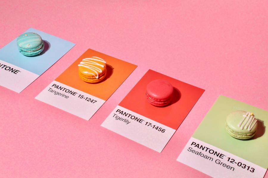
As December approaches, businesses eagerly anticipate the Pantone Color Of The Year announcement. Because this announcement often marks the birth of several color trends the upcoming year. With the unveiling of the Pantone Color Of The Year 2024 just around the corner, let’s take a swift journey through the history of Pantone Colors, revisiting the impact of the 14 Colors Of The Years from the last decade – colors that have shaped the creative landscape.
Ready to look back at the Pantone colors that shaped some of the critical color trends of the last decade? Let’s go.
- The Pantone Color System & the COTY Tradition: Tracing the Origins
- Every Single Pantone Color Of The Year Since 2010
- Pantone Color Of The Year 2010 – Turquoise
- Pantone Color Of The Year 2011 – Honeysuckle
- Pantone Color Of The Year 2012 – Tangerine Tango
- Pantone Color Of The Year 2013 – Emerald
- Pantone Color Of The Year 2014 – Radiant Orchid
- Pantone Color Of The Year 2015 – Marsala
- Pantone Color Of The Year 2016 – Rose Quartz & Serenity
- Pantone Color Of The Year 2017- Greenery
- Pantone Color Of The Year 2018- Ultra Violet
- Pantone Color Of The Year 2019- Living Coral
- Pantone Color Of The Year 2020- Classic Blue
- Pantone Color Of The Year 2021- Ultimate Gray & Illuminating
- Pantone Color Of The Year 2022- Very Peri
- Pantone Color Of The Year 2023- Viva Magenta
- What to Anticipate for Pantone Color Of The Year 2024
The Pantone Color System & the COTY Tradition: Tracing the Origins
Pantone revolutionized the printing industry in 1963 with the PANTONE MATCHING SYSTEM, an innovative tool for consistent color reproduction. This color system came as an answer to the challenges in attaining color accuracy back then. What began as a pragmatic solution rapidly evolved into a cornerstone of the design industry.
By the 1980’s the Pantone Color Institute began color consulting services and established their authority in trend forecasting.
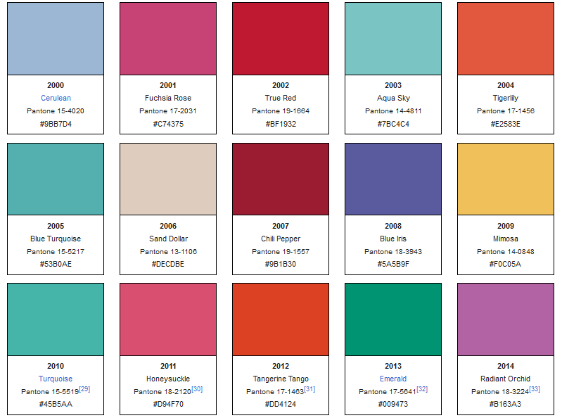
Every year since 2000, Pantone has chosen a color of the year to reflect the current cultural climate and serve as a trend forecast for various industries. Labeled the “Color Of The Year”, this selection acts as a trendsetter for the upcoming year.
The below images show every single Color Of The Year announced since 2000. Of these, we’ll be looking at the ones from the last decade, from 2010 onward.

What has been the impact of the Pantone Colors Of The Years so far?
- From runway to retail, these chosen colors have served as trendsetters in the fashion segment each year.
- Brands around the world leverage these colors in their marketing designs to join the conversation.
- The selected color makes its way into interior decor trends in the upcoming year in the form of furnishings, paint choices, and decor accessories.
- The beauty and cosmetics industry introduces limited edition collections aligning with the selected color.
- Events hosted in the first few months of the year draw inspiration from this color in their aesthetics.
To understand the impact of these colors a little more, let’s look at the Pantone Colors Of The Years since 2010 and some examples of how these industries leveraged them.
Every Single Pantone Color Of The Year Since 2010
Pantone Color Of The Year 2010 – Turquoise
In 2010, Pantone crowned PANTONE 15-5519 Turquoise as the Color of the Year. As can be seen in the below image, this Turquoise is a unique blend of vibrant green and calming blue. The color evokes thoughts of soothing waters. A “comforting escape from the everyday troubles of the world”, according to Pantone.
Turquoise also holds cultural significance in some parts of the world where it is considered to be a protective charm. In short, this color holds a lot of positive connotations.

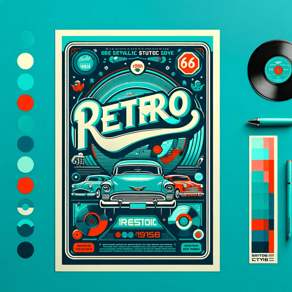
How do you use Pantone colors like this one in your designs? Well, your options are endless. To ignite your imagination, we asked ChatGPT to “design a retro-inspired poster with PANTONE 15-5519 Turquoise as the primary color” and here’s what we got!
Similarly, brands have since been using Turquoise in many ways in their branding and marketing graphics. Like the Turquoise Coca-Cola label or the Apple iPod Nano Turquoise version and so on. Color announcements like the Pantone Color Of The Year rekindle the popularity of these colors.
KIMP Tip: As you can see from the DALL.E-generated example, the problem with random text being displayed in AI-generated images and typo errors in the displayed text continues even with the introduction of DALL.E-3 as you can see. To understand this update better and to know about its strengths and limitations check out our blog here.
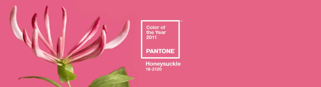
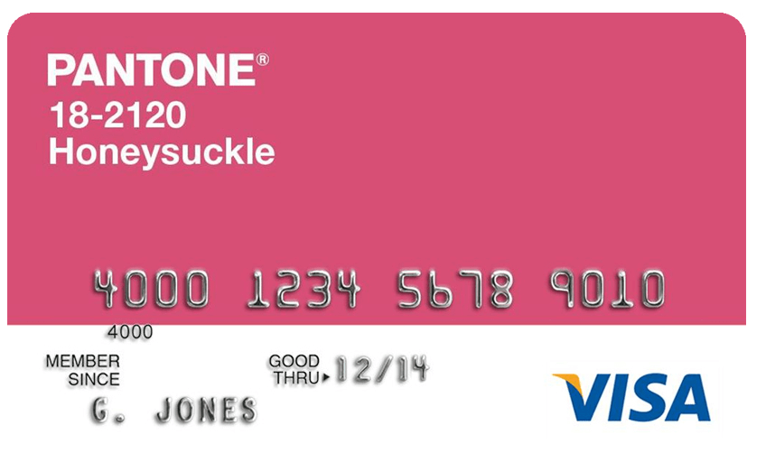
Pantone Color Of The Year 2011 – Honeysuckle
PANTONE 18-2120 Honeysuckle is undoubtedly one of the prettiest and most vibrant Pantone colors from the last decade. This unique blend of red and pink was bold and bright, “perfect to ward off the blues”, according to the executive director of the Pantone Color Institute, Leatrice Eiseman.
As can be seen from the below image, this color is an all-season color, a versatile choice for various industries.
A beautiful PANTONE Visa® Platinum Rewards Card was introduced in the year 2011 in a Honeysuckle version.
Take a look at the image generated by DALL.E of “a coffee maker inspired by the lively tones of PANTONE 18-2120 Honeysuckle”. No wonder the bold color made a statement in the home interiors segment.

Pantone Color Of The Year 2012 – Tangerine Tango
For 2012, Pantone announced PANTONE 17-1463 Tangerine Tango as the Color Of The Year. adding to the bold vibes of the Honeysuckle from the previous year, Tangerine Tango evoked a burst of energy.
Leatrice Eiseman described this color as “dramatic and seductive”. As can be seen in the image below, this shade beautifully blends the vibrance of red and the warmth of yellow resulting in an attention-grabbing color.
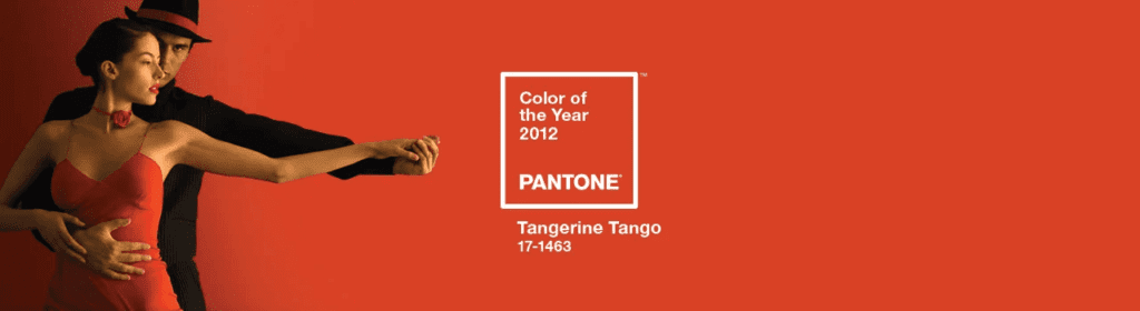
Several design labels like Tommy Hilfiger and Elie Tahari introduced this color in their Spring 2012 lineup.

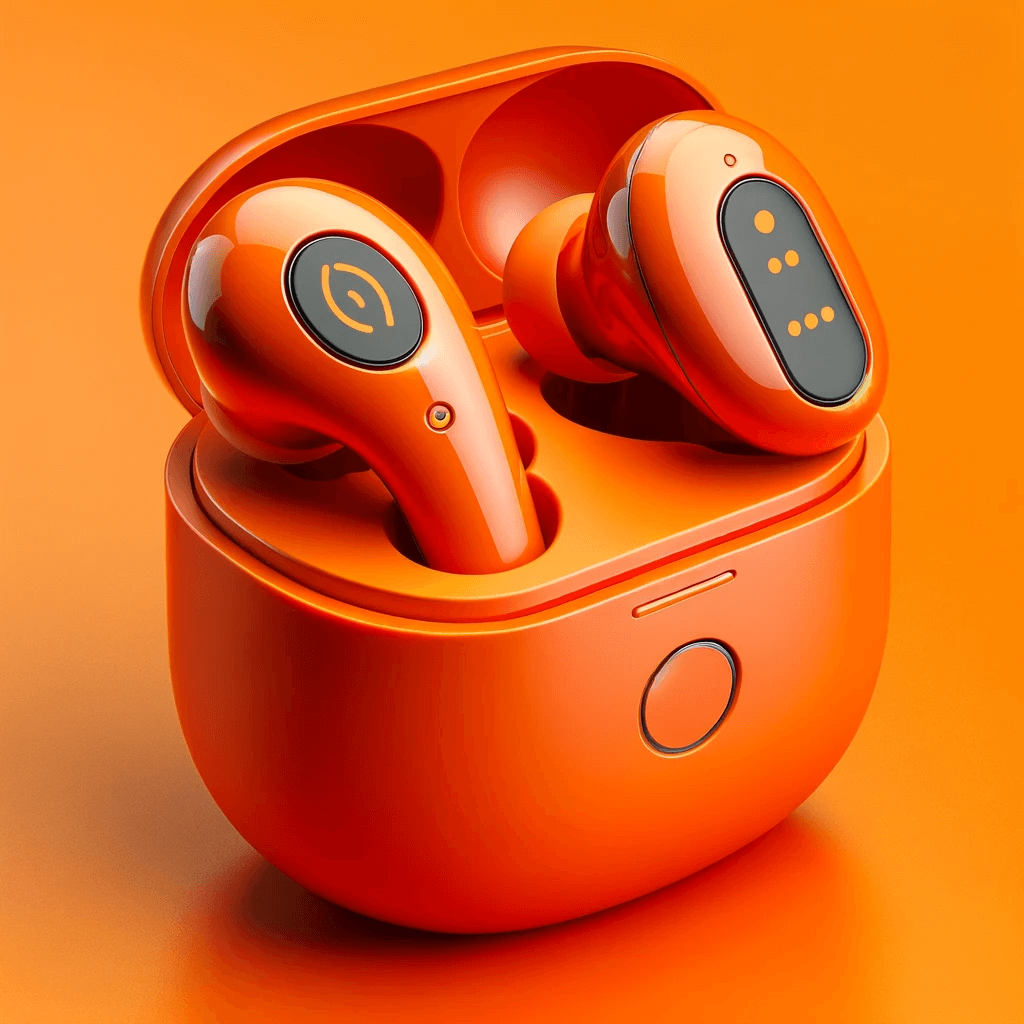
We asked ChatGPT to “Design a stylish pair of wireless earbuds inspired by the bold and playful hue of PANTONE 17-1463 Tangerine Tango”. This shows that this bold and playful hue feels relevant even today!
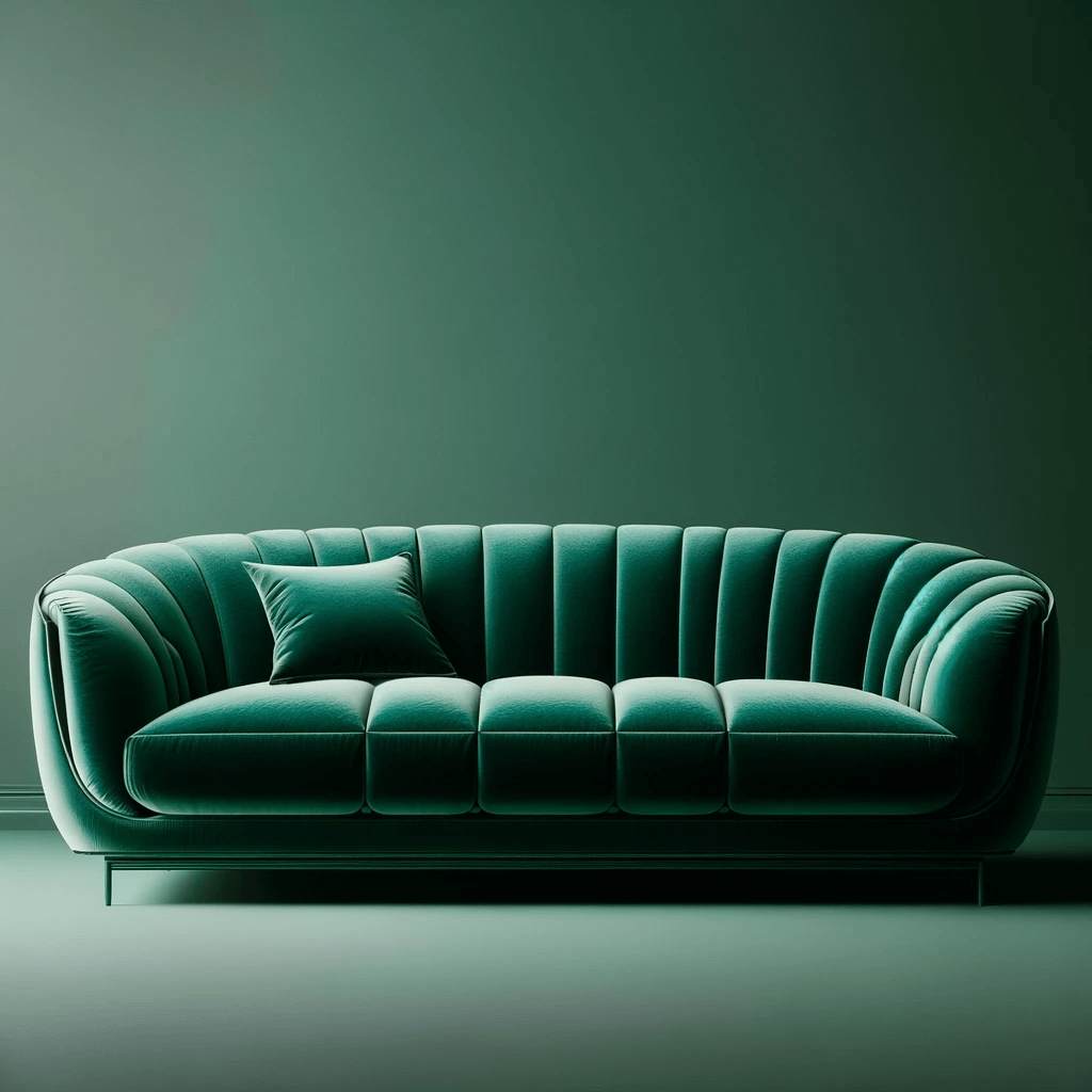
Pantone Color Of The Year 2013 – Emerald
PANTONE 17-5641 Emerald is one of the most luxurious Pantone Colors from the last decade. Capturing the essence of lush greenery, this deep and radiant hue symbolized growth, renewal, and a sense of sophistication.
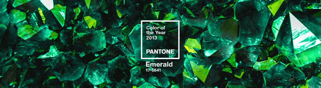
According to Leatrice Eiseman, Emerald evokes a “sense of clarity, renewal and rejuvenation”. In addition to the core Emerald hue, earthy combinations and sophisticated interpretations of the colors popped up in the world of fashion and home interiors that year.
The below image is that of “a luxurious and inviting sofa design in the rich and sophisticated shade of PANTONE 17-5641 Emerald” generated by DALL.E. It shows the many dimensions of this gorgeous and posh shade of green.
Pantone Color Of The Year 2014 – Radiant Orchid
In 2014, Pantone unveiled PANTONE 18-3224 Radiant Orchid as the Color of the Year. Labeled by Pantone as a “dazzling attention-getter”, this color made its way into the world of fashion and beauty. Pantone also noted that the color goes well with a wide range of skin tones making it a popular one in the beauty and cosmetics industry.
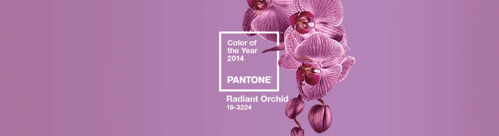
This is one of the Pantone colors that can easily be combined with neutrals like grey and taupe. The color had a special place in the Spring 2014 collections of fashion labels like Emerson by Jackie Fraser-Swan and Yoana Baraschi.

When we asked DALL.E to design “an elegant pair of high heels inspired by the rich and enchanting tones of PANTONE 18-3224 Radiant Orchid”, here’s what we got! It shows how this rich color has its spot in the fashion segment.

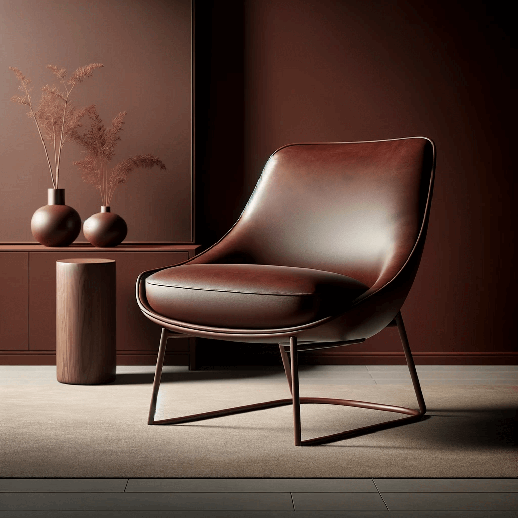
Pantone Color Of The Year 2015 – Marsala
For the year 2015, Pantone crowned the rich and robust PANTONE 18-1438 Marsala as the Color Of The Year. This one was a unique color with a hint of drama, not for those who love the ordinary!

Given the versatility of this color, Pantone recommended combining Marsala with muted Pantone colors like Silver Grey, and Cloud Dancer among other combinations. The deep and earthy tone of Marsala made it popular particularly in the home interiors category.
To explore the modernity of Marsala, its relevance in contemporary aesthetics, we asked DALL.E to “design a contemporary Marsala-toned accent chair, creating a stylish focal point in a modern home.” Here’s what it looks like.
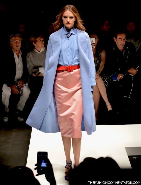
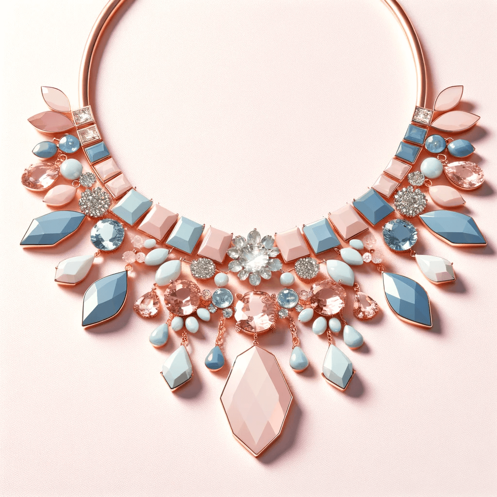
Pantone Color Of The Year 2016 – Rose Quartz & Serenity
In 2016, Pantone took an unprecedented step by introducing not one but two Colors of the Year – PANTONE 13-1520 Rose Quartz and PANTONE 15-3919 Serenity. This combination of a soft pink and tranquil blue was introduced to embrace gender fluidity which was the need of the hour.

The combination was also meant to reflect the harmony between peace and order in a world of digital chaos. This calm and relaxing combination was actively used in glossy and matte finishes along with Pantone colors like Orchid Haze, Cream Gold, Rose Quartz, and more.
The combination was adopted in the Spring 2016 collections from fashion labels like Richard James and Emilio Pucci.
The below image shows DALL.E’s rendition of “a chic statement necklace, seamlessly blending the gentle and soothing tones for an elegant accessory”.
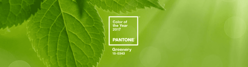
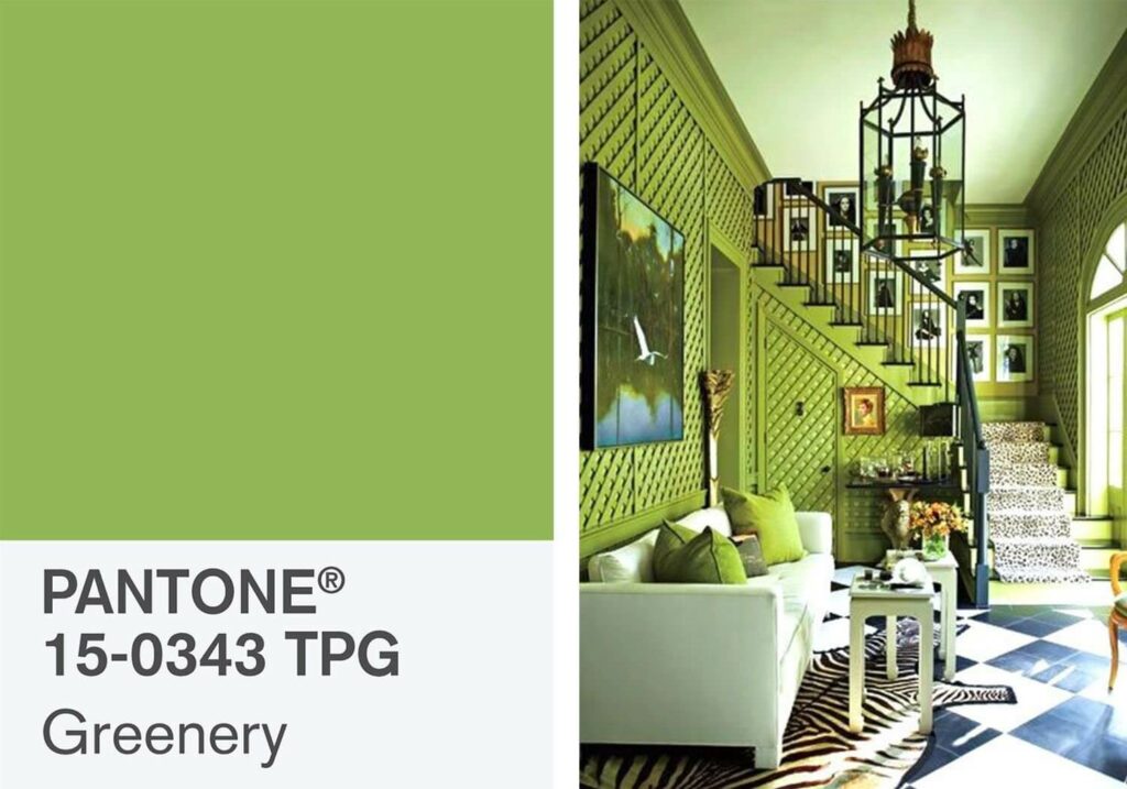
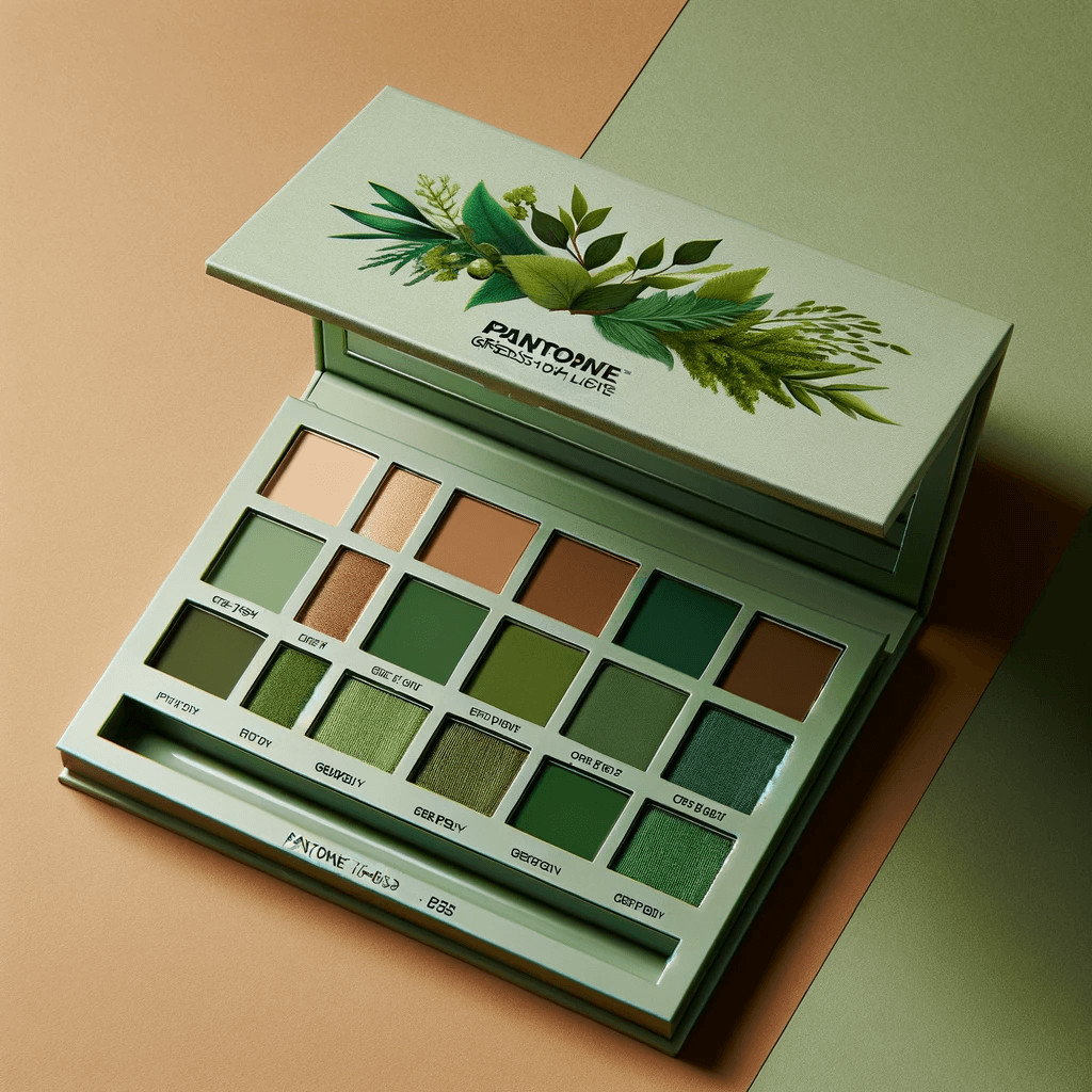
Pantone Color Of The Year 2017- Greenery
Among all the Pantone colors inspired by nature, Greenery is one of the most vibrant. For 2017, Pantone picked PANTONE 15-0343 Greenery as the Color Of The Year. The color feels like an escape into the natural world, a breath of fresh air, fresh greenery.
Given the trans-seasonal nature of Greenery, Pantone came up with color combination recommendations for various moods including some analogous and calming palettes. The color also grew popular in fashion, beauty, product design, graphic design, and other categories.
DALL.E’s version of “a PANTONE 15-0343 Greenery-inspired eyeshadow palette with a mix of earthy and lively tones” shows how this bold color finds its place in the most unexpected applications like makeup, especially when you wish to create a statement look.
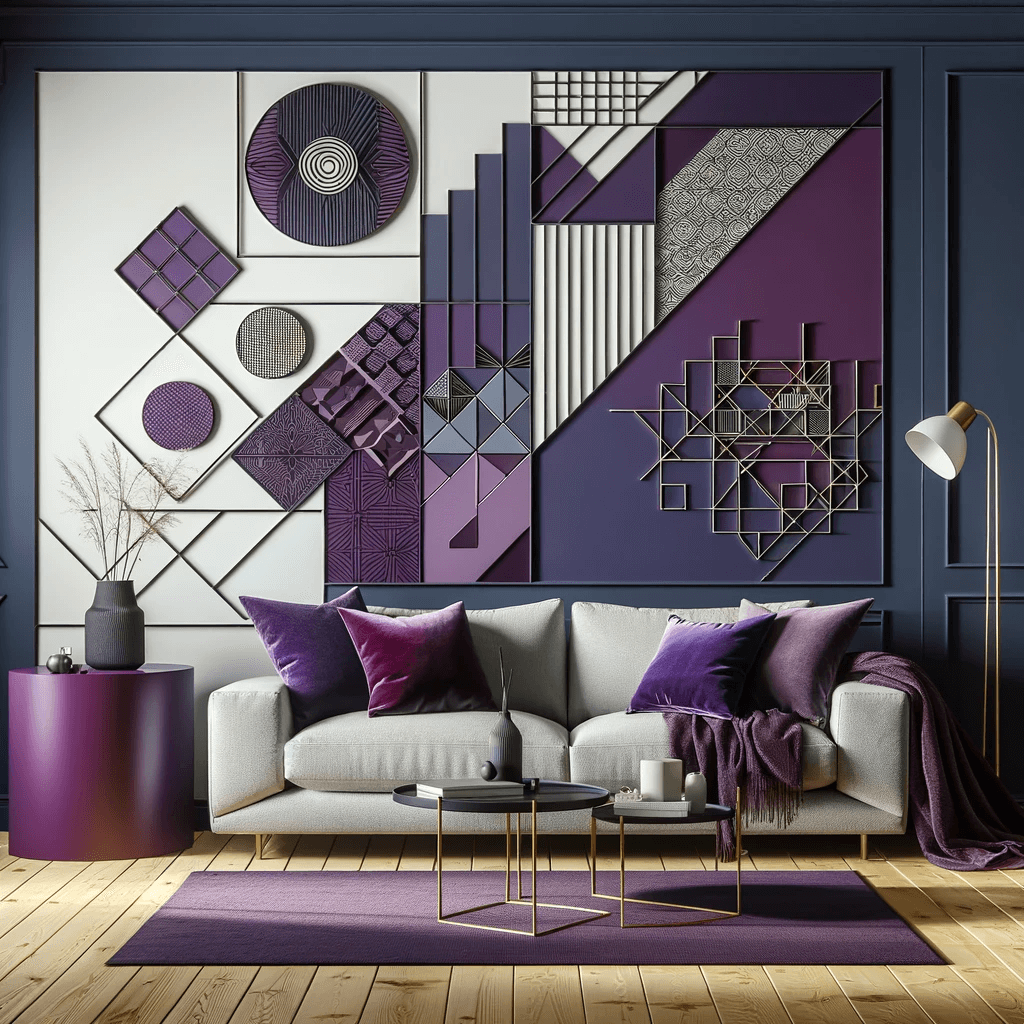
Pantone Color Of The Year 2018- Ultra Violet
For 2018, Pantone’s choice for the Color Of The Year was PANTONE 18-3838 Ultra Violet. Symbolizing innovation, creativity, and the mysteries of the cosmos, this futuristic color has also had a special place in pop culture and technology.

Ultra Violet pushed the boundaries of conventional color choices. This deep and enigmatic purple found its way into various industries, from fashion to beauty and home decor, embodying a spirit of exploration and pushing creative boundaries.
Renowned musical instruments manufacturer Fender introduced an exclusive guitar collection featuring Ultra Violet as a part of celebrating Jimi Hendrix on his 76th birthday.
.@JimiHendrix brought shades of Ultra Violet to the forefront of culture as a symbol of personal expression and artistic brilliance. Today, on his 76th birthday, we are bringing this @pantone Color of the Year to life! #Pantone #183838
— Fender (@Fender) November 27, 2018
Learn more here: https://t.co/AM0opziy1M pic.twitter.com/lk5PzzTGXv
Wondering what this color would look like in other segments like home decor, for example? Here’s how DALL.E imagined “an accent wall in a living room using PANTONE 18-3838 Ultra Violet”
Pantone Color Of The Year 2019- Living Coral
As a contrast to the rich and vibrant Ultra Violet, Pantone picked PANTONE 16-1546 Living Coral as the Color Of The Year 2019. Resonating with the lively underwater ecosystem, this positive color is spectacular in various applications.

Talking about the choice of Living Coral as the Pantone Color Of The Year 2019, Leatrice Eiseman said, “With consumers craving human interaction and social connection, the humanizing and heartening qualities displayed by the conviving Pantone Living Coral hit a responsive chord”. Naturally, the color was instantly accepted as a warm choice in the technology-forward era.
As for using this color in home furnishings, here’s a DALL.E version of “a children’s playroom with a playful and comfortable shag rug in the lively shade of PANTONE 16-1546 Living Coral”.

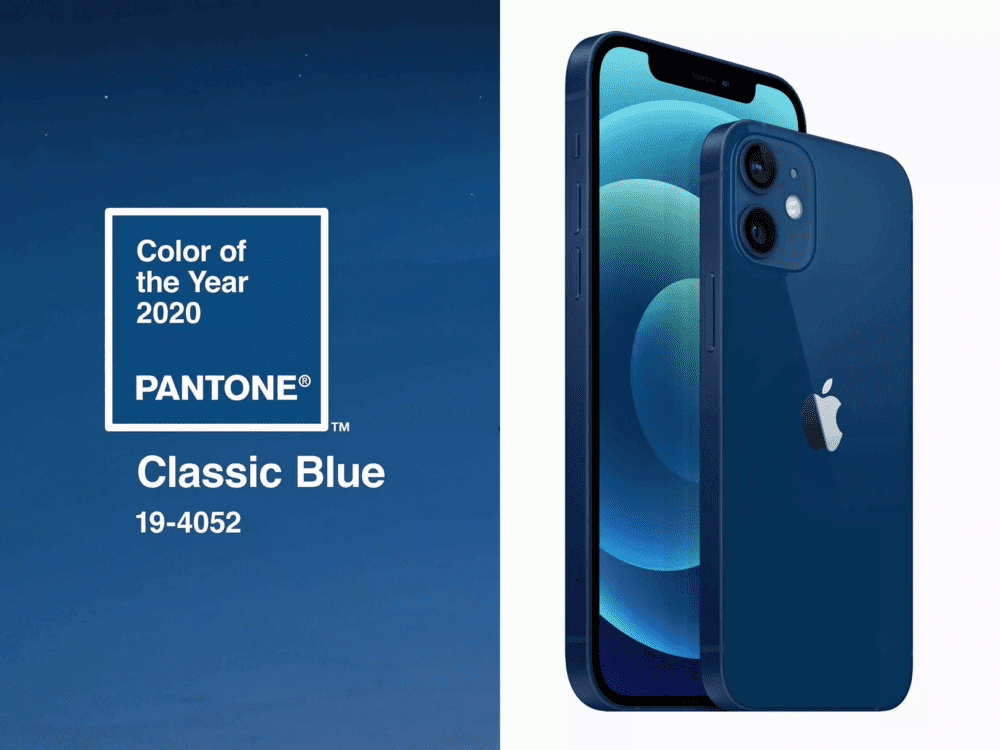
Pantone Color Of The Year 2020- Classic Blue
Calm, confident, and timeless, the Pantone Color Of The Year 2020, PANTONE 19-4052 Classic Blue, was more of a traditional hue. This was the early stages of the pandemic and the world was looking for elements of trust, and dependability, and blue is naturally a popular choice for this.

Whether you look at it as a color of the evening sky or as a color that represents resilience this one is a globally popular color. Therefore when it was announced as the Color Of The Year 2020, it fit well into product packaging design, ads, fashion, and home decor alike.
Classic Blue soon became a popular choice even in the technology realm including gadgets. The iPhone introduced in blue inspired by this color is a good example.
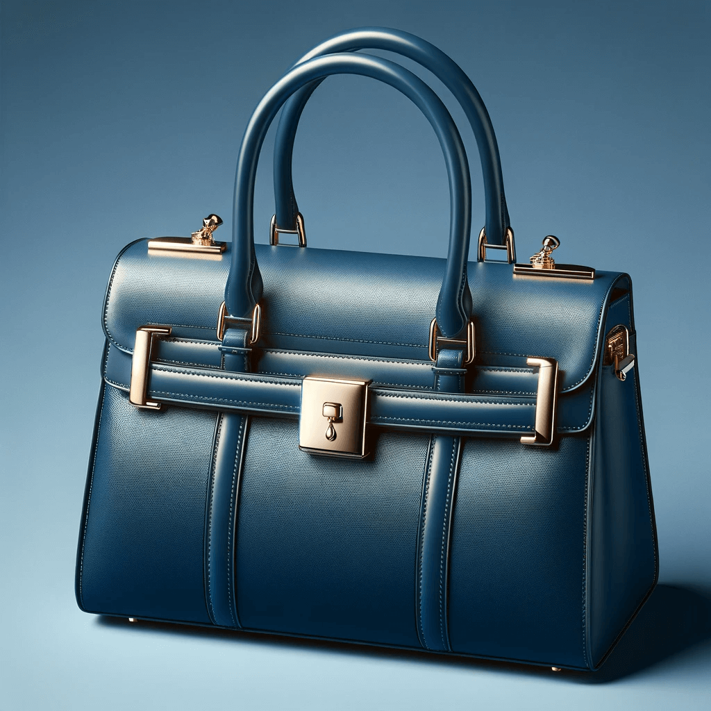
Here’s what Classic Blue would look like in fashion accessories like handbags, according to DALL.E:
Pantone Color Of The Year 2021- Ultimate Gray & Illuminating
Another time when Pantone chose a combination of two colors for the Color Of The Year was in 2021. They announced PANTONE 17-5104 Ultimate Gray + PANTONE 13-0647 Illuminating as the Color Of The Year 2021.

2020 was a year of challenges and opportunities. Pantone’s 2021 colors, Ultimate Gray and Illuminating, complement each other and create a beautiful contrast, representing hope and resilience. Therefore it felt like the perfect combination to leave 2020 behind and embrace 2021 with hope.
This influential pairing left its imprint on various industries, inspiring a blend of stability and positivity in fashion, design, and beyond, echoing the spirit of unity in diversity. From sneakers to handbags and scarves, statement makeup palettes to home and office furnishings, the combination of these colors appeared in several places that year.
Want to use unique color pairings like this one in home interiors? Here’s what it might look like according to DALL.E.
Pantone Color Of The Year 2022- Very Peri
In our list of Pantone colors, there’s yet another version of purple – PANTONE 17-3938 Very Peri which was crowned the Pantone Color Of The Year 2022. Another important point to note here is that Pantone created this new color as a derivative of the Periwinkle Blue going against its tradition of choosing from the existing Pantone colors for the Color Of The Year title.
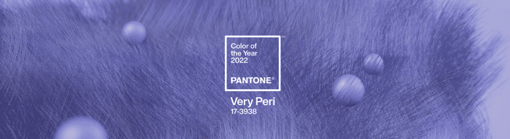
2021 was the year when the world was bouncing back to normalcy slowly after the pandemic era. And to mark the transition, to embrace change, Pantone thoughtfully created a positive and daring color. Of course, the color also aligned pretty well with the Metaverse which was taking shape slowly but steadily.
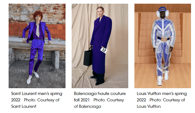
Fashion magazines pointed out that different variations of purples appeared in the Spring 2022 collections from popular fashion labels following the Very Peri trend.
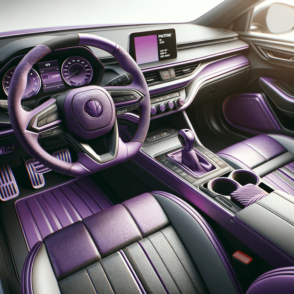
In addition to the traditional applications like limited edition fashion collections, beauty products, and packaging for brands, the Pantone colors trending each year sometimes feel relevant in applications like car interior styling. For cars meant to resonate with the younger crowd, a more timeless version of the respective color comes in handy. To give an example, here’s what car interiors incorporating Very Peri might look like, according to DALL.E.
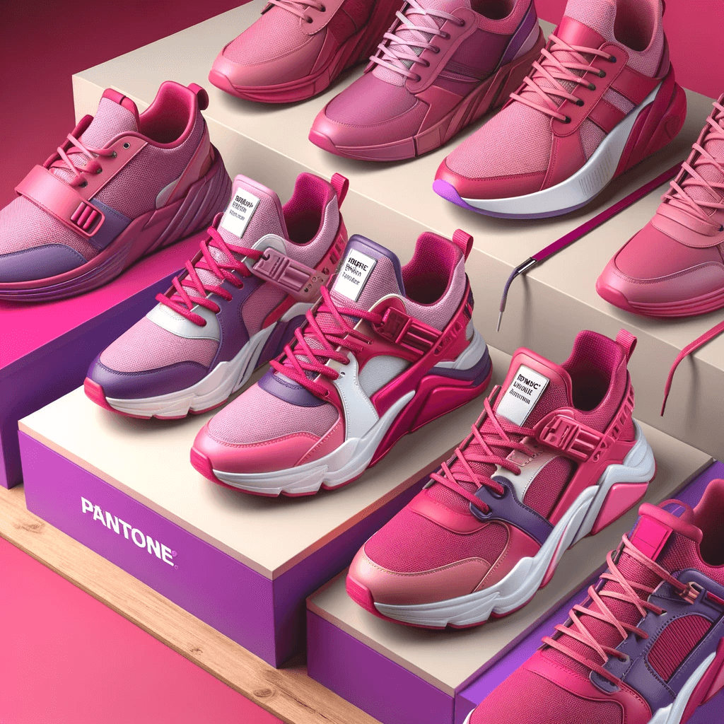
Pantone Color Of The Year 2023- Viva Magenta
Right when the barbiecore trend was making waves, Pantone announced PANTONE 18-1750 Viva Magenta as the Color Of The Year 2023.
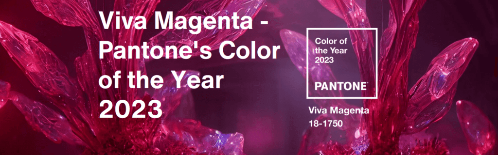
For 2023, Pantone went for something bold and fearless, as a vibrant reminder of the multi-dimensional world we live in today. You might have noticed that several Pantone colors draw inspiration from nature and Viva Magenta, is no different. It was inspired by the magical colors of the cochineal beetle.
The idea behind this joyous color was to embrace the enthusiasm with which people were returning to their explorations of outdoor spaces and adventures after the lockdown.
Motorola announced a new variant in the Motorola Edge 30 Fusion featuring Viva Magenta showcasing how this futuristic color seamlessly fits into the world of tech.
It’s here! Meet motorola edge 30 fusion in empowering Pantone Color of the Year Viva Magenta. #coloroftheyear #magentaverse #findyouredge pic.twitter.com/CcTKi7bEaF
— motorola (@Moto) December 2, 2022
The below image shows a vibrant sneaker collection featuring Viva Magenta as imagined by DALL.E.
What to Anticipate for Pantone Color Of The Year 2024
Pantone recently announced the Fashion Colour Trend Report Spring 2024 For London Fashion Week. Pantone has observed the dominance of several sunny and earthy shades in fashion recently. Will any of these colors become the Pantone Color Of The Year 2024? Or will it be a color that beautifully complements all these trending colors in fashion and interior design?
We’ll have to wait for a few more days for answers. Until then, we hope that this list of the past Pantone Colors Of The Years was useful to you. And we also hope that the list equipped you with enough information on what to expect and how to prepare yourself to incorporate the Pantone Color Of The Year 2024 in your marketing efforts so as to hop on to the trends on social media.
Do you think a designated design team will make it simpler for you to embrace such color trends on time and tweak your brand’s designs effortlessly? Consider a KIMP subscription. Register now for a free 7-day trial!