Unveiling the Most Renowned Graphic Designers Globally
Behind every mesmerizing ad you encounter or logo that you remember your favorite brands by, there’s the work of an exceptional graphic designer. The creativity of graphic designers around the world helps breathe life into a brand. Because these creatives help paint a virtual picture of a brand and help you put a face to a brand that otherwise feels like just another “name” in a crowded market.

We’ll be discussing their design philosophies, and briefly looking at some of their famous creative works. Ready to get inspired? Let’s go!
6 of the Most Popular Graphic Designers in History
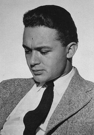
1. Saul Bass
“Design is thinking made visual.” – Saul Bass.
We had to start our list of the most popular graphic designers with one of the most influential designers of the 20th century, Saul Bass.
If there’s one thing you’re most likely to find in a seasoned graphic designer’s room, it’s a Saul Bass poster. Saul Bass is the epitome of simplicity and impact for graphic designers. The man who revolutionized the look and feel of branding for modern cinema!

From iconic logos to film title sequences and movie posters, his work spanned a wide range of creative mediums, leaving an indelible mark on the world of design and visual storytelling.
Famous works of Saul Bass
His career in the film industry which eventually won him an Oscar, kickstarted with his success in creating the title sequence for the film, The Man with the Golden Arm in 1955.
The other famous works of Saul Bass include posters for movies like Vertigo (1958), Anatomy of a Murder (1959), and The Shining (1980) among others. These exclude the many rejected posters and the many plagiarized versions of his designs that later appeared. Such was the impact he created in the world of graphic design.

It’s not just promotional graphics that Saul Bass is known for. He is the talent behind several corporate logos like the United Airlines logo in 1974, the Kleenex logo in 1962, and the iconic globe logo of AT&T in 1983.
Design lessons from Saul Bass’s works
- Keep it simple. Observe that most of his designs use simple shapes creatively aligned and oriented to create the intended effect.
- Customized typography creates an impact. Most Saul Bass posters incorporated custom hand-lettered text bending the traditional rules of serif and sans-serif typefaces.
- Good design is incomplete without storytelling. For example, take the exemplary movie poster for the 1958 movie Vertigo. Its swirling spiral is meant to capture the essence of the vertigo, the disorientation experienced by the movie’s protagonist.

2. Paul Rand
“Design is so simple, that’s why it is so complicated.” – Paul Rand
We cannot discuss the realm of corporate logos without discussing Paul Rand. This self-taught designer started out by designing stock images and later became a pioneer in incorporating Swiss Style in graphic design.
Famous works of Paul Rand
One of the early successes that allowed Paul Rand’s career to take shape was his work in creating the page design for Apparel Arts (now GQ magazine). He then went on to design the cover art for various magazines like Direction.
In addition to all these designs, some of the legendary pieces by Paul Rand have been in the corporate identities segment. The current versions of logo designs used by brands like Cummins Engine, UPS, and IBM are all works of Paul Rand. As can be seen in these logo designs, Paul Rand has a reputation for popularizing the use of minimalistic and modern aesthetics in corporate identities.
Design lessons from Paul Rand’s works
- There’s strength in simplicity. Simple logos are versatile and the IBM logo is the perfect example of this. When you choose simplicity, it is all about combining form and function.
- Aim for timelessness in your design. Most of the corporate logos designed by Paul Rand have stood the test of time for decades.
3. Rob Janoff
“I guess the most important thing a good design has to do is communicate. I don’t think people should have to work very hard to get what you are trying to say visually. How simple can you make it?” – Rob Janoff
Rob Janoff designed the Apple logo. Need we say more? The Apple logo is one of the most widely recognized logos in the world and an epitome of timelessness.

Inspired by the works of Paul Rand and Saul Bass, Rob Janoff’s style was also inclined mostly toward simplicity.
Famous works of Rob Janoff
Rob Janoff worked on the Apple logo when the company was still a startup without a big reputation. Rob Janoff’s idea behind the Apple logo was to make the identity fun and easy to understand.
Did you know that the “bite out of the apple” in the design was meant to reiterate that this was an apple and not any other fruit or other symbols?
Later, Rob Janoff’s creative director also pointed out the surprising coincidence of the word “byte” being relevant to computers and hence relevant to the brand. Overall, it turned out to be an engaging design with a simple message in it.
Design lessons from Rob Janoff’s works
- Stay away from complicated designs. Have you seen the first version of the logo used by the Apple brand? This long-forgotten design was quite intricate and is hard to associate with the brand Apple has evolved into today.
- Make your design more interactive. This helps foster stronger relationships with your customers.
- Keep your design unique and recognizable. If you place all the tech company logos side by side, the Apple logo definitely stands out.
4. Milton Glaser
“To design is to communicate clearly by whatever means you can control or master.” – Milton Glaser
With a career that spanned more than half a century, Milton Glaser is the creative behind the iconic I ♥ NY design.
What we see today appearing on t-shirts and other merchandise was once a simple idea that was scribbled at the back of an envelope during a cab ride. Today the logo has acquired an inseparable connection with New York City.
Famous works of Milton Glaser

Loosely inspired by the typographical experiments of famous artist Robert Indiana, the I Love New York logo has become more of a pop icon over the years. The idea behind designing a logo for marketing New York City was to foster unity among the residents. This opened up the market for souvenirs featuring this distinct symbol of New York.
The vibrant Bob Dylan poster which is a trendsetter in the rock poster realm was designed by Milton Glaser. The psychedelic poster designed in 1966 was to mark the singer’s comeback after an accident. The vibrant design evoked a positive vibe which resonated with the singer’s fans well.

Design lessons from Milton Glaser’s works
- When design meets art, magic happens. Most works of Milton Glaser remind us of the artistic side of graphic design.
- It’s all in the details you customize. While the I Love New York logo uses a simple traditional-looking typeface on the whole the stroke of the N is pretty distinct from the usual structure of the typeface. This creates an element of interest in the logo. Similarly, by paying attention to the little details in your design and typography, you can make a huge impact.
5. Susan Kare
“Icon design is like solving a puzzle, trying to marry an image and idea that, ideally, will be easy for people to understand and remember.“ – Susan Kare
Susan Kare is one of the most popular graphic designers in the digital design realm. From typeface design to icon designs Susan Kare’s works span various design categories.

Among the many things that Susan Kare is known for, the original icons she created for the Macintosh computer and her work in pixel art are the most popular.
Famous works of Susan Kare
Susan Kare used her education in fine art to create icons for Mac computers in the past. The legendary ones like the Dogcow and the Happy Mac icons are some of the many icons she designed for Apple.


Other than icon designs, Susan Kare also created several well-known typefaces like New York, Chicago, and Geneva. These were again created as elements in Apple’s brand identity.

Design lessons from Susan Kare’s works
- Focus on the user and you can never go wrong. The cheerful Happy Mac icon and others were created as a way to make digital screens and Apple computers in particular, feel more welcoming.
- Inspiration can come from anywhere. When Susan Kare was given the task of designing icons for a computer screen, she had no prior experience with it and no experience in pixel art either. She therefore drew inspiration from mosaics, hieroglyphics, and other areas. With all this, she was able to design icons that told a story.
6. Herb Lubalin
“You can do a good ad without good typography, but you can’t do a great ad without good typography.“ – Herb Lubalin
When we discuss graphic designers in the typography realm, Herb Lubalin is a name you cannot miss. His expressive typeface designs continue to inspire designers around the world.

Famous works of Herb Lubalin
Herb Lubalin is best known for his design and typographic work for the magazines Eros, Fact, and Avant Garde. Among these, for the Avant Garde magazine, he created the logo design as well as the page design.
It was then that he created the very popular ITC Avant Garde typeface which gets its name from the magazine for which it was created.
In addition to his contributions to typography design, Herb Lubalin was in the team of designers including John J. Graham who created the signature peacock logo for NBC.
Design lessons from Herb Lubalin’s works
- Make typography more expressive. From adjusting the kerning to the alignment of the characters, Herb Lubalin experimented with various aspects of typography in order to create custom typefaces that expressed the intended emotion.
- Be willing to push the boundaries. Both in his page design projects and type designs, Herb Lubalin is known for his unconventional approach.
Ready to Transform Your Design Vision Into Reality? Get KIMP
The life and works of these famous designers show how designs have played a critical role in the growth and evolution of several brands with a global reach today. As you can see from their designs, every little design detail like typography, colors and symbolism can help brands make a big difference.
Want to work with experienced graphic designers to transform your creative ideas into reality? Get a KIMP subscription. Wondering if the design subscription model will suit your marketing workflow? Start with a free 7-day trial!