Pantone Color Of The Year 2023: Viva Magenta PANTONE 18-1750
What is the best way to break the ice while conversing with a designer? Talk about the Pantone Color Of the Year! Well, in all seriousness, Pantone’s COTY announcement is definitely something most designers, brands, and marketers look out for. Pantone recently announced the color of the year 2023. Drum roll, please! It’s Viva Magenta, PANTONE 18-1750.

What an exciting color isn’t it? We are as thrilled as you are! Oh, the many possibilities it brings with it! The many ways in which you can use this color to connect with your consumers! We can’t wait to see this vibrant color popping up on runways, interior designs, packaging designs, and product designs.
Are you looking for ideas to Magenta-fy your campaigns? You are in the right place. Let’s get up close with Viva Magenta, the Pantone color of the year 2023. And let’s understand how to deliver contextually relevant content incorporating this color.
- Introducing Pantone color of the year 2023 – Viva Magenta
- Color of the Year 2023- Viva Magenta- the back story
- How is the Pantone Color Of the Year chosen every year?
- Do we see a pattern emerging?
- Brands that have jumped on the bandwagon
- Tips to adopt the Pantone color of the year 2023 in your marketing
- Give your marketing designs a dose of Viva Magenta with Kimp
Introducing Pantone color of the year 2023 – Viva Magenta
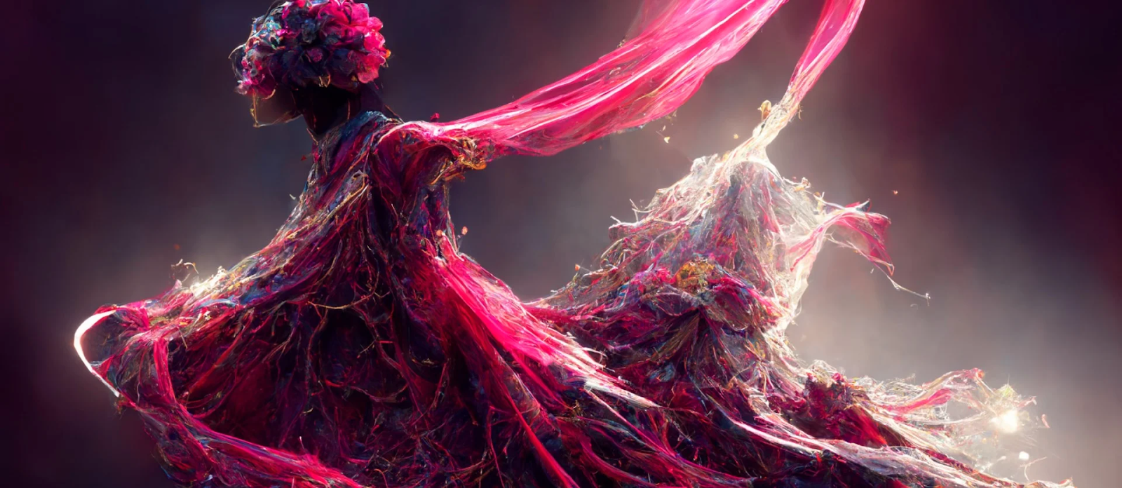
One glance and you’ll see what a unique color Viva Magenta is. Truly lives up to its name and stands as a symbol of “vim and vigor”, as Pantone puts it. It lies in that cozy spot between the warm reds and the cold blues.
Magenta has always been known as a color that doesn’t exist since it does not occupy a definite space in the visible light spectrum. And such an unorthodox color, without a doubt, will resonate with the radically pragmatic Gen Zers and the technology-loving millennials.
According to Pantone, Viva Magenta was chosen as a near-accurate representation of the thrill of self-expression. And we think that for the bold and beautiful social-media-loving generation ahead this color feels relevant. Well, the color might even remind you of the striking palette of the Instagram logo or the pinks of TikTok.
In short, the color is basically everywhere. Therefore, embracing this trend should not be that difficult.
Color of the Year 2023- Viva Magenta- the back story

As we move closer to digitization on a larger scale, Pantone wanted to go back to nature with its color of the year 2023 selection. The Viva Magenta is inspired by the carmine red dye extracted from the cochineal beetle. The cochineal beetle has survived fearlessly for centuries adapting itself and going strong amidst a continuously evolving world. What better way to represent the valor with which the world has bounced back after the pandemic!
The video that Pantone featured to introduce the color of the year 2023 says enough about the color. It first covers the doom that prevailed over the pandemic. After this, it goes on to focus on how people have emerged vibrantly embracing “brave new journeys”. Living life in full color.
“Rooted in the primordial, PANTONE 18-1750 Viva Magenta reconnects us to original matter. Invoking the forces of nature, PANTONE 18-1750 Viva Magenta galvanizes our spirit, helping us to build our inner strength.”
-Leatrice Eiseman – Executive Director, Pantone Color Institute
The moment Pantone makes the big announcement you probably see a lot of content creators and brands talk about the color. You see new trends popping up. Seeing all this, have you ever wondered how these colors are chosen? Or why so many people gush over the Pantone color-of-the-year trends? Let’s talk about that before we get into the Magentaverse.
How is the Pantone Color Of the Year chosen every year?

Pantone goes the distance when it comes to its color of the year decision. It does not shy away from breaking the trend and creating a combination instead of just one color, as it did when it announced the combination of Illuminating and Ultimate Gray in 2021. This combination was announced as a symbol of “resilience and hope” as the world was emerging from the COVD 19 pandemic.
And in 2022, Pantone went on to create a new color to capture “courageous creativity” in the form of Very Peri.
Now for 2023, Pantone projects positivity and exuberance for the forward-looking generation. Do you know how all this started?
In 1999, the Pantone Color Of The Year program was launched to delve into deeper conversations about color. It was to dig deeper into the connections between color and emotions, colors and global cultural perceptions. The process involves a team of color experts from around the globe. They sift through cultural trends, social and economical happenings, and topics that spearhead major paradigm shifts.
In short, the choice is made based on what’s been happening in the world in the realms of technology, politics, economy, and other walks of life. And also based on a prediction of where the world is headed, a cumulative emotional state anticipated. If all the predictions are true for 2023, Viva Magenta tells us that we are in for an optimistically mystical future indeed.
For all those who perhaps thought, “what’s in a color after all”, the thought process, the brainstorming, the research, and the social listening that go into choosing the Pantone color of the year give the best answer.
Do we see a pattern emerging?
First, there was the periwinkle purple rage with the introduction of Very Peri by Pantone as the color of the year 2022. Peppy versions of purple have been around a lot lately.
Did you spot a lot of your favorite celebrities sporting electric pink recently? The Barbiecore trend was one of the most talked about topics in 2022.
From designer clothing to fashion accessories, we saw this pink make its appearance predominantly in several places.
Another trend that closely connects is the massive emergence of the Y2K design trend that included a lot of futuristic palettes integrating pinks and purples in various shades and tones.
And now we have another addition in the form of Viva Magenta. Don’t you think that these colors are all closely connected? Do you also see the pattern emerging? Well, perhaps that’s a sign that this trend is here to stay. So, if you are looking for new colors to spice up your upcoming product launch or an upcoming seasonal campaign, Viva Magenta is definitely a color to experiment with. Don’t know how to do that? Learn from the brands that have already hopped on the trend.
Brands that have jumped on the bandwagon
Okay, so you have understood the Pantone Color of The Year and the emotions behind it. But how do you incorporate it into your brand’s marketing? Now, the inspiration for that comes from the popular brand collaborations with Pantone each year. Let’s look at the most popular ones this year.
1. Motorola
Motorola has announced the Motorola Edge 30 Fusion in Viva Magenta.
Following the footsteps of this partnership, there is a good chance of many other smartphone brands introducing the Magenta version in their smartphone lineups.
2. Spoonflower
Collaborating with Pantone, Spoonflower has announced its series of Design Challenges where creators can submit their creative interpretations of the Pantone color of the year 2023. Moreover, this is in addition to the independent artists’ artworks featured during the announcement event.
The brand had also partnered with Pantone for its design challenges back in 2019 and it’s following the tradition this year too.
3. Deepa Gurnani
The New York based jewelry designer duo has announced their Pantone Viva Magenta range of jewelry. This shows a refreshing take on the color in the fashion segment.

4. Hydrow
The fitness equipment brand, Hydrow has announced the Viva Magenta version of its indoor rowing machine.
This shows how a creative application of the color of the year is possible even in the most unexpected places. For the brand, this partnership is about offering personalization, to make fitness a more personal experience. It’s a way to allow the exteriors of the workout equipment to resonate with the users’ energy and enthusiasm.
5. Cariuma

Cariuma, the brand known for its diverse sneaker range, has partnered with Pantone and introduced its Viva Magenta range of sneakers. These are perfect for anyone who wishes to make a statement.
Tips to adopt the Pantone color of the year 2023 in your marketing
Having seen how brands adopt the color of the year 2023 in their product lines and marketing graphics, are you curious about experimenting with it yourself? Then here are some tips to help you get started.
Using Pantone color of the year 2023 in design tools
There was a time when you could use Pantone colors in Adobe tools and other design tools. But now if you wish to adopt the color of the year and other Pantone colors in popular design tools, Pantone Connect is your only option. The subscription lets you use Pantone colors in Adobe tools and other design apps.
What if you are designing with web-safe colors and wish to use Viva Magenta? The hex equivalent of Pantone 18-1750 will be #BB2649.
Color palette ideas
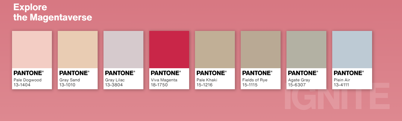
Every color you use in your design has a role to play, an emotion to convey. If you are struggling to put together a simple color palette that includes Viva Magenta a complementary color to go with it will be #26BB98 (Mountain Meadow).
Or if you think the energy in Viva Magenta is too much for your brand, Pantone’s Ignite palette perfectly balances it out. The muted shades let Viva Magenta pop while also keeping the overall mood subtle yet expressive.
Introduce a limited-edition product line
One of the easiest ways to use the color of the year 2023 in your marketing plan without deviating from your brand’s visual identity will be to try a limited edition product, similar to the Motorola Edge 30 Fusion.
Limited edition products are great ways to show your customers that you are one to keep up with trends. When consumers see the same color everywhere, they are struck by major FOMO. They feel the pressure, the motivation to try the trend. And if your product lets them do this, they will gladly make a purchase.
Kimp Tip:
Do you wish to test the water before making a huge investment? Then you can simply make changes to your packaging design. The product remains the same but the packaging will have a flavor of Viva Magenta in it.
Wondering how to quickly adapt to trends and make changes to your packaging and other designs? Choose a Kimp graphics subscription for quick turnaround times.
Making a temporary switch
If nothing else, you can still embrace these trends by talking about them on social media. You do not even have to make drastic changes to your brand. You can temporarily alter your social media aesthetic by featuring all your products that are in magenta. Or you can put together a video that shows what your brand’s version of Magenta looks like.
Simple conversational posts do the trick. They keep your customers informed of the new and emerging trends while also showing them why it’s worth following your brand.
Another way to do this is to somehow link your brand design or brand colors to the color of the year 2023 if it feels relevant. Vodafone brilliantly connected its Red to the Viva Magenta in the below Tweet.
Give your marketing designs a dose of Viva Magenta with Kimp
Many brands find it challenging to keep up with graphic design trends. But still, you simply cannot afford to miss color trends like the Pantone color of the year. As the examples above show, color trends are not just for the fashion realm. There is no industry where color trends feel irrelevant. Besides, when there is a trend that people around the world are enthusiastically talking about, your brand should definitely make an effort to join the conversation. And to jump into such trends without the slightest lag, you need a dedicated design team that can visually represent all your ideas. And that’s precisely what you get with every Kimp subscription.
Register now for a free 7-day trial.