2024 Color Trends: Navigating New Palettes in Marketing
As the calendar flips to a new year, a plethora of new marketing opportunities unfold. Brands looking to make their mark leveraging these opportunities have one main thing to look out for – the color trends of the year. So, if you are looking to get inspired by the anticipated 2024 color trends then you are in the right place!
Of course, the debate continues about whether to follow trends or adhere to timeless signature colors! We get it! However, we cannot ignore the appeal of staying fresh – staying in the loop when it comes to the year’s trends! Brands are constantly navigating this dilemma meticulously balancing trends vs timelessness in their marketing and branding designs.
Well, if you ask us, we’d say, knowledge is power. Understanding the year’s anticipated trends gives you a chance to make informed decisions. It helps you understand why colors like Peach Fuzz are appearing everywhere!
It’s all about understanding how the design landscape is evolving. So, are you ready to look at some of the 2024 color trends and some ideas to incorporate them into your marketing? Let’s dive in!
2024 Color Trends: Inspiration for a Year of Colorful Campaigns
1. Peach Prettiness!
We obviously had to start our list of 2024 color trends with Peach as it’s been the talk of the town ever since Pantone announced Peach Fuzz as the Color Of The Year 2024.
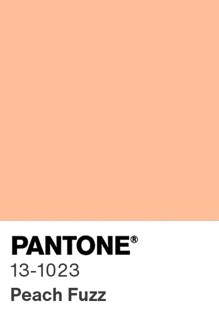
Capturing the subtle balance between pink and orange Peach is one of the warmest and fuzziest colors that brands can use in their campaigns. Pantone has given this color a new dimension by labeling it as the choice of the year for representing our “desire for togetherness”.
Given the relevance of the color to the current times, we think that peach and its derivatives are likely to be among the prominent 2024 color trends. So, yes, this is a good one to include in your upcoming campaigns. This way you will also be able to join the many online conversations that happen around the Pantone Color Of The Year every year!
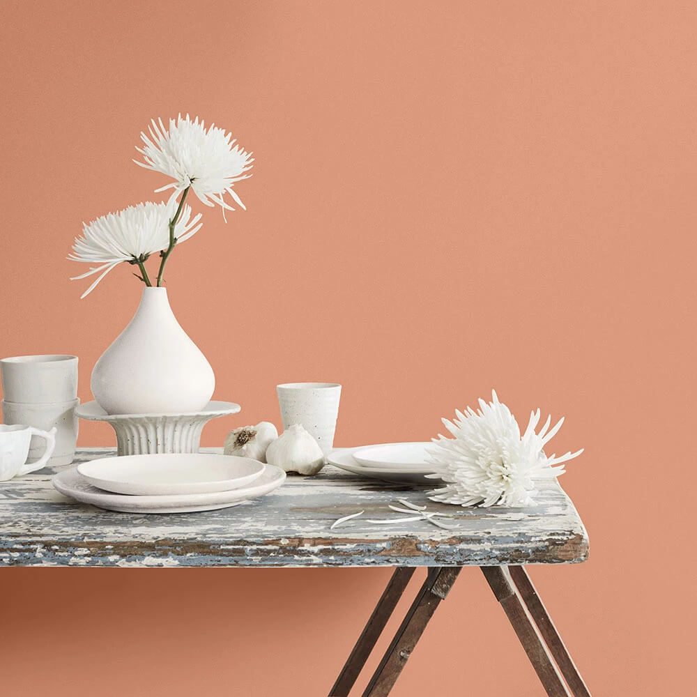
Moreover, Peach is a unique color that’s playful on one side and sophisticated on the other, a great choice for upcoming occasions like Galentine’s Day and Valentine’s Day as well!
Looking for something even more mellow? Then perhaps you would like the Dulux Colour of the Year 2024, Sweet Embrace which is slightly more on the pink side.
But if you are looking for something deeper and richer yet slightly connecting back to the Peach trend then you could also explore Persimmon which is part of the Color Of The Year collection announced by HGTV Home by Sherwin-Williams. This also carries a hint of terracotta when your design calls for an earthy vibe!
KIMP tips on incorporating the Peach color trend:
So now comes the question of where to use peach and where not to. As one of the most popular 2024 color trends, Peach makes a pleasant color for social media campaigns. It works particularly well in the self-care and fashion industries but products like The Motorola Razr 40 Ultra in Peach Fuzz prove that this pretty color has a special place in the world of tech too!
If you are looking to introduce a limited-edition product to embrace the trend, peach looks good in packaging design as well. Another option is to create temporary designs like landing pages for short-term campaigns embracing the trend without sacrificing your identity.
A few do’s and don’ts:
- Avoid saturating your design with Peach. Instead, use it as an accent color or as a secondary color along with neutrals that balance it.
- And, keep your target audience in mind. While versatile, Peach might not resonate with all target groups. Moreover, it might not be the best choice as the primary color when you are looking to make a bold statement or appear authoritative.
2. Blissful Blues
The next color in the spotlight on our 2024 color trends list is blue. But yes, blue has been a versatile and timeless color that exists in almost all industries. So, what makes it a crucial component of the 2024 color trends? Popular paint companies announcing some version of blue as their Color Of The Year 2024!
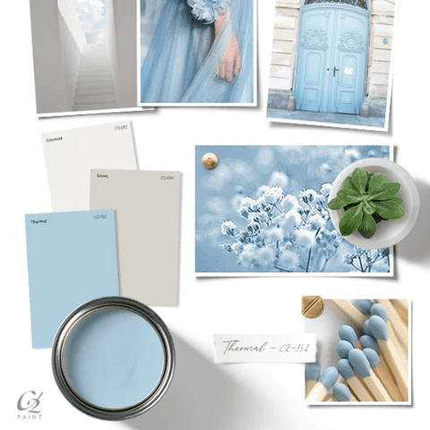
Looking for a calming shade for your designs, then C2 Paint’s Color Of The Year 2024, C2 Thermal #752 is a shade worth exploring.
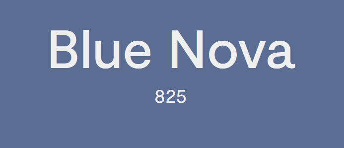
Or if you are looking for a less-used version of blue, one that evokes trust, then Benjamin Moore’s Color Of The Year 2024, Blue Nova 825 is a great choice. Combining a hint of purple and aligning more with the blues in nature, this side of blue works well for brands looking to capture sustainability themes.
Another unique blue with a restful aura is Valspar’s 2024 Color of the Year, Renew Blue. So, if you are creating something that’s meant to capture tranquility or natural harmony, Renew Blue works well.

Finally, there’s Krylon’s 2024 Color of the Year – Bluebird. This is the most vibrant among all the blues that are in the spotlight this year. If you have been following the dopamine decor trend incorporating bold and vibrant hues recently, then you might recognize this blue to be a good fit in it.
As you can see, from calming hues to eclectic ones, there have been a lot of blues in focus this year. Given the overlap in color trends across industries like interior decoration and graphic design, we think that blue in its many forms might be crucial this year!
KIMP tips on incorporating the Blue color trend:
Blue with metallic accents creates a touch of sophistication while blue with pastels can create a beautiful palette for packaging for children’s items. This inherent versatility is what sets blue apart and makes it highly likely to be among the popular 2024 color trends.
Additionally, blue can combine well with natural elements in order to promote organic products. And the shades of blue we discussed now can also be unique elements to play with in upcoming occasions like Earth Day in April or even Oceans Day in June.
Some do’s and don’ts:
- Being a cold color, some shades of blue might appear too gloomy or dull for designs meant to capture a happy theme.
- Stay away from using blues to represent gender stereotypes by using blue as a masculine color.
3. Radiant Reds
Various bold shades of Red have been consistently appearing in the Spring/Summer 2024 collections from popular designers like Gucci. This passionate color can also be customized for various moods without sacrificing the energy it carries. Therefore, this is one of the most versatile 2024 color trends to look out for.
According to Vogue, Red is even among the most anticipated hair color trends for 2024. In interior design, red has a special place of its own
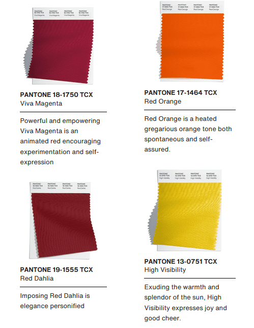
Moreover, unique reds like Red Orange, and Red Dahlia were also part of the Pantone Fashion Color Trend Report Autumn/Winter 2023/2024 for New York Fashion Week.
In addition to all these factors, red is a creative color a bold face of self-expression. It is therefore a hue that several brands might be looking to embrace given the newfound optimism after the world has chosen to finally leave the pandemic behind and make the most of fresh beginnings!
On a lighter note, we also had plenty of red appearing in social media trends like the Big Red Boot trend that was a rage last year! Not to forget, the iconic red sleeping bag jacket that Rihanna at her Super Bowl event. So, yes, we have seen red in many forms recently and so it’s definitely holding a strong position in the 2024 color trends list!
KIMP tips on incorporating the Red color trend:
Red makes a great choice for brands meant to capture energy and enthusiasm like fitness brands. And they work well in almost all types of campaigns for such brands including print and digital. Another industry that can confidently embrace red is the fast-food industry where red can represent a sense of urgency and induce hunger. So, it makes a great choice for restaurant menus and flyers to promote restaurants.
As for the other industries looking to keep up with the 2024 color trends without leaving their brand colors behind, red is an attention-grabbing element in designs that are meant to evoke excitement. This can be social media posts, video teasers or even Story ads announcing a product launch. Or emails that are meant to kindle anticipation for an upcoming sale!
Another notable fact here is that maximalism is touted to be among the biggest graphic design trends of 2024. Red makes a great choice to establish maximalism in your marketing aesthetics.
And now for some do’s and don’ts:
- While Red works in many places, it might not be the best choice if you are looking to create a calming vibe in your design.
- Not all shades of red might work in designs that are meant to appear neutral or formal.
4. Harmonious Earthy Tones
Sustainability has become the need of the hour. From thrifting to switching to e-bikes, searching for effective recycling to spending more on brands with a sustainable approach, consumers around the world are strongly expressing their inclination toward sustainability. Therefore, colors that connect back to nature, colors that evoke a cozy natural vibe are here to stay. That’s why we think that earthy tones might be big among the 2024 color trends for brands.
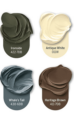
This could include rich and luxurious hues like Dutch Boy’s 2024 Color Of The Year, Ironside 422-7DB. The below image shows an earthy palette suggested by the brand to make the most of Ironside. As can be seen in this example, combining colors inspired by the elements of nature results in something aesthetically appealing, perfect for designs promoting sustainability themes.
The travel industry bouncing back and people seeking solace in nature more exuberantly than ever before are also some of the reasons why earthy tones hold a crucial spot in the 2024 color trends. Another perspective is the growing desire for authenticity, the yearning to connect with the grounding spirit of nature.
KIMP tips on incorporating the Earthy colors trend:
When we talk about earthy tones, what are your options? Various shades of brown, rust, mud, foliage green, deep forest greens, ochre, sage green, and even shades of terracotta for that natural connection. In short, the objective is to create something that appears close to nature. So, naturally, earthy tones are not the best options for brands promoting synthetic fabric or processed food.
On the other hand, earthy tones work perfectly in designs meant to capture a sense of well-being, a sense of calm, or even organic resilience.
And some do’s and don’ts:
- For earthy tones to have the most impact, you need to combine them with the right elements. When your imagery and fonts all look synthetic and artificial, an earthy palette might not make the intended impact after all.
- Similarly, when it comes to adding textures, natural textures, and matte finishes work best rather than artificial shimmer effects and too much sheen.
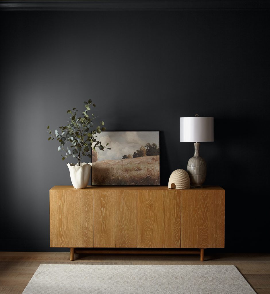
5. Mellow Neutral Tones
If you like the grounding effects of earthy tones but like to add variety while staying within the muted spectrum, then neutrals might appeal to you. But do not be deceived by the mellow nature of these neutrals – they can make a big impact when you use them aptly. And the best part – sophistication or simplicity – neutrals can assume the mood you prefer.
Why are neutrals likely to be among the 2024 color trends for brands? Because we live in times when surrealistic AI-generated design, social media chatter, and advertising chaos seem to dominate the screens. So, finding balance through the subtlety of neutral tones is a decision that several brands are willing to embrace. Besides, neutrals when deployed correctly can be timeless as well!
Neutrals were also in trend in 2022 and appeared in a lot of places in 2023 as well (like the browns from the Miu Miu Autumn/Winter 2023 collection). This ethereal trend is also likely to continue in 2024.
KIMP tips on incorporating the Neutral colors trend:
Neutrals might be known for their mild and minimalistic nature but there’s variety, and diversity in neutrals that brands can explore. From warm toupe to timeless beige and cream, serene greys to the regality of ivory, there are a lot of options to explore. Why, you’ll even find some dramatic shades like Behr’s Color Of The Year 2024, Cracked Pepper.
So, finding a complementary or triadic color palette to harmoniously work with your brand colors will be easy.
So, if you would like to create an inviting user experience while also adopting the 2024 color trends then incorporating neutrals is one way to do it. Where do neutrals look good? In packaging and other print designs, even billboards as well as landing pages!
And now some do’s and don’ts:
- If you are aiming to create a design that captures playfulness and energy, using merely neutral tones might not give you the intended results.
- Neutrals are generally mild-natured. So, if you wish to leverage this aspect to create a minimalistic design, you also need the incorporated illustrations and imagery to be clutter-free and simple. Stay away from decorative fonts or those with eclectic letterforms which can hamper the simplicity of neutrals.
Bring 2024 Color Trends To Life With KIMP
So, what are you waiting for? The year has just begun and there’s already a good line-up of colors and color trends to explore. Curious about seamlessly bringing these 2024 color trends into your marketing designs? A dedicated design team can make it easier to explore the possibilities. A dedicated design team that caters to unlimited designs for a flat monthly fee – that’s precisely what you get with an unlimited design subscription, like KIMP!
Register now for a free 7-day trial!