Design Inspiration: Pantone’s 2021 Colors Of The Year
You might have seen a few headlines recently about Pantone’s 2021 colors. And you might be wondering what Patone is and why it matters. Well, it all comes down to the importance of color in graphic design for print.

Using the right colors in your graphic design projects helps you trigger your customers’ emotions, so that they associate certain ideas with you. And since color plays such a significant role, you may find that you often go back and forth with your designers trying to get it just right.
This whole process can become a lot more complex when you describe colors with unique descriptors. Say, you tell your designer you want a sunshine-like-yellow. It might seem universal enough, and it might make sense to you. But unless you and your designer are speaking the same language your design projects can get really confusing.
This is why the Pantone system is so important. It gives you a standardized set of scales and codes that offer clarity about the exact colors that you want to use. And in this blog, we’re going to take a look at how the Pantone system works as well as Patone’s 2021 colors so that you can get some inspiration for your 2021 designs to keep them looking trendy and on point.
What exactly is Pantone?
“Pantone” comes from the words “Pan” and “Tone” which mean “all” and “colors”. It offers a language of color that is universal. Pantone helps designers and their clients choose the precise colors they want to use in their design projects and ensures clarity in communication through the design process. Over 10 million designers and producers all around the world rely on Pantone’s color systems. They are used in multiple applications such as graphic designs, product and even fashion designs.
Pantone launched their first color matching system in 1963. And since then has been making it possible for designers, ink makers, printers, and their clients to achieve consistency in colors across their projects. Over the years they’ve built up the reputation of being a world-renowned authority on color.

The Pantone Matching System (PMS)
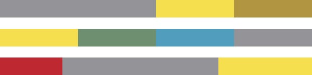
Pantone’s Matching system makes color identification and matching possible. It consists of 1867 solid colors, created using 13 base pigments. Most of the colors used in graphic designs, come with a pre-assigned 3 or 4 digit code followed by the letters C, U or M.
These letters stand for Coated, Uncoated or Matte in that order. With all the variations provided in the PMS, designers can see what each of the colors chosen will look like on Coated, Uncoated or Matte papers. Some colors may not look all that different regardless of the type of paper. For others it could make a whole world of a difference.
If your designer uses Pantone colors in your print designs, ask them to indicate which version should be printed. They can do this by indicating the corresponding letter for the approved design. All the colors are available on the Pantone website and in their printed book as well. The printed version is more reliable than the website version. However, it is also more expensive to get.
Incorporating the right Pantone colors with codes and letters in your brand style guide is a foolproof way to ensure that your designers get your color just right. It also helps maintain consistency throughout your branding and communications.
Why is the Pantone Matching System important?
Since the PMS assigns a specific set of characters to each color, colors can be selected more easily from a clear and meticulously detailed resource. In 2021 and beyond it’s entirely likely that you and your designers will be working together remotely like we do at Kimp. But both parties can work in sync by referring to these codes. The biggest advantage you get with the PMS is that it helps you avoid any mismatches between the idea, design or a manufactured product. As long as all parties involved have the right Pantone chart, your specifications will be matched perfectly. Think about the revisions and amount of time you will save with this!
What’s the difference between Pantone and CMYK?
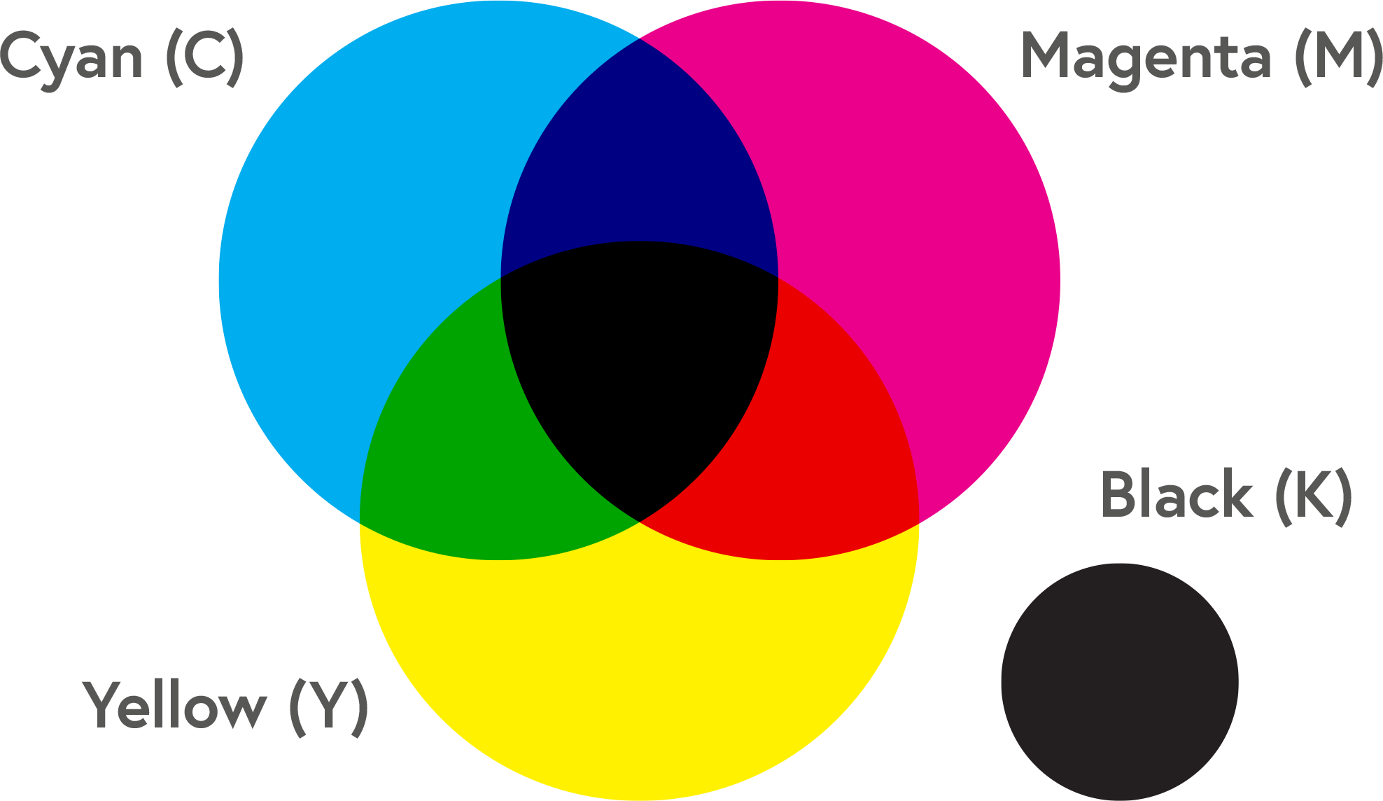
Chances are you’ve already heard of the CMYK color system for your print designs. And even if this is the first you’re coming across that name, you might be wondering why we need multiple color systems.
Well, CMYK utilizes four color plates to print out particular colors. They are cyan, magenta, yellow and black. These colors are usually printed individually and then layered. And it’s the system that most home printers use. One drawback here is that the intended colors can come out a bit differently each time. This compromises the print quality, based on your printer’s calibration.
Proper calibration requires ink cartridges to be aligned to the paper you’re printed on. It also requires the ink cartridges themselves to be aligned to one another.
On the other hand, Pantone doesn’t involve mixing colors during printing. Instead the base inks are mixed ahead of time and then applied to one plate. This way they can be printed on a machine set up for that particular job.
A quick rule of thumb to help you figure out which route to go is this: Printing with Patone is most effective for large print jobs to ensure pure colors. And CMYK meanwhile is great for smaller printing jobs.
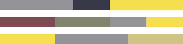
Pantone’s 2021 colors
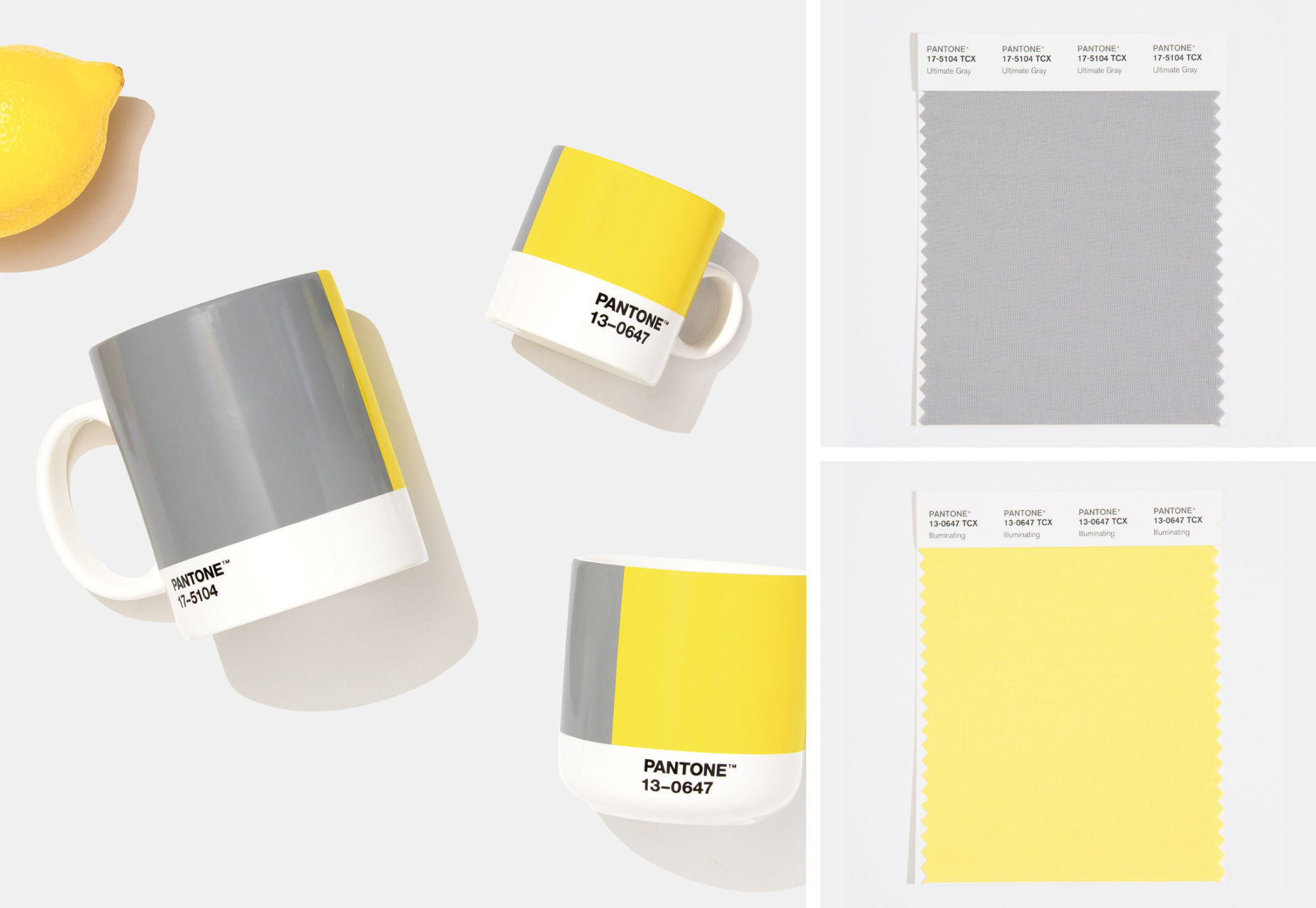
The new year is just a couple of weeks away and Pantone has broken with their tradition of choosing a single color for the year with two colors for 2021.
- Pantone 17-5104 Ultimate Gray
- Pantone 13-0647 Illuminating
2020 is the year no one saw coming. It’s posed an endless number of challenges and learning curves. It’s also highlighted and created opportunities and much needed reckonings. And in recognition of this Pantone has selected these two hues that complement each other and create a beautiful contrast. Context is so important in how color is utilized. And so a combination for 2021 creates the possibility of a deeper meaning than a single hue could.
Ultimate Gray is neutral and brings in feelings of dependability and resilience according to color psychology. Illuminating is a cheery shade of yellow that is sunny and vivid, carrying vibes of positivity. Together, these two shades create a feeling of stability and hope. The actual color treatment for next year is bound to incorporate multi-colored gradients as well.
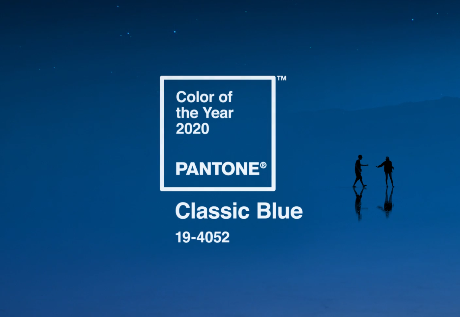
The last time that Pantone chose 2 colors of the year was in 2016: Rose Quartz and Serenity. And in case you’re wondering, Pantone’s 2020 color of the year was Classic Blue.
The color choices that Pantone proposes are always aspirational. And the particular pairing for 2021 conveys positivity and fortitude according to Pantone. Both of these are exactly what we all need in the year ahead.
Pantone’s 2021 Colors: Stronger together
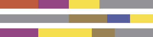
Now let’s get into a bit more detail about this unique color pairing for 2021. The most outstanding appeal of these two colors is that they create a high contrast when combined. Illuminating, when accentuated with hints of Ultimate Gray is all spirit and strength. The reverse brightens up the understated and austere.
Think for example, of a door painted with Illuminating. Now imagine the exterior walls in Ultimate Gray. The finish is attractive and just the right hint of vibrant. The pairing is also perfect for home decor such as sheeting, linen and even towels, helping transform living spaces into a modern and vibrant haven. Something that sounds incredibly appealing given the amount of time we’re all spending at home! Working from home is no longer an occasional thing or something you might daydream about. It’s here to stay.
And these colors are versatile enough to be used in a wide range of other products. They include activewear, fashion accessories, cosmetics and any type of product packing. Because the two colors balance each other out, using them in your website or graphic designs will work beautifully too.

If you want to try out these Pantone colors for 2021 and see how they work,you can use Pantone Connect or Instagram.
How do Pantone’s 2021 colors combine with palettes?
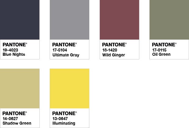
When added into color palettes, the combo for next year does certainly have a lot of promise. The five palettes featured by Pantone are Aviary, Enlightenment, Sun & Shadow, Intrigue and Orbital. Below, are the color harmonies of Illuminating and Ultimate Gray when used in each of these palettes.
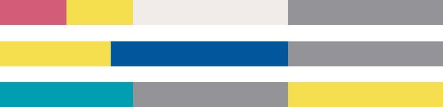
The Aviary Palette
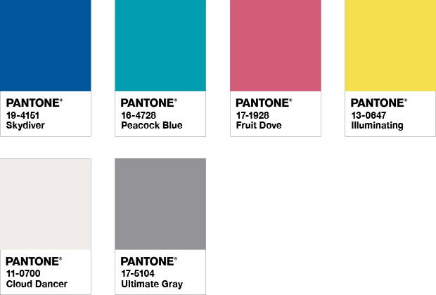
This palette evokes feelings of joy and vibrancy, as striking as a bird with eye-catch plumage. PANTONE 17-5104 Ultimate Gray adds a sense of nature to complement the cheeriness of bright colors like PANTONE 13-0647 Illuminating. And to contract there’s PANTONE 11-4201 Cloud Dancer, a white for a more dramatic effect.
The Enlightenment Palette
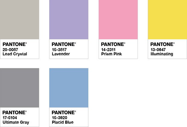
The enlightenment palette is a nod to futurism, sparking imagination and suggesting new realms. The silvery metallic addition of PANTONE 20-0087 Lead Crystal goes a long way to this end. Meanwhile, PANTONE 17-5104 Ultimate Gray and PANTONE 13-0647 Illuminating in this palette combine to bring together wisdom with a yearning to move forward and embrace new ideas.
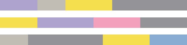
The Sun & Shadow Palette
In the Sun & Shadow palette PANTONE 17-5104 Ultimate Gray exudes a sense of resiliency. This is balanced with PANTONE 13-0647 Illuminating’s sense of hope and positivity in a palette fully earthy shades. The Sun and Shadow palette gestures to the timeless beauty of nature all around us.
The Intrigue Palette
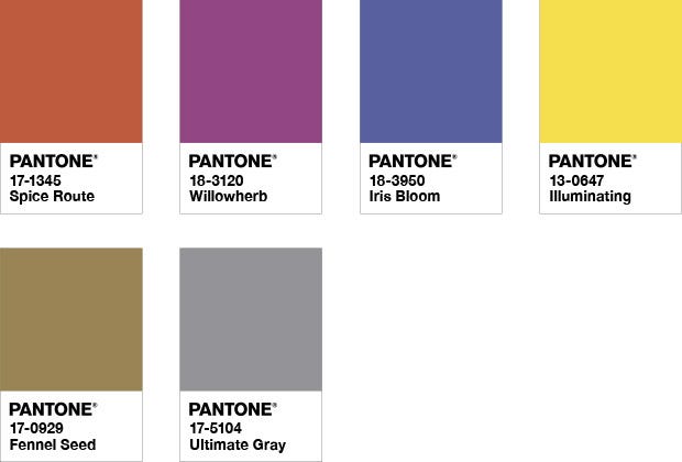
This palette is true to its name. Combining an intriguing mix of colors, the Intrigue Palette represents many different influences coming together. It’s both unique and individualistic and universally appealing with all its colors. PANTONE 17-5104 Ultimate Gray adds a sense of dependability here, meanwhile PANTONE 13-0647 Illuminating provides a touch of sunshine, by representing its warmth.
The Orbital Palette
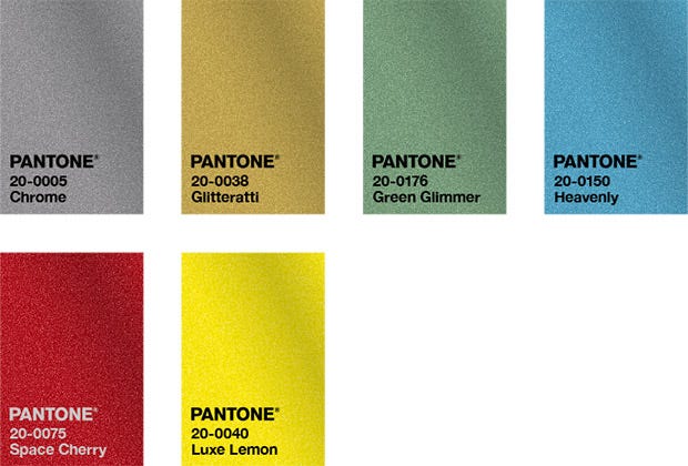
Another nod to futurism, the Orbital Palette’s metallic tones shimmer. They suggest the depths and wonder of far flung galaxies in outer space. PANTONE 20-0040 Luxe Lemon’s golden tone sparkles radiantly. And PANTONE 20-0005 Chrome hints at the stars, and the way they shimmer.
“The selection of two independent colors — PANTONE 17-5104 Ultimate Gray and PANTONE 13-0647 Illuminating — to be our Pantone Color of the Year for 2021 conveys the idea that is not about one color or one person, it’s about more than one. They communicate a deeper understanding of the importance of relationships and our need for one another. The joining of these two different colors speaks to the strength and optimism that results from unifying different ingredients.”
– Laurie Pressman, Vice-President of the Pantone Color Institute.
Pantone’s 2021 Colors: A tale of two colors
Together, Pantone believes that the two colors of 2021 weave a tale of how we have come together. In 2020 we have moved to strengthen our communities in the wake of a global pandemic. The colors are a testament to 3 things. The importance of relationships, the collective work that we have all taken part in and our invaluable support systems. We certainly hope that these two colors bring about an optimistic and resilient outlook as we look ahead with hope to 2021.