Book Cover Designs – Inspiration From Bestsellers
Have you ever grabbed a book from the bookshelf merely because you were attracted by the book cover? And then eventually fell in love with the book too? Well, you are not alone. Book cover designs have that effect on people. In this blog, we are going to talk about bestsellers whose book covers are a cut above the rest.

Book Cover Designs – 4 Facts That Show How Important They Are
- A book cover is the first thing that readers notice about your book. It is the salesperson that brings in new readers. That’s why book cover designs are a pretty big deal when it comes to publishing a book and promoting it.
- In fact, your promotions begin with your book cover design. The promotional content for your book will all be designed with the book cover design as the reference. So, a good book cover sets the stage for a book’s success in a competitive market.
- In 2021, nearly 826 million physical books were sold. And then there are ebooks too. In short, millions of books get published year after year. With publishing services like Amazon KDP, self-publishing has exploded too. All these mean that you should be ready to face stiff competition in promoting your book. You need to get creative with your book cover design in order to get people to notice your book on a crowded bookshelf.
- With your book cover design, you can define your visual style. And when your marketing materials consistently capture this style too, people remember your book cover. So, when your next book comes out, they will instantly recognize it.
So, book cover designs can significantly increase the chances of your book being picked off of a bookshelf. But how do you design one? Let’s look at some of the most popular book cover designs from bestsellers and what makes these designs so special.
Book Cover Designs What the Bestsellers Did Right
1. The Great Gatsby by F. Scott Fitzgerald
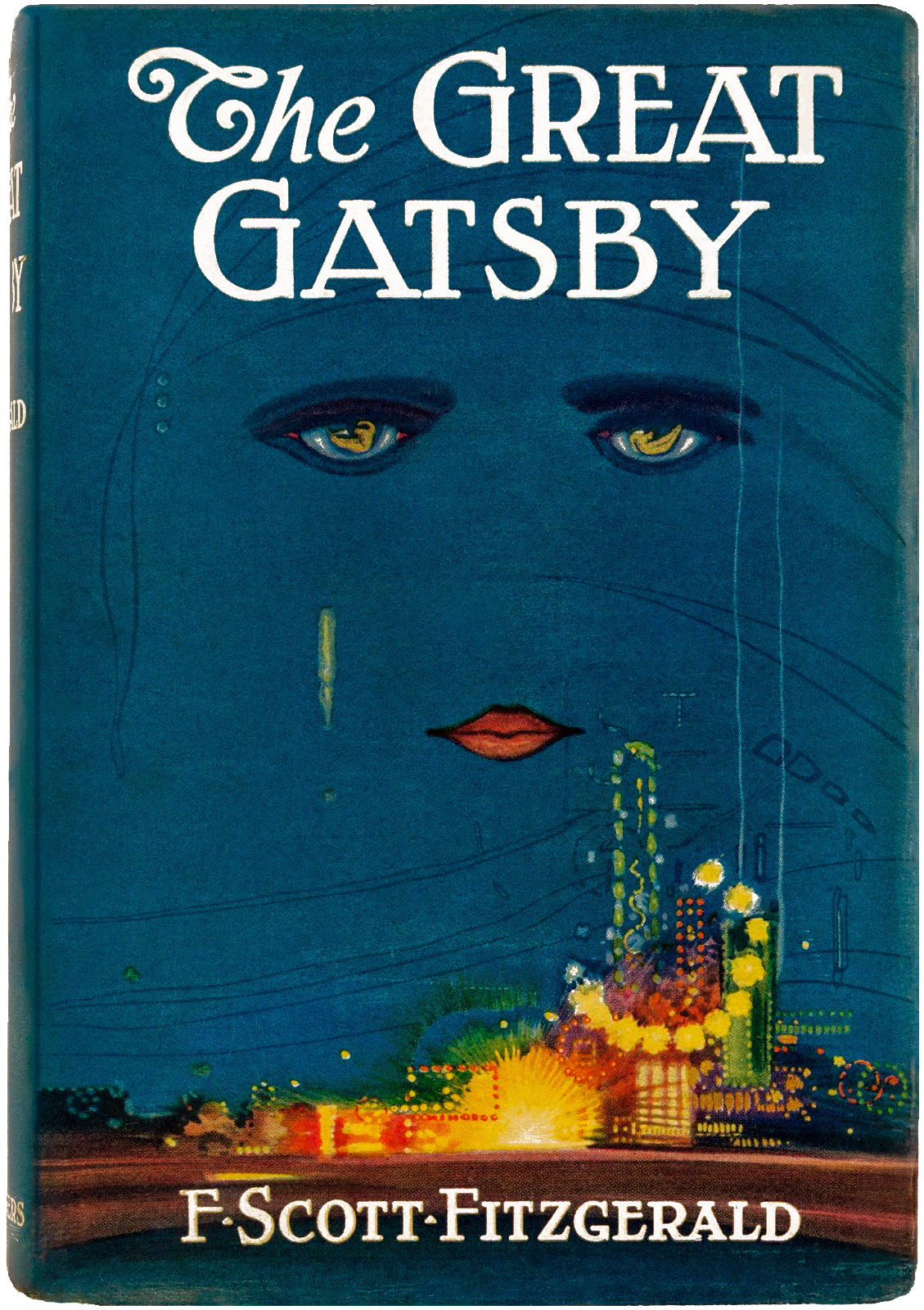
The book cover of the original edition of The Great Gatsby features an illustration by graphic designer Francis Cugat.
Do the gloomy eyes instantly tell you that the book captures a tragedy? It perfectly aligns with the loneliness and misery in the life of the protagonist Jay Gatsby.
This is one of the crucial details we would like to talk about first. The cover of your book is meant to give your readers a first-hand encounter of the emotions you cover in the content. If your content is meant to make them happy, your cover should do it too. Does the content revolve around a horror them? Your cover should send shivers down your reader’s spine. By doing this you are laying the foundation right!
The cold blue sky with the sad eyes just above the bright yellow skyline can also be seen as a metaphorical reference to the sorrow that prevails in the seemingly fancy life of the wealthy people the story revolves around.
We have a Kimp blog that talks about visual metaphors in detail. It is a concept that comes in handy in impactful designs like a book cover. Why choose something ordinary when you can tell so many stories with one single design right? The Great Gatsby shows that with the right use of visual metaphors, you can make your book cover as interesting as the book itself.
Kimp Tip: Contrast plays a crucial role in the effectiveness of the above design. The contrasting red lips on the blue sky as well as the contrast between the cold blue color and warm yellow of the skyline both add depth to the design. This clearly shows how the wise use of contrast can make your design unique.
2. Psycho by Robert Bloch

The cover design of the first edition of Psycho shows how you can stun your audience with simplicity. Created by Tony Palladino, this cover gets straight to the point. It focuses on the one word that sums up what the story is about. And the crack in the word psycho is perhaps a metaphorical representation of the antagonist’s mind.
The eerie theme of the design is what makes it special. Like The Great Gatsby cover design, this one instantly conveys the emotions the content deals with. For a psychological thriller like Psycho, it is particularly important to evoke a sense of fear in your readers from the first moment. And this cover design does that perfectly.
The cover also shows how even with a text-only design you can create something memorable. And the orientation of the text on the cover is different from what you usually see on most book covers. This aligns with the way this book challenges your perspectives on the characters in the story.
Finally, the color palette of the book shows how you do not need too many colors to actually make an impact. Just one or two appropriate colors are all you need to create a good first impression.
Want to create a simple and sleek text-only book cover design but don’t know how? Get in touch with the Kimp team today.
3. The Little Prince by Antoine de Saint-Exupéry

The cover design of The Little Prince is one of the most delightful examples of the strength of illustration. The celestial theme of the cover aligns with the storyline of the prince visiting different planets. The original illustration that appears on the cover is in line with the illustrations the book is filled with. And these were illustrated by the author himself.
The friendly script font is perfect for the young audience the book targets. And the warm yellow color that dominates the design captures the warmth the content spreads.
This book cover design shows the need for choosing the right fonts and colors for your book. Have you instantly connected specific emotions with different colors? Color psychology is a pretty big deal in design. It taps into the emotions attached to each color. That’s one way to create graphic designs that evoke the intended emotions.
Similarly, have you noticed that some fonts look formal, some look cheerful, some look elegant and others have a funky vibe? Font psychology is as important as color psychology. In the above example, do you think a clean modern font would have captured a similar friendly mood? Not likely. For books targeting young readers, you should avoid complicated fonts that are difficult to read as well as uninspiring ones that do not have a strong character.
4. The Godfather by Mario Puzo

Created by graphic designer S. Neil Fujita, the cover art of The Godfather is one of the most iconic designs in the literary world. This design leverages the combined strengths of custom illustration and visual metaphors.
This cover art is also a classic example of the benefits of experimenting with powerful typography. In fact, this idea can be projected onto various other designs. When you choose a font style with strong character, you add a new dimension to your design.
Besides the catchy font, the illustration is another point of attraction in this design. The puppet string illustration is indicative of the idea of control and power that the story predominantly deals with. The traditional font, on the other hand, aligns with the theme of the powerful mafia family in the story. Finally, there is minimal use of color given the grave theme.
When a book is turned into a movie, the original cover graphics from the book are often used either fully or partially. And this was the case with The Godfather too! Not all graphics that look good on a small book cover look equally impactful on a large-scale billboard ad for promoting the movie. So, coming up with a versatile design is one way to keep your options open.
Struggling to create book cover designs that can conveniently be scaled onto other marketing collateral? The Kimp team is here to help. Your dedicated team of designers takes care of all your design needs ensuring that they all look cohesive.
5. Jurassic Park by Michael Crichton

There are very few cases where the movie adaptation and the original book have both seen phenomenal success. And Jurassic Park by Michael Crichton is the perfect example.
The cover art of Jurassic Park shows how straightforward designs and iconography can have a huge impact on the readers. Designed by graphic designer Chip Kidd, this cover features a skeleton of a Tyrannosaurus. This iconic silhouette became an inseparable element in the Jurassic Park movies as well as in the promotional materials.
The book cover design keeps it simple and uses a fuss-free sans-serif font which is perfect for a science-fiction book. The movie poster uses the same Tyrannosaurus skeleton but a different font style which is slightly more powerful and suitable for the big screen.
Jurassic Park movie poster featuring a Tyrannosaurus skeleton

The fierce dinosaur silhouette not only tells you what the story is about but also represents the thrill and suspense the story exudes.
Kimp Tip: What really makes the design stand out is its clutter-free layout with plenty of negative spaces. So, the reader’s full attention is on the title and the dinosaur skeleton, thus making the design a memorable one. Make the most of negative spaces in all your designs. They come in handy when you have to direct attention to specific areas in your design. And at the foundational level, negative spaces ensure legibility and prevent clutter.
Don’t worry if you are having a tough time making negative space work in your design. Choose a Kimp subscription and your dedicated design team will help you with that.
An object of beauty
6. A Clockwork Orange by Anthony Burgess
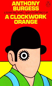
The book jacket of this popular book has undergone quite a lot of changes over the years. But two of the book cover designs so far have been among the most talked about cover art in the literary world.
One is the iconic design you see in the above image, nicknamed “cog-eyed droog”. There are several things we love about this design. The stimulating color palette is one that perhaps grabs your attention in the first place. And this feels relevant to the serious theme of the novel. The title itself comes from the phrase “as queer as a clockwork orange” indicating the bizarre nature of the main character in the book. The silhouette of the main character, Alex, and the gear detail representing “clockwork” capture the core idea.
Another version of book cover that became popular for this book was the recent one featuring an orange circle on a plain white background. This is an exemplary design that shows how you can make heads turn with minimalism.
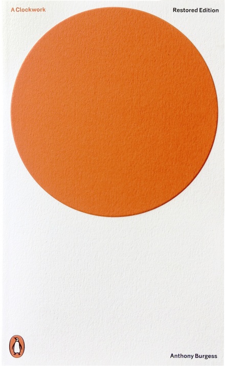
The cover does not give away too much information about the book. It does not tell you what the book is about. Even the title does not appear fully. You only see the text “A Clockwork” right next to the big orange circle. The reader is left to complete the sentence by associating the graphics in it.
By making the design more modern and packing layers of meaning in what seems like a simple design, this book cover is pretty intriguing. But yes, it is a risky bet since you are not providing many details for the readers who are new to the book! However, this intriguing design might turn out to be the visual hook that makes your audience stop and pay attention to the book.
When you have an iconic book that has steadily garnered popularity over the years, it is worth taking such calculated risks.
Book cover designs for a new book or redesign for an old publication, the Kimp team can help you with all kinds of cover art requirements.
Create Attention-grabbing Book Cover Designs With Kimp
From the book cover design you need before publishing your book to the social media designs and ads you need for promoting it, everything can be taken care of in a single monthly bill with Kimp subscriptions. And what’s more? You also get unlimited designs and unlimited revisions for continued production of social media designs to build a strong social media community for your readers.
Start your 7-day free trial today.