Everything You Need To Know About Website Sliders
Creating a website is easy today. Many online website builders let you build yours in minutes. So, everybody can do it. What sets yours apart will be your strategy for customizing the site. One of them is incorporating sliders. Website sliders are a scrolling set of images or videos that can be added to a website to make it more interactive. Also enhancing the aesthetic in the process.

To promote your discounts, give a sneak peek into all the new products for your customers to check out – there are many ways to use website Sliders. Moreover, sliders also give you a creative way to customize your website without interfering with the overall visual style and the design of other core elements.
If you are not already using them then you are in the right place. Let’s talk about some benefits of using website sliders and some easy design tips too.
The real reasons why you need website sliders
Websites are no more just digital brochures of information on a business. They are often the first serious touchpoint where a business meets an interested customer. 50% of consumers consider website design as one of the most critical elements of a brand. From the overall usability of the interface to the ease of finding information, there are a lot of factors that influence a user’s perception of a website. Moreover, 40% of consumers appreciate the use of images and photos to make websites
Sliders can put a creative spin on navigation

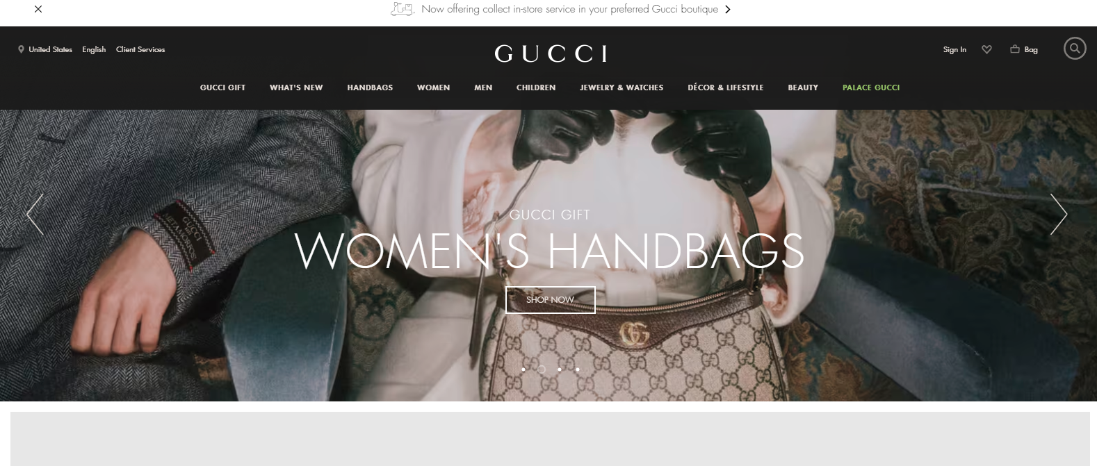
The Zara website shows you how you can creatively use sliders to create an interactive website. The website on the whole is pretty engaging with a lot of animated content and category-relevant visuals to welcome the visitor. The website also incorporates both horizontal and vertical sliders to let costumes navigate through the different categories of users like men, women, and kids and further navigate across categories in each segment like partywear fashion, shoes, and more.
Instead of boring slide-down menus, website sliders can be used to take visitors to the section they are looking for.
Sliders are space savers
Brands love to highlight their flagship products in each category to direct attention toward that particular category. In such cases, instead of crowding the page with too many images, you can use website sliders.
This also applies when you have to promote a huge sale and give a peek into discounts in major categories. In all these applications, while you can use multiple images for respective destinations, you can always use a single image slider and save an ample lot of space.
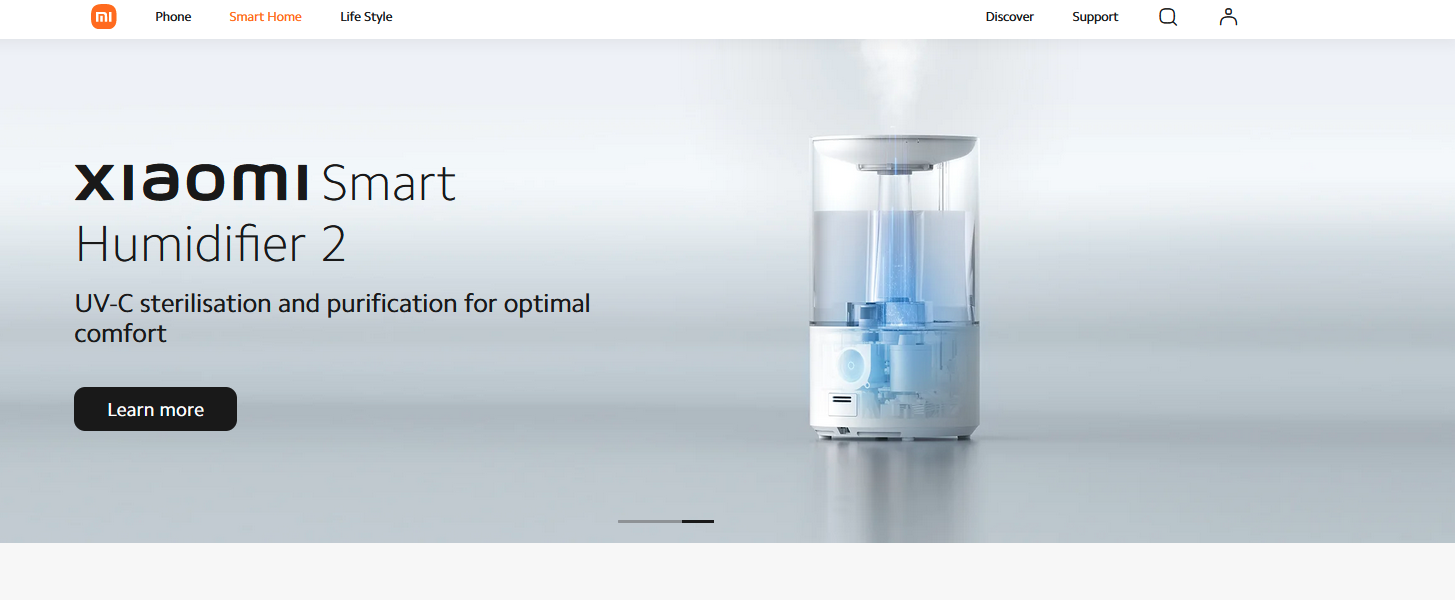
The snapshot below shows how the Xiami website uses sliders to save space.
Draw attention to what matters
A visitor’s eyes are drawn to wherever there is movement. So, if there is important information that you do not want your customers to miss, you can use website sliders to draw attention. You can use these sliders to advertise within your website or even make announcements for all your visiting customers.
Dress up your website without modifying its structure
During the holiday season, physical stores have many options for customizing the ambiance to suit the season. For example – Christmas decorations for the Holiday season – banners, Christmas trees, and the whole deal.
However, with an online store, how do you do this? You cannot change too many things about your website because that will affect its usability. Users who are used to finding your menu in one particular place or have associated specific colors to specific functions on your website will have difficulty in using your site if you modify too many things. That’s where website sliders come into the picture.
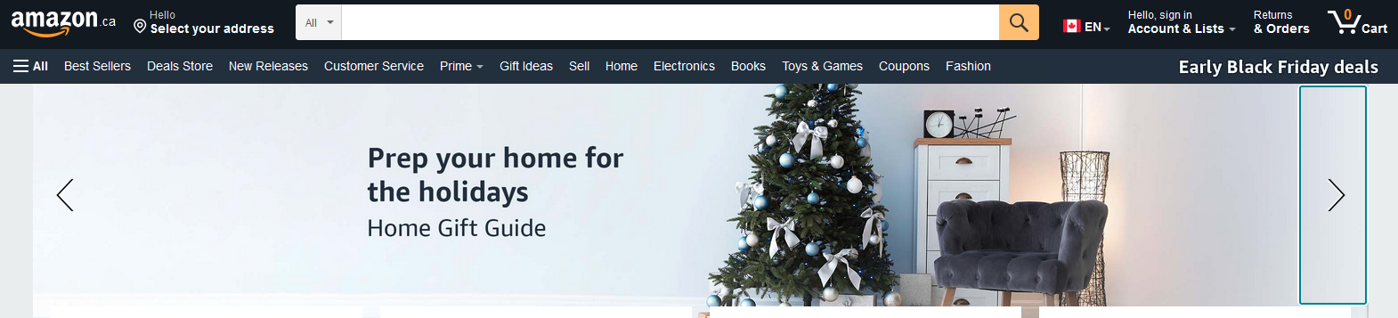
For example, the below image shows a snapshot of how Amazon puts its holiday shopping guide in the spotlight as a way to dress up the website for the season way before Christmas.
Most of these website slider benefits matter only when you have the right design. Now, how do you make that happen? Let’s talk about some design tips to help you get started.
Website sliders – tips to design for conversions
Adding website sliders to your website is easy because there are many plugins that let you do that. Most of them have premade templates that you can customize by adding custom images and text. So, a lot depends on the actual design part. Using custom graphics in place of generic stock images ensures that you leverage the full potential of sliders. And when you do use custom graphics, here are some tips to simplify things.
Pick the right layout for the purpose
We discussed several benefits of website sliders. Which of these would you like to tap into? Depending on the purpose identify the most suitable layout. Your design, including aspects like the image resolution, the position of the visuals and text within the design, and others depend on the layout you choose.
Vertical scrolling sliders, for example, will make more sense when you have to divide a product page into multiple sections. Because users tend to scroll down to read more about the product they are interested in.
Choose the right colors
Avoid using too many clashing colors on your slider because you do not want visual chaos on your website. Here are a few ideas to choose the predominant colors for your website sliders:
- Use your brand colors – this works when you have an otherwise minimalistic website layout. So, you can use your sliders to establish the presence of your brand colors. But if your brand colors appear everywhere including the website background, then you might have to choose a different set of colors. Otherwise, your sliders might go unnoticed.
- Use colors based on the highlighted product. This will help draw all the attention to the product. Take a look at the below design by Kimp. The slider uses the product label color as a reference and creates a visually harmonious image.

- Use colors based on the theme or season. Reds and greens for Christmas, blues and greys for winter sales, black for Black Friday sales, green for St. Patrick’s Day discounts – you know the drill. These colors don’t just convey the theme instantly but also help customize your website aesthetic for the season.
Tell a story
Planning your slider in such a way that there is a strong cohesiveness between consequent images makes the design even more impactful. This way, when customers scroll through the sliders, they don’t see random graphics but experience a story.


Customers will be more willing to scroll through the slides if your first slider image has a visual hook and an attention-grabbing message and the subsequent slider images add to the information presented in the previous slide. So, if you want to create sliders that actually drive engagement plan your slide images so that they cohesively tell a story.
Visual consistency makes a difference
Sometimes, you have distinct details to present in each slide but you want them to still appear connected. In such cases, you can create visually consistent designs to achieve the intended effect.


In the above examples, there are different products highlighted on each slide. The slides also use different background images and different product photos. And yet they look similar and connected. That is because both images use a specific template. In other words, there is a fixed style with respect to the placement of the product image and text.
Kimp Tip: One other way to maintain visual consistency among all the images you use in your website sliders will be to use similar editing styles. If you have a particular alignment or formatting for your fonts, or if you use filters and background blur, repeat the steps for all your images.
Want to design website sliders the easy way? Choose Kimp.
Use meaningful and relevant images
Remember that every piece of graphic you add to your web page directly influences your website load times. So, yes, though it’s important to add visuals to your website, it’s even more important to use relevant and meaningful ones. Random stock images plugged into the page will only weigh it down without a clear purpose.
Instead, choose custom graphics that quickly communicate the message to your customers. Because more than aesthetic images used just for the sake of it, meaningful ones that make customers stop and take a good look and react make the most of the website real estate.
Take a look at the below design – the before and after pictures for proof, the product image to tell what is being promoted together convince customers to click the CTA.

Mobile-friendly designs are a must-have
If you want users to keep coming back to your website, there is a 74% better chance if you keep the overall design mobile-friendly. Heavy sliders can sometimes cause lags in the mobile version of your website. The other kind of problem you might face is when you use wide-screen full-width sliders. In such cases, the slider text might appear too small on the shrunk version of the image displayed.
Compact slider styles that fit perfectly in both desktop and mobile versions of your website will be the optimal choice.
Add a clickable CTA button
While clicking the image directly takes users to the destination in most website sliders, it’s a good idea to include a visible CTA button. And use a relevant copy for your CTA instead of generic ones like “click here”. With this, users will know why they should click the CTA and what comes next.

Use A/B testing
Seasonal website sliders and those announcing new product launches and offers tend to be replaced quickly. But some sliders are meant to stay on your website for a long time. In such cases, it’s important to continuously monitor the effectiveness of your slider design. Remember that it’s adding a slight extra weight to your website. So it makes better sense if your sliders drive conversions.
Performing A/B testing and experimenting with the layout, position, and design of your sliders is one way to improve their performance.


As you can see in the above images, altering even the smallest of details like the position of the text in your design and the font sizes can drastically affect the impact of the design. Have different versions of your slider images created and experiment with them to find out what works.
Creating multiple versions of any given design becomes so much simpler with an unlimited design subscription like Kimp. You can request any number of changes and any number of variations for experimenting with at no extra cost.
Don’t squeeze too much into one slider element
Sliders are meant to be easy to navigate and you can always add arrows, a navigation bar, or even the traditional scroll dots to let users move back and forth between images. But don’t add too many images within the same slider. Users come to sliders for quick introductions and not for endless scrolling. If you have multiple announcements to make, categorize them and spread them across in multiple sliders. But remember to optimize these sliders and their resolution so that they do not slow the website down.

The above snapshot shows how the Samsung website incorporates multiple website sliders to highlight different topics.
Design eye-grabbing website sliders with Kimp
Website sliders, as you can see, have multiple applications. In addition to the core design of the slider images, you can also play around with the transition effects and scrolling directions of the images. This lets you fully personalize your sliders based on the rest of your website interface. Want to start adding stunning sliders to your website? Sign up for a Kimp Graphics subscription.
Start your free trial today by signing up right here.