7 Essential Tips For Creating 404 Pages That Your Customers Will Love
Dead ends are not always pleasant. But in the case of your website design, you can change that! Even dead ends can be made to work for your brand. Even dead ends can look beautiful. Yes, we are talking about 404 pages, the dead ends that any visitor encounters owing to broken links.

What if someone offered you direction when you thought you met a dead end? Wouldn’t you be eager to explore the alternative proposed? You can replicate that for your website’s 404 pages as well.
Default pages are boring. They do nothing for your brand. Instead, they frustrate your website visitors. And might even be a reason for them to abandon your website. But with a little planning and good design, you can turn the tables. You can direct customers to other relevant destinations that might interest them. And benefit your brand in the process too!
But how can you do that? Let’s look at some examples of brilliant 404 pages and see what ideas to take away from them. Of course, we’ll first tell you why going that extra mile and getting a 404 landing page designed for your website actually matters.
404 Pages – benefits no one talks about
A 404 error page can often make new visitors anxious or upset about not finding what they want. They do not always land there because of wrongly entering the URL themselves. This could be an error at the side of the source that brought them to that page. But customers face the brunt. So, the purpose of customizing a 404 page is to make up for this unexpected bad experience a customer has. And when you do that, here are some benefits for your brand:
- Gives you a chance to show your brand’s quirky side, to break the ice.
- You can use your creative side to set your business apart from the competition.
- A unique 404-page design will act as a visual reminder of your brand’s tone of voice. Customers are familiarized with your communication style. It helps if they understand how approachable your brand is.
- A custom 404 landing page gives you an opportunity to add a high-conversion CTA or links to upsell and cross-sell. That’s good for your website traffic as well as your sales in the long run.
- It helps reduce the chances of website abandonment. Customers who come across a 404 error page do not always willingly go back to the home page or try to figure out how to get the right URL. Instead, they might simply abandon the website. A 404-page with an interesting concept, engaging visuals, and a creative copy is likely to reduce the chances of this website abandonment.
So now that you know the need for coming up with a creatively personalized 404 page, let’s talk about some design tips and content ideas to bring your ideas to life.
Creative ideas for 404 pages that make a splash
1. Use your brand’s signature product
Featuring your signature product on your 404 page is one of the simplest and yet the most effective ideas. By doing this, you are leaving a lasting impression on your audience. How? Because even if they choose to abandon your website there, the last thing they see on your website will be that product. So, even if they are new to your brand they have now met the flagship product that your brand is known for. Remembering a brand for the product it sells is much easier than remembering a brand name and other elements.
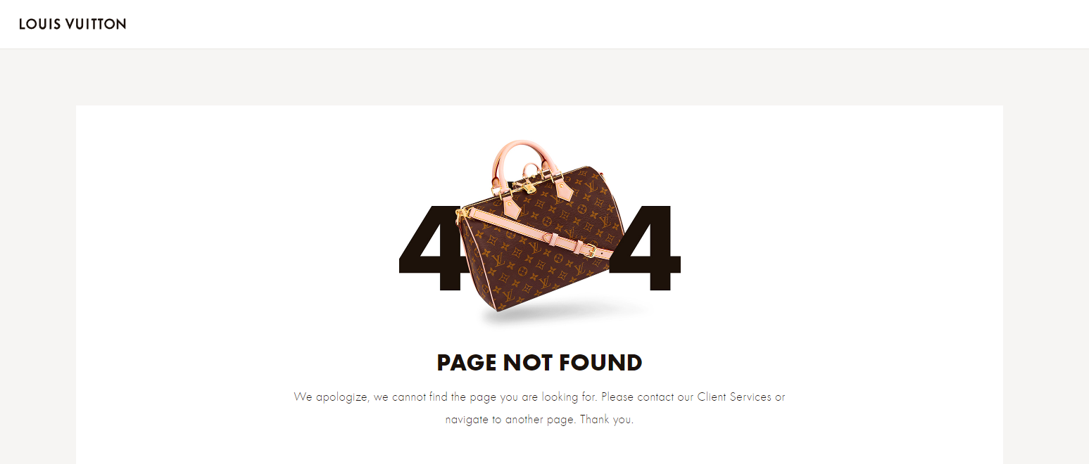
The above image shows the 404 page on the Louis Vuitton site. It features the iconic LV monogram Speedy bag so customers will get a taste of the brand even on the 404 page. And the best part is that the imagery here does not weigh the page down.
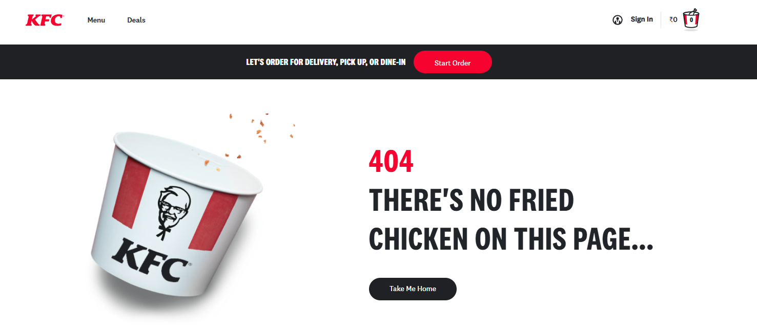
KFC’s 404 page is even better. The signature KFC bucket and the copy together connect back to the brand. And the fact that the bucket is empty makes you crave one. That’s precisely what marketing designs should look like for a food brand – they should make you hungry. This one does!
2. Or use a metaphorical reference for better interaction
Visual metaphors have a special place in the world of marketing design. If you have never explored them in your marketing, do check out the Kimp blog on visual metaphors and how to use them. But now, we are talking about visual metaphors in the context of 404 pages.
Put in simple words, these are metaphorical representations of an idea you wish to convey. Instead of presenting an image of your product, you include a scene or an item that gets customers to think of your product, the idea behind your product. In other words, you stimulate your customers’ minds and engage them meaningfully. And that works in favor of your brand. So, it makes a brilliant idea for your 404 page.
Take a look at the below 404 page on the Coca-Cola website. Instead of featuring the actual product, it uses visual metaphors. The soda can, the water droplets on the “4” and the use of red all relevantly connect with the brand and help users visualize the red Coca-Cola soda can instantly.
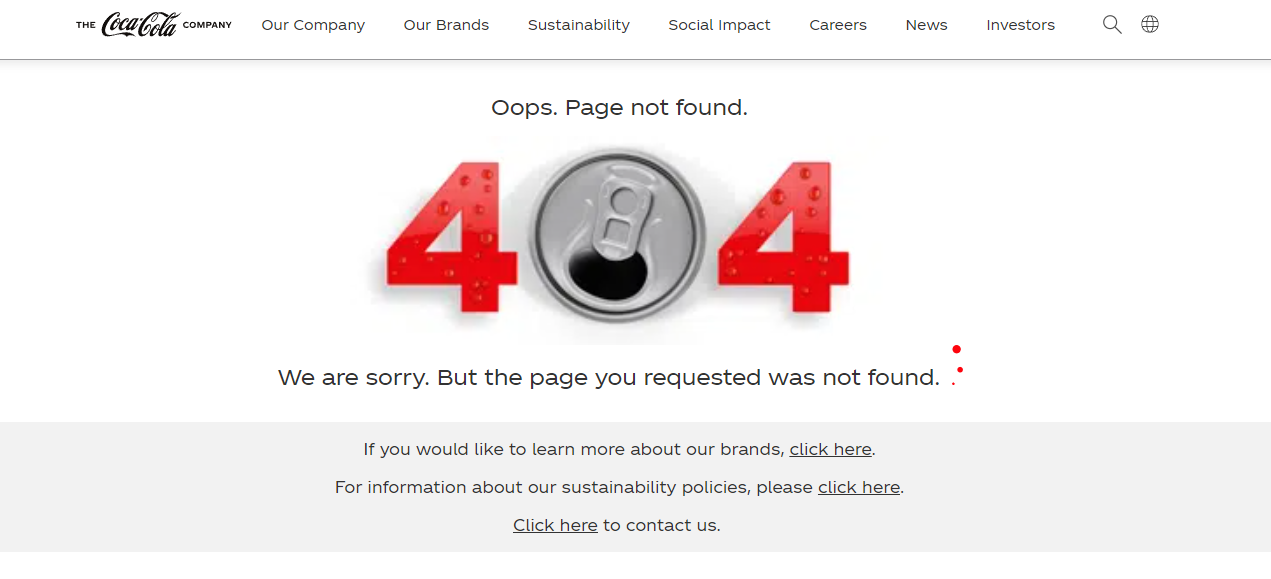
Kimp Tip: Always think of the end user when you design visual metaphors. If your branding elements, the imagery in your ads, and the popularity of your product and its applications are not strong enough, customers might not entirely grasp the idea in the metaphor. The above Coca-Cola 404 page will not make sense to someone who does not know that the brand is known for its sodas. So, instead of designing a visual metaphor based on your perception of your brand, design one based on your customers’ perceptions of your brand.
Want to experiment with visual metaphors and other interesting elements on your 404 landing page? The Kimp team can help.
3. Dynamic 404 pages
Because the default 404 page is boring brands choose to design a custom 404 page. But there are some brands that are not happy even with a simple static custom 404 page. They incorporate dynamic pages. This is where the brand has a set of 404 pages and a different page is displayed each time there’s a broken link. That’s a good idea to try. Marvel does it perfectly.
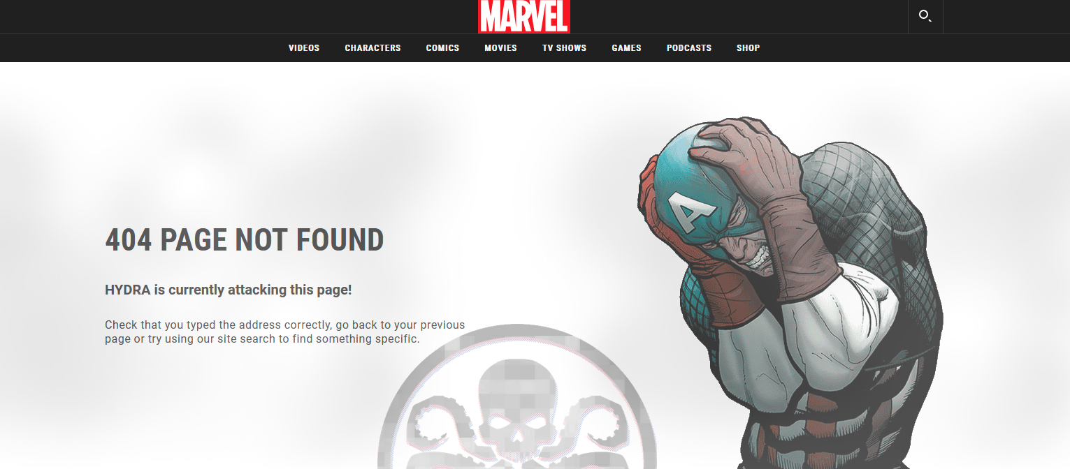
The assortment of 404 pages on Marvel’s website is as interesting as the movies from Marvel. Makes you want to hit a dead end on purpose! Here’s another one.
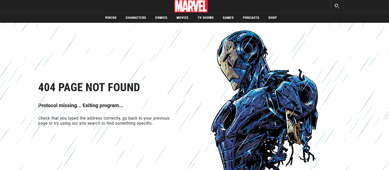
These pages all feature popular characters from the Marvel Cinematic Universe. Imagery, animation, a copy that is bang-on – Marvel truly knows how to excite its fans. This is just one simple example of Marvel’s marketing finesse. Here’s one more 404 page on the Marvel website. It’s the last one we show you, we promise ?
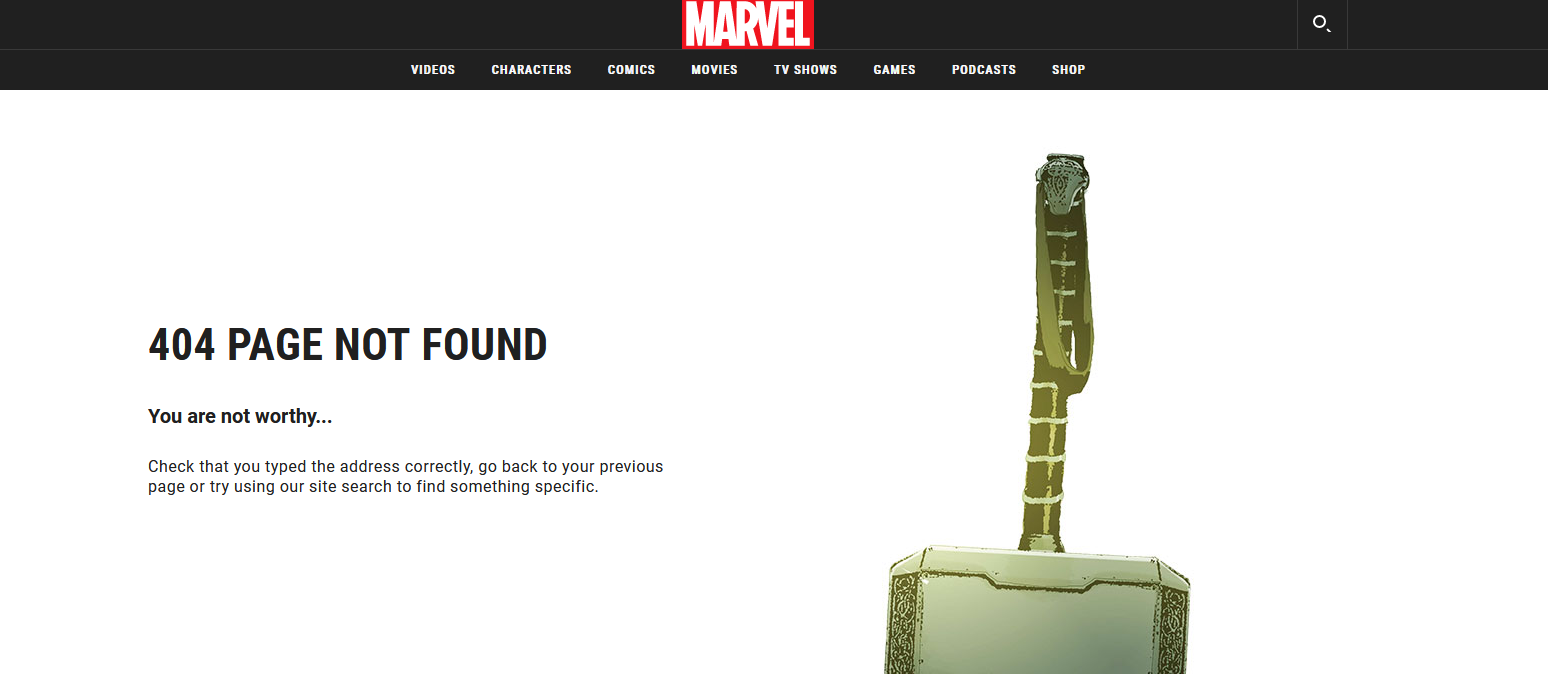
Go on, refresh any 404 page on the Marvel website and see if you can catch your favorite superhero!
Some takeaways from the Marvel 404 pages:
- Copy and design go hand-in-hand.
- The above designs are sure to excite any true Marvel fan. The best cues for what to include in your 404 page, or even any marketing design for that matter, come from your audience. If the references you make or the humor or the puns you use in your design or copy do not make any sense to your customers, your design loses its purpose.
4. Use your mascot for better branding
We’re going to use our own 404 page as an example here. Here’s the 404 page you’ll see if you encounter a broken link on the Kimp website.
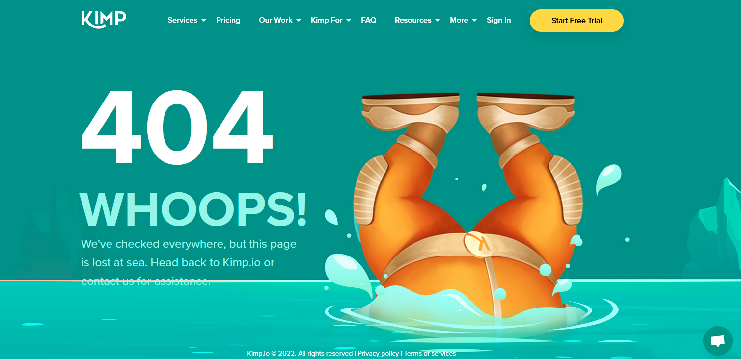
With a 404 page, you get a chance to introduce your customers to your mascot. And unlike other pages on your website with very specific objectives, the 404 page has just one goal – to ameliorate an otherwise bad experience or even make it a memorable one. You can exercise your brand mascot’s unique personality and combine it with copy that matches your brand tone of voice. So, customers get an idea of what kind of brand personality you have – fun, responsible, sophisticated, and so on. Kimp’s mascot, for example, has a unique vibrant personality. Our 404 page just captures one of our mascot’s quirks! What does yours convey? Think about it!
5. Go beyond images
GIPHY uses a GIF on its 404 error page. After all, a website to download GIFs cannot go with just a static image, right?
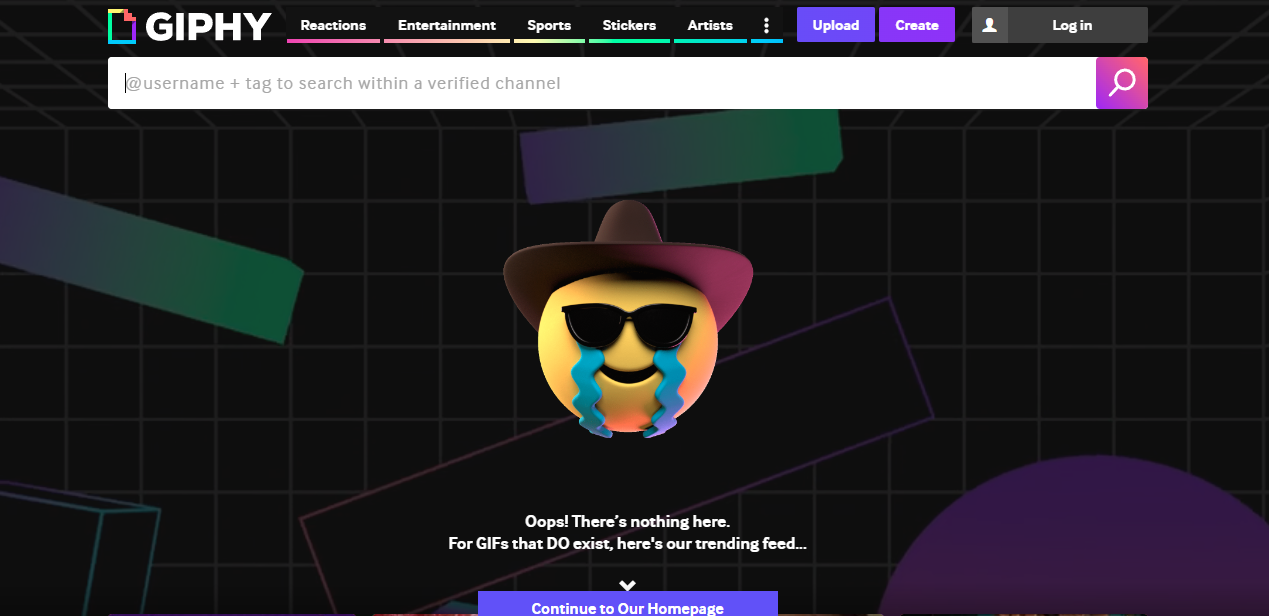
This idea works not just for GIPHY. Adding an animation amplifies the experience. It makes even a 404 page more fun. Good marketing and good user experience are all about creating a positive emotional connection with your audience. Interactive animations help you achieve that.
However, you do not want lengthy animated videos. A roundabout message is the last thing a visitor wants after already being annoyed by hitting a wall. Use motion simply to grab attention and do this without adding to the loading time of the page. Small-size GIFs do just that.
Want to create branded GIFs to add value to your 404 landing pages? Choose a Kimp subscription.
6. Don’t forget the links
Besides exercising your creativity in terms of the overall page design you also need to get creative with the links you provide. Most brands stick with redirecting to the homepage. But you can do better than that!
There might be customers from different sources, arriving at your website for different purposes. So, sending them back to the homepage does not really make much of an impact. Instead, identify the most relevant links. These could be conversion funnels or productive CTAs that capture information about your leads or provide them with a possible direction to move forward.
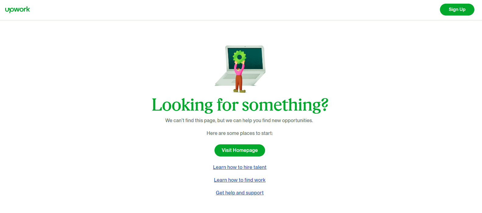
The below 404 page on UpWork has a cleverly worded copy that leads customers to perform one of the actions that make the most sense. People who visit the UpWork are mostly looking to hire talent or find work. The 404 page includes links relevant to both types of users.
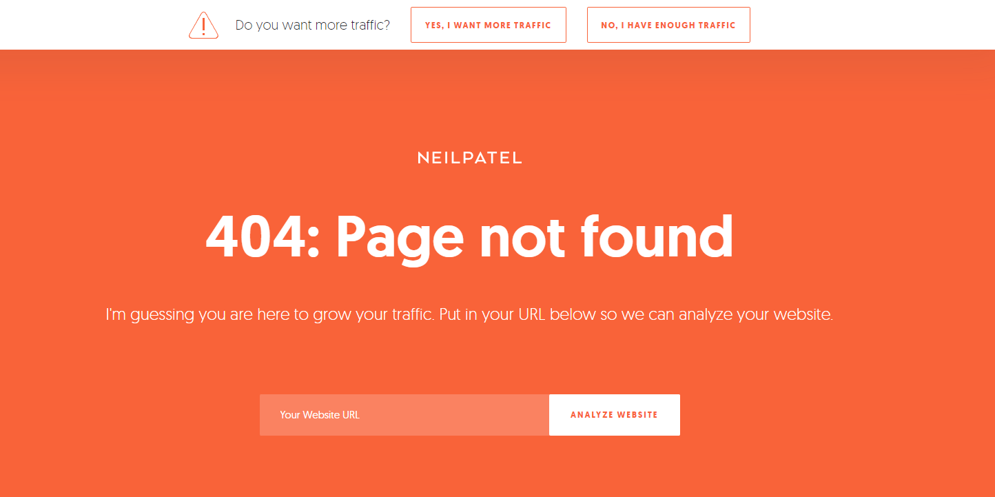
Another interesting example of this idea is the 404 page on Neil Patel’s website. There is one key service the website is known for and that’s website optimization. So, the 404 page includes a field for users to directly key in the URL of the website they wish to analyze and optimize. This lets the users take a step immediately.
Kimp Tip: The key is to redirect your customers in a direction that’s most beneficial to your brand while also making it relevant to them. Avoid adding too many links. Because you know that too many options end up confusing your audience. And confused audiences do not take a solid step forward. Instead, choose a few good links that are suitable for all kinds of users on your website.
7. “Simple” can be stunning
In the end, you need lightweight pages that do not have to be crawled by the search engine. So, you don’t actually need too many complicated elements to make your 404-page work. Visuals and interactive GIFs are great. But if you wish to keep it simple, you can still come up with creative ideas that feel most relevant to your brand. IMDB shows how this is done.
The 404 pages on the IMDB website, similar to those on Marvel, are dynamic and use movie references. But the difference is that the pages are simple. Stripped down to just a simple text bubble that displays popular movie dialogues with a line that says which movie the reference is from.
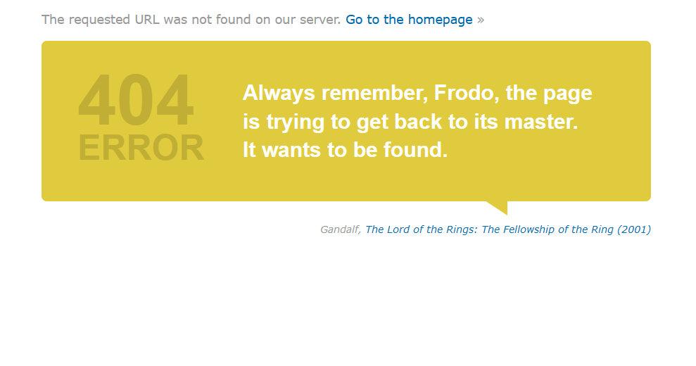
And there is a link to the respective movie page. This idea kindles the users’ interest in the form of famous movie dialogue. And when the user clicks on the movie link, the purpose of visiting the website, finding information about movies, is fulfilled after all!
Kimp Tip: Minimalistic pages like the above example from IMDB can sometimes be tricky to work with. Customers should be constantly reminded of where they are and what your brand is about. Here the idea works because of the easily recognizable IMDB brand color used on the page. Similarly, when you design your 404 pages, let your brand colors take the center stage.
Wow your audience with creative 404 landing page designs from Kimp
One of the most important types of designs covered in a Kimp Graphics subscription is landing page design. A good landing page lies at the crux of most successful campaigns. Even your 404 landing pages can look so much better when you make up your mind to tweak them to suit your brand. Let the Kimp team help you customize your 404 pages. Sign up for a free trial to see how subscription works and then have unlimited ads, landing pages and so much more designed for your brand.