4 Rebranding Fails: Learning From the Mistakes Big Brands Made
Rebranding can be exciting because a new logo, some new colors, and a whole new look can be refreshing. Rebranding can be intimidating because what if your existing customers do not recognize your new logo? Sounds relatable? Every business owner who has had to make a rebranding decision has been there!

Rebranding can be both exciting and stressful at the same time. But sometimes, it’s the best a brand can get. Time it right and rebrand for the right reasons and you will be able to take your brand places. Major brand rebrands and logo redesigns can teach you so much about what to do and what not to do when you are rebranding. Ruling out what not to do can simplify the process in many ways. So, let’s talk about rebranding fails. We’ll look into examples of failed attempts from popular brands. But first, how do you know that it’s time to rebrand? Come find out.
Signs that tell you that it’s time to consider rebranding

Improper timing is one of the critical reasons behind some rebranding fails. Let’s look at some signs that indicate the need for rebranding.
- Your brand identity and your brand’s purpose are no longer on the same page. It could be because you switched to a different product line or your brand vision is no longer what you planned at the beginning.
- Global trends and events, like the COVID-19 pandemic, for example. In a survey conducted by UpCity, it was found that nearly 51% of the 600 businesses surveyed had changed their branding approach due to the pandemic. With people forced to spend more time indoors, and shopping online to avoid crowds, a lot changed. Naturally many brands wanted to keep up with the changing customer preferences. That’s a good reason to rebrand. Rebranding to adapt to the changing market trends can give you tremendous results, provided you know that the changes are not momentary.
- Your logo feels outdated. This can be because your brand has grown and evolved to be bigger than what it initially was. And sometimes, it’s because you are in more places now. Perhaps a brick-and-mortar store that has now expanded its online offerings or an online store that has gone on a global scale.
- Your competitors have changed and so you need to keep up with the changes or set yourself apart.
Having identified a strong reason for rebranding, if you are wondering where to start, let’s look at some rebranding fails. Knowing what goes wrong when some brands rebrand helps you avoid that path and tread more cautiously.
Rebranding fails and what to learn from them
Even big brands have had their share of rebranding fails. That’s proof that there’s no black-and-white answer when it comes to making a rebranding decision. You need to explore all the shades of gray in between to identify whether your brand will benefit from a major rebranding campaign or subtly pivoting your marketing approach will be sufficient.
If you look at most of these rebranding fails, sometimes the timing is wrong, and sometimes the market trends affect the outcome. Either way, these rebranding attempts did not go well with the audience and so you cannot let that happen with your brand.
Without further ado, let’s discuss some well-known rebranding fails. Some of these are major rebrands and some are minor logo redesigns that went wrong.
Petco
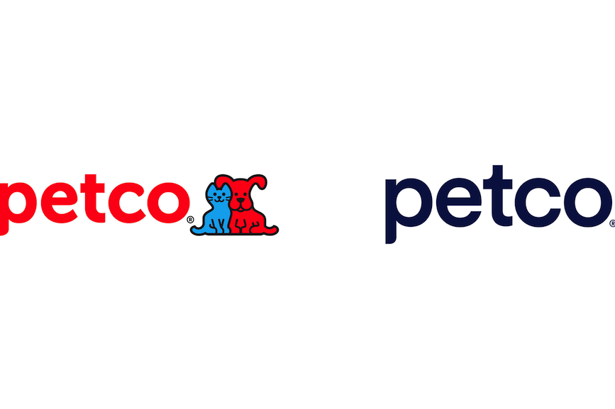
In 2020, Petco announced its rebranding from “Petco Animal Supplies” to “Petco, The Health + Wellness Co”. When the brand pivoted, it came up with an all-new logo. Though the font remained relatable, the color was changed. And what really disappointed the fans was the brand’s decision of dropping its mascots Ruff and Mews from the logo.
The old Petco logo with its illustrated mascots and the bright color palette was overall fun and relevant for the industry. Customers did not like it when the brand chose to drop the mascots from the logo.
Some loyal customers felt that the new logo felt “cold and lifeless” and a few even raised online petitions for the brand to change the logo back. Always gauge your customer sentiments before you take a major step with respect to your logo design. Because to them, your logo is the face of your brand.
Kimp Tip: In rebranding fails like the Petco example, things go wrong when the logo does not have a strong personality. Your logo should be a reflection of your brand personality. Even if you are expanding your business if your brand personality remains then ensure that your new logo does not have a totally different vibe than the old one.
Struggling to redesign your logo without losing out on your brand identity? Leave it to the Kimp team.
PlayStation 5
PS4 logo
PS5 logo
Sometimes the hype that precedes a rebrand is bigger than the actual changes made. And the PS5 logo is a good example. What was anticipated to be one of the biggest announcements at CES2020 turned out to be a non-event for fans. The new logo of PS5 unveiled at the event bear a striking resemblance to the PS4 logo and fans were not happy. They took to social media to share memes and express how let-down they felt with the “new” logo.
For a brand that’s known to be an innovator, an uninspiring logo redesign can earn a huge backlash and that’s what happened here.
As they say, “nothing changes if nothing changes”. If your new logo design, does not look any different from your old logo then most customers fail to even realize that your logo has changed. And when they don’t recognize the change, the purpose of your rebranding is lost.
Kimp Tip: Deviating too much from your old logo or changing too little can both be bad. Talk to your customers, look for social media discussions and find out which part of your logo connects the most with your customers. Perhaps it’s the font or your mascot illustration in it. Once you have identified this element, you know what to change and what to retain.
Rebranding is tough. We get it. Changing your logo is just a small part of the problem at hand. You need to plan your rebranding campaigns and tweak your ad strategies. So, leave the logo redesign to the Kimp team while you focus on the other tasks in your rebranding campaign.
When G Suite became Google Workplace
Google has been spreading its wings unstoppably and one of the major changes recently has been the switch to Google Workplace from G Suite. All the new logos that Google released with the Google Workplace were mocked at and criticized in many ways making this one of the most notable rebranding fails in recent times.
Some users even pointed out how the new designs might not be the best choice in terms of accessibility.
Speaking of which, we do have a blog on creating accessible graphic design. Do check it out if you would like to know more about creating accessible designs for all your customers.
One of the main reasons why several users did not like the new logo was because it lacked the usability that the previous versions were known for.
Take a look at the below image comparing the old and new logos and you’ll understand what we mean.
The new logos are aesthetic, they look cohesive and they brilliantly incorporate the brand colors. There’s no doubt! But what’s missing is meaning. Technology solutions like these are meant to be user-friendly. If someone who is new to using Google Workplace finds it hard to distinguish between the different products based on the icons alone, we don’t blame them. Documents, calls, calendar – the imagery in the old one and the meaning they add to the logo surpasses the aesthetic appeal of the new ones. Logos with a straight or hidden meaning are more memorable.
New corporate logo design of J.M. Smucker Co.
J.M. Smucker Co. has been a popular name in the business of jams and jellies. But the fruit-spreads brand decided to spread its wings and explore new product lines and that’s when the new corporate logo was released. It replaced the original iconic logo with strawberry illustrations and went for a vibrant modern logo.
The logo is minimalistic, and fresh and sports a flat design making it apt for the trends. Then why did fans not like it? Because like the Google logo change, this one too lost the meaning of the logo. The symbols in the logo don’t immediately scream “fruits” as the old logo did.
The brand took to Twitter to let unhappy customers know that the logo change is only part of the corporate identity.
The brand did try to add more meaning to the logo by explaining what each element stands for but that explanation did not save the attempt either.
Rebranding fails like these are often because customers get a little attached to your logo and because your logo becomes inseparable from your brand. In such cases, a drastic makeover is the last thing you need. Instead, go for more subtle redesigns.
Kimp Tip: In the process of modernizing your logo you cannot lose out on the roots of your brand. Sometimes a heritage symbol in your logo can add so much more value than a cleaner and more minimalistic symbol. The key is to know what works for your brand and what strikes the right chord with your customers instead of blindly going with the trends.
A few quick tips based on these rebranding fails
A lot goes into rebranding like – logo redesign, changing brand colors, brand taglines, and the overall visual style.
But then simply changing your identity without giving your customers a heads up will do more harm than good. Here are a few tips that can help when rebranding.
- Take it slow. Instead of surprising your audience, introduce them to the fact that you are working on a rebranding campaign. Explain to them the purpose of the rebrand and what it means to your brand and what it means to them. This will make them anticipate the change and accept it more willingly.
- Don’t abruptly stop using your old logo and brand colors. Instead, create a bunch of graphics that incorporate both your old logo and the new one.
- Create introductory videos. Even movie-style trailers will help kindle your audience’s excitement. When you get them excited about the change, you are less likely to face friction when you introduce your new identity.
- If you have a brand mascot, use your mascot to communicate the message. This makes it more personalized and easier to remember.
With all these easy tips you can avoid major rebranding fails and instead make your new and revamped brand identity work wonders for your business growth.
Rebrand with confidence with designs by Kimp
Changing your logo is one of the crucial first steps in rebranding. Because your logo is what represents your brand uniformly across all channels and changing it shows your customers that your business is changing. That’s when you grab their attention and communicate the message of what is changing in your brand. To talk about your rebranding campaign on social media, you need consistent designs that convey the idea of the campaign. Juggling these promotional designs and the new logo design can be tough. But that changes when you choose Kimp. One subscription takes care of all your branding designs and marketing designs in one place and in one monthly bill.
Register now for a free trial and rebrand with confidence.