Accessible Design – 5 Essential Secrets For Graphic Designers
Inclusivity is becoming a design trend you cannot ignore anymore. Creating designs that accurately capture your brand and message is important. But what’s even more important is creating designs that your customers see and process the right way. And this includes designing for people with various kinds of disabilities. There is a huge section of the population that lives with some form of disability. That’s 61 million adults in the U.S. alone. Therefore, accessible design is something you cannot take lightly. The International Day of Persons With Disabilities is on December 3rd. So, now’s a good time to talk about accessible design.


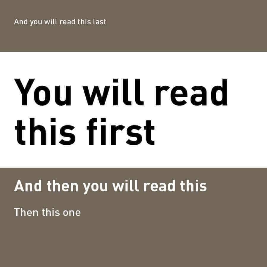
Did you see the number 73 in the above image? Not everyone can! And people who have difficulty distinguishing colors are also part of your target audience. That’s why it’s important to start prioritizing accessible design. Don’t know where to begin? We got you! We’ll give you some doable tips on simple adjustments and design considerations that can make all the difference.
- Accessible design – from a graphic design perspective
- 1. Pay attention to your typography
- 2. Color contrast deserves a special attention
- 3. Be careful when you use text overlays
- 4. Designing for color blindness
- 5. Add clear captions for videos and alt text for images
- Simplify accessible design with Kimp
Accessible design – from a graphic design perspective
When we talk about representative advertising and inclusivity in marketing, we often limit to the concept of including diverse cultural representations. Making people of varied demographics feel included. Acknowledging and embracing different ethnicities. But inclusivity goes beyond that. Evaluating and fine-tuning the experience for differently abled users is another critical component of inclusive marketing.
Accessible design is a pretty vast domain. This includes designing for accessibility at all your customer touchpoints. From an accessible UI design to app features that simplify usage for all kinds of users, there are several measures that a brand can take. But in this blog, we are going to talk about accessibility in graphic design in particular. This includes creating promotional graphics that are easy to consume for people with disabilities.
Most brands consider physical disabilities like blindness and hearing impairments. But cognitive disabilities require a fair share of your attention too. Aphasia, autism, dyslexia, ADHD – there are several such cognitive disabilities that make it difficult for people to process the information you present to them. Your ad, a design you think looks brilliant on screen, might be seen very differently by them.
For example, what if the contrast between the text and the background is not enough and so the user misses out on critical information? Or what if the pie chart in your infographic has different colors for different parameters but a color-blind user cannot distinguish them? The purpose of the design is lost. That’s why considering accessibility features is important in your marketing and branding designs.
And the best part is that accessible design in marketing is not that difficult after all. A few small tweaks and your design is ready for both the general audience and for people with disabilities. Let’s look at some ideas to achieve this.
1. Pay attention to your typography
Various aspects of typography affect the legibility and readability of the copy. While you cannot always limit yourself in choosing the right typeface and styling your fonts, considering a few aspects can make the design so much more convenient for people with visual and neurological disabilities.
Think twice before you use a tiny font
Small fonts put a lot of strain on the eyes. And it makes your users work harder to get the message. Chances are, they won’t! Moreover, fonts less than 12px can be tough to read especially on a mobile phone. Considering that 58.99% of the global web traffic comes from mobile devices, avoiding tiny fonts is definitely a good decision for accessible design.
So, big bold fonts for the hero text don’t just act as attention-grabbers or scroll-stoppers but also ensure ease of reading for several users. Varying the font sizes for different sections also makes it easier for all kinds of users to understand the hierarchy. Because the largest fonts are often the first ones that most people notice and the smallest are perhaps the last.
The typeface you choose matters
There are plenty of beautiful and legible serif fonts out there. There’s no doubt about that. But if you are designing keeping people with vision impairments in mind, sans-serif fonts have a clear advantage. Their clean and fuss-free letter shapes make them more convenient to read. And this applies to both print and digital designs.
Within sans-serif typefaces, you should stay away from fonts with very thin strokes. Decorative fonts are the other kinds that do not work when you are designing for people with vision impairments. It’s alright to use decorative fonts in moderation. But the section that delivers the core message, the CTA, and areas with a lot of text should have a more legible alternative.
Be careful about the letter spacing
Kerning or the spacing between characters in the copy ensures that your readers read the information right. And that they read it without any difficulty. Letters that are too close to each other might make the overall text inconvenient to read. For people with vision impairments and cognitive difficulties in reading, too little space between the letters poses an even bigger problem. Of what use is a good copy if it does not have the intended effect on your audience? Or worse, what if they abandon your brand due to poor experience?
Well-spaced out letters and a clutter-free overall layout are just what you need. Not a busy design. Nobody likes it, not just people with disabilities.

The above business card incorporates all the above ideas about mindful typography adjustments. It uses a simple sans-serif font throughout. The spacing between letters makes the text readable. And as the final touch, the QR code helps create the perfect hybrid design. Scanning the code takes you to a digital business card with links to the website, social media pages, and direct dial links. All types of users will love a user-focused sensible design like this one.
Kimp Tip: Don’t know whether the chosen typography is easy on a reader’s eyes? Write down the below characters next to each other-
- Uppercase “i”
- Lowercase “l”
- And the number “1”
And for font size, step away from the design a bit and see if you can read the text comfortably without having to zoom in. Get a few different perspectives from your team members and you are good to go.
Worried about making typography work? Get in touch with the Kimp team.
2. Color contrast deserves a special attention
Contrast is an essential component in all designs. Color contrast is what tells you how distinct two colors are. Place them side by side or place them one over the other in the foreground and background, if the colors nearly blend then the contrast is too less. Poor contrast can be a pain for all kinds of people. And it makes the message particularly tough to consume for those with vision impairment.
According to The World Wide Web Consortium (W3C), a contrast ratio of 4.5:1 or more between the foreground text and the background is recommended.
At the same time, if the contrast is too high, it can still cause a lot of discomfort. The below example with the text in green on a red background is a good example. The contrast is high but the combination can be heavy on the eyes.

You also do not want to have flickering and flashing animations involving high-contrast colors. These can be tough on people with light sensitivities.
Kimp Tip: Instead of wondering if that red you chose for the font would look good on a gray background, use an online tool like WebAIM Contrast Checker to find out the contrast ratio.
3. Be careful when you use text overlays
One other design aspect to avoid if you want to create an accessible design will be placing text overlays on complicated backgrounds. When there is a lot going on in the background, even the most legible fonts are sometimes difficult to read. It can be tougher for people with dyslexia, for example. An estimated 10% of the population has dyslexia. Your business flyers or business card or social media design should be easy for them to read.
Complicated backgrounds can be in the form of photos or patterned backgrounds. While both these designs make for a great background, they might not always do justice to the text that lies in the foreground.
To avoid this, you can use text boxes or accents that are either solid colors or a translucent one. Again check the contrast ratio between your font color and the color of the accent.
For example, the below design lets the photos shine while also making the text easy to read.

Contrast related issues can blow up especially when it comes to applications like food labels or medicine labels. If the allergy disclaimer or the ingredients list and dosage instructions are not clear, the packaging design can be a safety hazard to its users.
So, when it comes to applications like packaging where you have a limited real estate to work with, here’s an idea to try. Kellogg’s introduced a special packaging design for people with visual impairments. There is an on-pack code that can be scanned by people using screen readers for assistance. That’s just one way to keep your design hybrid and suitable for all kinds of audiences.

4. Designing for color blindness
Choosing colors is a stressful decision in itself. But what if you had to make it suitable for users with color blindness? The good news is that many design tools let you design for people with color blindness.

The most common types of color blindness are protanopia, deuteranopia, and tritanopia. When your end user cannot see one color as different from another, your decision of using different colors for the font and background or different colors to capture hierarchy in an infographic all turn out to be meaningless.
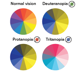
It’s estimated that color blindness is most common among Caucasian males. If that describes your target audience, then there’s no argument about choosing color-blind safe color palettes.
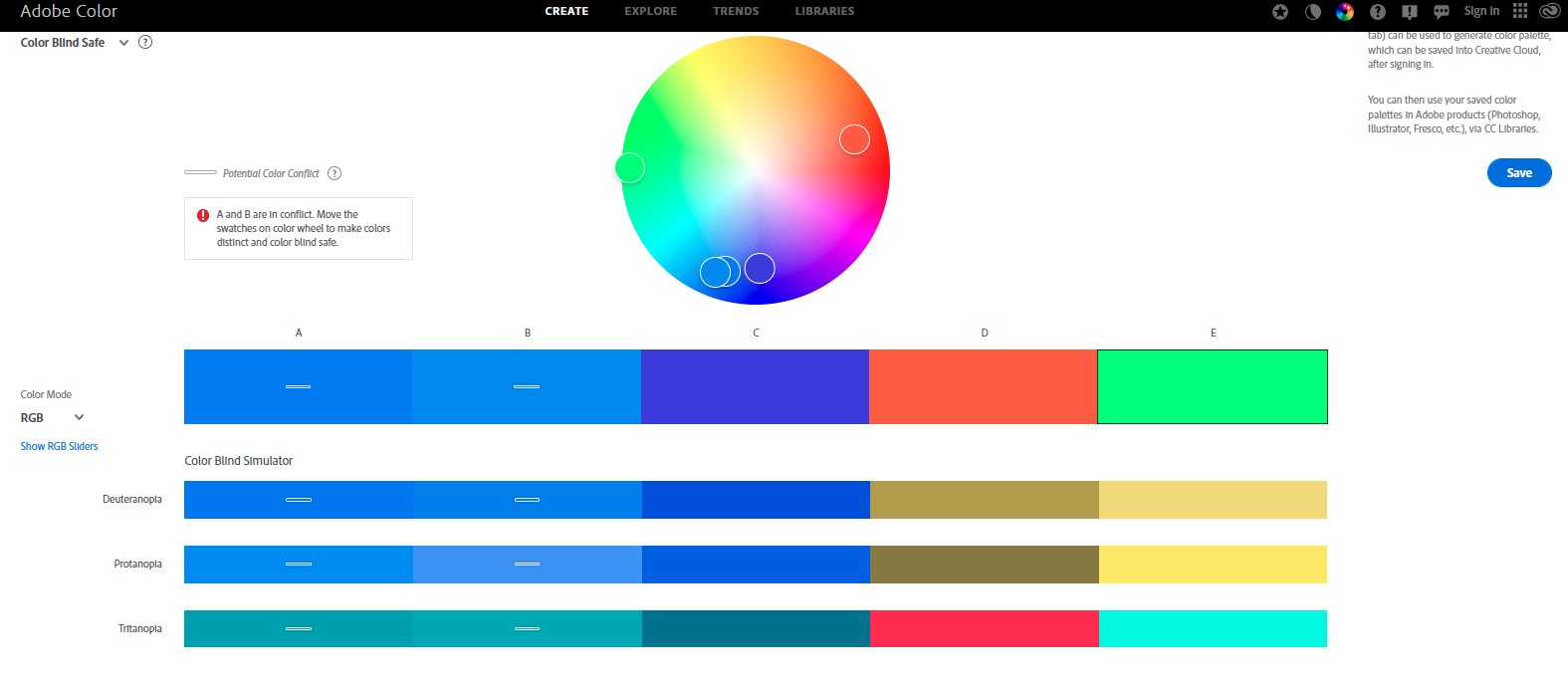
Tools like Adobe color let you check if your color palette is color-blind safe. You will see a simulation of how the chosen colors appear to people with color blindness and you can identify colors that appear the same. In the below image, the colors where the horizontal lines appear are the colors that look similar to color-blind users. Steer clear of such tricky combinations if you are aiming for an accessible design.
Or, if you wish to check an existing design and make it color-blind safe, you can use online tools like Coblis- Color Blindness Simulator to see what your design looks like to a color-blind user.
If your CTA button pops out and draws the attention of a general user but is nearly invisible against the background for a color-blind user, you are still missing the mark. Every user counts, every user interaction counts. So, choose the right colors.
Kimp Tip: Instead of relying on color-based hierarchy alone, use font size and other elements to make things clearer.
5. Add clear captions for videos and alt text for images
Remember that some of your users rely on screen readers. So, your image might not be of any use to them unless you use relevant alt text. Yes, your alt text does more than help you with SEO. It helps create an accessible design for your users. But yes, stay on point – avoiding lengthy descriptive ones.
The other textual aspect of visuals will be the captions in videos. Do not rely on automatically generated captions. Use text overlays to guide your users through the video. On YouTube, you can create chapters to make things even better. And finally, add your captions in a clear and legible font that does not just fade away into the background. And remember you have a moving background here.
Adding captions also helps you meet the needs of people who prefer watching their videos on social media muted. It’s a win either way. The fact that social media platforms prioritize accessibility features like LinkedIn recently adding automatic captions for videos, is a good indicator that it’s time to take accessible design seriously.
Simplify accessible design with Kimp
Accessible design in marketing is all about tapping into the power of visuals without ignoring the difficulties and requirements of even one of your audience groups. In fact, for a minute, forget the concept of “target groups” and understand that you are communicating one-on-one with a set of unique individuals. That changes the way you look at your brand designs! And if you need any help creating these accessible designs for your brand, just let our designers know and we’ll be glad to help you come up with the best ads and social media posts to meet the needs of your diverse customer demographics.
Sign up now and try a Kimp subscription free for 7-days.