8 Cool Logos With Hidden Meanings + Logo Design Tips
What do you think of when hearing the word “logo”? Nike’s Swoosh or perhaps the golden arches of McDonald’s.
So many sentiments are attached to this simple graphic that represents a brand. And that’s why brands go the distance and spend thousands of dollars on logo design.
In fact, some of them even cost millions of dollars. But have you ever wondered why a symbol or a simple text is so expensive?
Often, it has to do with the many layers of meanings that these logos carry. It is also about the way the brands connect these logos to their brand personas. And thus make an emotional connection with their audiences.
There’s a lot of strategic and creative thinking that goes into all this. And that’s exactly what we are going to discuss in this blog by looking at the hidden meanings in popular logos. We’ll also talk about the logo design takeaways from these cool logos that can inspire your logo design project.
Why Are Logos So Important Anyway?
- Logos are often the first visuals that your customers notice about your brand. When they see your app or visit your website or even purchase a product, a catchy logo will grab their attention.
- We all need visual cues to remember things or people by. And for your target customers to remember your brand, your logo will be the visual representation they associate with.
- Logos instantly tell your customers what your brand is about. For instance, you can use a combination mark logo with a symbol representing the products or services your business offers.
- A logo can be a visual representation of your brand’s persona. While the brand name and symbol in your logo tell what you offer, the font style, logo color, and overall mood can capture the personality of the brand. Two or more brands can offer very similar products or services but no two brands will have the same personality. You can use your logo to establish the unique personality of your brand.
A logo, thus, has a strong role to play in introducing a brand to its audience and helping them remember it better. A meaningful logo does this even better.
If you are wondering how to create meaningful logos that create a strong impact on your customers, we got you covered. In today’s blog we’ve pulled together a list of logos from globally popular brands. And these aren’t just any logos – these are logo designs that have a hidden meaning.
You can use these designs as inspirations to understand how to connect different design aspects like font styles, negative spaces, and symbols to convey a deeper meaning than what meets the eye.
You can use these designs as inspirations to understand how to connect different design aspects like font styles, negative spaces, and symbols to convey a deeper meaning than what meets the eye.
Cool Logos and Their Hidden Meanings
When it comes to how a design is perceived, it is all about perspective. We’ll give you an example. In 2012 Wendy’s redesigned their logo three decades after the brand was first introduced. Several design blogs pointed out that the ruffled collar of Wendy’s girl formed the shape of the word “mom”. See if you can notice that in the below logo.
But there are some brand logos that purposefully incorporate such interesting details in their design. So, once you know what the design actually means, you start seeing the brand itself in a new light. Here are a few such popular cool logos that have interesting meanings hidden in their designs.
1. Amazon
We’re starting the list with a brand that has now become a household name, Amazon. What started as an ecommerce business has now ventured into the world of online content streaming services and so much more. Have you heard about the reason behind the arrow in the brand logo?
The arrow in the Amazon logo goes from “a” to “z” as a representation of the diversity of products the company caters to. To show that you get everything from A to Z on Amazon. And does the curved arrow look like a smile? You probably guessed it right. It is to indicate the smile the brand wishes to bring to the faces of its customers. With a single design, it captures two core meanings of what it offers and what the brand stands for.
Takeaway:
To convey a strong message you do not need complicated symbols. A simple and easily relatable symbol (like the arrow in Amazon’s case) can be optimized to get your message across to your audience.
2. Toblerone
One of the most loved chocolate brands in the world, Toblerone has always been popular in discussions revolving around brands with interesting logos. That’s because of the bear symbol that hides in plain sight on the mountain-shaped logo of the brand. Have you noticed it? Do you know why it’s there? We’ll tell you.
The chocolate brand was founded in Bern, Switzerland. Below is the coat of arms of Bern. Have a look and you’ll know the connection between bears and Toblerone.
Yes, the bear on the mountain in Toblerone’s logo pays tribute to the city of origin of the brand. The mountain itself is a representation of the Matterhorn mountain in Bern.
Takeaway:
Logos that tell customers about your brand’s origin stories make a lasting impression on them. And this is a great conversation starter to introduce a brand.
3. Gillette
This is perhaps one of the toughest Easter eggs in the world of enigmatic, cool logos. Have you seen the Gillette logo? It is a simple wordmark logo, right? Look closely. What do you see in the “g” and “i”. Here’s the logo so you can take a closer look.

Do the sharp cuts on the alphabet G and I remind you of razor cuts? And together if you focus on the negative space alone, they form it looks like a double blade razor. Brilliant, isn’t it?
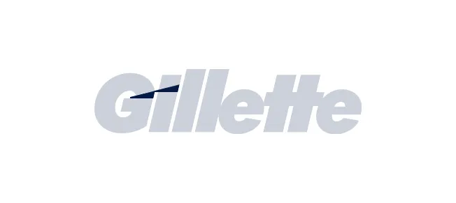
Together the design talks about its product and the USP, which in this case is the precision in shaving these razors are known for.
Takeaway:
Wordmark logos are straightforward. To make them memorable, you can use subtle design optimization strategies like playing with the baseline or shape of just one or two letters in the word. Below is a logo design by Kimp which makes use of a similar concept.

The levitating “O” in the wordmark reminds you of a hovering balloon.
4. Le Tour de France
This world-famous bicycle race for men has an intriguing logo design. Have a look at it yourself.
The O with a dot at the center and the interestingly shaped R together form a rough depiction of a cyclist which is pretty apt for the brand. And the extra yellow circle which is also one of the eye-grabbing details in the logo, that is otherwise black, conveys the fact that these races are held only during the daytime. Another reason for the use of yellow is the bright yellow jersey worn by those taking part in the race.
Takeaway:
You do not need too many colors in your logo design to make a difference. Just one meaningful color that has a strong connection with your brand is just what it takes.
5. Unilever
The U-shaped lettermark in the Unilever logo is not just a bunch of random symbols. There is a symbol to represent each of the product lines or industries the brand comprises. It has 25 symbols in total. Look close and you will find a flower for the skincare brands, clothes for the detergent brands, and so on.
Cool logos like this one can play a huge role in raising brand awareness.
Takeaway:
When you do not know what kind of symbols and other visual elements to use in your logo, stick with the basics. Telling your customers what your brand offers is a great place to start. Even with the most common symbols, you can arrive at the most interesting designs that set a signature style for your brand.
6. Baskin Robbins
While the logo looks fun and colorful it only uses two colors. In fact, 76% of the logos of top brands use only one or two colors. Too many colors can cause visual clutter. That’s why Baskin Robbins keeps the color palette simple. You will also notice the brand colors being predominantly used in packaging design and the store ambiance, for visual consistency. And this is one of the biggest contributors to the brand’s branding success.
Takeaway:
The Baskin Robbins logo shows how you can use colors to emphasize particular elements in your logo design. This design is also a great reminder to maintain design consistency in your brand’s marketing materials.
7. Goodwill
Have you noticed the G in the Goodwill logo? It looks like a smiling face making it the perfect design for a brand that brings happiness to the lives of the underprivileged.
Your logo should match the personality of your brand. It should capture the emotions your brand evokes in your target customers. Goodwill does this wonderfully with its cheerful-looking logo.
Takeaway:
Typography can bring a huge difference to your logo design. While there are many conventional fonts in the market, illustrated fonts that are optimized to hide meaningful symbols, as you see in the Goodwill logo, will make visually memorable designs.
Here’s a cool logo with illustrated typography designed by Kimp. The strong personality of the typography in this one makes it an attention-grabber.
Looking for logo designs with creative typography? The Kimp team can help.
8. FedEx

FedEx’s logo is an exemplar design that shows what happens when you combine simplicity and sensibility. No wonder the logo has won 40 awards.
You might have noticed the arrow formed between the letters E and X in the logo. But have you ever wondered why it is there? The arrow pointing right is a symbol of forward motion and speed. And since the brand is known for its fast and timely deliveries, this symbolism works perfectly.
A logo design that manages to convey your brand message in an instant is timeless. And for brands like FedEx targeting a global audience, simplicity in conveying the message is even more important. The clear and elegant logo of FedEx does both these effortlessly.
Takeaway:
The perfect arrow in the FedEx logo is because of two things – pragmatic interpretation of the negative space and the proper use of kerning (spacing between letters). So, if you want a simple design that makes a strong impact, try experimenting with the kerning and negative space between letters in your wordmark. Remember, that the shape of each letter in the typeface you choose will also have a strong role to play in this.
If you cannot hide symbols within the negative space of the letteres, you can also use the negative spaces in the symbols in the design. Here’s an example from Kimp. Can you spot the yeti within the footprint?
So, that was a round-up of some cool logos from big brands and the meanings they hide in them. How many of these did you already know?
Want to use such innovative concepts in logo design for your brand as well? It’s easier than you think. Logo design is a part of the graphic design services you get with every Kimp Graphics subscription. And since we’ve seen our fair share of cool logos and logo design projects, below are some tips to get you started on your own:
Logo Design Tips From Kimp

Kimp Tip 1: Pay attention to the typography. It sets the mood and also affects legibility. When you have an expansive audience you need to be sure that everyone who reads your logo should understand your brand name. The clean sans-serif typeface of FedEx makes the logo easy to read in the fast-moving logistics workflow.
Kimp Tip 2: Be wary of the colors you choose. Your logo will be the first sampler of your brand colors. So, you should have a color palette that evokes the right sentiments in your target audience. To do this you can pick colors based on the well-known color associations.
Kimp Tip 3: Don’t be afraid to manipulate the negative spaces. Logos, unlike other graphics, are mostly used scaled down to a small size. So, you will have to pack a punch within limited dimensions. That’s why it pays off when you make even the negative space in your logo count.
Kimp Tip 4: Understand the different types of logos and the strengths of each of them. Once you finalize a logo design, you will likely not be changing it for the next few years. So, you should be sure that you choose the right type that accommodates your brand message.
Kimp Tip 5: Prioritize versatility when it comes to logo design. Earlier, the surfaces on which logos appeared were limited. There were just print media and traditional advertising creatives that included logos. But now, most brands have both a physical and digital presence. From the colors to the typography of your logo, everything should look good both on digital and print designs. Consider style versatility and the effectiveness of colors in different color models like RGB and CMYK so you know how your logo looks in different places.
Need help with navigating all this? That’s where working with an experienced design team can be a great investment.
Design Cool Logos With Kimp’s Unlimited Graphic Design Services
A logo will often be a representation of what your brand stands for. It will be the face of your brand. So, to lay a strong foundation for your branding efforts, you need a strong and thoughtfully designed logo. With the unlimited revisions you get with a Kimp Graphics subscription you can be sure that you have a logo crafted to perfection.
Want to see if unlimited graphic design works for your brand? Sign up for a free trial.