Using Monochromatic Color Schemes For Scroll-Stopping Ads
What attracts you instantly to anything online? In a time where the most exercise our body gets is via the scrolling thumb, what makes the thumb stop? Well, you may think that there is no one correct answer to this question. There are a lot of things that make people stop and take notice of a particular content piece.
But, the reality is a little away from it.

Most content pieces, marketing designs, and media you come across have three to four elements to it at the maximum. And that is color, text, image, and format (video/animation/static design).
Across all these elements, studies show us that color is what engages our brain immediately to grab our attention. Not just as a separate element, but color also enhances the value and attractiveness of the text, designs, symbols, and images used in a particular content piece.
Given the importance of color in marketing and advertising, every year some new trends and combinations hit the market. Many stay for a while, but some fade away quickly.
A trend or strategy that has withstood the test of time is a monochromatic color scheme. Monochrome is a popular color scheme that has been in use for over two decades now.
In this blog, Kimp Graphics brings you a guide on how you can use this color scheme to create high-impact and scroll-stopping advertisements for your brand.
But before that, a quick overview of the significance of color schemes in advertising awaits you.
Let’s check it out.
Significance of Color Schemes in Advertising
Graphic designers and marketing experts have many theories on how to leverage color in advertising campaigns. A popular technique that is currently trending in the marketing industry is the usage of different color schemes in different contexts.
Color, in itself, is a vital part of branding, marketing, and advertising. Specifically, in branding and advertising, the right color scheme can elevate your design and content to a greater level.
Color psychology helps designers and marketers choose the right color for their designs. With this choice, they can :
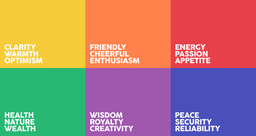
- Influence the public and shape brand perception in the market. Our minds associate different colors with particular meanings, emotions, and subtle messages. By using the right color, they can convey their message and affect the customer in the right way.
- Appeal to a specific target audience ideal for their brand by choosing colors they will find attractive. Colors have different meanings to people of different ages, genders, cultures, or even economic statuses. So the right choice will make the brand desirable to the right audience.
- Convey the emotions of the advertising instantly. Should customers look for happiness, energy, or calmness in advertisements? The colors you choose will take care of this messaging.
Now that we have established how important the decision of colors and color schemes is for your advertising design, let’s get down to business.
Monochromatic Color Schemes
So, what exactly are monochrome color schemes? When monochrome means a single color, how do you make color schemes out of those? And why is it touted to be one of the most effective schemes for advertising?
Let’s understand.
First off, a monochromatic color scheme comes into existence when you choose a color and then create different hues from it by varying its brightness to create darker or lighter shades. Because of this activity, you have a palette where all the colors have a similar undertone bringing the design together.
Why choose monochromatic color schemes in advertising
Besides personal choice and aesthetic trends, why should a brand consider monochromatic color schemes in advertising?
- Monochrome color schemes in advertising help you present a unified message to the customer. When you have over two colors in your advertising, you gamble with what attracts the customer first and what is the first impression that comes out of it. With monochrome color schemes, there is no ambiguity or chances of misinterpretation.
- You can build a strong visual identity by choosing monochrome color schemes for your brand’s advertisements. Since the entire color palette is similar and works well with each other, it becomes easier to remember. The brain mostly registers it as the primary color + similar shades. This gives way to a strong brand identity because of the highly recognizable and retainable color scheme.

- Brands that use monochrome color schemes in advertising come across as sophisticated, minimalistic, and modern. When you use a single color in varying hues, you project calm, peace, and unified energy. These are all signs of professionalism and developed brand identity.
- Monochrome color schemes in advertising lead to a perfect design where the elements are in harmony with each other, balance each other out, and have the visual hierarchy in place to make the user experience smooth.
If we have not convinced you yet, the Kimp Graphics team brings you a list of examples of monochrome color schemes in advertising. These examples will show you how appealing this color scheme can get when used well.
Monochromatic Color Schemes in Advertising: Examples
We are a huge believer that seeing is believing. So we thought we can either go on and on about how great Monochrome actually is, or we can show you. As we mentioned before, the use of monochrome color schemes in advertising has been around for a long time. And it has stayed a crowd favorite consistently too.
A lot of major brands have employed these color schemes in advertising to make them stand out.
These examples will tell you how to use monochrome color schemes in advertising for the best results.
Let’s get right into it.
1. Varying hues for visual hierarchy
The major difference between art and design is that design has a purpose, and that purpose becomes even more vital in advertising designs. When the customer comes across an advertisement, you want the design to tell a story to them and guide them to notice all the important sections.
This means visual hierarchy is of extreme importance in advertisement design. Out of all methods to accomplish that, color varying is the best method. And that works like a charm when you use monochrome color schemes in advertising.
In monochrome color schemes, the different shades in use have a natural relationship with each other. And designers can arrange them in a way that the darkest is at the significant places such as the CTA, price, features, and discounts. The lighter hues can guide the customer’s eye to the darker section.

Just like in this newsletter advertisement by Everlane. The brand uses two different shades of brown here. While the darker ones bring attention to the product, the lighter ones help bring order and harmony to the overall design. The final CTA also carries the darker shade, being an important part of the design.
Kimp Tip: When you choose only two shades from the monochrome color wheel, ensure that you use them wisely. Simplistic designs can be hard to balance and can become lackluster easily. But as Everlane showed us, it can work well too. You need a team that understands design well.
Kimp Graphics team can create attractive designs for you in monochrome color schemes. Book a call to know more about our services.
2. A monochrome color scheme to suit your brand personality
Many customers discover brands on social media, the digital world, and offline channels via advertisements. In such cases, your design choices with the advertisement will play a significant role in their perception of your brand.
A proven way to form the right brand impression is to choose the right color and color schemes for your advertisements. More specifically, if it is an intentional brand awareness campaign, then monochrome color schemes in advertising are your best bet.
We spoke of how people associate many emotions, contexts, and meanings to colors based on cultural settings and their lived experiences. Sometimes, having over one color can end up sending a mixed or wrong signal. But with monochrome color schemes, there is only one message, and it is always loud and clear.
Moreover, the other colors in the advertisements work overtime to ensure that the chosen primary color shines. So the resultant design is full of harmony and a unified message about your brand personality.
Take this Halls advertisement, for example. While there are many shades of blue here, even a couple of other colors in small measure, what is your instant takeaway? You see the trademark color blue and feel calm, refreshment, and a bold brand personality. And that is how you tick the mission accomplished box.

Kimp Tip: It is okay to incorporate other colors in minuscule quantities when you choose a monochrome color scheme in your advertising designs. But always remember that the color scheme you chose must dominate the design with no scope for chaos or attention diversion.
3. Use monochrome color schemes to show context
After brand personality, you can also color schemes to set the right context for your advertisements. As they say, the attention span for people is constantly decreasing. Now this applies to print, digital, and all display advertisements. To solve all these issues, we suggest you go with a monochrome color scheme.
Nothing gets the message out right off the bat like monochrome color schemes in advertising designs. When a customer is crossing the billboard at a busy junction or scrolling through their feed on a social media platform, if they see a color that speaks to them they will stop. But if there are too many colors, no single color may capture their attention.
For example, if you want to advertise an eco-friendly product, then you choose a monochromatic color scheme of green. This is much more effective than having two or three where green is just the color under the spotlight.
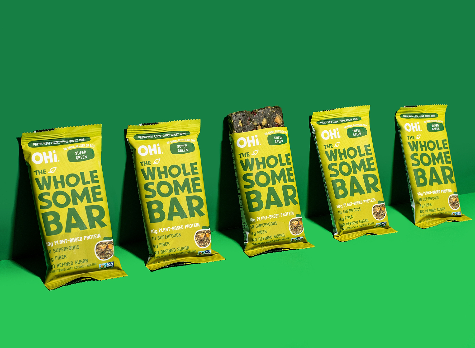
We can see this clearly in this advertisement for the Oh-Wholesome bar. The product is plant-based and will instantly appeal to someone choosing a vegan lifestyle because of their connection with the environment.

This social media post immediately connects the context to water because of the usage of monochrome color schemes.
Kimp Tip: Monochrome color schemes in advertising also help you tell the customer what you are offering. For example, an overwhelming red design around Nov-December signifies a Christmas sale, while the traditional pumpkin color sets the context for Halloween.
Contact Kimp Graphics today to create monochromatic holiday-themed advertising designs for your brand.
4. Bold color usage
There is a general agreement in the marketing world that advertising cliches are cliches because they work. The popularity of bold colors in advertising is one such popular fact. And it accomplishes the goal. Bold colors are simple enough to notice, engage with, and relate to. So using bold colors in your advertisement can help you grab the users’ attention.
However, designing with bold color is easier said than done. It is a tricky walk but becomes easier when you choose a monochromatic color scheme for your advertisements. Then the harmony replaces the chaos that comes with bold colors in the design.
You can use bold colors like Red, orange, black, and purple with complete confidence that it will not be a busy design, losing its purpose. The varying tones and shades will get the work done troubling no one’s eyes and senses.
This advertisement by Adidas is poetry in motion. Especially because such a bold color as the blue they chose works so well. And that is because the designer could choose a monochromatic color scheme on white backgrounds, making the video even more pleasing.
Kimp Tip: This video shows how monochromatic color schemes work well in motion graphics as well. When you choose this color scheme in the video in conjunction with other colors, ensure that you choose a thumbnail that highlights the monochrome color scheme to attract your audience.
5. Old is gold: Get back to the grayscale
Some say that monochrome color schemes originate from the classic black and white combinations. And that is why grayscale is still one of the most popular monochromatic color schemes in use in advertising to date.
Something about this color scheme makes it have an international appeal in the advertising industry. Using grayscale works great for brands looking to connect with the Gen Z and millennial audience, because of their fondness for somber shades.
Greyscale also adds a touch of sophistication and grace to the brand’s personality besides the advertising design.
Leverage Monochromatic Color Schemes for Ads with Kimp
Monochromatic color schemes can be your biggest ace in the hole if done well. You may think that choosing just one color may not lead to the most attractive designs. But we hope that we have changed that opinion with our examples above.
For monochromatic color schemes to work well, you need a design team that understands the finer points of design and possesses a sound knowledge of color and its relationship with marketing strategies.
With years of experience under its belt, we can proudly tell you it is definitely Kimp Graphics and Kimp Video. We have a magnificent team of talented designers proficient in many design techniques to fulfill all your requirements.
Our plans are also unlimited graphic design services that come with unlimited design requests, unlimited revisions, user accounts, and brand profiles. All this at a flat monthly fee and no hidden charges.
Sign up for the free trial today to experience the magic of our designers firsthand.