Decoding Typography Terms: A Non-Designer’s Handbook
Have you ever found yourself hunting for ways to tweak your design’s typography but felt lost in a sea of unfamiliar terminology? Or maybe you’re working with a designer on a wordmark logo and want to communicate your vision, but you’re not familiar with the jargon. Don’t worry, those days of confusion are behind you. We’ve got you covered with a comprehensive guide to typography terms.

Whether you’re an aspiring designer revisiting the fundamentals or a marketer aiming to improve your design collaboration skills, this guide is tailor-made for you. We’re going to explore the world of essential typography terms. So, let’s get started!
To kick things off, we’ll begin by clearing up one of the most common confusions: the distinction between typefaces and fonts.
Typeface Vs. font
People use these typography terms interchangeably but are they really the same? Well, not exactly. Think of a typeface as the overall design of the characters – their shape, and appearance. Can you tell Montserrat apart from Times New Roman? That’s the difference the overall design brings. Because they are different typefaces.

When you try to apply the Montserrat style, have you noticed the options within that – (thin, regular, bold, and so on)? These are the different fonts within the Montserrat typeface.

In summary, you can create multiple fonts or font styles based on one single typeface. But all these variations will not alter the basic structure of the characters – how the strokes connect with the bowls or whether they have a serif. (more on bowls and serifs in a minute)
Now let’s take a look at the basic anatomy of typefaces – in other words, the parts put together to create various characters in a typeface.
Typeface anatomy
To understand the typography terms associated with the typeface anatomy, let’s revisit the contrast between Montserrat and Times New Roman. How do you distinguish between these two typefaces? It is all about studying the minute details of characters—the way strokes connect, the nuances in the curvature of “C”s, the distinct roundness of “D”s, and so forth.
It’s these fine points that set typefaces apart. So, let’s dissect the fascinating anatomy that sets these typefaces apart – the typography terms related to them.
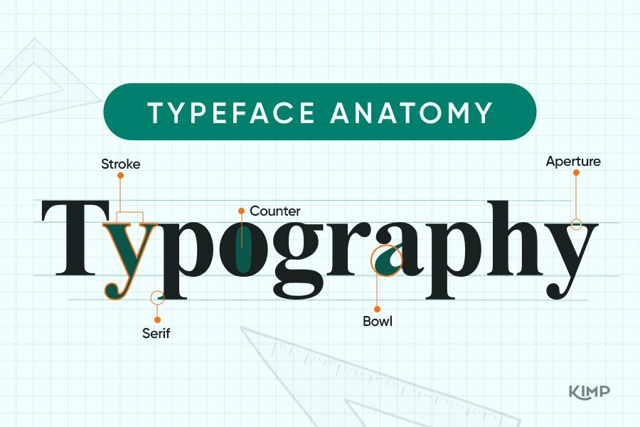
1. Stroke
Imagine the stroke as the skeleton of a letter. It’s the fundamental line or curve that defines its structure. Each character is composed of one or more strokes.
For example, in the uppercase “A”, there are three strokes – 2 diagonal and 1 horizontal. As you can see, these strokes are what lay the foundation of the shape of a character.
Furthermore, in straight primary strokes, the diagonal and vertical ones are often referred to as the stems, and the shorter strokes extending out from the main strokes are often called arms/legs.
2. Bowl
The bowl of a character is one of the most distinguishable details in it. It is the curved stroke you see in characters like the lowercase “a”, “b”, “d” or “p”. So, when you try comparing the shapes of characters in two different typefaces you will often notice differences in the size, shape, and curvature of the bowl.
Take a look at the below examples. Notice the slightly elliptical bowls in the first one and the perfectly circular bowls in the second.


3. Counter
In characters with curved strokes, notice the space created within the bowls. These spaces are called counters and they are fully enclosed. Furthermore, the shape and size of the counters influence the legibility of the letters in a particular typeface.
Look at the typefaces here. The small counters in the first one mean that the legibility of the letters might be affected especially in small font sizes. However, the humanistic counters in the second one make the typeface much more legible.


4. Aperture
While counters are the fully enclosed spaces in characters with curved strokes, the partially enclosed spaces are called apertures. For example, in the lowercase “e” there’s a fully enclosed counter at the top and a partially enclosed aperture at the bottom. The size and shape of the aperture also affect the legibility of the typeface. We’ll give you an example.
The small opening in the strokes makes the characters hard to distinguish especially at a smaller scale in the first typeface. Whereas in the second one, the wide-open aperture improves legibility. This is the kind of font you should choose for web interfaces, especially for optimizing for small screens.


5. Serif
Have you seen that in some typefaces, there is a tiny decorative stroke added to the main strokes or the arms or legs? These extensions either add to the aesthetic of the characters or enhance the legibility. In fact, one of the major categories of typefaces is characterized by the presence of serifs in characters. (we’ll be looking at it in the next section)
Typeface categories
With the anatomy of typography laid out, let’s talk about the common classifications based on the nuances of these components. Now here are the typography terms associated with the typeface categories.
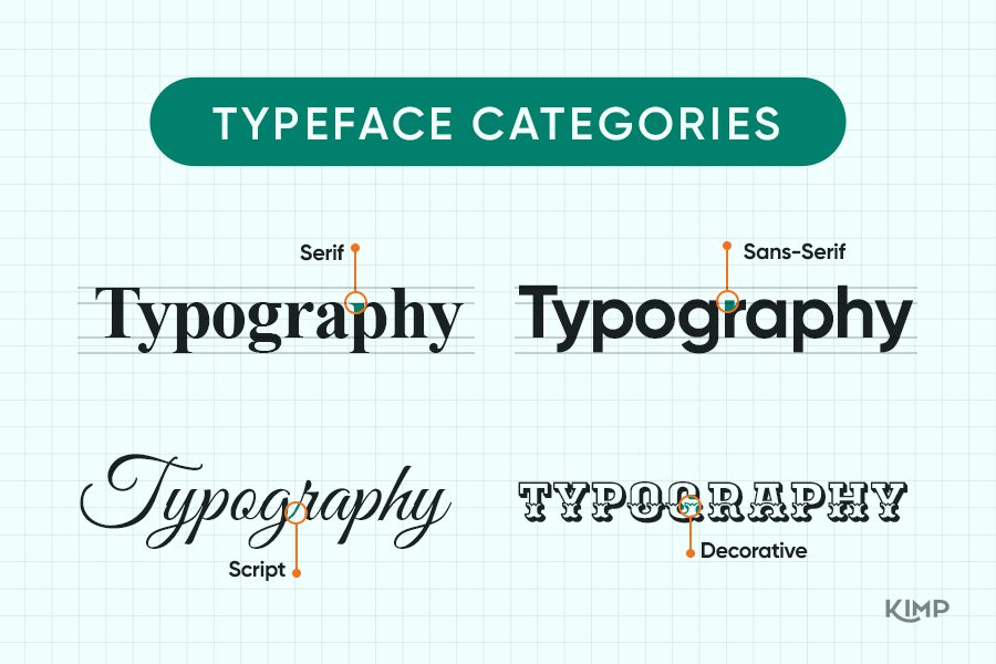
8. Serif typefaces
Firstly we have serif typefaces. Remember we spoke about typefaces with “serifs”? These are called serif typefaces. They have a unique classic appeal. Moreover, serif typefaces are known for their timelessness and some of them even look sophisticated.
If you wish to establish a sense of tradition and formality, then serif typefaces get the job done beautifully. Times New Roman and Georgia are some of the well-known serif fonts.
Here are some logos featuring elegant serif fonts:
9. Sans-serif typefaces
These are typefaces where characters appear sans serif (without serif). Therefore, they are cleaner and more on the contemporary side. Sans-serif typefaces are more popular on digital platforms. They also make a wonderful choice when it comes to establishing a casual theme.
Let’s look at some logo designs that incorporate modern sans-serif fonts. Helvetica and Arial are some of the most popular sans-serif typefaces.
KIMP Tip: Serif and sans-serif typefaces look good when combined. So, if you ever find yourself hunting for the right font combination, then consider pairing a serif with a sans-serif typeface.
Wondering where to use serif and where to use sans-serif typefaces? Then check out our blog here.
10. Script typefaces
These are typefaces where the characters resemble handwritten text. Old school charm or a more chilled-out vibe – there is a script typeface for every mood. They are the perfect choice for instances where you need to personalize the design or create a bold statement look.
Brush Script and Lucida Calligraphy are some well-known script typefaces.
Let’s now look at some sleek Script logos
11. Decorative typefaces
Decorative typefaces are those where each character in the typeface looks artistic. You might notice intricate details within the strokes or uniquely shaped serifs. And in some cases, there are curved extensions or swashes added to the strokes to give them an ornate touch.
Besides the above-mentioned variations, some decorative typefaces even come with shadows or outlines added to the strokes. In short, these typefaces look creative and embellished on their own. So, they are good to go into your design without the need for additional font styling.
Let’s look at a few decorative typefaces:


Typographic measurements
So far we’ve spoken about typography terms to distinguish categories in typefaces and to describe the anatomy of characters in a typeface. Let’s get to the work of putting the text together in the design and the typography terms involved in that process.
Typographic measurements play a pivotal role in achieving a harmonious and visually appealing layout. Let’s explore some fundamental typographic measurements that guide the arrangement of characters.

12. Baseline
Irrespective of the typeface you choose and the font style you apply, all the characters in a particular word sit on an imaginary horizontal line. This placement is what lays the fundamental harmony in typography. This horizontal line is called the baseline.
In other words, the baseline serves as a reference point for aligning and organizing text in a consistent and orderly manner.
Maintaining a consistent baseline is crucial for achieving a polished and professional appearance in typography. A level baseline ensures that characters in a line of text appear visually connected, making it easier for readers to follow the flow of the text. It’s the anchor that holds the text together, providing stability and uniformity in your design.
13. X-height
In simple words, x-height is the height of the lowercase characters (excluding the ascenders in characters like b, d, and h). The position of the x-height with respect to the baseline determines the size and proportion of the characters. A well-planned x-height ensures legibility and overall aesthetics of the typography.
14. Cap height
In essence, cap height refers to the distance from the baseline to the top of uppercase letters in a typeface. Just as the x-height affects the legibility of lowercase letters, cap height determines the legibility of uppercase letters.
Remember that the relationship between cap height and x-height varies between typefaces. For example, in some typefaces, like Verdana, (the first image below) the cap height and x-height may be relatively close in measurement, creating a more compact and uniform appearance.
In others, like Didot Display (the second image below) the cap height may be significantly taller than the x-height, resulting in a more dramatic contrast between uppercase and lowercase characters.


15. Ascender height
Ascenders are the extended strokes that appear in characters like lowercase “h”, “d” and “b” and these extend beyond the x-height. The distance between the baseline and the top of the ascenders is called the ascender height.
In the examples we saw previously, notice that the ascender height is much smaller than the cap height in the case of Didot Display. However, in the case of Verdana, the ascender height is only slightly lower than the cap height.
16. Descender height
Descenders are the parts of lowercase letters that extend below the baseline, like the tails of “g,” “p,” or “q”. The distance between the baseline and the bottom-most point of the descenders is the descender height.
When arranging lines of text, identifying the descender height avoids clashing of text. The line spacing should ideally be such that the ascender line of the second line of text falls well below the descender line of the previous line.
Typographic layout and composition
With the above typography terms, we covered the basic arrangement of characters and text depending on the typeface you choose. Let’s now shift our focus to the overall arrangement of text. This includes spacing manipulations between characters, between words, between lines of text, and also the placement of the text portions.

17. Kerning
Kerning is the spacing between individual letters or characters in a particular word. Ideally, there’s uniform kerning between characters when you apply a particular font style. However, you might choose to play with the kerning between two characters to create an element of interest. On the other hand, in some typefaces, adjusting the kerning between some characters helps create a pleasing and balanced aesthetic.
In the below logo the kerning between “E” and “A” as well as that between “S” and “T” have been cut short to create balance and to add an interesting dimension to the design.

18. Tracking
The uniform spacing applied between pairs of letters is called tracking. The difference between kerning and tracking is that unlike tracking, which applies uniform spacing to all characters, kerning specifically addresses character pairs that may have visually awkward or uneven spacing. Tracking, on the other hand, is adjusted so as to improve the readability of the text.
In the below example, the first design has its kerning adjusted between the letters “l” and “o”. However, in the second image, the tracking in the word “Domains” has been adjusted in order to create a balanced arrangement of the two words in the logo.
19. Leading
Leading, also known as line spacing, is the vertical space between lines of text, measured from the baseline of one line to the baseline of the next.
Leading plays a critical role in controlling the overall spacing and readability of text blocks. Proper leading ensures that lines of text are appropriately spaced, making it easier for readers to follow the content. Additionally, proper leading also ensures that the text does not look cramped or scattered.
20. Orphans and Widows

Orphans and widows are not typography terms you come across that often. These terms come into play when you have a large volume of text in the design.
Once you apply uniform letter spacing and line spacing the line breaks in a paragraph are the next big thing to focus on. Any undesirable ones in these line breaks result in widows and orphans.
Generally, if the closing line or word of a paragraph appears at the top of a page or a column separated from the rest of the paragraph, it is called a widow. When the starting line of a paragraph appears at the bottom of a page or column separated from the rest of the paragraph it is called an orphan.
Both orphans and widows can break the continuity in reading a piece of text. Therefore they sometimes lead to the user missing out on critical details. Additionally, they also impact the aesthetics of the text section.
Adjusting line spacing and paragraph spacing, font size and the wording in the copy are some ways in which you can avoid orphans and widows.
Perfect the typography in your design with KIMP
Without a doubt, typography is a building block in design. And knowing these typography terms gives you a headstart in creating designs or getting them designed by an external designer or design team.
If you choose the latter, then have you tried an unlimited design subscription? It is a convenient way to outsource all your design requirements for branding and marketing with the assurance that the same dedicated design team will work on all of them. Furthermore, you can request unlimited designs all for a flat monthly fee.
Want to see how that works? Sign up for KIMP’s free trial today.