6 Design Ideas For Ecommerce Logos In 2021
The world is moving online. With that, ecommerce businesses are literally emerging out of nowhere. As an established or upcoming brand in the Ecommerce world, you need all the edge you get to attract your customers. Especially since you are selling in what must be the most crowded marketplace of all. A marketplace of close to 24 million ecommerce sites.

A logo is any brand’s first line of defense to break the customers’ inhibitions and begin that first dialogue. How these fare will ultimately determine the effectiveness of your branding and marketing efforts.
This makes logo design one of the pivotal decisions for an ecommerce brand in 2021.
Given the gravity of this decision, Kimp brings you a guidebook on designing Ecommerce logos in 2021.
Importance of Ecommerce Logos
Logo holds significance for any brand, irrespective of the industry and nature of business. But its importance takes additional dimensions in ecommerce stores.
Why?
Well, customers come across thousands of social media sites, newsletters, and digital advertisements in their tryst with the internet every day. The average attention span varies between 8 -12 seconds, and all it takes is just 5 seconds to form an impression.
In such scenarios, you need a medium to attract customers instantly. This attraction must hold their attention and make them click on your ads, newsletters, and other digital links.
The easiest way to achieve all of this is via logo designs.
Creating Ecommerce logos: A Guide
We have established that your logo can make or break your ecommerce brand. But there are good logos, and there are great logos. You want to be in the great category for obvious reasons.
So what makes a great logo design for an ecommerce brand?
Ecommerce logos have some specific considerations to achieve their purpose for customer acquisition and generating interest in the brand.
Some tried and tested rules for Ecommerce logo design ideas include :
- Keep the logo design simple and understated. Loading the logo design with too many elements that contrast and fight for attention will make it less effective. KISS is a formula that is cliched because it works.
- Optimizing your logo designs for a mobile screen experience. Most ecommerce transactions happen via a smartphone. Also, all marketing campaigns have a higher click rate on mobile screens. So the logo must be in its best light on a mobile phone for best results.
- Designing ecommerce logos that have meaning and a connection with the brand. The younger generation makes for a majority of the Ecommerce brand client base. And symbolism and meaningful brand identity make them trust you better.
- Choosing a flexible and versatile logo design for your ecommerce brand. Your logo will feature on your social media profiles, digital advertising channels, and offline marketing channels as well. And the logo has to appear consistent and relevant in all these mediums.

Ecommerce Logos: 4 Styles to Consider
In our previous blogs, we have covered the different logo design styles available for brands. You can check the guide here, but for your ease, we have curated some design styles that work best for an Ecommerce brand.
They are popular in the industry and are in use by many prominent brands, showing their ability to help a brand in the competitive industry.
1. Wordmark
This is probably one of the most popular logo designs, irrespective of the industry for the longest time now. KFC, Microsoft, IBM, and Walmart have Wordmark logos. If you choose this for your brand, you will essentially go ahead with your name itself represented as the logo.
This is a good way to go, but for an ecommerce brand where time is precious, you need to bring a character in the logo. So, unless your name connects with the business, or is popular enough or even weird enough to tug people in, you may need a little more.

2. Brandmark
Many times, brands leverage the power of images and symbols in their logo designs. As visuals work better for recall and recognition, this gamble pays off as well. Thus comes the logo design we all know as a brand mark or Graphical logo.
In this logo design, you choose/design an image that best represents your brand in some form. It can also be abstract, such as the iconic circular image in Pepsi’s logo. Some may say it represents the bottle cap and is a good bridge between abstract and meaningful designs.
For Ecommerce stores, choosing an image that represents the product or service you deal with can be immensely helpful. Your customers can instantly understand what you do, and it looks great on social media profiles, websites, product branding, and advertisements.
3. Combination Mark
Combining the best of wordmarks and brand marks, we have the combination mark logo design. Wordmark helps you brand recognition and awareness for your business, while brand marks make it easier for the audience to understand. But when you design a combination mark logo design for your Ecommerce brand, you can have it both.
You can popularize your brand’s name and leave no doubt about what you do. You also accelerate brand recall and recognition by incorporating visuals in your logo.
Bringing text and images together also allows the design team to experiment with logo design, making the result even more effective and unique.

4. Emblem
This may not be a very popular or oft-seen logo design in the Ecommerce industry, but emblem logos are extremely versatile and personable. Of course, you don’t have to stick to the old-school crest in your logo. Any frame that has an image and brand name within it is an emblem logo.
Ecommerce brands looking to appear sophisticated, conservation, and even vintage can adopt this logo design. Emblem logos like all yesteryear trends are coming back. This can be an opportunity for your brand to stand out amidst the same Watermark and Brandmark model of logo designs.
Ecommerce Logos: Design Elements Overview
Now that we have covered the different logo styles you can adopt for your ecommerce brand, let’s move on to the next part. When you are looking for logo design ideas for your ecommerce brand, the design style or the logotype decision is one of the easiest of the lot.
Then comes the details. For the logo design of your ecommerce brand to be an effective branding element, it has to be just right for you in all aspects. This means you have to pay attention to each design element decision as well. The color, the font, the layout, and even the smaller strokes in them contribute to the overall look and need considerable deliberation.
So here is a list of the major design elements you need to pay attention to, along with the hottest trends of 2021 for each of them.
1. Color

Color is the most dominant element of an ecommerce logo design. Our brain perceives and interprets color before any other element, so you must leverage this to attract your audience.
2021 saw a lot of new color trends, including black and white color schemes, monochrome color schemes, Color blocks, pastel colors, and neutral tones. As an ecommerce brand, you can choose to apply any of these trends. But, it is always best to relate these elements with the brand than go trend hopping.
2. Font

Next comes the font. This is an important element if you are opting for a Wordmark logo, especially. The font style you choose must work with your brand personality. Serif fonts look best on digital mediums, making them ideal for an ecommerce logo design.
Of course, you can always experiment and opt for a more ornamental font if it matches your brand personality. There are many options for fonts, so pick wisely.
3. Shapes
Geometric logos were one of the most popular logo design trends in 2021. This is because a distinct shape in the logo design enhances its attractiveness and draws the audience to know more about the brand.
You can also incorporate shapes in the logo to symbolically describe your products like the Apple logo. Or you can use it as a visual break between the brand mark and brand name display in a combination mark logo.
4. Imagery
Most ecommerce brands are primarily retail brands. So, it makes sense that you incorporate relevant imagery into your logo design. Now, you can choose any image as you please. But, you can also see what are some popular trends that can work in the long term too.
Some such trends include the use of custom illustrations in the logo design, pop art in logo design, and vector-style drawings for the imagery.

Ecommerce Logo Design Ideas: 6 of the best and not-so-best from 2021
So you know what to do. But we would not be a good graphic design agency if we did not stand by our “Visuals >>>> text” philosophy, right? Yes, we understand that, so the Kimp Graphics team brings you some of the best and not-so-best ecommerce logo designs from 2021.
1. Healthy Mummy
First off, the brand’s name is an amazing choice. It has healthy – a very positive word right in the name. And that is a significant advantage. No ambiguity of deliverables here, a straight promise of health.
Next, let’s look at the logo. Given how the logo must carry the same vibe as that of the brand, this logo design idea of Healthy Mummy does a brilliant job.
Some good points for this logo design idea:
- The usage of Pink color – something traditionally associated with women and motherhood.
- Using the imagery of a woman jumping up fits perfectly with the brand’s personality. You don’t need to see the person, the illustration just screams happiness.
- Even though the logo uses two fonts, the connotation and meaning behind it are obvious. The word “Mummy” is in a more feminine and happy font, while the word “Healthy” is simple and means business.
2. Deliverr
Another brilliant ecommerce logo design idea. Some designs speak to you and tell you what to expect from the brand. Deliverr’s logo design does exactly that.
First off, the logo color signifies an action that is perfect for a delivery partner. In many cultures, red also denotes speed, imbibing trust in the customers in the brand’s promise.
Beyond the logo color, the shape/pattern in the logo brings a sense of movement. It is akin to the Nike swoosh and resembles a wing as well. Such a well-thought-out design tells the customer that they mean business and completely understand the assignment.
Kimp Tip: In combination mark logos such as the Deliverr logo, it is important that the imagery and the name’s font style match for a consistent viewing experience. Here, the design has rounded edges on the wing to mimic the font style and works brilliantly.
You need a design team who will pay attention to these smaller details, resulting in a completely effective ecommerce logo design.
3. PopSockets
What do you think of when we say Popsockets? Colorful and round objects that help you hold your devices better, yes? Did you know it is actually the name of the brand that launches these?
Yes, this brand has honestly accomplished what everyone with a wordmark logo wants. To become synonymous with the product itself. Like Xerox, for example. Who even calls it photocopying anymore?
Anyway, given how important the name is to the brand, the logo design with the word mark is amazing. The font is a typical rounded font but it is the minor details in the name that stand out.
The brand has transformed the “O” into a small popsocket, while giving an individual color to the rest of the letters “S O C K E T” in the name. It is an ideal representation of how the world perceives popsockets.
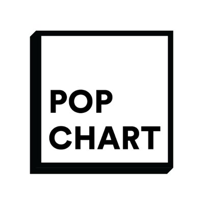
4. Pop Chart Lab
Another young brand with a versatile audience base, we love the idea of a pop culture brand. Given how high the influence of pop culture is in marketing and branding, we would have liked it if the Pop Chart lab’s logo did a little more. Anything. A pop of color, a swish of movement, an ode to a pop culture illustration, or just a more interesting layout of the words.
Yes, some may feel that the logo design works due to its understated nature and resemblance to a signboard from the pop culture era. We agree to an extent, but given how ecommerce logos must attract and bamboozle the audience instantly, Pop Chart lab falls a little short.
Not exactly a mainstream or even popular inspiration from logo design ideas for your ecommerce brand. Take the principal, but jazz it up a little.
5. SMT
SMT or Skinny Me Tea is a product that is also from the health industry. The brand aims to attract customers looking to get back on the fitness wagon and maintain good health. With such an emotional and vital purpose behind the brand, the logo is a huge letdown.
The abbreviated SMT does not tell us anything about what the brand does. There is no mention or depiction of the product or brand values anywhere. This is in complete contrast to the Healthy Mummy brand which left nothing in doubt.
To make matters worse, the color scheme and the styling of the words are too vague. The black color outline and the floral patterns make you feel this is a modern florist brand rather than a health-conscious organization.
Ambiguity in ecommerce logo design ideas is not a good idea, and we would love to see an SMT rebrand.
6. Raven Roxanne
As a rule, artists get a pass on the covenants of design. They create to express, not to impress or communicate. And we can understand that. Yes, but for ecommerce logo design ideas, there has to be some connection between the brand and the logo.
Raven Roxanne is a brilliant artist, and the digital studio looks gorgeous on Shopify. But, the simplistic version of the original artist’s render is somewhat lost on the website. They are now three disconnected ravens, and few will know that it is an art studio.
We don’t want people to miss anyone’s hard work. That’s why we implore our customers to pick an ecommerce logo design that means something and will connect with the audience.
The original logo
The current logo
Get the best Ecommerce logo design ideas with Kimp
We hope you understand how complicated and vital the logo design process for an ecommerce brand is. So, you need a professional who can create mood boards, give you options, and show you what works and what doesn’t.
Your best option for this is unlimited graphic design service and not just any service – Kimp Graphics’ unlimited graphic design service packages.
With unlimited design requests, revisions, and a talented team to handle end-to-end design services, our packages are a steal. Sign up for the free trial to understand our team’s design style before you commit to a subscription.
So what are you waiting for?
Sign up for the free trial today and begin the journey instantly.