Color Psychology In Marketing: How It Impacts Your Branding
Colors have the power to grab attention. As you scroll through a web page or your social media feed, when you spot something colorful and out of the ordinary, you automatically stop scrolling.
That’s what marketers crave. They want customers to take notice of their ads, and their social media posts. So it’s no wonder color psychology has a strong role to play in marketing.
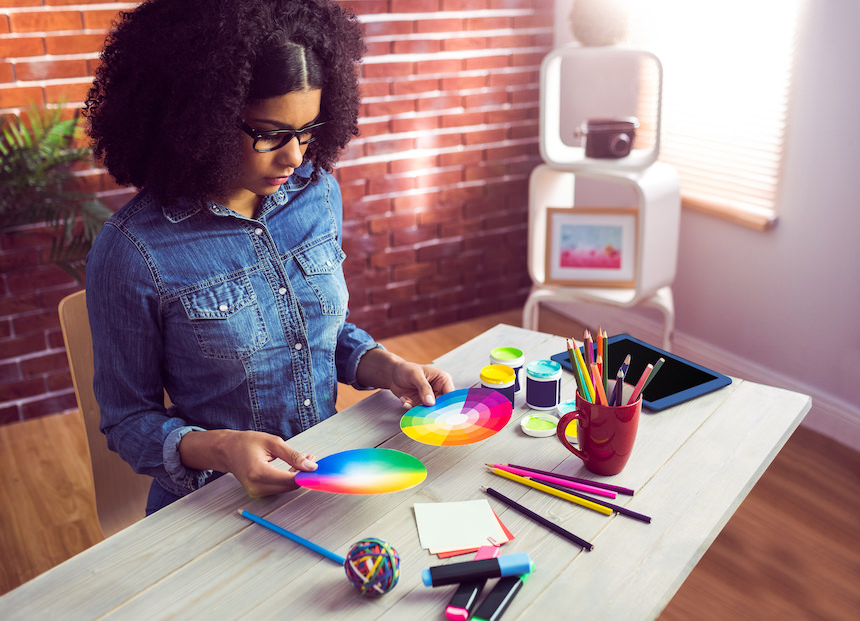
Colors are important, there’s no doubt about that. But what colors you choose and how and where you use them are even more important. Brand-appropriate color choice and consistently tying these colors to your brand’s message will be the key to better marketing performance.
So, for a brand to really make a difference two things are important
- Choice of the right colors for the brand
- Consistent use of these colors in branding
In fact, picking a main color for your brand and using it across different channels can help increase your brand recognition by 80%. Most brands have a primary color palette. This could be one signature color or a pair of colors. And then there is a secondary palette as well.
The signature colors appear in most places including logos. Secondary colors are the go-to choices in graphic designs representing the brand in digital and print media.
Understanding color psychology is a great way to figure out the contextual application, and the relevance, of primary and secondary color palettes for a brand.
The connection between colors and emotions
Different colors trigger different moods. Some colors make you feel nostalgic. Others make you feel instantly calm. Have you noticed how adding a sepia filter to a photograph kindles a sense of nostalgia?
Colors affect people’s emotions due to several reasons including:
- Natural perception – for instance, we automatically connect green with leaves and nature, blue with sky.
- Social conditioning – specific colors are used in particular contexts so often that people automatically connect them. For example, most people associate a ‘red’ signal with a ‘stop’ sign.
- Personal memories – the subconscious mind registers colors from surroundings during particular incidents. As a result, some colors vividly trigger particular memories.
- Cultural influences – colors have different interpretations in different parts of the world. For example, red is an auspicious color in many Asian countries. Green is a color of good luck in Ireland and the US.
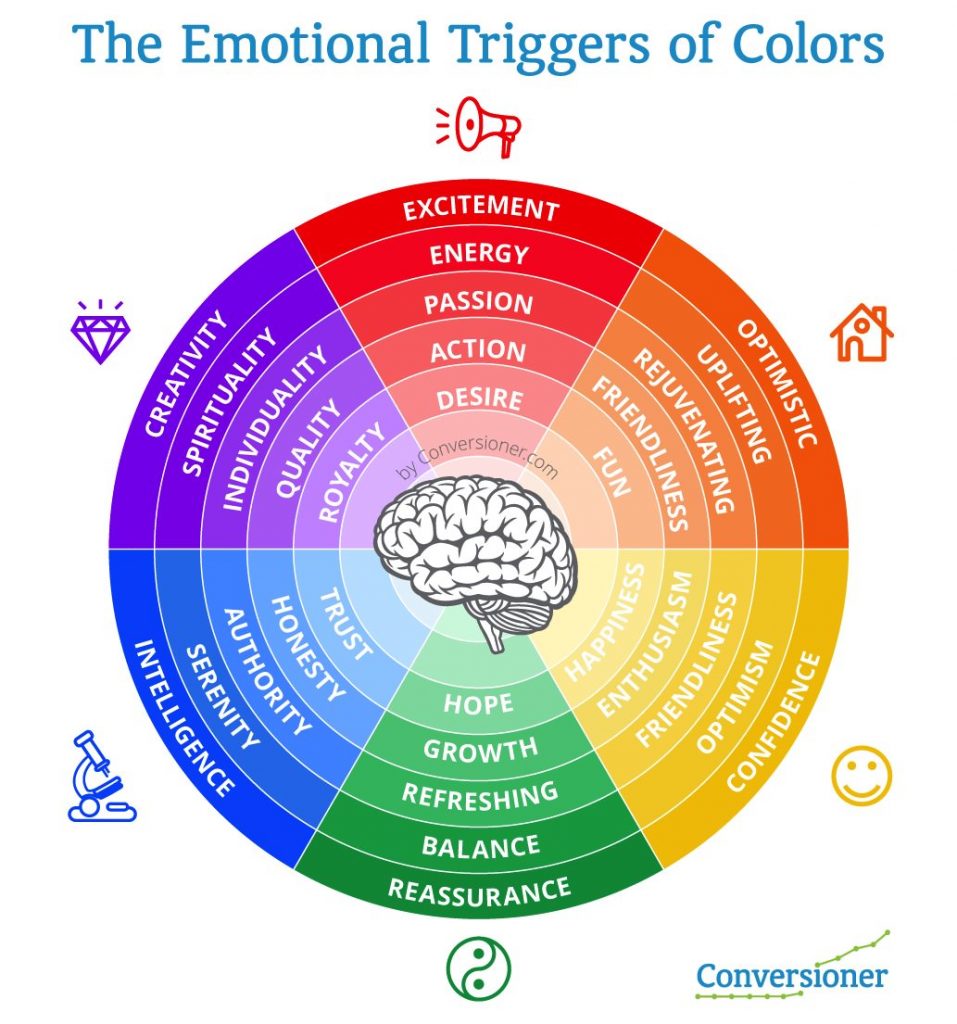
Source: Conversioner
Association with personal memories is the only aspect that you cannot appeal to. The other three can be used as cues for picking your brand colors. Start by understanding the common color associations. Then use color theory to create a visually aesthetic palette for your brand’s designs. That’s the key to creating good visual content.
Next, let’s take a look at how these diverse associations with colors can be used in marketing.
Context and color psychology in marketing

Source: Kimp
There are certain “universal values” associated with different colors. For instance, green means harmony and refreshment, while orange means movement and happiness. But context is also important. What you sell also has certain values associated with it.
So you need to choose colors for your branding and marketing that are appropriate for what you’re selling. An interesting Stanford study suggests that there are 5 dimensions of brand personality. They are sincerity, excitement, competence, sophistication, and ruggedness. Get to know what your product or service is associated with, and you’ll be able to choose the right colors to reinforce this.
Of course, you’ll need to validate your choices. This is where market research and user experience testing methods like A/B testing can help you. With these you can determine colors that:
- Are relevant to your niche
- Reflect your brand’s personality
- Connect to your ideal customer personas
Context is important when it comes to color psychology in marketing. Because simply choosing a certain color doesn’t make your product or service something that it isn’t.
Kimp Tip: Your customers might not always see the contextual meaning of your brand colors, especially when your brand is new. You might have to give them direction. You can achieve this by creating graphics that explicitly display your brand message or maybe a tagline, along with your signature colors. As customers keep seeing the color and the message coherently displayed, they will start connecting the dots.
Wondering how to create consistent graphic designs for your marketing? Kimp’s unlimited graphic design subscription can help you with that!
How different colors are commonly perceived
Color symbolism is a huge subject and there are some cultural influences at play here as well. But color psychology involves understanding the common emotions that colors trigger in particular.
On the basis of this, some colors are ‘happy’, some are ‘safe’ and some are ‘trustworthy’. Knowing these common inferences will be a great first step in branding. You can easily compare the adjective that most people use to describe a color and the adjective you would like to denote your brand.
Listed below are some of the most common colors in branding and the meanings that most people associate with them.
Yellow

Source: Snapchat
Yellow is youthful, energetic, and optimistic. It’s said to induce hunger and that’s why you will find it in many food packaging designs. Yellow is an attention-grabbing color that prompts decision-making. For these reasons, it can be a great choice for products in saturated markets.

Source: Wikimedia Commons
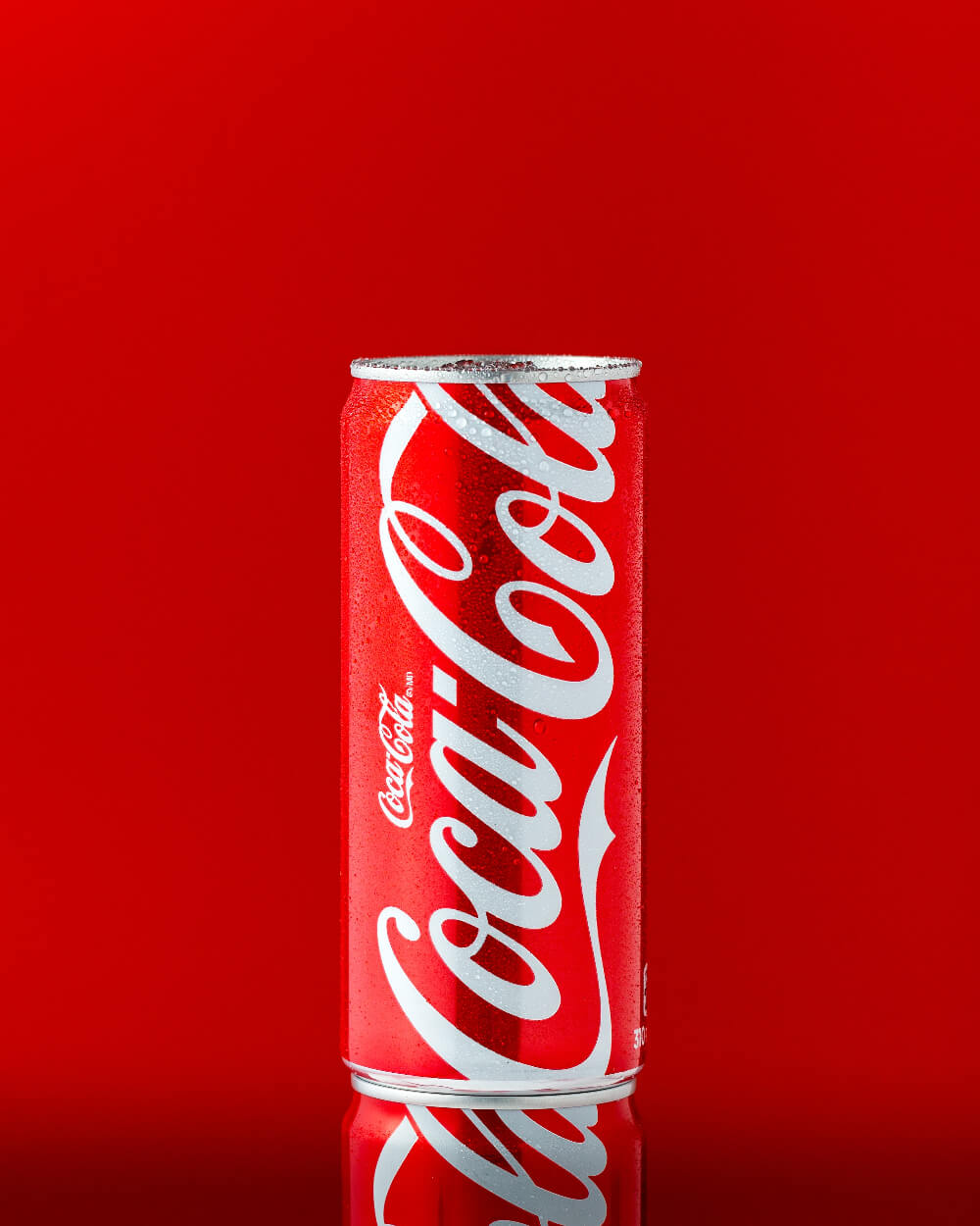
Red
Red signifies energy, passion, and boldness. It creates feelings of urgency and appeals to impulse shoppers, which is why we often see it in promotions for sales. Red, like yellow, can also induce appetite. So it’s used in the food and beverage industry often.
![]()
Source: Wikimedia Commons
On the flip side, some shades of red can represent danger, so they should be balanced with text and/or elements that have positive connotations. When used as a signature color, brands balance it out with other colors, like yellow in the fast-food industry.
![]()
Source: Frito Lay
Orange
![]()
Source: Wikipedia
Orange is a combination of red and yellow and so you will see a mix of the associations that we see with both these colors. Both aggression and excitement are tied to the color orange. As are friendly, cheerful, and confident emotions.
Orange is thought to bring about a fun, warm, and enthusiastic vibe that appeals to impulse shoppers. It is also a popular choice for brands targeting young audiences. Nickelodeon, a television channel targeting kids, has been using an orange-colored logo since the year 1984. Even when they rebranded to “Nick” they kept the color orange as a constant.

Source: Facebook
Blue
![]()
Source: Wikimedia Commons
Blue is a color associated with trust and security. Many conservative brands prefer it for this reason. In fact, 40% of the Fortune 500 companies use blue logos.
Blue is also thought to represent dependability, strength, effectiveness, and reliability. Blue is also a color associated with peace and tranquility and has been found to be universally liked across genders. That’s perhaps one reason why you might find it in the logos of social networking sites targeting diverse demographics like Twitter, Facebook, and LinkedIn.
![]()
Source: Wikimedia Commons
Green
![]()
Source: Spotify
Green is associated with wealth and being cost-effective. It also brings out feelings of peace and relaxation, adventure, playfulness, and vitality.
![]()
Source: Wikipedia
Green is best connected with nature. This makes it the most suitable choice for brands with environmental priorities or with organic products. Lighter tones of green are thought to be associated with freshness and health. Darker tones, meanwhile, are thought to be tied to luxury and wealth.
Pink
Pink is often stereotypically used to market to women and girls. As such, it’s thought to be feminine and romantic. At the same time, certain shades of pink can be calming, inspirational, empathetic, youthful, and/or creative.
![]()
Source: Wikipedia
Baskin Robbins, a globally popular ice cream chain, is a brand that aptly captures the ‘fun’ and ‘lively’ energy of pink in its logo. From the ‘31’ in its logo to the sampling spoons that customers receive at the outlets, Baskin Robbins uses pink in many places.
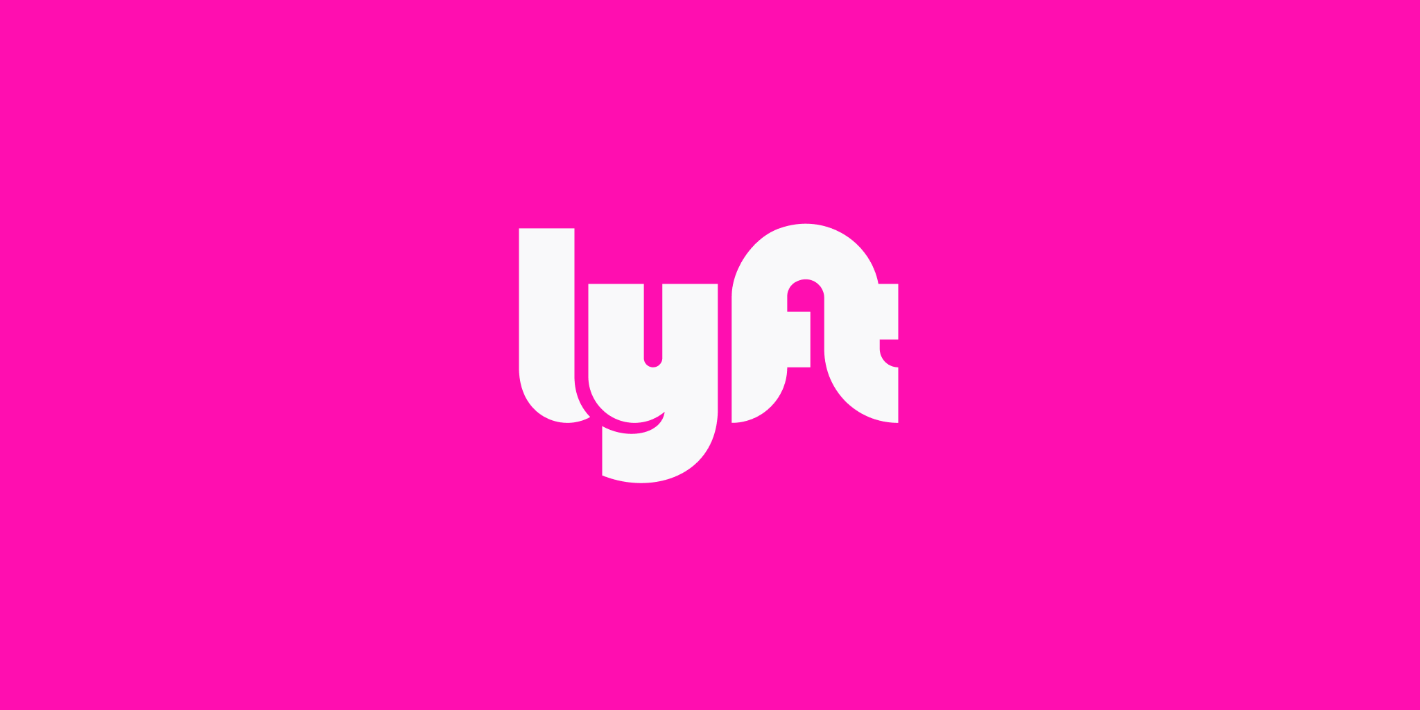
Source: Lyft
Lyft, a brand of rental cars, has also carved a niche for itself in a highly competitive segment. It has a pink logo that is as unique as its business model.
Purple

Source: Facebook
Purple is a color of royalty and luxury. So, it is a popular choice among brands offering luxury products and services. The mysterious nature of this color is one reason why you will find several spiritual associations with purple. And that makes it a favourite amongst health and wellness brands, particularly those related to yoga.
![]()
Source: Yorkdale
Purple is also thought to be soothing and calming. It’s a representative of a brand being creative, imaginative, and/or wise. Unlike most other colors, this one is not very common in nature. It is this rarity that makes it even more special.
Black
![]()
Source: Wikipedia
Black is tied to being powerful, sophisticated, and sleek. In moderation, though. Too much black can be overpowering. It’s also linked to luxury and premium options. It is said to appeal to impulse buyers. And it can allude to authority or mystery, depending on how it’s used.
![]()
Source: Wikipedia
White
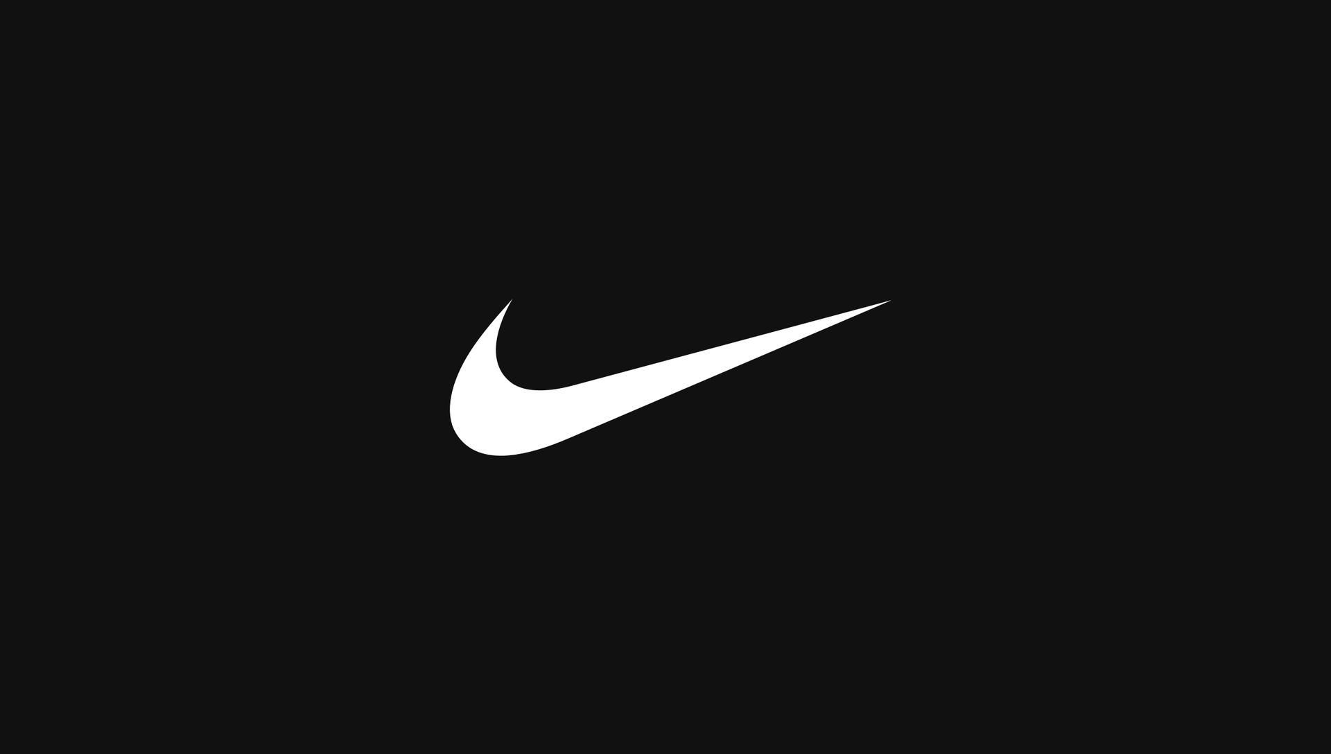
Source: Nike
White is thought to symbolize purity and innocence as well as cleanliness. It’s favored by tech companies for conveying efficiency and simplicity. You might notice white occurring in many logos as the main color or simply as negative space in a colored background. The contrast that white creates is very useful in conveying a strong message. But white as a primary color or the sole color is not common, because it makes elements and text difficult to read.
Brown
![]()
Source: Nespresso
Brown is associated with ruggedness and security. It’s thought to be natural, wholesome, and to symbolize comfort and earthiness. As a grounded color, this one is also used by brands that want to promote themselves as a stable and approachable business.
![]()
Source: 1000 Logos
Another association you might notice is brown being used to indicate coffee or chocolate and brands that specialize in these products.
Color variations & color psychology in marketing
Colors don’t just come in single options. Or with singular meanings. There are pure colors, tints (when you add white to a pure color), shades (when black is added to a pure color), and tones (when gray is added).
The colors you choose can be combined to create color schemes that tell your brand story in a consistent way. In individual marketing pieces, they can also help you create contrasts so that your audience focuses on the right things. Without this contrast your messages can go unnoticed or your images or videos can become difficult to understand.
We can see how powerful the use of color can be when we consider logos and branding. Most companies will pick a color scheme and stick to it religiously. As a result their customers start associating them with a particular color scheme.
Some companies are even known to have trademarked a set of colors to protect their brand from being diluted by competitors in the same market. These could be unique shades or tints or color combinations.
![]()
Source: Wikipedia
For example, the farming equipment company John Deere has a trademark for the classic yellow-green combination it uses in its machines and logo. So, machinery brands cannot pick this as their signature color combination.
Before finalizing a color scheme for your own brand, analyze your industry and look for trademarks that can put your company’s reputation at stake.
Kimp Tip: No matter the color schemes you use in your marketing, you should always include some black and white to make sure that your designs are balanced.
Putting together color schemes for your designs
So now you’ve got a thorough overview of color psychology in marketing. We have also spoken about different colors you can choose from. Now, let’s take a look at color schemes. This is the especially fun part – when you start trying out different combinations in your designs.
Color schemes or color harmonies are different color combinations that are aesthetically pleasing. And they can be created through variations in tone and shade. So there’s a ton of options you can try out.
1) Monochromatic color schemes:
Monochromatic color schemes have different shades, tones, and tints of the same pure color/hue. Combining different elements of one color can create a sleek minimalistic look.
Monochromatic designs also have really interesting compositions because of how light and dark areas can be created within them.

Source: Ads Of The World
Kimp Tip: Most ads on social media are vibrant and use many colors. So, if you choose one brand-relevant color and create a visually impactful monochromatic design, you get a scroll-stopping content.
Need help creating great looking ads for your social media campaign? Get in touch with Kimp.
2) Complementary color schemes:
Complementary color schemes include two colors that are directly opposite on a color wheel. There’s usually one warm color and one cool color. And they’ll be used according to the 80/20 rule so that one is dominant, and the other an accent. Complementary color schemes can really make things pop as the two colors are direct opposites.

Source: Kimp
3) Split complementary color schemes:

Source: Kimp
This combination includes one base color (red in the example above) and two colors that are adjacent to the base color’s opposite (blue/green and green). This scheme is visually engaging, without creating as much tension between the colors as complementary color schemes do.
4) Analogous color schemes:
Analogous color schemes combine colors that are beside each other on the color wheel. Because of this, designs with an analogous scheme aren’t jarring. Instead, they’re more subtle, calming, and pleasing.
Analogous color schemes are helpful for designs that need to convey information and don’t include a call to action. They can work well in Instagram and Facebook images since you do not have a CTA button within the image. If you do need an element to stand out though, like a banner ad, you may need to add in a complementary color.

Source: Kimp
5) Triadic color schemes:
Triadic color schemes combine 3 colors that are equally distant from each other on a color wheel. There are either 2 warm colors and 1 cool color, or 2 cool colors and 1 warm color. By making one of the colors dominant, and using the other two as accents, it’s possible to highlight the information you want to.

Source: Kimp
Kimp Tip: Avoid combining all dark shades as this might lead to a lack of definition between colors. To create a visual hook try choosing one vibrant color and then working with your designer to identify the other two for your triadic color scheme.
Incorporating color psychology in your brand’s graphic design
Color psychology in marketing is an important element in developing your brand identity. And as you develop your brand, you could even say the colors you choose become your brand. This is because, over time, people will start to associate you with the colors you consistently use in your branding and marketing.
So take your time, do your research, and test, test, test. It’ll be more than worth your effort when your branding and marketing hit home with your customers.
Need a hand getting your designs done in a consistently branded way? With Kimp Graphics, you can get unlimited graphic design services and work with a dedicated team of designers who get to know you and your brand. You can make unlimited requests and unlimited revisions too. All for a flat monthly fee.
Start your free trial today.