Pink Branding: How & When To Use Pink In Your Designs
Pink – some see it as a feminine color. Others see it as a pleasant color of hope. There is something supple and charming about it either way.
That’s one reason why you will find brands using different shades of pink somewhere in their marketing.

Along with red many brands use pink during Valentine’s Day promotions. But, pink is less commonly used as a primary brand color. It has a long-running history as having feminine connotations. And as a result, it appears mostly in brands targeting women. But, is pink really only for women-focused brands?
Before we answer this question, let’s take a look at different interpretations of pink. There are quite a few that we commonly know of and different cultures treat this color differently too.
- Color psychology – what does pink represent?
- Pink branding- how different countries see pink
- Pink branding – Lessons from big brands
- Pink branding: The many ways to use pink for your brand
- Pretty pink shades to inspire you
- Some color combinations you should know about
- Pink branding done right with Kimp Graphics
Color psychology – what does pink represent?
A quick fact – did you know that the ‘word’ pink comes from a flower named Dianthus plumarius, popularly called ‘garden pink’? There are so many manifestations of pink in nature:
- Subtle shades of pastel pink cherry blossoms
- The exotic deep pink of flamingos
- Peachy pink shades in rhodochrosite crystals
These are just a few examples of pink occurring naturally around us. So, it is a color that is easy to connect with. And when used right, it can work wonders for your brand. But for that, you should also understand what color psychology has to say about this color.
- Pink is a color that represents happiness. If you have a delightful message to convey for your brand, it looks even better in pink.
- The color pink is noted for its calming effect. Would you like to hear an interesting example that justifies this effect of pink? A particular shade of pink nicknamed Baker-Miller Pink actually has a history of being used in prison cells to reduce the feeling of hostility and aggression.
- To be “in the pink of health” is an idiom we all know. So, pink denotes good health as well.
- Pink symbolizes hope and can be used as a color to spread positivity.
- Mellow shades of pink are often used to symbolize child-like innocence.
- Pink, like red, is associated with love.
- It is seen as a color of sincerity and it strengthens a feeling of trust.
Pink branding- how different countries see pink
The cultural associations of pink are as interesting as the many symbolic meanings according to color psychology. In the early 1900s pink was once seen as a strong color suitable for boys. Meanwhile blue, with its dainty appearance, was set aside for girls.
But things changed in the 1940s as Americans started using more pink in fashion for women and little girls. That’s the trend that has socially conditioned people into believing that pink is a feminine color.
But people from different cultures perceive this color differently. Here are a few associations of pink across the globe:
- In Western culture, pink has been popularly used in women’s fashion and the trend has now spread across the globe.
- As the color of the sakura (cherry blossom), pink has a totally different place in Japan. It is seen as a masculine color in Japan.
- Pink was not widely used in China until recently when the country started gaining exposure to Western culture.
As you can see, there are many different interpretations of pink and multiple cultural associations. Though pink does have a soft side that brands can tap into, there are not many brands that currently do.
“Pink it and shrink it” was a rule that some marketers used in the past. This was about creating a pink version of a usual product in order to target women. And this was yet another reason why many brands stayed away from this color in the past. But today, brands are breaking stereotypes.
Gone are the days of seeing “pink” as a color of ‘femininity’. If you do choose this color as a primary color for your brand, you will find a lot of inspiration, even from some big brands.
Confused whether pink will be the right color for your brand? Let’s see how different brands tap into the color psychology of pink and its cultural associations.
Pink branding – Lessons from big brands
Your primary color will be in your logo, your emails, social media pages, and all types of ads. So, you should be sure about how people see the particular shade of pink you choose. A lot depends on the trends that popular brands have set too. In fact, nearly 85% of shoppers find colors to be impactful enough to alter their buying decisions.
Will pink be a color that your target audience enjoys? Well, it is easier to understand the effectiveness of pink by studying the brands that already use it. Here are some popular ones that do.
1) Baskin Robbins

Pink is a color you can easily associate with ice cream, and desserts in general. Baskin Robbins capitalizes on this and captures a delectable pink shade in its ice cream cups, and packaging boxes as well.
The color pink easily resonates with pastries and sweet treats making it a great choice for bakeries and ice cream shops.
2) Deutsche Telekom
Pink is not a color you commonly see in the telecom industry. That’s predominantly one of the reasons why Deutsche Telekom has been using a lively shade of magenta in its branding. The brand uses the color to showcase how unique it is. This plan has worked beautifully for the brand and it is one of the most recognizable logos in Europe.
If you are looking to break conventions and set new trends in your industry, make heads turn with deep and luxuriant shades of pink like the one used by Deutsche Telekom.
3) AEON
AEON is a Japanese multinational company in the retail industry. As a brand known for its convenience stores and supermarkets, it uses a color that its target consumers very well connect with, pink. Pink, as we mentioned earlier, is a common color in Japan, one that has the respect of both men and women of all age groups. This logo taps into that and gives it a fresh take with a hint of purple.
For a brand in Japan or one that somehow connects with Japanese culture, pink is an easy color to work with.
Kimp Tip: If you have a color like pink in your mind and you wish to make the most of it in your marketing strategy, come up with a balanced color palette using colors that complement it well. We’ll talk more about combining other colors with pink, a little later. But for now, you should understand that the color schemes you choose and how you use them in your graphic designs have a huge impact on the way your brand connects with your audience.
Wondering how to consistently create marketing designs with a color palette you have chosen? Try Kimp Graphics, our unlimited design subscription.
4) Cosmopolitan
As a magazine designed especially for women, the logo of this one is all pink and no fluff. Its lively Fuschia shade combined with the sans serif font creates a clean logo that is easy to relate to.
Brands catering to women’s products including women’s fashion brands often use this color. It also works like a charm if you have a business offering professional beauty services. Clinics offering skincare and wellness treatments are the other kinds of businesses that can build on the history of pink being associated with women’s products and services.

5) Vineyard Vines
Pink continues to be a common choice in women’s fashion. Vineyard Wines caters to both women’s and men’s fashion but it still uses a pink logo. The brand offers casual and comfortable clothing for both men and women and for different age groups as well. It makes use of a mild and friendly-looking pink in its logo to simplify its customer communication.
If you do use pink in the fashion industry or women’s wellness and other women-focused categories, you should know that the color is very common. To stand out, you should choose the right shade that sets your brand apart. Then comes the type of logo you design and the other visual elements that go into it.
Kimp tip: Logo trends are continuously evolving. So, when you do have a solid color chosen for your brand, you need the right type of logo to make the color work. The Cosmopolitan logo is a perfect example to show that even a simple wordmark logo can have a huge impact on its audience.
Looking for a logo design that will change the face of your brand? Talk to the Kimp team today about getting your logo, and all its iterations, designed for a flat fee.
Pink branding: The many ways to use pink for your brand
If you use pink as a brand color, keep in mind that it will be used widely across your marketing channels and choose the most appropriate shade for your audience. However, if you are not ready to use pink in your logos but would still like to explore shades of pink in other places, there are plenty of choices. Here are some ways in which you can integrate the color seamlessly into your branding efforts.
1) Pink branding on your websites
If you want to use pink in your website but do not want it to appear too bright, take cues from the soft pastel palette of the website of KNC Beauty. The brand beautifully balances the power of pink with other pastel colors.

Want to use a bright pink? This can get overwhelming if it’s the base color for an entire design. But you can use it for text and/or the CTA buttons without it becoming overpowering. This looks mild and is easier on the eyes.
2) Pink branding for catchy flyers
Consumers are becoming more and more immune to ads. So, if you do choose flyers and leaflets for local ads, the effectiveness depends a lot on the colors you use and the overall graphic design.

For such print-based marketing materials that are hard to grab customer attention with, you will find a vibrant color like pink to be a great choice. Green, blue and black are quite common in flyers but not pink. So when yours uses pink correctly, it is sure to make heads turn.
3) Capture love in billboards
You have to be extra cautious about the colors you choose for outdoor advertising. While red is perhaps the first color that comes to mind while depicting love, a huge red billboard by the road might look like a warning sign. Pink might be a better choice in such cases.

Kimp Tip: You will find both RGB and CMYK (i.e. digital and print) alternatives for most shades of pink. So, incorporating pink as the main color into your designs will not be too difficult. Just be sure to get some help from a professional designer. To the untrained eye, the difference between the pinks used in print and digital mediums can seem jarring. It pays off to work with professional graphic designers for print ads, especially large-scale ones like billboards.
Struggling with maintaining the colors of your brand and the quality of your designs on your billboards? Get in touch with Kimp to solve your billboard design woes.
4) Picture perfect social media posts in pink
Pink works exceptionally well on social media. Even the Instagram logo has a beautiful gradient of pinks for that matter! So, pink is a beautiful option if you need to create visually appealing posts or Stories for social media.

5) Pink branding and marketing emails
Email marketing has been around for a long time now. And today people have easy access to their emails on their phones. But the average open rate for marketing emails is hardly 19.8%. In addition, the click-through rate is even lower at 11.3%.
Using a bold and vibrant color like pink will come in handy if you need a visual hook that will make your customers actually stop and take a look at your email. And the fact that this color works well with kids and women makes it an easy option for segmented email campaigns too.
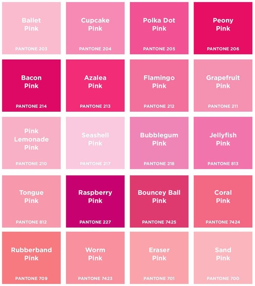
Pretty pink shades to inspire you
Some shades of pink are bright and loud while others are soft and serene. What do you want your pink to capture? A deep romantic vibe or perhaps a simple pink that shows the gentle side of your brand? Not sure? Here are a few shades to try:
1) Pacific Pink
Imagine the color of the ocean lined by a beautiful pink sky during sunset. That is what the Pacific Pink color looks like. It has the power to draw attention. According to Shutterstock, this is one of the trendiest colors to try in 2022.
Pacific Pink is a commonly occurring color in nature. As a result people feel an instant connection with it. It works well in logos for fashion brands as well as in backgrounds for social media images and websites.
2) Pantone Radiant Orchid
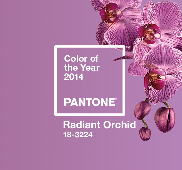
Radiant Orchid was the Pantone color of the year in 2014. It rocked the interior design space as well as the world of fashion. The hint of purple on a pink undertone makes it a pretty color that does not hurt the eyes when used in excess.
3) Pantone Honeysuckle
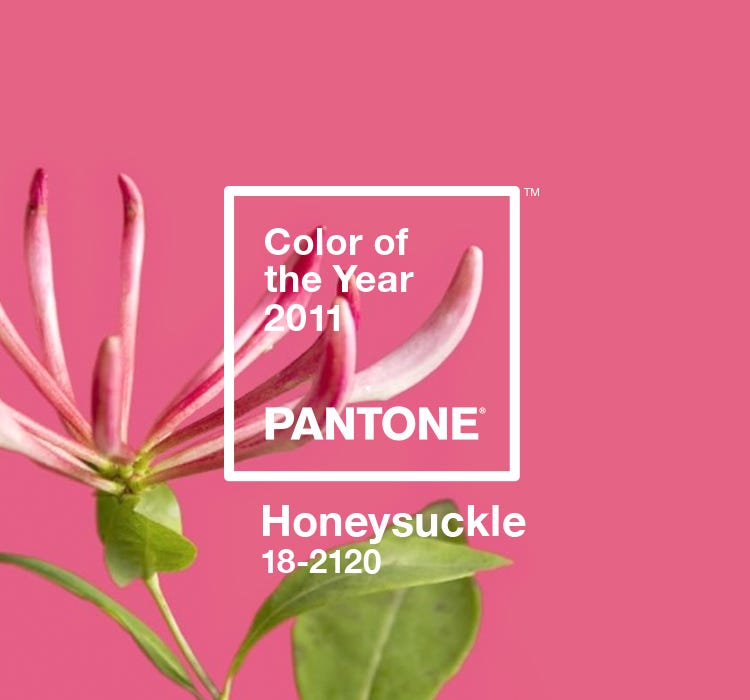
Named Pantone Color of the Year 2011, this is a great choice if you need something bold and scroll-stopping. The energy this shade emanates makes it a suitable choice for brands targeting youngsters.
Some color combinations you should know about
Pink branding and marketing can be tricky if you do not know the right colors to pair together. In fact, the whole point of choosing pink, and the many positive associations it has, might be lost if you pair it wrong. Here are some color combinations that work well for pink.
1) Pink with black for a touch of sophistication
If you find pink to be too gentle, combine it with black and it makes a luxurious pairing.

2) Pink and blue complement each other
As these are complementary colors, they work well together. Have a bright shade of pink to use? You’re in luck! Blue will balance out the heaviness of the pink.
3) The analogous combination of pink and purple
As colors that appear next to each other in the color wheel, they make a pleasant combination. Lyft beautifully incorporates this vibrant pairing in its Instagram aesthetics.

Pink branding done right with Kimp Graphics
The colors you choose for your brand reflect your brand’s personality. And this isn’t just in first impressions. How you present your brand’s personality using color, over time, will impact whether you can form long-term relationships with your customers. To really convey the impression you want, you need to consistently incorporate your brand colors in the right places.
Need a team that can help you stay on top of your marketing and designs? Get a dedicated team of designers for a flat monthly fee with a Kimp Graphics unlimited design subscription.
Start your free trial today.