YouTube Fonts: 17 Ideas To Adorn Your Channel
As you browse YouTube, only a few videos catch your attention, right? These select few possess an aesthetic appeal that draws you in, often due to their catchy thumbnails. One of the major influencers contributing to the allure of these thumbnails is the font they use. Even before you read the content, the typeface communicates with you. This highlights the importance of selecting the right YouTube fonts.

However, font selection isn’t limited to thumbnails. There’s your YouTube channel banner as well. The font you choose can make or break these elements, determining whether your videos are clicked on and if your channel is deemed trustworthy.
So, what’s the key? YouTube fonts need to be visually appealing to make that crucial first impression. Additionally, they must also be easily readable; users shouldn’t have to strain their eyes to grasp information in fleeting moments.
How can you achieve this? That’s precisely what we’ll explore in this blog. We have a short list of impactful YouTube fonts and typography tips to adorn your channel. So, are you ready to elevate your YouTube typography game? Let’s go!
Upgrade Your YouTube Aesthetics: 17 YouTube Fonts to Elevate Your Style
Serif Fonts
1. Bernhard Modern

Serif fonts are rare to come by on YouTube given their traditional tone that contradicts with the overall casual setting that prevails on YouTube. However, some sleek serif fonts like Bernhard Modern make their way into the platform.
This elegant typeface is suitable for YouTube channels that call for an air of elegance. It works well on banners, thumbnails as well as video intros. If you have a channel that belongs to the fashion, beauty, lifestyle, or luxury niches, then this is one of the most beautiful YouTube fonts to add to your list.
KIMP Tips:
- The font looks upscale and might not be suitable for brands meaning to appear casual or young.
- To ensure readability use high contrast between the text and background when using Bernhard Modern.
2. Brasika
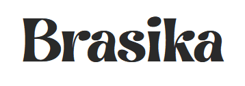
This chunky display font is best suited to channels meant to maintain a nostalgic aesthetic. There’s also a slight playfulness to this font that ensures that it does not evoke a rigid traditional mood.
Given the strong personality, this is one of the best YouTube fonts for channel banners where your text needs to immediately draw attention.
KIMP Tips:
- Avoid using Brasika in long text portions.
- The font might not be that easy to read when scaled down too much.
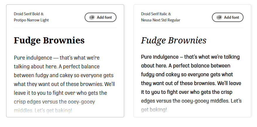
3. Droid Serif

Another great serif font but slightly heavier and bolder than Bernhard Modern, Droid Serif is also better in terms of readability.
This is a great choice for short lines of text in the intro or even on thumbnails. Adobe recommends pairing this font with slimmer sans-serif fonts like Neusa Next Std Regular or Protipo Narrow Light. These pairings help when you choose to use Droid Serif in the video copy, as titles or subtitles in your text.
Given the professional tone this font carries, it makes a great choice for channels that prioritize education and informative content.
KIMP Tips:
- Remember that the font’s traditional personality might not suit all brands.
- Use different weights and styles to add variety. Because this font closely resembles several other commonly used serif fonts and therefore lacks a touch of uniqueness that every YouTube channel must carry.
4. Arvo
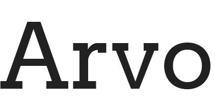
If you are looking for YouTube fonts that are versatile, then Arvo is a great choice because this one looks good on both print and digital designs.
Its geometric letterforms ensure readability making it suitable both for banners and thumbnail text. This is also a bold font to use in attention-grabbing CTAs in your YouTube videos.
KIMP Tips:
- Given the strong personality of Arvo, it works best when combined with more minimalistic fonts so that the overall design does not appear too heavy.
- Avoid using this font against busy backgrounds to avoid the risk of overwhelming users.
Sans serif fonts
5. Bangers

If you are looking for YouTube fonts with a comic-book style appeal, then Bangers should definitely be on your list.
It’s a display font designed originally for cover text on comic books and hence it works well in titles and short attention-attracting text in videos, like the intros for example. Besides, the font also looks good when animated!
Its quirky personality makes it suitable for YouTube channels with a young target audience as well as channels focused on gaming and entertainment.
KIMP Tips:
- If you are looking to tap into humor as the main emotion in your channel or in a series of videos, then incorporate Bangers in the thumbnail design.
- Avoid using this as the primary font style since it lacks professionalism.
6. Badaboom BB

While it looks a lot like Bangers, Badaboom BB is slightly quirkier. But remember that both these font families have limited style variations to explore.
So, if you need something bold, you might like Bangers but for something more playful, then Badaboom BB works.
Badaboom BB is a great choice when you wish to add sticker texts or simple animations meant to evoke excitement at specific portions of a video.
KIMP Tips:
- This font is less legible in small font sizes and hence might not be suitable for the body text in your video copy.
- Since the font has a strong personality of its own, avoid combining it with another bold font with a contrasting personality, like Arvo for example.
7. Roadway

A modern sans-serif font with a slightly industrial tone, Roadway is a unique combination of the old and new. This carries a condensed structure which is also good in terms of readability.
Putting all of these traits together, this one makes a great choice for text that appears in your video like the overlay text or even the lower-thirds. Roadway also works well if you have to add contact details within your banner. It delivers the message without taking up too much space.
KIMP Tips:
- Roadway combines well with slim-weight serif fonts and sans-serif fonts.
- Since the font is minimalistic on its own, add colors and banners to add more character to the text.
8. Caribold

With a highly impactful structure, this is a bold and easily readable font with versatile applications. This font is an attention-getter and makes a great choice for thumbnails.
The font is pretty loud and is therefore more suitable for short text. Using this too much might result in the design appearing overwhelming.
As for the tone, this one is more on the modern side and might work well for brands looking to create a professional and authoritative aesthetic.
KIMP Tips:
- The font evokes an energetic vibe and therefore might not be suitable for channels meant to appear more approachable and friendly.
- If you wish to mellow down the font a little choose subtle colors for the text.
9. Config Rounded

If you are looking for adaptable YouTube fonts that can be used in diverse style variations and applications, then Config Rounded will not disappoint you. The geometric structure of the letterforms ensures readability at different scales and on different backgrounds.
The Config Rounded font family consists of a variety of line weights. So it makes a great choice for video text where you need to establish hierarchy by distinguishing between titles, subtitles, and body text.
KIMP Tips:
- When using narrow line weight versions from the font family, use solid-filled banners and a good text size to ensure readability.
- The font on its own might not attract a lot of attention. So combine it with fonts with unique personalities that align with your theme.
10. Dustin
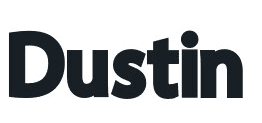
Modern, bold, and informal, Dustin is also easy to read. Combining the simplicity of clean lines and geometric shapes, this font makes a great choice for the YouTube channels of consumer-centric brands as well as channels carrying a contemporary aesthetic.
Since the font is easy to read when scaled up or down, it works well for on-screen text including overlays. Moreover, the bold version looks catchy in the title text.
To add a creative twist to your designs and to let typography take center stage, you can use the outline version within this font family. It also comes in handy when animating the text in your video.
KIMP Tips:
- Avoid using the outline version of Dustin on busy backgrounds and with poor color contrasts.
- On its own, Dustin may look like it lacks a personality of its own. Therefore, ensure that you add an on-theme font to go with this – an elegant script font or a modern serif font.
11. Chucklesome

Chucklesome is a fun display font suitable for content that’s high in the entertainment quotient. This expressive font is suitable mainly for thumbnail text and outros that are meant to close the video with a bang.
A slight cartoonish feel and bold strokes make this a great font for animated callouts added to videos to make them more engaging. Chucklesome is a unique font and hence adds a touch of memorability to your channel as well.
KIMP Tips:
- To make the most of this font, use vibrant color palettes in your design.
- Avoid using this for long lines of text as it might appear too loud.
12. Playkidos
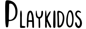
Fonts like Playkidos prove that sans-serif fonts can have a unique personality of their own too! Aptly named Playkidos, this one has a playful tone and is a great choice for YouTube channels designed for kids.
With each letterform carrying its own quirky nature, this font also makes a fun choice for videos with plenty of text animation.
KIMP Tips:
- This font appears fun and exciting. So avoid combining it with something that contradicts its nature, like a traditional serif font, like Droid Serif for example.
- Since the font is predominantly used with thin stroke widths and a condensed structure, use a good text size to ensure that it’s easy to read.
Script font
13. River Drive

Hunting for YouTube fonts that appear easygoing? Then add River Drive to your list! With a street typography-like feel, this casual font carries an intriguing hand-written appearance.
By adjusting the transparency of the text element you can easily adjust the texture from dry brush stroke to rough chalk. This helps add a rustic touch, especially for channels owned by individual creators. The raw nature of the font helps add a personal touch. This versatility is also the reason why this font feels suitable to convey a wide range of emotions by combining it with the right colors and visual elements.
KIMP Tips:
- River Drive has an artistic flair of its own. So avoid combining it with fonts with a rigid personality or something that appears overly formal as it would mute its vibrant energy.
- Avoid using River Drive for text-focused videos where users need to read and process several lines of text to process the information.
14. Beauty And The Beast

If you are looking for a script font that is creative and highly expressive, then Beauty And The Beast is one of the best options.
Given the creative details that come with the font, this one comes in handy when you have to add exclamatory words or interactive pop-ups within your videos. Or if your thumbnail has a simple short text that is meant to immediately grab attention, this font does a great job.
KIMP Tips:
- Remember to pair this one with easy-to-read fonts within the sans-serif category especially when it comes to adding supportive text.
- Since the font on its own carries an adorned style, avoid adding too many styling elements or shadows and highlights to it.
15. Chicken Pickle

If you need a font that makes your text look as casual as handwritten notes penned down with a Sharpie, then try Chicken Pickle.
The font looks great for lifestyle themes, channels that document everyday vlogs or even those that celebrate cooking experiments, art projects, etc.
KIMP Tips:
- Some of the characters in this typeface might be difficult to read especially when the text size is scaled down.
- Given the unrefined nature of this font, it might appear difficult to discern against backgrounds with a lot of details or patterns.
16. Rushk

Similar to River Drive, Rushk is a raw brush script font that mimics handwritten script for a personalized touch. The font’s dry-textured letters and rough edges add to the aesthetic appeal of your videos. This gritty font with a slightly vintage feel works well in thumbnails as well as eye-catching intros.
Channel banners or attractive thumbnails, Rushk is a versatile brush stroke font that looks equally impactful everywhere.
KIMP Tips:
- Pair Rushk with simple readable fonts so that your message is communicated clearly.
- The relaxed vibe of this font might not suit brands looking to deliver informative content in a more professional tone.
17. TT backwards script

One of the distinguishing factors that sets this font apart is its predictable brush strokes and consistent structure. Despite being a script font, there is an order in this font that makes it look professional especially when combined with the right visuals and background details.
The font family includes different line weights so as to allow you the freedom to choose how bold or delicate you want your text to be.
This monoline script font is versatile and can be used to communicate different emotions. Combine it with a conventional serif font and you can create a sense of nostalgia. Or pair it with a chunky sans-serif font to create a more informal look.
KIMP Tips:
- This font might not be easy to read when there is a lot of text or when the font size is small.
- If you are looking for something sophisticated or with a hint of luxury, this might not be a great choice given its casual aesthetic.
Now that we have a handful of font options to explore and start working with, let’s move on to discuss a few more typography tips in a broader sense.
Quick Typography Tips For Your YouTube Channel
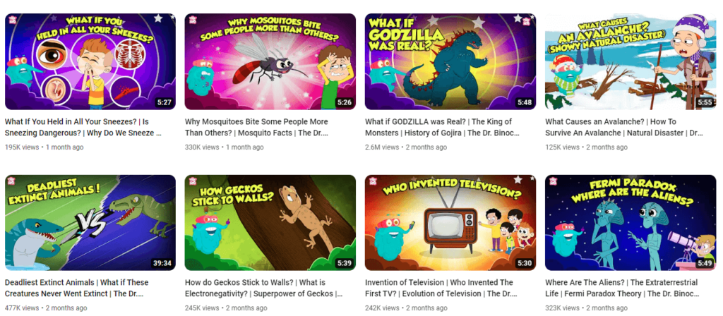
Choose fonts that resonate with your target audience
In addition to comparing common factors like the font’s aesthetics and readability, consider your target audience’s preferences when choosing YouTube fonts.
The below image shows the thumbnails used in a YouTube channel called Peekaboo Kidz. As evident as it might be, the target audience here is children. Therefore the visuals and the fonts are all chosen to resonate with little kids.
Find fonts that reflect your brand’s personality
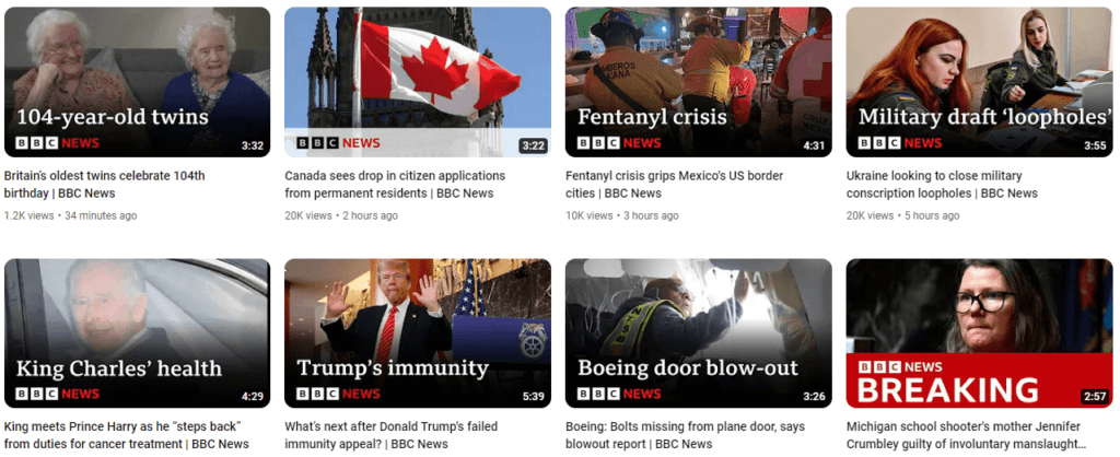
Your brand identity is one of the most important factors to consider when picking fonts. If you maintain an overall formal tone in your brand’s visual identity and branding designs as well as marketing designs everywhere, quirky or eclectic fonts look out of place in your YouTube channel. Instead, you need something sleek and more resonant with your brand’s personality.
The below image shows the thumbnail fonts used on BBC News’s YouTube channel. Given the modern and professional identity the brand maintains across various channels, the sleek serif fonts suit the channel’s aesthetics well.
Use fonts that clearly establish and distinguish themes
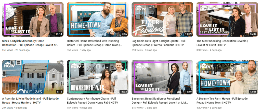
Though your YouTube channel might have a defined niche, you might have themes within your videos. For example, if you own a beauty channel, you might have a set of videos focused on skincare, some focused on makeup and some focused on cosmetic product reviews. You can use different font styles and different font families on the thumbnails to distinguish between these themes.
The below image gives a glimpse of the HGTV YouTube channel. Notice how the brand sticks to a single recognizable template but uses different fonts to differentiate between the themes.
Simplify Your Motion Graphics Requirements With KIMP
Most often, you have great video footage and brilliant ideas to add value to your channel. But bringing them to life is challenging. That’s where a motion graphics subscription like KIMP Video comes into the picture. A KIMP Video subscription takes care of almost all of your short-video requirements as well as the editing process of your long videos. Therefore, to create catchy intros and outros, add text overlays, create logo animations, and add professional edits to your videos for YouTube, all it takes is one KIMP Video subscription.
Want to see how this works? Register now for a free trial!
