Instagram Fonts: The Best Fonts For Your Stories, Reels & Posts
Instagram – a realm where visual storytelling reigns supreme. In most places, we say that visuals help attract attention. But on a visually immersive space like Instagram where visuals are the only type of content you see everywhere, what do you do to attract attention? The answer lies in the little details that compose the grand aesthetic – like typography for example.

The right typography can have a scroll-stopping effect and ensure that the intended message in the post is delivered clearly and memorably. The fonts that grace your Stories, Reels, and Posts, paint words with emotions, themes, and tones. In this image-driven world, we can safely say that typography is your secret weapon.
All things considered, the real challenge begins when you start hunting for fonts. You either find too many good ones or don’t find any that seem to connect with your design. Sounds relatable? You’re in the right place. Today, we’re unraveling the secrets to Instagram fonts. Whether you’re curating a brand page that radiates identity or cultivating a personal space that resonates with authenticity, you’ll find fonts that help you paint your story.
So, are you ready to stop the scroll and make your mark? Let’s go!
Mastering font selection on Instagram – tips for every post type
As we briefly discussed now, fonts shape the way your audience perceives your message. From your static image posts to the Stories, each post type demands a tailored font choice for optimal impact. Here’s a breakdown of some useful font selection tips for various Instagram post types:
Static images
About 71.9% of posts shared on Instagram are photos. This means that your static image is likely to face the most competition. Therefore, you need fonts that visually showcase your brand or personality. And these fonts should complement your visuals and communicate the message correctly. Here are a few tips to achieve that:
- Consider the contrast in terms of color and font sizes. You want your text to stand out from the background and other visual elements in the design.
- Pick fonts that align with the mood of the rest of the visuals in the static image. The below post from Google is meant to be informative. So, it uses a simple sans-serif font that easily communicates the message.
Carousel posts
With an average engagement rate of over 1.92% carousels continue to be popular among brands. How do you find the right Instagram fonts for your carousels?
- Use a combination of 2 or 3 fonts throughout the carousel. The slides should all look cohesive.
- Maintaining a cohesive visual style in all your slides is important. To keep up with the bold and vibrant visual style in the below carousel, Coca-Cola uses a fun display font.
Stories
These fleeting posts when leveraged effectively create an unforgettable interaction with your followers. Your fonts should therefore be visually captivating.
- Find fonts that are legible and easy to read considering that users cannot zoom in and scrutinize the text in the Story posts.
- Use bold and elegant fonts that instantly convince users to stop rather than scroll away. The below Story post on the Target page uses big bold attention-grabbing fonts.

Reels
Reels have the potential to bring new visitors to your page. Therefore you need Instagram fonts that enhance the dynamism of your content. Here are some tips to achieve that:
- Font animations make videos appear more interactive and therefore you need fonts that look good when animated.
- Pick fonts that blend with the theme, the vibe of the video – informative, fun, or dramatic. The below Reel from Microsoft uses the signature Barbie font to go with the Barbie theme.
With these tips in your arsenal, you’re equipped to make informed choices with respect to Instagram fonts for different post types. Let’s now quickly look at some font recommendations to strengthen your Instagram page and aesthetics.
15 fonts to adorn your Instagram page
Serif fonts
1. Didot

If you are looking for Instagram fonts that are elegant and sophisticated, Didot is a great choice. Moreover, the bold vertical strokes grab attention.
When it comes to the application of Didot, it works well for high-end brands looking to create timeless posts.
KIMP Tip: The Didot font is known for its high-contrast strokes which enhance readability. Therefore, it works well in Story posts meant to attract immediate attention and deliver a clear message.
2. Cormorant Garamond

As a font known to harmoniously balance contemporary and traditional styles, Cormorant Garamond is also easy to read.
As for the application of this font, it works well in situations where you have to establish authority – like posts meant to build trust. So, this is one of the best Instagram fonts for educational or informative static image posts or even carousels.
3. Creative Vintage

For those posts that call for an antique touch, Creative Vintage is a great font. Moreover, its bold chunky strokes mean that this font works well in those designs where the text needs to be the focal point.
Despite having the subtle traditional mood of serif fonts, the curvy strokes on this one add a playful twist. So, use this font when you have to come up with a fun vintage-themed poster for your static posts or even a Reel.
4. Emerland

The Emerland font is a mix of tradition with a hint of professionalism. With heavy strokes, this serif font is a good option for lifestyle brands looking to create a statement design.
When it comes to the readability part, this font has moderate contrast in its strokes. Hence it is comfortable to read even in smaller font sizes. In fact, this is one reason why it makes a great font for social media platforms like Instagram which are commonly accessed from small screen devices like smartphones.
Finally, with the bold look, Emerland makes a great choice for the title text in carousel posts or even the hero text in static images.
5. Merritta Serif

All the Instagram fonts listed so far have that signature conventional structure to them. But if you want something more creative but without losing the charm, and the luxury of serif fonts, then the Merritta Serif is the perfect option.
There is an inherent grandeur about this all-caps font which makes it a popular option for luxury brands to post event invitations on social media or even to make critical product launch announcements in Reels.
Remember that the slightly irregular character sizes and the ornate swashes in some of the characters take a toll on the legibility of the font especially when scaled down. So restrict this font to the title text, the part that is meant to grab attention.
Sans-serif fonts
6. Open Sans

The clarity and versatility of the Open Sans font are what make it perfect for digital platforms like Instagram. Because of this versatility, this font can be used in a variety of occasions like posting quick business updates on your page or even adding an informative post for engagement.
In terms of the mood of the font, its slim and curvy strokes make it appear approachable and friendly while also maintaining a slight level of professionalism. For this reason, the font also comes in handy for text in Reels created by influencers and small businesses.
7. Raleway

Raleway looks a lot like modern sans-serif fonts like Open Sans. Yet, the subtle difference in some of the characters like the W in the above image, adds a creative twist. This makes the font suitable for brands trying to establish modern aesthetics.
As for the legibility part, Raleway has slim and even stroke widths throughout making the characters legible and clear irrespective of the font size and screen size. Raleway also comes in handy when you are trying to create a minimalistic theme for Story posts or text-rich carousels.
8. Monerd

With slim and tall letters, this uppercase font is a bold choice for tech-related brands. It is an equally appealing choice for lifestyle brands looking to create an elegant design.
Since this is a bold font on the whole it is a good choice for headings. For subheadings or longer lines of text, this font works better on increasing the kerning to enhance legibility. As for the placement of this font, Monerd works well in almost all types of posts including static images, Stories, and Reels.
KIMP Tip: Several fonts like Monerd can be personalized to suit your brand and your message by manipulating the kerning and using the right font formatting for your text. Collaborating with professional graphic designers helps achieve this effortlessly.
9. Montserrat

This timeless font is a staple in modern aesthetics. At first glance, Montserrat looks a lot like Open Sans. However, Montserrat has slightly broader and slimmer strokes giving it an edgy look. The geometric characters in Montserrat make it easy on the eyes irrespective of the size of the font and the length of the text.
In short, when legibility is the number one priority, as in the case of informative posts and carousels, Montserrat does its job perfectly.
10. Etapi Sans

If you are looking for Instagram fonts that are not commonly used, then the Etapi Sans is definitely a good one to add to your list. This display font has broad bold strokes and small rounded characters.
Etapi Sans is a unique and attractive font suitable for creating big headlines for social media ads or even for scroll-stopping Stories with minimal text content. However, the legibility of the text comes down a little when the font is scaled down. This means that this is not the best choice for body text.
Given the clean cutting-edge shapes of the characters, this is not for brands with a traditional approach. But is definitely a must-try for contemporary brands and those targeting young audiences.
Script fonts
11. Northwell
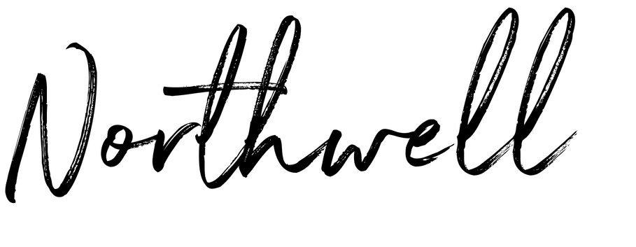
Sometimes you need Instagram fonts that capture the raw and authentic vibe you wish to reflect through your posts and your page. And in such instances, Northwell is a great font.
Its rugged and textured dry brush strokes introduce a crucial element of personalization that every social media post could gain from. Choose Northwell for a stunning Story ad, or the opening frame and thumbnail of a Reel. Given the casual aesthetic of this font, it is more suitable for personal branding.
12. Hello Santuy

Instagram fonts in the Script category are particularly popular because they allow you to add a personal touch to the message in your social media post. It’s classy, it’s elegant and there is a free-spirited nature to this font that makes it a great option for influencers and small brands.
Text in Hello Santuy takes up a lot of space and reducing the size of the font takes a toll on the legibility. So, it is better suited to Carousel title slides or even the headline text in Story posts.
13. Playlist Script

The charming hand-lettering style of Playlist Script makes it suitable for modern and casual aesthetics. In posts featuring narratives meant to connect with the audience at a personal level, Playlist Script can be used in the title text or other sections that are meant to be in focus.
The contrasting stroke widths help improve legibility and therefore the font is also suitable for posts with short text like quote posts. Mimicking handwriting, this font makes the quote easier to read and relate to.
14. Allura

Allura is an artistic font with an air of refinement around it. If you are looking for Instagram fonts for a more formal setting, then Allura fits the description.
This script font is suitable for brands that wish to show their creative side and small brands designing their event invites for a Static post or Story post on Instagram. With the right font size, this font is also surprisingly more legible in comparison with most other script fonts.
15. Yamatha

Yamatha is a monoline font perfectly suited for contemporary casual aesthetics. The most distinct trait of this font is the elegantly balanced characters it features. Smooth curves without surprise ornamentations and swashes make this font a good choice for traditional brands that wish to add a slightly casual touch to their posts.
Given the legibility of this font in various font sizes it makes a good choice for all types of Instagram posts.
Can’t pick the right Instagram fonts for your design? Get KIMP!
From the list, it is evident that there are plenty of Instagram fonts in various categories and in various styles. However, you need to carefully choose yours so as you sculpt your brand identity or your personal brand through your social media designs and aesthetics. Choosing a font is a crucial design decision because it can make or break the message and mood of your design. And without the right emotional response, anything you post on social media is likely to go unnoticed.
Taking all these factors into account, working with professional graphic designers is one way to simplify your work, find the right fonts, and format these fonts appropriately for your social media designs. And with a graphic design subscription like KIMP, you get unlimited designs from various categories. Besides, you also get to work with the same team for all your designs. As a result, you can be assured of cohesive designs and the freedom to explore diverse post formats on Instagram.
So what is stopping you? Sign up for a free 7-day trial now!