When & How To Use Yellow In Branding + Design Examples
When we ask you to imagine a happy color, what comes to your mind? Probably yellow? You’re not alone. Bright as the sun and warm as the morning rays of sunshine, yellow has always been perceived as a cheerful color. And this isn’t some recent phenomenon.

The first-ever appearance of yellow in art was way back in the Paleolithic times! This was one of the colors used in ancient cave paintings.

Source: Wikimedia
One other very common piece of trivia about yellow, that you might have heard, is that it is the most visible color in the spectrum. It’s easiest to see at night or in dark environments. And that’s one reason why you will find it being used a lot in roadside signage.
So, yellow has a long history and great visibility. Does that automatically mean that yellow in branding works well? Well, you will have to understand color psychology to get an answer to this question. And you should also analyze how different brands create associations with this color to get inspiration for your brand.
Lucky for you we’re helping you navigate both of these topics in this blog! Keep reading to find out whether yellow should be the main color in your branding or an accent color as part of your marketing.
- Color psychology: How yellow affects moods
- Yellow in branding: Cultural associations you should know about
- Yellow in branding: How the big brands do it
- Yellow in Branding: How and where to use the color for effectiveness
- Yellow shades to try for your brand
- Pairing your yellow with other colors
- Making your brand colors work with Kimp Graphics
Color psychology: How yellow affects moods

In the words of Vincent Van Gogh, “Yellow is capable of charming God.” It is a color that evokes a feeling of happiness. That’s also the reason why smiley faces and emojis are mostly yellow.
On the flip side, yellow stimulates the eyes and the brain. As a result, when used in excess, this color can be fatiguing. In fact, babies actually cry a little more if there is excess yellow in the room. And for adults too much yellow can cause frustration.
At the same time, the stimulating effect of yellow evokes energy and increases the rate of metabolism. It is also said to induce appetite. That’s one reason why you will find it in the color scheme of many fast-food restaurants.
:format(webp):no_upscale()/cdn.vox-cdn.com/uploads/chorus_asset/file/10806291/best_buy_comparison_3.png)
At the same time, nearly 22% of consumers quickly associate the color yellow with affordability. This could be one reason why the BestBuy logo was predominantly yellow for a really long time (image on the right). Of course, that and the fact that the brand wanted to stand out in a competitive consumer electronic segment. Today, however, the chunky shopping tag logo in yellow has been replaced by a blue logo with a small yellow shopping tag.
Now we’ve looked at some of the most common moods and meanings associated with yellow. But is it the same everywhere in the world?
Let’s find out!
Yellow in branding: Cultural associations you should know about
Sometimes, color psychology is deemed invalid when there are strong convictions about colors in different cultures. So, it’s important to know what colors mean locally and regionally amongst your target audience.
On that note, let’s take a look at how people around the world perceive yellow. Is it a happy color everywhere? Let’s find out.
- In some parts of Canada, yellow is a sign of hope, optimism. This is because, during the Great War, people in Canada used to tie yellow ribbons outside their homes, as a symbol of hope.
- Yellow is seen as a color of positivity in the US and most western countries.
- A legendary Chinese emperor is known by the name “Yellow Emperor”. So, yellow has a strong historical significance in China.
- In Africa, yellow is constantly compared with gold and is reserved as a color of luxury.
- Japanese consider yellow a color of bravery.
- In Germany however, yellow is often associated with jealousy.
One color and so many different interpretations for it. The only way to get color psychology right in branding will be to ensure that there is no negative connotation to the color in the country you target. And then you choose the right shade and tint or pair it with other colors to form a visually pleasant palette. More on this later in the blog.
But before that, if we ask you to think of the most popular brands using yellow in their logos, how many can you list? We’ll help you get started:
- McDonald’s
- IKEA
- Subway
- Lay’s
Notice something common in them? These are all consumer brands most of which are from the food industry. Well, there are other brands that use yellow in their branding too. Curious to know how they incorporate yellow into their brand? Let’s dig a little deeper.
Yellow in branding: How the big brands do it
Sometimes branding lessons are best acquired from experience. It does not always have to be your brand’s experience. You can also take cues from the success stories of famous names in your industry.
Chances are your target audience overlap with that of at least one of these brands. So, even before you use this color extensively, you will know the kind of response to expect.
And it would also be an effective way to identify shades or tints that will actually be different from what’s commonly used in your industry.
1) DHL
In a room full of parcels, a DHL package is easy to spot. Not to mention, their vibrant yellow delivery trucks. No matter how packed the roads are you’ll spot them. For a fast-moving brand that is all about an energetic supply chain, the stimulating effect of yellow works well.
To add to the liveliness here, the brand combines it with another powerful color, red. These colors are nicknamed Postyellow and DHL Red.
Brands that want to evoke a feeling of vibrancy at some point or throughout their interactions, will therefore find bright shades of yellow like DHL’s Postyellow, to be a great choice.
2) Stanley
Yellow is perhaps the most used color in warning signs, besides red. So, it is an apt color for a brand that sells hand tools. The brand uses a yellow color scheme even in its packaging design and on its tools. The yellow here is attention-grabbing and clearly reflects the warning notion.
3) Snapchat
One of the most popular brands that tap into the youthful energy of yellow is Snapchat. And if you place the Snapchat logo next to the logos of other popular social media apps, this one stands out, effortlessly. After all, less than 13% of brands around the world use yellow in their logos.
If yours is a brand targeting a young audience or if you want to showcase how young and optimistic your brand is, yellow is a great color to work with.
4) Denny’s
This is among the many restaurant businesses that use the fool-proof red and yellow combination in their logos. As a casual diner, a place for friends and families to hang out, this brand cleverly uses a cheerful yellow in its branding.
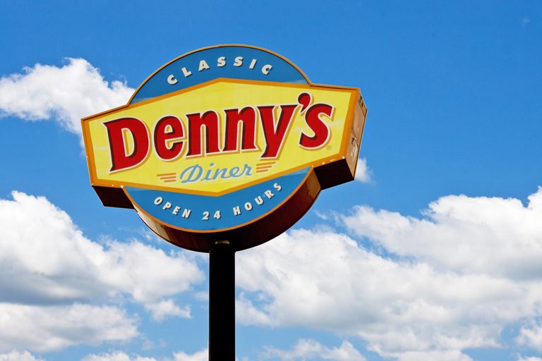
The bright yellow signage of this brand outside its stores will be hard to miss when you drive by. And that can be a huge benefit to restaurants like this one.
Kimp Tip: If you are a business in the food industry and if you choose to use yellow, be ready for tight competition. Your contenders will be big brands. So, you will have to come up with a unique yellow shade or a brand-appropriate color palette using yellow for best results.
5) Ferrari

In the automotive industry filled with cars that are “safe”, “reliable”, “feature-packed” this brand is all about “exclusivity” and “performance” with a touch of being “sporty”. A yellow logo with a prancing horse easily captures the personality of the brand.
In the auto industry, you will mostly notice colors like blue and silver used to indicate reliability and sophistication. For the sporty side and to denote power, some brands also use red. But yellow is not a color that automotive brands dare to use. Ferrari is a trendsetter this way. And what the brand has done with its joyful yellow logo is a great lesson in branding.
Kimp Tip: Notice how different brands connect different personalities with the same color? It is this powerful association that has helped them prove themselves even amidst stiff competition. And as you can see from the above examples, a lot begins with the logo design and the colors you use in them.
Is the thought of designing a professional-looking logo to represent your brand intimidating? Work with Kimp Graphics and get your new logo designed for a flat fee!
Yellow in Branding: How and where to use the color for effectiveness
Most brands have great logos but not all of them manage to get people to associate their brand with the color in their logo. Why is that? Because only a few brands remember to seamlessly integrate these colors into their branding material. It could be anything from the shop’s signage and local flyer ads to their business cards and social media pages.
When you choose a color to represent your brand you are choosing how you will connect with your customers. To achieve this, you should know when and where to use the color you choose. Here are some tips to use yellow in your many branding channels.
1) Brightly adorn your social media pages
Social media aesthetics are important because they help create a strong first impression. A subtle shade of yellow used to accent your posts or highlight key elements will have a great effect on the viewers. Just take a look at the Instagram Feed of Caterpillar Inc. below.

2) Billboards that grab everyone’s attention
In outdoor advertising, colors have a huge role to play. The main color you choose should be such that it is visible in broad daylight and in the dark of the night with minimal lighting. What better color than yellow for this?! A billboard like the one below will make people stop and take a second look.

3) In infographics to keep users engaged
When you create content like an infographic, you will want users to stay stimulated as they navigate all that information. Only then will they be attentive enough to read the whole thing. Yellow’s warm and attractive nature is good for this. But since too much yellow can be annoying to look at for a long time, you can use it sparingly or in combination with a balancing color like black.

Unique combinations like these are hard to come by. So, they will definitely have your audience’s attention when you share them on social media. 65% of brands use infographics in their marketing plan. So, you will definitely want yours to stand out.
4) Flyers and posters
Flyers and posters do not receive the attention they deserve among gadget-loving younger generations as it is. So, if you use cliched colors in these print ads, you might miss the mark. That’s where a chirpy yellow can save your design.

Kimp Tip: If you have noticed, CMYK modes are used in the world of print advertising and RGB for digital media. So, when you are sure that you have chosen an ideal yellow for your brand, replicate the style in both print and digital ads. This will ensure consistency in your branding and marketing and increase brand recognition and awareness.
Need help with designing great looking flyers? Book a call with Kimp’s design team today.
5) Emails that pop
Emails may be an older marketing tool. But they are still very important and quite effective for brands. But customers receive so many emails in their inbox every day. So, if you want yours to make a difference, a happy yellow color will do the trick.
Kimp Tip: Like the “yellow brick road” from The Wizard of Oz, this is a color that is hard to miss. If you have some detail that should pop on the screen, or perhaps a section that should automatically attract attention, yellow will be a great color. And so it works perfectly in emails.
Yellow shades to try for your brand
Since there are so many perceptions associated with yellow and since many big brands have set strong trends, it can be confusing trying to fight the right shade. Here are some crowd pleasing options to try:
1) Pantone Illuminating
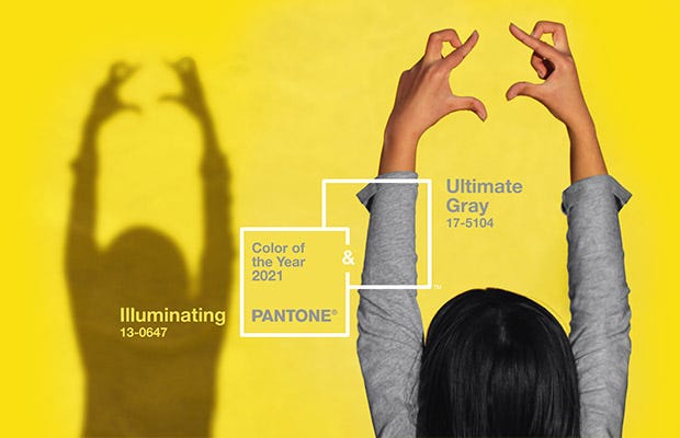
Along with Ultimate Gray, this color was named the Pantone color of the year 2021. It is an optimistic shade of yellow that is not too strenuous on the eyes.
2) Mellow Yellow

If you are looking for something subtle and light in weight, then this shade works well. You can also use it if you have to create less-distracting accents in website design.
3) Gold

This is a more luxuriant shade of yellow that has a tinge of powerful orange in it. Though this is not a blaring shade, it is quite bright on both light and dark backgrounds.
Pairing your yellow with other colors
How effective a color appears depends a lot on the other colors that appear along with it. So, once you have finalized a shade of yellow for your brand, here are some combinations to try.
1) Black and yellow
This is a combination that is hard to go wrong with. Picking a luxuriant mustard or gold yellow and combining it with a classy black creates a design that looks sophisticated.

Update: The design for the KeSalon print design seen above has been featured as part of Design Rush’s “The Best Brochure and Publication Designs”.
2) Yellow with white
Like yellow and black, yellow with white is a classic combination that works most of the time. It comes in handy particularly when you have to create long visually engaging content, like presentations.

Notice the sparing use of yellow to highlight sections and create engaging visuals in the example above. After all, too much yellow can be overstimulating and you do not want this in your presentation design.
3) Yellow and blue
Blue is a cool color and yellow is a warm one. Together, they create a balanced look. If you want the color scheme to look sophisticated, you can also go for a deeper shade of blue like navy.

Making your brand colors work with Kimp Graphics
Even if you have the best color palette for your brand, for the colors to truly make an impact, you need strong visuals to support your effort. That’s where the benefit of working with a dedicated graphic design team kicks in. When you consistently work with the same designers, they get to know your brand and help you build it consistently across your designs and marketing. Just like the Kimp design teams do.
Want to see how an unlimited graphic design service will work for your brand? sign up for Kimp’s free trial today.