Colorful Logos: Cracking the Code of Vibrant Branding
Which industry do you think has the most colorful logos? Fashion? Or perhaps food? Well, when you dig deeper, you’ll find that the most vibrant multi-colored logos are not from any of these industries. In fact, you might stumble upon some from the industries that seem least likely for a multi-colored logo.
But how do these brands make these colorful logos work within their industries? After all, we often talk about the need to choose a limited color palette for branding. And how brand colors grow to become strong brand identifiers. Naturally, most brands lean toward choosing just one or two colors for their logo, as their brand colors.

While that is the norm in branding, there are some brands that dare to break the norm and add several colors to their logo. We’ll be talking about such brands today. About the risks and challenges they overcome for this decision and how they do so. And in the process, we’ll take away some priceless branding lessons and design tips as well. So, shall we get started?
Multi-colored Branding – the Risks in Choosing Colorful Logos
At first glance, adding a splash of colors to a logo might look like a a step that brings a kaleidoscope of possibilities. It seems like this brings the option of being perceived as a vibrant and energetic brand. And of course, there’s the benefit of establishing a cheerful mood. Despite these benefits, why do 43% of Fortune 500 companies use only two colors in their logos? Because colorful logos come with their risks. Let’s explore a few of these.
Difficulty in achieving consistency
Data shows that the consistent presentation of a brand increases revenue by about 23%. However, achieving this consistency and obtaining similar results on various platforms becomes a challenge with colorful logos. For example, the colors of the popular multi-colored logo of eBay might not appear the same on all screens and in all print qualities.
Scalability restrictions
If there is an application where the logo can only appear in one color, a multicolored logo might not necessarily have the same impact as it has with all its colors.
What if the Gmail logo turned grey or any other single-solid color? Will you still be able to distinguish it from the other email apps on your phone? Probably not! Just turn on the grayscale mode in your phone and notice how several app icons become hard to identify! This loss of recognition is one of the biggest challenges in using colorful logos.
Adaptability to different backgrounds and color palettes
When creating your marketing designs one of the main steps is choosing colors for the design, especially the background colors. The colors should be chosen such that they align well with the brand colors and the background should be such that the logo stands out. These decisions are much simpler when the logo has just one or two colors in it. With colorful logos, creating vibrant marketing designs becomes a challenge as there is the chance of the chosen colors clashing with the colors in the logo.
Nevertheless, some brands like Google, CNBC, and others have successfully navigated these challenges and have been using multi-colored logos. It’s time to talk about these famous colorful logos and the strategies adopted by these brands to tackle the risks of multi-colored branding.
Distraction from the brand’s core message
Some brands choose brand colors that represent the products they sell and others choose based on their USP (unique selling point). Some choose based on their industry norms and others choose based on their heritage. In all these choices, color psychology plays a crucial role.
In branding, color psychology indicates that every color evokes a different emotion and has a different cultural interpretation. So, brands choose brand colors that evoke the right emotion and accurately represent the brand’s personality. This is where the problem arises with colorful logos. Because when there are multiple colors in the logo, the core message is sometimes diluted. Or it might so happen that the colors clash with each other and distract the audience away from the intended brand message.
Despite these challenges, some brands like Google, CNBC, and others have managed to consistently use multi-colored logos in their branding. How do they overcome these challenges? Let’s find out.
Brands That Make Multi-colored Logos Work + Branding Lessons
1. Google
Perhaps one of the most colorful logos out there and also one of the most widely recognized ones is the Google logo.
So how does Google make its multi-colored logo work?
A clear purpose
The idea behind bringing a multi-colored logo to represent the tech brand was to emphasize that this was a brand that did not follow rules. Reportedly, the team decided to go with primary colors, and green (a secondary color) was intentionally added to break the rules.
Keeping up with the purpose, the brand has always chosen unconventional ideas and modern aesthetics which further add meaning to the multi-colored logo.
Tapping into the versatility
Additionally, the Google logo is proof of the versatility that colorful logos bring with them. The below image gives a snapshot of the logos of various Google products. While these designs have consistently received negative criticism for their usability, the fact that the brand was able to create a consistent look proves how versatile multi-colored color palettes can be.
Using simplicity to balance the complexity in colorful logos
Colorful logos are inherently complex. Therefore, Google balances this complexity by adopting simplicity in every other design aspect.
To begin with, the brand uses a simple wordmark logo without any decorative icons. Secondly, the logo features a clean sans-serif font which further simplifies the design making it memorable. Finally, there is the flat design. Google chose to switch from a skeuomorphic design to a flat design in 2015.

Flexibility in branding
Google often adapts its logo to the application and sometimes uses a G lettermark instead of the brand name wordmark logo. The brand consistently reuses the multi-colored palette in the lettermark logo as well. This consistency helps tie the logo back to the brand.

Amplifying brand message
To further amplify the significance of colors in its logo Google consistently uses the signature palette in several campaigns. Take the Year In Search game for example. You’ll find the logo colors appearing as the main colors in the scene.
Another good example is when Google chose to display its logo in grey to display its condolence for the demise of Queen Elizabeth II. This simple change established the fact that the signature multi-colored palette is the heart of the Google logo.
2. eBay
Another brand for which a multi-colored approach to logo design feels apt is eBay. After all, given the diversity of the products the brand sells, the vibrant palette feels accurate.
So, how does the brand tackle branding and maintain a consistent brand image while having one of the most colorful logos in the segment?
Commercials that deliver the message
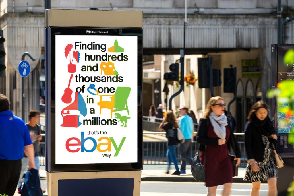
Colorful logos have different purposes. The brand therefore needs to adopt strong strategies to help establish this purpose. In the case of eBay, it’s about the variety it delivers. To reiterate this message the brand regularly includes commercials that show the endless options that users can find on eBay. The below commercial is one such!
Notice the use of lively colors throughout and the copy “Everyone has a Thing”. They facilitate clear message delivery.
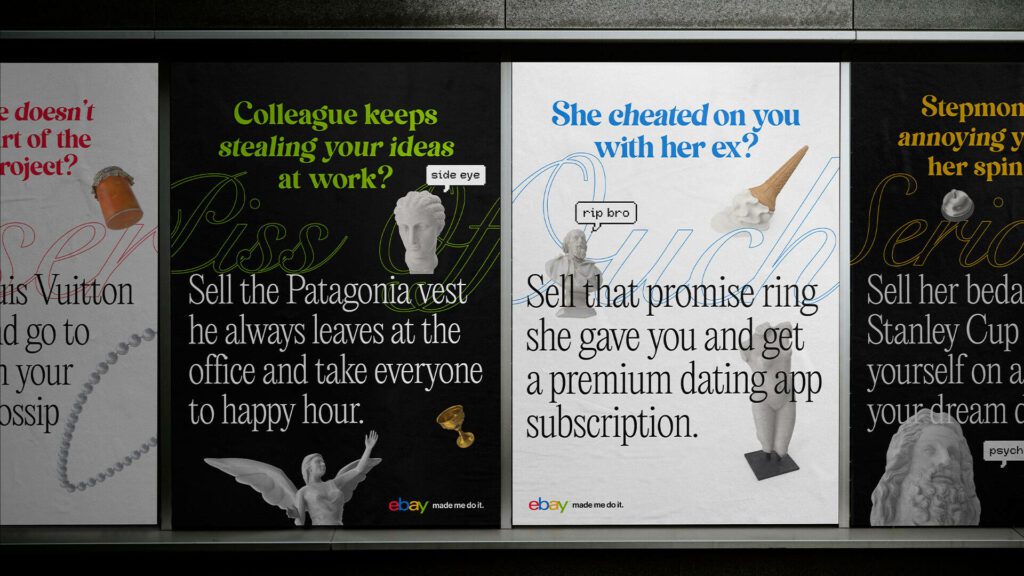
Consistent use of brand colors in advertising designs
Similar to Google using its signature colors in the Year In Search game, eBay often incorporates its brand color palettes in its ad designs, especially in simple static ads. When the message is simple, as with the below ad, the addition of the brand’s colors helps add more meaning and context to the ad.
A distinguishable brand tone of voice adds more meaning to the colors
On the whole, colorful logos appear playful. To build on this, eBay also has a strongly recognizable tone of voice. You will notice a witty and playful tone in the ad copy as well as in the brand’s social media captions and comments. This consistently fun tone of voice adds more vibrance to the colors that represent the eBay brand.
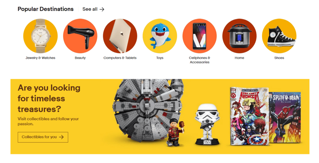
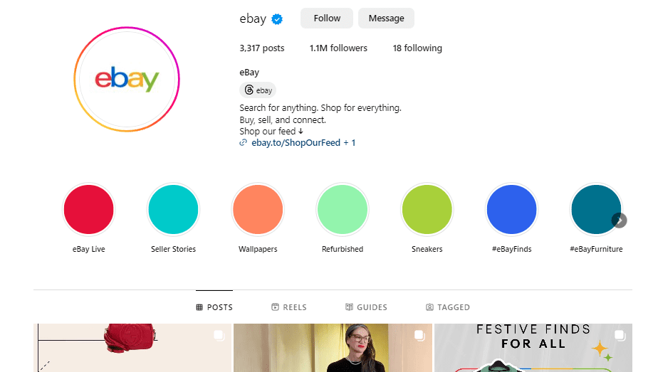
Aesthetic consistency across platforms
Take a look at the below images. The first one is a snapshot from the eBay website and the next one is from their Instagram page. The aesthetic cohesiveness between these is pretty evident. And they all follow the multi-colored approach as well. This consistency is one of the biggest strengths of eBay’s strong brand image.
3. NBC (National Broadcasting Company
The NBC logo (which is also used by CNBC) is perhaps one of the most beautiful multi-colored logos out there. This peacock logo was introduced in 1986 and has managed to stand the test of time appearing relevant even today.
So, what can we learn about mitigating the risks of colorful logos from NBC’s branding?
Choosing colors with a purpose
The best kind of brand colors are those that have a strong purpose behind them. From that perspective, the multi-colored approach works very well for the NBC brand.
NBC began introducing its signature multi-colored peacock symbol in its branding much earlier (1956 to be precise). The original version was slightly different, a little more detailed.
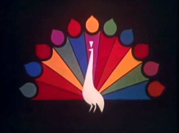
The introduction of this colorful peacock symbol was to mark the company’s progress into color TV broadcasting. From there the symbol remained a crucial part of the NBC brand only to be fine-tuned and released as the core symbol in the brand’s logo three decades later.
So, the colorful logo palette is a purposeful decision in the case of NBC. Also, today the six colors are said to represent the six divisions of NBC including News, Sports, Entertainment, Stations, Network, and Productions. This shows that colorful logos work when you have a strong reason behind your decision and a purpose behind each color.
Tapping into the elegance of simplicity
All the colorful logos we’ve seen until now have one thing in common – they are all minimalistic. Because colors are loud and bright. So, ornate details might end up clashing with the emotions that the colors evoke.
Similarly, even with the NBC logo its minimalism is partly what made the design timeless. Instead of using intricate details, the brand sticks to a simple flat design.
Aesthetic details
Not all colorful logos are aesthetically appealing but the NBC logo is! Part of what makes it beautiful is the noticeable visual balance in the design. The symmetry in this logo adds a touch of sophistication to it.
Another noticeable detail in the NBC logo is the prominent white outline that the brand uses. This seemingly tiny detail actually makes a big difference, especially in the case of colorful logos like this one. The distinct outline helps differentiate the logo from its background. This addresses the problem of adapting to different backgrounds that we discussed earlier.
Finally, there’s one more little design detail that adds more value to this design and that is the peacock’s head created within the negative space between the feathers. This clever manipulation of negative space ensures that the symbol is clear even to the current-day audience who might not have encountered the original NBC peacock from half a century ago. Notably, the peacock’s head points forward indicating the brand’s future-focused approach as well.
Balancing with a dark theme
The colors in the NBC logo are vivid. To balance this the brand uses a dark theme on its app, website as well as in its social media icons. This way the bright logo appears on a dark blue background that balances the look. Additionally, the dark theme lets the content displayed on the website take precedence. This also adds a subtle professional touch to the logo because trust is a crucial factor in the broadcasting industry.
KIMP Tip: Dark themes work well for websites especially since mobile optimization is a priority now. However, keep contrast in mind when choosing dark themes. Too much contrast can often lead to eye strain especially when there are too many colors displayed in the foreground. NBC tackles this by using white as the main color across its website for the text and UI elements.
Need help with website design? Get KIMP!
Design Colorful Logos With KIMP
In conclusion, while colorful logos might seem like a daunting move, with the right branding strategies you can make it work. You need consistent branding and purpose-driven visuals that cohesively work to support your multi-colored logo. That’s where having a designated design team feels like a practical choice. This way you are in for a long-term collaboration. So, you can establish a clear pattern for your brand – a clear and consistent set of visuals that define your brand’s personality and make your colorful logo work.
An unlimited design subscription like KIMP brings this benefit along with the benefit of a flat monthly fee! Register now for a free trial!