Unilever Brand: Logos & Design Insights From 7 of Its Renowned Brands
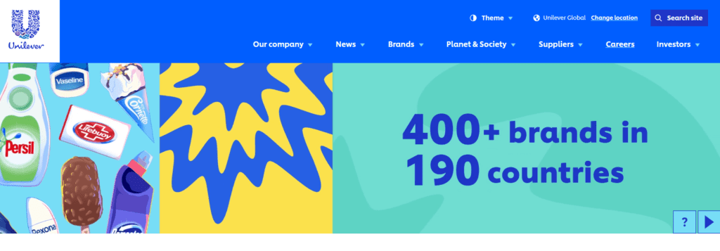
Unilever, a colossal player in the realm of consumer brands, boasts an impressive lineup of over 400 brands that span across 190 countries. What makes this conglomerate truly fascinating is its ability to maintain a wholesome corporate identity while brilliantly crafting individual brand identities for each of its products. It’s like a treasure trove of branding inspiration, and today, we’re going to explore the nuances of the Unilever brand.
So, are you ready to get some serious branding lessons? From deciphering the hidden symbols within their iconic main logo to uncovering the distinct personalities that each Unilever brand carries, we’re about to explore the many dimensions of this global brand’s identity.
Let’s begin with understanding the Unilever brand logo and the design lessons it brings.
The Unilever Logo – an Overview
The Unilever logo is a lesson in visual storytelling. It tells you how the simplest of symbols can help carry an intricate narrative that builds a strong brand image.
The current logo of the Unilever brand was a major leap from the previously used corporate logo, in terms of its design and impact.
Old logo
As you can see, the previous version of the Unilever logo was a strictly corporate design with a traditional tone. The unique U monogram vaguely appearing like twin towers is another little detail that gave this design a professional touch.
In addition to the symbolism, the typography also had a similar effect. The old logo, as can be seen, used a serif typeface which is both legible and elegant.
This was the time when the logo was almost absent from consumer-facing designs like print ads, packaging, and TV commercials. So, a less consumer-friendly design like this one did not make much of a difference. However, the brand’s identity changed for good the moment it switched to a warmer and user-centric logo in the early 2000s.
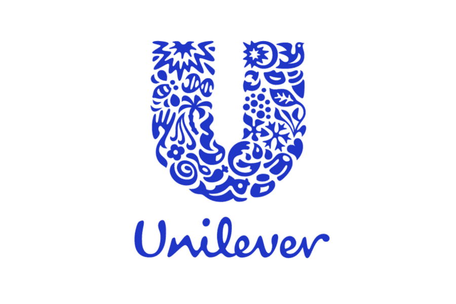
Current logo
The current logo has been in use as the corporate logo of the Unilever brand for nearly two decades now. The current design is a powerhouse of inspiration for any brand looking to leverage symbolism in logo design.
Let’s quickly look at the basic design of the current Unilever logo before we discuss the symbols it packs.
Firstly, there is the basic structure of the logo consisting of the U monogram and the Unilever wordmark. This structure has been reused from the previous version of the logo so as to effortlessly retain the brand’s core identity.
Secondly, the colors in the logo. While the old Unilever logo also used blue which is known for its professional tone, the redesigned logo has a much more vibrant blue. This goes well with the fresh new identity that the brand currently carries.
Thirdly, the changed typography. The current version of the logo features a casual script font for the Unilever wordmark. This is a creative touch to help the brand appear more approachable and consumer-centric. This shows how casual typefaces in the script and sans-serif categories can easily mellow down the mood of a logo design and optimize it for consumer-facing brands.
Finally, there is the eye-grabbing details in the monogram of the Unilever logo. How many symbols can you spot embedded within this monogram?
The Unilever monogram is perhaps one of the most intricate monograms in the world of branding. This monogram cleverly packs a unique collection of symbols representing the popular brands of Unilever and the many values that the brand stands for. Here’s an overview of the symbols in the monogram and what they stand for, according to Unilever.
Understanding the Unilever symbols
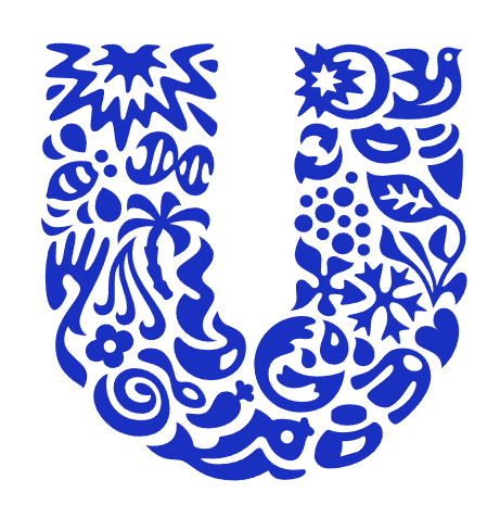
- Sun – a source of sustainable energy, stands for the brand’s efforts to reduce greenhouse gas impact across their product lifecycle.
- Dove – represents freedom
- Plant – represents the natural world and embodies the brand’s efforts in sustainable sourcing and manufacturing.
- Spark – as a symbolic reminder that Unilever aims to spark change by elevating the livelihoods of all those involved in the brand.
- Chilli pepper – a core ingredient in many Unilever food products and a depiction of the brand’s sourcing of agricultural raw materials.
- Spoon – to indicate taste and cooking and the brand’s commitment to delivering great nutritional quality in their food products.
- Bowl – an icon to represent food and fresh meals from Unilever brands.
- Flower – a reminder of nature’s beauty, a symbol of the beauty brands from Unilever, like Lux.
- Ice cream – a symbol of delight, a reminder of Unilever’s ice-cream brands like Wall’s, Ben & Jerry’s, and Magnum.
- Hand – a visual representation of care, a nod to Unilever’s health & hygiene brands.
- Hair – represents beauty.
- Lips – stands for communication and openness.
- Swirl – to capture the nuanced tastes and flavors in Unilever products
- Fish – a representation of fresh food and a nod to the ocean.
- Clothes – for fresh laundry and a reminder of brands like Omo and Comfort.
- Bee – a true symbol of community spirit, depicts the brand’s efforts to minimize its environmental footprint.
- Particles – Unilever’s commitment to science and innovation.
- Packaging – symbolizes the unique packaging experience Unilever aims for.
- Transformation – represents that the brand wishes to be a driver of positive change.
- Waves – depict freshness and vigor.
- DNA – captures the brand’s heritage.
- Palm tree – represents forests and growth.
- Heart – embodies love, health, and well-being.
- Virtuous cycle – the cycle of manufacturing and disposing of the products while aiming to reduce waste.
A few takeaways from the Unilever logo and icons
One thing that the Unilever monogram establishes is that you do not need to take up a large space or have a complicated design to tell your brand’s story and communicate your brand values.
Cleverly packing the many icons within the silhouette of the brand’s monogram is a good utilization of the available space. The brand further breaks down the details on its website to simplify the message delivery in its logo and to strengthen brand awareness among those getting newly introduced to the brand.
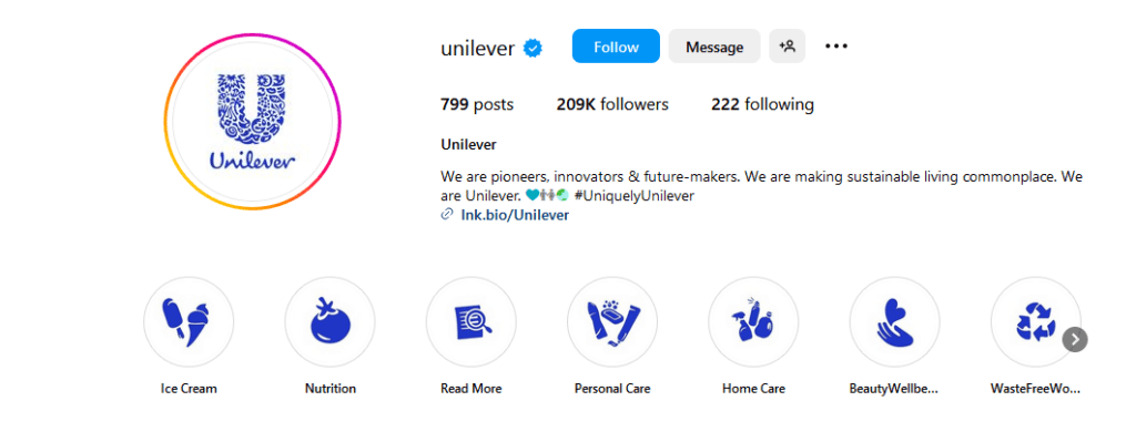
Furthermore, if you look at the symbols used in the logo, they are illustrated in a unique style which also brilliantly aligns with the illustration style the brand uses in several other places in its marketing designs. The below snapshot shows the Highlights section of the Unilever brand’s Instagram page.
Given the simplicity of these symbols, they are versatile and the brand uses them in different color variations across its website.
All of these applications of the Unilever logo symbols show the need for establishing a connected brand identity design with a clear purpose. Additionally, these also reiterate the significance of consistency in branding.
Having discussed the main Unilever logo and brand, let’s now quickly review the logos of the popular Unilever brands.
7 Popular Unilever Brands and Their Logos
1. Lifebuoy
This 128-year-old brand of soap is one of the most popular Unilever brands. Its emblem logo, in use since 2007, brilliantly incorporates the iconic lifebuoy symbol, in perfect harmony with the brand’s namesake. Prior to this emblem logo, the brand had various wordmark logos, each preserving the signature red and white color scheme inspired by the actual lifebuoy.
Additionally, the emblem incorporates a plus symbol at its core, serving as a symbol of protection and health. The design as a whole encapsulates the brand’s primary role in promoting hygiene, cleanliness, and overall health.
KIMP Tips:
- The incorporation of the lifebuoy symbol in the logo serves to fortify the brand’s identity and its commitment to health and protection. This shows how symbols can reinforce brand identity.
- Typography helps capture a brand’s personality. In this case, the shift from a traditional typeface in the past to a simple sans-serif font signifies a transition from the brand’s heritage to a contemporary image.
2. Dove
Dove, a cornerstone in Unilever’s portfolio, has established itself as a symbol of purity and care. Its logo encapsulates the brand’s essence. The iconic logo features a graceful silhouette of a dove which goes with the brand name.
With its elegant design, the logo stands as a testament to the brand’s message of purity and care.
KIMP Tips:
- The logo is a great example of the strength of minimalism. It shows how minimalistic logo designs allow the brand’s values to shine.
- The Dove logo is also a reminder of the need to choose relevant typefaces to complement the design. The choice of a clean and elegant font here reflects the brand’s image of gentleness.
- And finally, since this Unilever brand is in the beauty and skincare category, the use of gold feels relevant. Besides it also adds a subtle touch of sophistication to the design.
3. Axe
Axe, marketed as Lynx in regions like the United Kingdom, Ireland, Malta, Australia, New Zealand, and China, is a French brand of grooming products for men. The brand is recognized for its allure and youthful appeal.
In the regions where the brand goes by the name Lynx, a very similar wordmark logo featuring the brand name Lynx is used. It reuses the typeface and colors of the Axe logo.
KIMP Tips:
- The design of the Axe logo emphasizes the role of typography in logo design. The bold, capital letters of “Axe” are eye-catching and effectively reflect the brand’s identity as bold and masculine.
- Over the years, this Unilever brand has redesigned its logo a few times but all the iterations have been wordmark logos in black. The difference has always been the typeface. They have slowly been evolving to give away to the current-day macho typeface. This shows how you can capture the evolution of your brand through your logo design evolution.
4. Knorr
Over the 185 years that Knorr has existed, its logo has seen only 4 redesigns so far. With each of these redesign projects, the brand has been adding a little more green to its design. However, the signature script typeface has been retained for consistency
The overall traditional vibe of the logo captures the brand’s heritage and trust, which are central to the brand’s culinary products.
KIMP Tips:
- The logo gives a strong lesson in using color psychology in brand identity design. The use of green in the logo signifies freshness, which is a core aspect of Knorr’s culinary products. The color communicates the brand’s commitment to natural and quality ingredients.
- With its recent rebranding, the brand chose to switch to a cleaner flat design. This transition has added to the versatility of the logo. Flat design works well in logos especially when brands are trying to maintain a cohesive impact across various digital and print platforms.
5. Lux
This Unilever brand features a truly luxurious logo that perfectly resonates with its name. The Lux logo is one of the few famous logos in gold. It is a testament to the brand’s long-standing commitment to luxury and beauty.
KIMP Tips:
- Though the Lux logo is basically a wordmark logo, the connected L and X add an interesting new dimension to the design. This helps create a memorable mark to help the logo stand out.
- Like all other Unilever brands, Lux also leverages color psychology intuitively. The gold color in the wordmark with the subtle sheen represents the luxurious pampering the products are designed to provide.
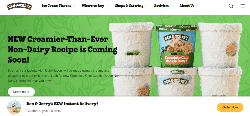
6. Ben & Jerry’s
In a segment filled with logos in pinks and other bright hues, the Ben & Jerry’s logo distinctly stands out with its charming vintage design. Over the years the Ben & Jerry’s logo has been getting simpler and more versatile.
The clean layout appears more modernistic while the playful serif font has a subtle nostalgic vibe. Together they capture the whimsical nature the brand exudes.
KIMP Tips:
- In some places, the brand complements the wordmark logo with an illustrated icon of dripping ice cream to add a pop of color and to indicate what the brand is about. This works because of the strong presence of the wordmark logo and its instant recognition. This shows the need for consistent branding to create a strong identity.
- Since typography is the hero element in the Ben & Jerry’s logo, the brand consistently uses the typeface across marketing and branding designs like packaging and website. This helps you recognize the brand just from the signature typeface.
7. Rexona
This Unilever brand catering to deodorants and antiperspirants is more than a century old and has expanded to the global market with different names to suit the local markets. The main logo consists of a checkmark with the brand’s wordmark.
A checkmark is a universally recognized symbol that stands for “yes” and here it indicates that the brand “won’t let you down”. Therefore, it fits perfectly into Rexona’s branding. Therefore, it appears as the visual connector between the many names that the brand is known by in different regions.
KIMP Tips:
- From the positioning of the checkmark to its dimensions and alignment, every little design aspect has been carefully planned to create a balanced logo design. This evokes a sense of harmony and thus makes the logo aesthetically appealing.
- Pay close attention and you’ll notice the unique choice of kerning between the letters “e” and “x”. This is to create balance and boost the visual appeal.
Get a KIMP Subscription, Design Logos That Tell a Story
In summary, in the world of branding, logo design holds a prominent position. And when it comes to logo design, even the smallest details make a big difference. You might have a great idea for a logo but if the design is not executed in a way that the idea is accurately representing, it weakens the foundation of branding.
That’s why working with professional designers for logo design can be a great decision. So, are you ready to create meaningful logos like those of the Unilever brands? Then sign up for a KIMP subscription and work with a dedicated design team for all your branding designs and marketing designs.
Register now for a free 7-day trial!