Typography Rules: 8 Do’s And Don’ts In Design
Have you ever felt like something’s missing in your design even when it has it all? Or has it ever felt like a visually appealing design still does not convey the message? In several such situations, the foundational block you should be revisiting is the typography. When you pay attention to typography rules, you have a better chance of taking your design from “meh” to “wow”. Because fonts are the foundations of good design.
Typography sets the tone of your design, represents your brand personality, and ensures that your message is delivered clearly and as intended. In fact, some brands manage to create such an impact with their brand fonts that you instantly recognize the brand when you see the font somewhere else.
For a design element that carries so much weight, you definitely should know when to follow the rules and when it’s alright to sway a little. But that sounds like an intimidating decision given that the choice can make or break your design, right? Let’s simplify that. We’re going to discuss typography rules in this blog.
To keep things simple and to help even the non-designers make the right choice when it comes to fonts, we’ll break down the rules into easy do’s and don’ts.
Without further ado, let’s get the ball rolling.
Simplifying typography rules – 8 do’s and don’ts you should know
1. Do – understand font psychology
First and foremost is the choice of typefaces. You perhaps already know about the different font categories like serifs, sans-serifs, script fonts, and so on. This is the broadest way to classify fonts. And within each category, you’ll find font families with different aesthetics and overall tone. One of the first typography rules is to understand the difference between these tones and to pick a font that sets the right mood.
Because a good design looks good but a great design gets the job done. And for that, you need typography that evokes the right emotions. Do fonts really affect emotions you ask? Take a look at the below example. The same text but in different fonts. Definitely different moods, don’t you agree?
We’ll give you another example to explain the role played by fonts when it comes to setting the tone of a design. Both the below designs are social media images where text has a strong role to play.

While the first one is meant to be more fun and casual, the second one is meant to be more formal and informative. If you had to swap the more professional font in the second image for a casual style like in the first one, do you think the message would have been conveyed as effectively?
Fonts with a casual tone, as that used in the first design, are more conversational. But when you have to convey serious information, you need a font that builds trust. That’s one reason why swapping the fonts between these designs will break the intended effect.
2. Don’t – use too many fonts
Okay, so we spoke about choosing the right font for the design. You will find several such “right” choices when you go through font libraries. Does that mean you can use as many different styles as you like in order to create the design?
Take a look at the below design and you’ll have the answer to this question.
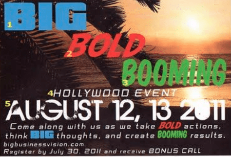
As you skimmed through the above design if your eyes were all over the place or if you skipped the text altogether, we don’t blame you. That’s what happens when you use too many fonts in your design. Remember we said fonts evoke emotions? You do not want to confuse your audience with too many emotions embedded into one design.
Additionally, adding too many contradicting fonts or even font styles can bring down the aesthetics of your design. Because then your design looks unorganized. Like it lacks a clear intent.
Kimp Tip: So how many different font styles can you choose for a design? In most cases, a combination of two different typefaces will be enough to execute your design. Take even the case of a text-heavy context like a book – you’ll see one typeface used in the header and one in the body text. You can always play with the formatting to create further hierarchy.
Again, you cannot overdo the formatting differences either. This again will make the text portions look too distracting and clumsy.
3. Do – choose the right font combinations
Sometimes even the best-looking fonts can tip the scales of your design when they do not look good together. That’s the power of font combinations.
Like choosing the right font for your design, pairing the right fonts is an art worth acquiring. Some of the classic combinations you’ll come across are:
- Serif + sans-serif
- Script + sans-serif
- Script + serif
These are combinations where one style beautifully balances the other. For example, an elegant script font is good to draw attention but bad when it comes to readability. But a sans-serif font can do the job well. Similarly, choose font combinations such that the element of aesthetics and function are both fulfilled effortlessly.
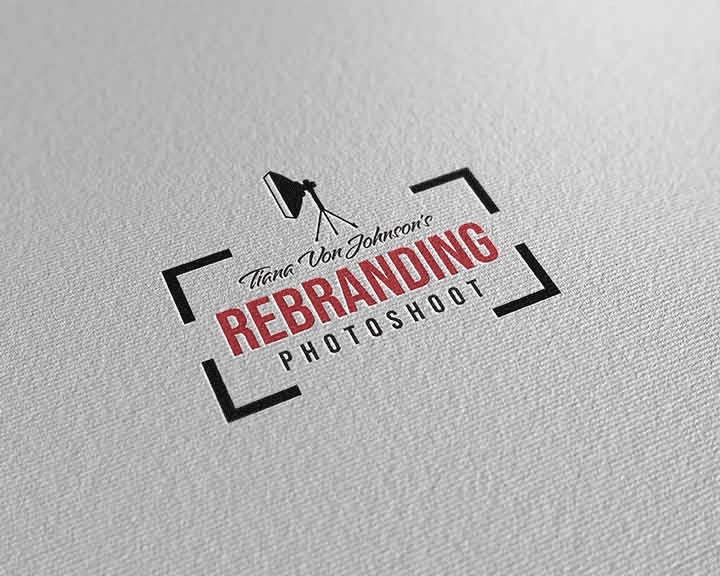
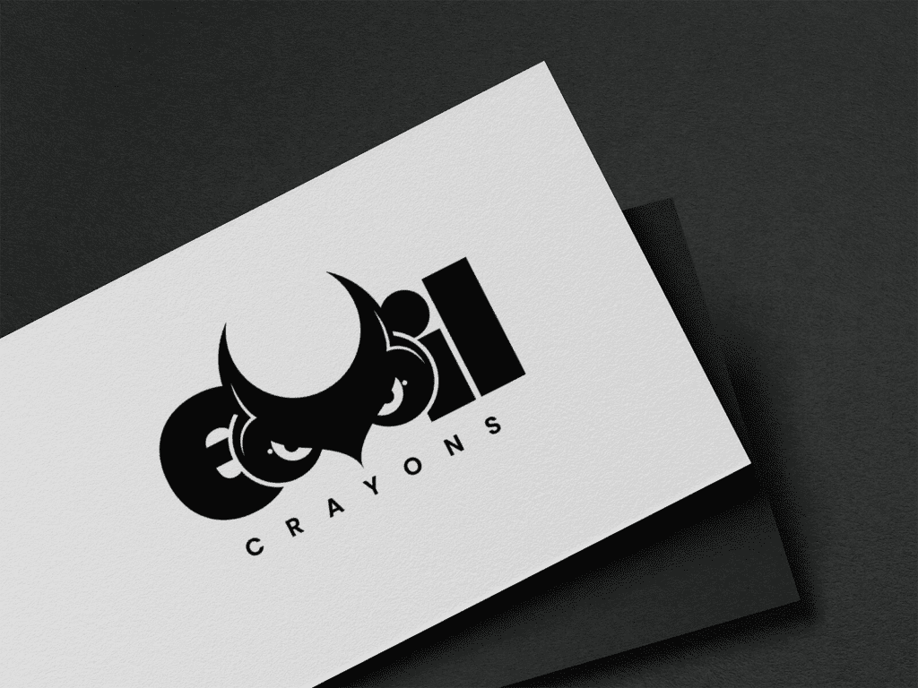
In the above logo design, the script font adds a personal touch while the sans-serif font keeps the design looking professional and credible.
Similarly, come up with font pairs that look good together. At the same time, you cannot ignore the personalities of the fonts. In the above logo example, while the script font helps with the personalization it still looks elegant and helps represent the brand’s credibility.
Kimp Tip: In addition to looking good together, both these fonts you choose for your design should also align with your brand identity. This is why brands identify and use brand fonts.
The brand guidelines for design come with details about the fonts to use and how to use them. Because your designs are not standalone entities but pieces of your marketing puzzle. So, you want all your designs to work together to establish your brand identity.
Need help creating your brand guidelines? The Kimp team can help you design them.
4. Don’t – ignore legibility

As you meticulously choose fonts that represent your message well and find visually appealing font pairs, there’s one thing you cannot ignore and that’s the legibility of these fonts. Even the best-looking fonts will not add value to your design if it’s hard to read.
Some fonts look great and their unique aesthetics can instantly attract attention but they might not be easy to read. In such cases, you bring your audience to your design but your design does not deliver the message. This is as good as your audience scrolling past your design without looking at it.
That’s why one of the most important typography rules is to prioritize legibility. In fact, legibility is a pretty vague term without defining the context. Fonts that look good on a digital screen might not necessarily have a similar impact in print. Fonts that look good in a short logo text might not always have that effect when used in the body text of a social media image.
We’ll explain this with an example. Take a look at the below fonts.

They both look good but which one would cause an eye-strain when used for long sections of text? The first one, obviously. But given its breezy style, the font in the first image is an attention-grabber, undoubtedly. So, even though it’s not the easiest font to read, you can use it in the title text. This is what we meant by swaying a little from the typography rules on some occasions.
For the body text, the text sections that are meant to deliver the core message, and text that delivers the contact details or CTA, you need to stay away from decorative fonts that are not easy to read.
5. Do – focus on kerning and leading
In the above section, we spoke about the legibility of the chosen fonts. This was particularly in the context of the shape of specific characters and the regularity of these characters in the chosen typeface. But there’s one other aspect of typography that can affect legibility and that is the spacing between letters (kerning) and the spacing between lines of text (tracking).
Even the most legible font looks cluttered and difficult to read when the spacing between characters is too little or when lines of text are placed very close to each other.
Sometimes in design, you can creatively manipulate the kerning in a word, for example. This helps you stretch out the text a little and establish a unique character for the chosen word.
Another use of kerning manipulation is to create balance in design. For example, in the below design, in the second line, the characters are spaced out. This helps create a symmetrical balance in the design.
And in the below design the lack of line spacing between “Skate Night” and “Wednesdays” creates an element of interest.
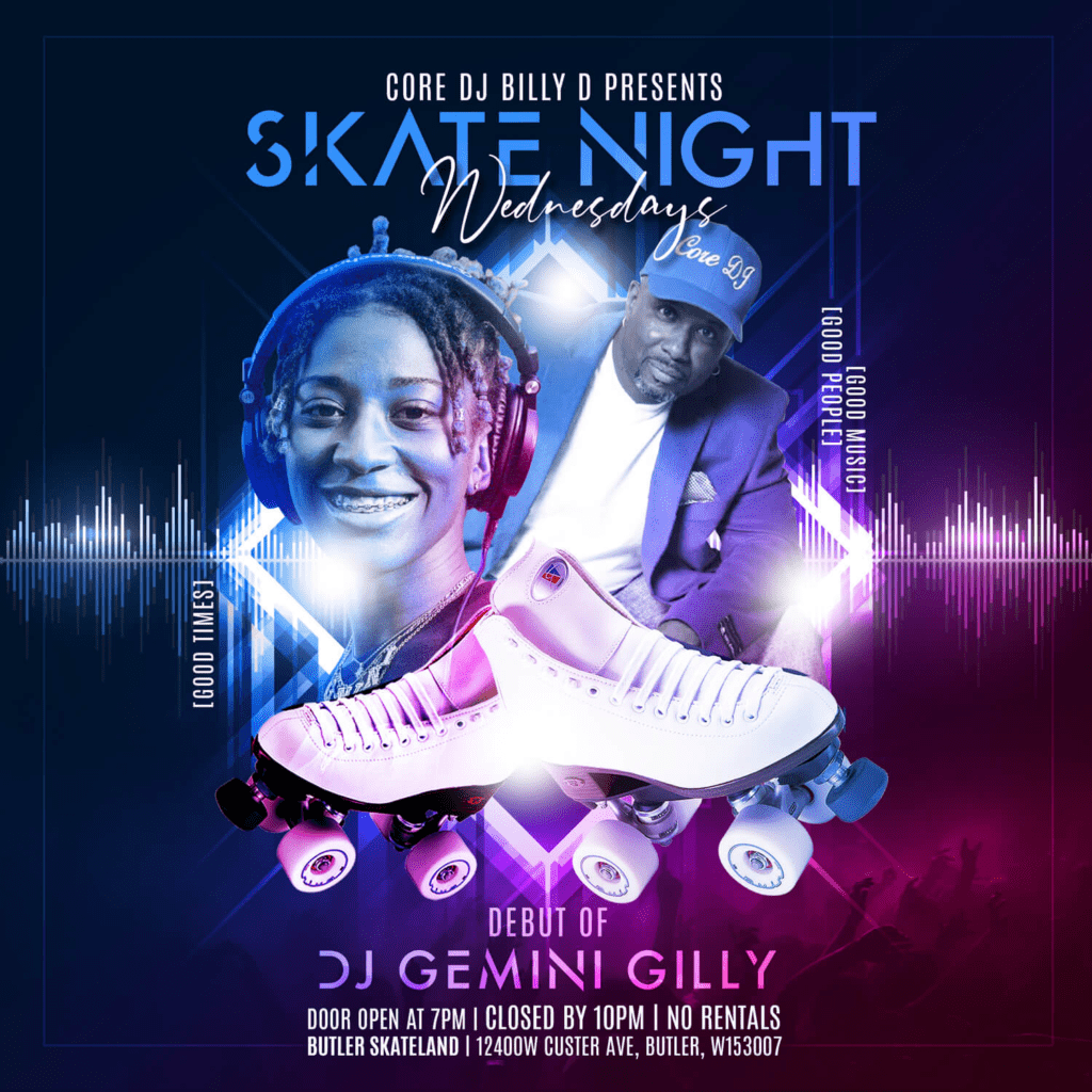
As you work on creatively experimenting with kerning and leading as in the above examples, remember to double-check the legibility of the text. In both the above cases, the font style, font colors, and background contrast together work to support the legibility.
6. Don’t – neglect alignment
Alignment is another design aspect that influences both aesthetics and functionality in a design. Proper alignment ensures that the design looks well-structured. Intentional adjustments to alignment are often used to separate portions of text or to establish the relationship between different sections in the design.
Therefore, one of the main typography rules to remember is to use the right alignment for the text. After choosing a legible font, pairing it with a supportive font that looks good together, and applying the most relevant kerning if the text is not aligned correctly, the meaning is lost.

In the above ad, each line of text is clear and easy to read. But the random alignment of different words makes the design look cluttered. It also makes it difficult to understand the relationship between one part of the ad and another.
On the other hand, take a look at the below design. It bends the conventional style of horizontally aligning text and places them diagonally. And yet, the whole design looks organized and aesthetically appealing. That’s because the alignment here goes perfectly well with the other design elements including the diagonal bands of color. That’s how you make the most of alignment to let your typography choice shine.

Kimp Tip: Even the slightest change to the alignment can make a big difference to your design. Often, this can be that one little secret to alter a boring design and create something interesting. However, when you do this, don’t make the reader tilt and turn and strain his neck to get the message.
Want to safely experiment with alignment and other design principles but don’t know where to start? Start by signing up for a Kimp subscription.
7. Do – pay attention to contrast
Contrast refers to how well a particular design element stands out from the rest of the design. Contrast is crucial in typography because poor contrast can affect both the legibility and the readability of text in the design.
Take a look at the below design for example. The design neglects most typography rules including alignment and choice of fonts. But a bigger problem here is with respect to the contrast. The design has a busy background and several parts of the copy are difficult to read because of this. Additionally, in some areas, the lack of contrast between the font color and the background color makes things further complicated.
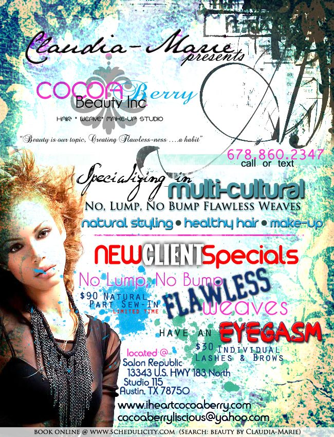
To avoid blunders like these, consider using a simpler background for text-heavy designs. And when the background has complicated patterns or textures, stay away from fonts with thin line weights. They nearly disappear in the background and therefore your message is lost.
The below design is a good example of good contrast. The contrasting color and the thicker line width of the fonts together make the text very easy to read while also maintaining the aesthetics of the design.
8. Don’t – forget about visual hierarchy
After sorting out the rest of the typography rules, you need to be sure that when everything comes together the design flows smoothly. In other words, the design should make it crystal clear as to what portion of the text to read first and what to read last. You achieve this by assigning relevant visual weights in the form of font size, font color, and other little details.
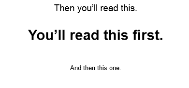
As you can see in the above example, the font styling (bold styles are catchy) and font size (smaller fonts don’t easily draw attention) are a few aspects you can adjust to create the intended visual hierarchy. This ensures that a reader navigates through your message smoothly and also grasps the idea accurately.
Put an end to your typography troubles with a Kimp subscription
Typography can be a tough nut to crack. And going over these typography rules each time and trying to figure out the best fonts for your designs can be overwhelming. A professional design team can lift this burden off of your shoulder. So, sign up for a Kimp subscription today.