The Art of Travel Logos: Creating Designs That Tell A Story
So you’re planning your next vacation! You’re scrolling through your options trying to find a travel company you can trust. There might be brands you know – travel logos you recognize and then the ones you don’t. But still, when it comes to making a choice, some logos appeal to you and you are willing to give the new travel company a shot – to click that button and find out more about that brand. And there are others that just fade into the background. Ever wondered what makes you gravitate toward certain logos?

Well, for that matter, this happens quite often in consumer decision-making. Whether you’re exploring travel options or navigating choices in any other industry, you’re naturally drawn to logos that exude professionalism, relevance, and meaning.
So, the question is, how do you craft such impactful logos that resonate with someone who encounters your brand for the first time? Logos that stay etched onto your customers’ minds so that they instantly recognize your brand? We’ll answer all these questions and more in this blog.
We’ve curated a list of travel logos that have mastered this art to present to you some ideas and tips to guide you in designing a memorable travel logo. Shall we begin?
Travel Logos: 7 Ideas To Inspire You
1. Simplicity speaks volumes
An impactful logo does not always have to be intricate. In fact, there are several iconic simple logos that have established themselves as trendsetters in various industries. Similarly, in the fast-paced travel industry, a simple logo quickly communicates the message.
Moreover, a simple logo transcends boundaries and hence feels suitable for brands spanning different geographical regions. There are two globally popular travel logos that exemplify the power of simplicity in travel branding – Booking.com and Trip.com.

The logos of both these brands are wordmark logos that carry the brand name and exude professionalism, and dependability thanks to their simplicity. This simplicity helps these travel logos overcome language and cultural barriers thus being accessible to diverse audiences.
Moreover, both logos use blue which is a color that evokes trust and authority. That helps because people look for brands they can trust especially when they travel with their loved ones!
So if you are looking for a versatile logo that builds trust and is also equally impactful across various screens, then a simple logo works. Wondering how to create a simple logo that stands out? Here are some quick design tips.
KIMP Tips:
- Pick an appealing color harmony. Like the monochrome scheme in the Booking.com logo or a complementary scheme in the Trip.com logo.
- Opt for clean readable fonts so that typography complements the simple nature of your logo.
- Add an element of interest like the color variation in the Booking.com logo or the contrasting yellow dot in the Trip.com logo.
2. Reinforce your core offering
One of the best ways to create travel logos that build brand awareness is to visually fortify the essence of the brand through the design. And it works particularly well for brands offering unique services in the travel industry.
Take the below logo for example. The design immediately communicates that the brand offers caravan-related services. So in an assortment of travel companies, this one stands out to a user with a defined intent – hiring a caravan.
Similarly, establish what your core offerings are – bespoke itineraries, eco-friendly adventures, luxury getaways, off-beat travel, or road-tripping. Use visual cues like illustrations or symbols to represent this and you have a great logo for your travel company.
What’s the perk of creating travel logos that highlight the core offerings? You can easily cut through the clutter and attract the right audience.
KIMP Tips:
- Rather than using stock elements to represent your services, come up with a creative interpretation of them to ensure that your logo does not appear cliched.
- Use colors that support the theme of your services – a rustic palette for off-beat travels, a nature-inspired palette for eco-friendly tours, and so on.
- Add descriptive taglines or keywords in your logo to amplify your message.
3. Infuse a story into your design
Storytelling humanizes your brand and gives people a reason to appreciate your brand a little more. Storytelling particularly holds significance in the travel industry because traveling isn’t just about visiting places – it is about creating stories, about making memories. So, if your travel company logo tells a beautiful story, it makes a lasting impact on your audience.
Moreover, storytelling helps foster emotional connections. And traveling is all about human encounters and cultural explorations. So, travelers seeking authentic and emotionally enriching experiences resonate with travel logos that tell a strong story.
Take the Airbnb logo for example. The below video summarizes the story behind the iconic Bélo in the logo.
The objective of the brand is to make people feel like they belong, no matter where they are! And their logo captures this objective creatively making this one of the most discussed logos in the travel industry.
KIMP Tips:
- So, how do you design a logo that packs a powerful story?
- Create a custom symbol that captures the essence of your message, like Airbnb’s Bélo.
- Use colors to paint relevant emotions. For example, the subtle pink color of the Airbnb logo is soft and friendly.
- Use the right fonts and styling to achieve the intended effect. Uppercase letters work when you have to establish authority and lowercase letters like the Airbnb logo help create a more approachable identity.
4. Feature your mascot
A mascot can be a huge benefit to a brand. Besides humanizing it and building a positive brand image, a brand mascot can also nurture stronger customer relationships provided they are designed with a clear and relevant idea in mind. Therefore, travel logos can become so much more meaningful when they feature the brand’s mascot.
Take the Tripadvisor logo for example. This one features the brand’s own mascot named Ollie.
As can be seen, the illustration of the mascot in the logo also hides a binocular symbol within it so as to tie back to the travel industry.
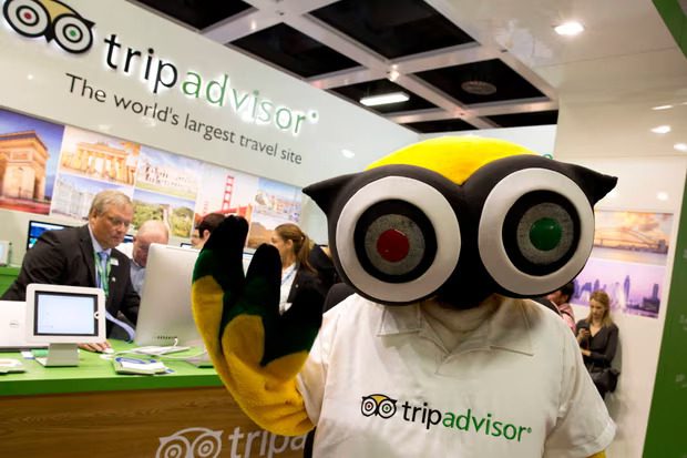
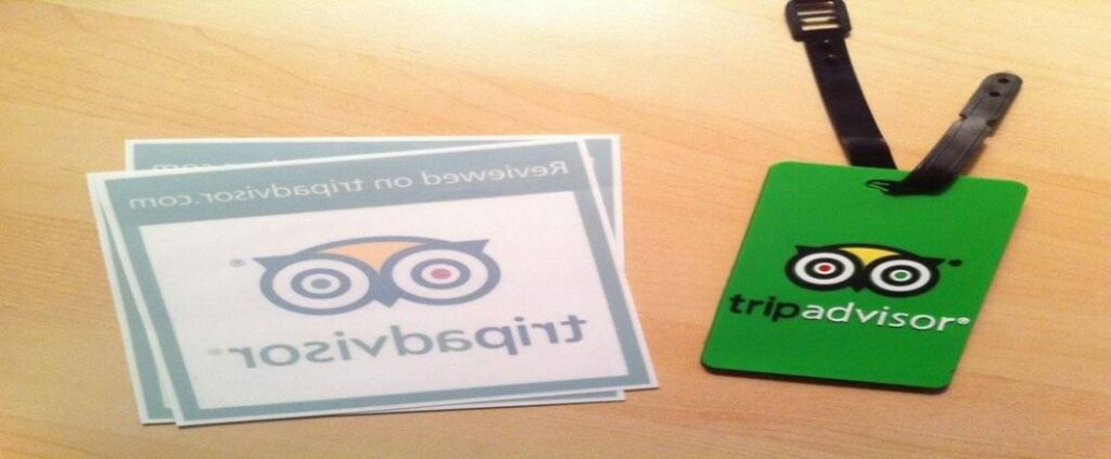
Mascots can capture a travel brand’s values and communicate the essence of the experience they wish to create as well. Besides, mascots strengthen branding and come in handy when you wish to expand your designs and venture into branded merchandise, etc.
In the case of Tripadvisor, the mascot appears on the brand’s merchandise like their luggage tags. This adds a personal touch to the travel experience they create and acts as a tangible reminder of the brand as well.
KIMP Tips:
- When adding your mascot, ensure that it resonates with the visual style of your brand, of your logo. For example, a minimalistic flat illustration looks more professional whereas a vibrant 3D illustrated mascot makes your logo look energetic and fun.
- Ensure that your mascot aligns with your brand – with travel elements. In the case of Tripadvisor, the owl is a symbol of wisdom, therefore relevant to a brand that provides travelers with useful travel-related insights.
5. Draw inspiration from the moniker
Coming up with a unique brand name for your travel company is a big step. Therefore, a logo that adds more meaning to this name and etches this name in your customers’ minds is a good one.
So, when designing travel logos, if you are looking for cues to add to the visual dynamics of the logo, look closer at your brand name.
Take the below name-inspired logo for example. The brand has a unique name and the kangaroo symbol brings this name to life. The creative twist lies in the inclusion of the luggage symbol which establishes the industry in this case. The extended tail harmonizes the design and separates it from the wordmark. On the whole, this is a well-balanced logo that acts as a visual reminder of the brand’s unique name. That’s one way to design your travel logo!
KIMP Tips:
- A brand name does not always have to abide by the industry norms – you might have your own reasons behind coming up with a name. Therefore, add a playful and easy-to-understand interpretation of this name for maximum impact.
- Do not forget to include industry-relevant symbols like the luggage in this case. Otherwise, your logo ends up confusing your audience.
6. Subtlety in abstract elements
Travel logos with abstract elements add an element of intrigue and invite viewers to uncover the meaning. The “Aha” moment that happens when they get the meaning leaves a strong impact on them.
The new Trivago logo is a good example of cleverly incorporating abstract elements into travel logos.
The recent logo introduced the brand’s door-hanger mascot along with its sleek logo. What grabs attention is the unique “t” in the wordmark. Look closely and you’ll see that there are two parts to it. The upper portion is a checkmark meant to capture the satisfaction of finding the right hotels at the right price. The lower part is meant to capture the smile that appears on a customer’s face on finding the best deals! Together this abstract detail adds so much more meaning to the logo.
Another travel logo that achieves a similar result with abstract elements is the TUI logo. The abstract symbol in the logo combines the characters “t” “u” and “i” and a hidden smile as well!
KIMP Tips:
- When using abstract elements, eliminate clutter – you do not want to distract the user away from the core message.
- Choose colors that add an extra layer and simplify the comprehension of the idea in it.
- When you have abstract details you need supportive brand designs and marketing designs to communicate the meaning and to add more strength to the story behind it. Logo animations similar to the one used by Trivago are a good option.
If you do not have an internal team of designers, how can you tackle all these design requirements and that too cost-effectively? Sign up for an unlimited design subscription, like KIMP!
7. Let your logo reflect your brand personality
Simple travel logos like the Booking.com logo can work well for some brands. Whereas for others looking to stand out in a sea of competition, the brand’s unique personality is what helps. It is about adding more character to humanize the brand.
Is your brand meant to be seen as cheerful, or dependable, adventure-seeking or awe-inspiring? Answering this question helps you sift through your logo design options and finalize one that accurately captures your brand’s unique traits.
Logo colors, typefaces, and font styling, and the overall visual theme are some of the elements that help establish a brand’s personality.
For example, take a look at the below logo. Does it evoke a feeling of sophistication? The serif font combined with the luxurious flourishes added to the letters along with the gold color set the mood and capture the essence of the brand. This is how you can elevate the looks of even a simple wordmark logo and get it to reflect your brand personality without complicating the design or adding additional details.
KIMP Tips:
- Understand shape psychology in logo design. Because different shapes evoke different emotions and this aspect comes in handy when creating a design resonant with your brand’s personality.
- Draw inspiration from the likes and dislikes of your target audience. Ask yourself what style would resonate best with them. For example, a playful font might appeal to the youth whereas older travelers looking for a safe trip might see a logo with playful fonts as too casual and might find it hard to trust.
Create Timeless Travel Logos With KIMP
In summary, there are many ways to add a creative flair to your travel logo. Through abstract symbols, name-inspired illustrations, or just stylized typography you can effectively communicate to your audience what makes your travel company unique. The key is to be clear about what aspect of your brand to highlight – your core offerings, your USP, your brand values, or just a general sense of professionalism.
Once you know what you are looking for, the options are plenty. With all these little hacks in mind, work with professional designers to bring your brand’s core identifier to life. An easy way to do that will be a design subscription, like KIMP! Because then you get unlimited revisions and a whole lot of other design requirements taken care of for a flat monthly fee.
Want to see how that works? Register now for KIMP’s free 7-day trial!