7 Symmetrical Logos: Examples and Design Tips
TL;DR
Symmetrical logos use balanced visual elements to create a sense of order, stability, and harmony. This guide breaks down popular examples and what makes them unique.
Logo design is an art. The art of achieving the delicate balance of core design principles to create something that’s not just visually appealing but also meaningful. An accurate representation of what your brand truly is. Symmetry is one of the core design principles that every logo designer likes to experiment with. So today we’re exploring the allure of symmetrical logos.
While some brands strive for symmetry in their logos, others deliberately break it to create visual interest or direct attention to a specific element. Today, we’re looking at both approaches: seven symmetrical logos and three familiar logos that show how asymmetry can work just as effectively.
So, if you are working on a logo design project and wish to use symmetry to enhance your design, you’re in the right place.
Get ready to dive into the world of symmetrical logos.
Symmetry in Design – An Overview

What is symmetry in design?
Symmetry is everywhere, especially in nature. From the arrangement of leaves on a stem to the wings of a butterfly, there’s symmetry all around us. No wonder we feel instantly drawn to symmetrical designs, like symmetrical logos. They feel balanced and harmonious.
In design, symmetry occurs when elements are arranged in a way that follows a consistent pattern around an axis or central point. This often creates a sense of balance and harmony, although a design can also feel balanced without being perfectly symmetrical.
The design is such that encountering one portion of the design is all it takes for the brain to fill in the rest. Therefore, when you apply symmetry thoughtfully, every element has a strong purpose to fulfil. When used thoughtfully, symmetry can make a design feel more cohesive and easier to take in at a glance.
Types of symmetry in design

Before we dive into the examples of symmetrical logos, let’s quickly talk about the most important types of symmetry.
- Bilateral symmetry (or reflection symmetry) – as the most popular type of symmetry, this is where there is a central axis dividing the design into two similar parts, mirrored halves. A classic example is a butterfly’s wings.
- Radial symmetry (or rotational symmetry) – here, the elements are all arranged around a central point, radiating outward at equal intervals. Like the petals of a flower or the spokes of a wheel.
- Translational symmetry – this type involves repeating elements across a space. The elements shift in a consistent direction without drastic changes to the orientation. Therefore, there is a seamless flowing pattern.
With the foundations detailed, let’s move on to our examples. These are logos that tap into the power of symmetry to stand out in a crowded space and create something memorable.
7 Symmetrical Logos + What We Love About Them
1. McDonald’s
The McDonald’s Golden Arches logo is a textbook example of a simple symmetrical logo. The logo demonstrates reflection symmetry (along a vertical axis).
Trivia: Did you know that the McDonald’s Golden Arches logo design drew inspiration from the architecture of the first franchised McDonald’s restaurants in the 1950s?
In this case, symmetry works particularly well as it demonstrates the brand’s emphasis on consistency across its global locations. Whether you’re in Tokyo or Texas, the logo evokes the same promise of fast, familiar food. The balanced design of this logo reinforces that dependability.
Additionally, the symmetrical logo makes the brand memorable and easy to recall, which is crucial for a brand that relies on quick recognition. They want you to instantly recognize a McDonald’s outlet, even if it’s just a quick glimpse of the golden arches from the corner of your eye while driving on the highway.
KIMP Tips:
- Tap into the strength of simplicity. The symmetrical logo of McDonald’s is proof that you do not need a complex design to create a logo layered with meaning.
- Consider what your brand stands for. If it’s stability, trust, tradition, or universal appeal, then reflectional symmetry can be your secret ingredient.
2. Under Armour

We have another symmetrical logo that depicts the power of reflection symmetry in design – the Under Armour logo.
The interlocking curved shapes in the design are not just symmetrical arches but also the letters U and A mirroring each other across a horizontal axis.
So, what’s the role of symmetry in this case? The brand is known for performance-focused clothing. Hence, the precise, perfectly symmetrical design works.
To accentuate the appeal of symmetry, the brand uses an interlocked design. This helps create a sense of unity and resilience, which in a way captures the essence of the brand’s gear that provides robust support for athletes.
KIMP Tips:
- If you choose to go with a symmetrical logo, use symmetry as a tool to capture your brand’s ethos.
- Focus on versatility. In this case, the clean symmetrical interlocked arrangement of the brand initials creates a versatile, easily scalable design.
3. Airbnb
The iconic Bélo logo of Airbnb is symmetrical along a vertical axis. The decision to go with a symmetrical logo is significant in this case, given that the design itself is abstract. Therefore, the bilateral symmetry here brings balance and structure to a form that might otherwise feel ambiguous and difficult to remember.
The brand introduced a design with a video explaining the thought process behind the whole concept.
As you can see, the design packs a punch, and symmetry acts as an anchor, making the design feel cohesive and intentional.
KIMP Tips:
- If you think symmetry makes your design feel too rigid, add soft curves like the Airbnb logo to bring warmth and make your design feel more human.
- Infuse a deep meaning into your logo, a story that initiates conversations.
4. Chicago Bulls
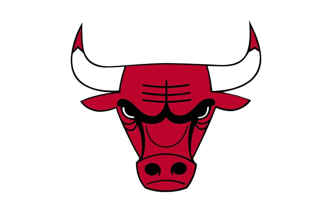
One of the most popular symmetrical logos in the sports segment is the Chicago Bulls logo. The ferocious expression, the blood on the horns, the flaring nostrils together create so much power and a strong emotional appeal.
In this case, symmetry works as a scary good amplifier that gives the logo a commanding presence. It creates a sense of strength and intimidation. Hence, without symmetry, the bull’s emotions probably would have looked slightly mellowed down.
Interestingly, the design doesn’t rely on soft curves to humanize the symmetry as with most designs. Instead, it uses sharp angles and strong lines to create an image that feels intense and authoritative.
KIMP Tips:
- Complement symmetry with the right elements, like the bold colors and sharp lines in the case of the Chicago Bulls logo.
- Use symmetry as a visual aid to reflect your brand’s personality. In the case of Airbnb, symmetry helps bring things together but in the case of the Chicago Bulls, symmetry helps create a bold and aggressive design.
5. Volkswagen
The aesthetic symmetrical logo of Volkswagen is the perfect example to demonstrate the elegance that symmetry creates.
Whether it is its old skeuomorphic design or its most recent flat design, Volkswagen has built the foundation of its brand identity on a bilaterally symmetrical aesthetic. The letters “V” and “W” are stacked on top of each other with a common central vertical axis.
In this case, symmetry helps add character to an otherwise plain lettermark logo. This demonstrates how symmetry can be used to enhance the visual appeal of a design, to create something unique out of an ordinary idea.
Talking about the significance of symmetry with respect to highlighting the meaning of the logo, it helps reinforce order and stability, therefore building trust, which is crucial in an automobile logo.
KIMP Tips:
- Embrace sleek lines and contrast. The clean lines and geometric shape of the Volkswagen logo and its contrast against its background simplify the design, making it memorable and scalable too.
- Simplicity brings timelessness, and the longevity of the symmetrical logo of Volkswagen is the perfect example.
6. Walmart
When talking about symmetrical logos, how could we not discuss the iconic golden spark symbol of Walmart?
The Walmart logo is a classic example of radial symmetry. The six evenly spaced rays radiating from a central point create something visually intriguing. Moreover, the fact that they form a circular shape on the whole adds to the stability of the design. It gives it the visual appeal of geometric shapes, tapping into the power of shape psychology, effectively capturing a sense of community (due to its circular shape).
Along with the bright yellow and the circular shape, the symmetry here adds energy to the design while keeping it approachable.
KIMP Tips:
- Like the Airbnb logo, the Walmart logo combines abstraction and symmetry. These examples highlight how combining various design concepts thoughtfully can help create something that stands out.
- Consider the placement of your logo to understand how effective it truly is. In this case, you’ll see the Walmart spark icon appear on its own or next to the brand wordmark or sometimes even above it. The symmetry here helps bring this versatility.
7. Audi

The Audi logo is a striking example of how repeated shapes can create a cohesive design. Its four interlocking rings form a balanced arrangement with reflection symmetry along a horizontal axis, while each individual ring has its own symmetry. The repetition of the same circular form gives the logo unity without making the design feel overly complicated.
There is a charm in translational symmetry – a cohesiveness it creates, and the Audi logo makes good use of this. Moreover, there is deep meaning in the logo – the four rings are meant to capture the four companies that were merged into one. To communicate this message, the brand uses similar shapes arranged in translational symmetry and in an interconnected fashion.
KIMP Tips:
- In addition to the nuanced symmetry details, the Audi logo also uses the color silver in its branding for that polished, premium feel. This shows how color can help amplify the impact of symmetry in design.
- The perfect geometric shapes and the precise arrangement help capture the precision and quality that the brand is all about. Similarly, use symmetry thoughtfully to convey high standards and reliability.
So far, we’ve celebrated the inherent harmony of perfectly symmetrical logos. Now, let’s explore instances where designers intentionally skewed symmetry to inject dynamism and create compelling visual interest.
Breaking the Mold: 3 Logos That Play With Assymetry
NBC
The NBC peacock logo is a brilliant study in how to intentionally deviate from perfect symmetry to create something dynamic and unique to your brand. While its overall form appears perfectly balanced and symmetrical, look closer and you’ll see how the design plays with reflection symmetry along a vertical axis by using negative space and colors effectively.
For instance, without the head of the peacock carved into the negative space of the design, this would have turned out to be just another abstract design. If the colors had been the same on either side of the vertical axis, the logo would have lacked the vibrance that multi-colored logos are known for.
Nintendo Switch

Before looking closely at the above image, were you also of the idea that the Nintendo Switch logo is symmetrical? You’re not alone!
At first glance, the logo appears to be a symmetrical representation of the console’s detachable Joy-Con controllers, with one side solid and the other outlined. But that’s not the case. The solid right “Joy-Con” is actually slightly narrower than the outlined left “Joy-Con.”
In this case, the intentional asymmetry has been added to create a visual balance rather than mathematical precision. Given that the filled shape carries more weight, it’s designed to be narrower, thus balancing the visual weights on either side and creating a sense of balance without being too evident.
Finally, the high contrast color scheme of the logo helps elevate this uniquely charming asymmetry in the Nintendo Switch logo.
Starbucks
While a basic level of symmetry exists in the human body, perfect symmetry can result in something creepy and artificial. Slight imperfections and subtle deviations in symmetry are what make the human face human.
This concept is exactly what the Starbucks logo is all about. Reportedly, the first few iterations consisted of perfectly symmetrical designs. But something felt off, and so the design team went back and infused slight asymmetry into the design, and this resulted in this iconic logo, which is one of the most popular brand symbols out there.
Tap Into the Power of Symmetry in Logo Design With KIMP
Whether you want to create a balanced symmetric design for memorability or a subtle asymmetry to create something dynamic, the support of an experienced design team can make a huge difference. With the dedicated design team that comes with unlimited design services like KIMP, you have the creative freedom to experiment with symmetry, asymmetry, and everything in between. This helps you come up with something truly exceptional. Something that’s an accurate representation of what makes your brand unique.
Ready to give your branding a boost? Sign up for a KIMP subscription.
To get a glimpse of what an unlimited design workflow looks like, register for a free 7-day trial!