5 Of The Best Car Brand Logos Of All Time + Design Tips
From the luxurious Porsche crest to the sleek four-ringed design of Audi, there are many car logos that have captivated car lovers around the world. Car brand logos are more than just brand identifiers. They stand as a badge of honor, a symbol of excellence, and an ode to automotive excellence.

Car brand logos are meant to evoke strong emotions.
Is your logo supposed to help your customers visualize the roar of engines? Or perhaps think of the elegant curves of chrome in car styling? Or even perhaps feel the kind of cozy and safe ambiance in the car? Notice that each of these feelings resonates with a different car brand personality.
For example, Mercedes-Benz has been about luxury. Nissan stands out for its impressive safety ratings. And their logos are accurate representatives of the kinds of sentiments customers associate with the respective brands and cars. Because a car is a long-term commitment. That does not happen without a strong emotional connection.
So, rev up your engines. Let’s talk about car brand logos that have acted as driving forces behind some well-known car brands in the world.
5 popular car brand logos + lessons in logo design
1. Mercedes-Benz

The three-pointed star of the Mercedes-Benz logo has become the epitome of elegance in car brand logos.
Meaning
The Daimler brothers got the idea of using a three-pointed star as the logo from a marker on a postcard from their father.
Later, as the symbol became an inseparable entity representing the Mercedes brand, the star acquired an even deeper meaning. The three points reportedly represent land, sea, and air. This goes with the idea of the brand’s vision to span different environments with its engines.
Design evolution


Incorporating a simple and memorable symbol and text, Mercedes-Benz uses a combination mark logo. Over the years the logo design evolved from the first ever wordmark from 1902 to the brandmark logo of 1909 (the first one to feature the three-pointed star), and so on.

The combination mark version of the logo debuted in 1989 and has remained more or less unchanged since then. Except, of course, the positioning of the brand name.
Design lessons from the Mercedes-Benz logo
- The Mercedes-Benz logo is a practical lesson in the strength of simplicity in car band logos. It is living proof that minimalism is a fool-proof idea in branding designs.
- The custom serif-font used in the logo gives it a touch of elegance. This is a reminder of the fact that your logo font sets the mood of your logo design.
- The three-pointed star appears enclosed in a circle. Different shapes evoke different emotions and circles are often chosen for a sense of stability and community. And both of these align with the Mercedes-Benz brand.
2. Porsche
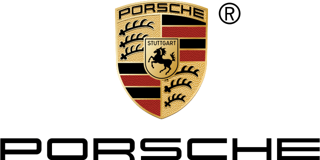
The Porsche logo is a stunning representative of the grandeur and good-looks that the Porsche cars are known for.
Meaning
Of all the car brand logos, if you are looking for inspiration for an emblem logo, the Porsche logo is the most popular choice. Its emblem is based on the coat of arms of the Free People’s State of Württemberg. Here, the imagery in the logo aligns with the origins and traditions the original brand meant to represent.
The black horse at the center of the emblem also connects back to the place of origin of the Porsche company. Originally there was a horse-breeding farm in the place where Stuttgart, the capital of Württemberg came into existence. The horse in the logo stands a reminder of this history.
Design evolution
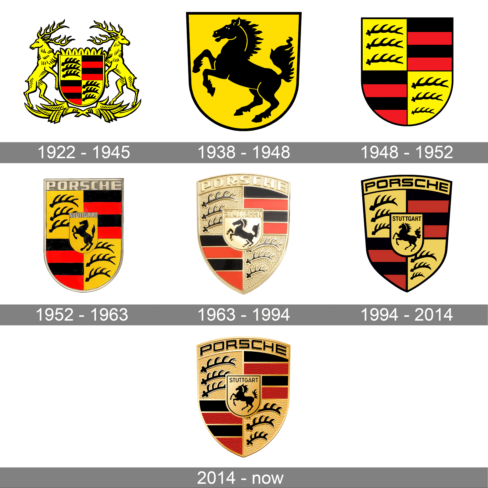
The logo has always been a creative interpretation of the coat of arms of the Free People’s State of Württemberg. Little details like the appearance of the brand name and the shape of the logo have changed over the years. But the current version of the logo is more or less similar to the 1963 logo except for subtle changes in the color palette.
Design lessons from the Porsche logo
- The choice of colors is another unique aspect of the Porsche logo. The logo brilliantly uses red which is a color of excitement – the emotion the brand wants you to feel about riding a Porsche. The professionalism of black balances the red. The dominating gold in the logo stands for luxury which is again a critical trait of Porsche cars.
- In addition to choosing elegant fonts, the brand uses bold capital letters to denote dominance and power. These are the kinds of emotions the brand wants to associate with its cars.
Kimp Tip: Brand loyalty is a crucial aspect of car company branding. Keeping this in mind, car brand logos should aim for timelessness. That’s why the Porsche logo, unlike several other car brand logos, has not changed with respect to trends. Instead, it has stood the test of time.
3. Audi

With its unique four-ring design the Audi brandmark logo exemplifies the effectiveness of a clean and minimalistic design.
Meaning
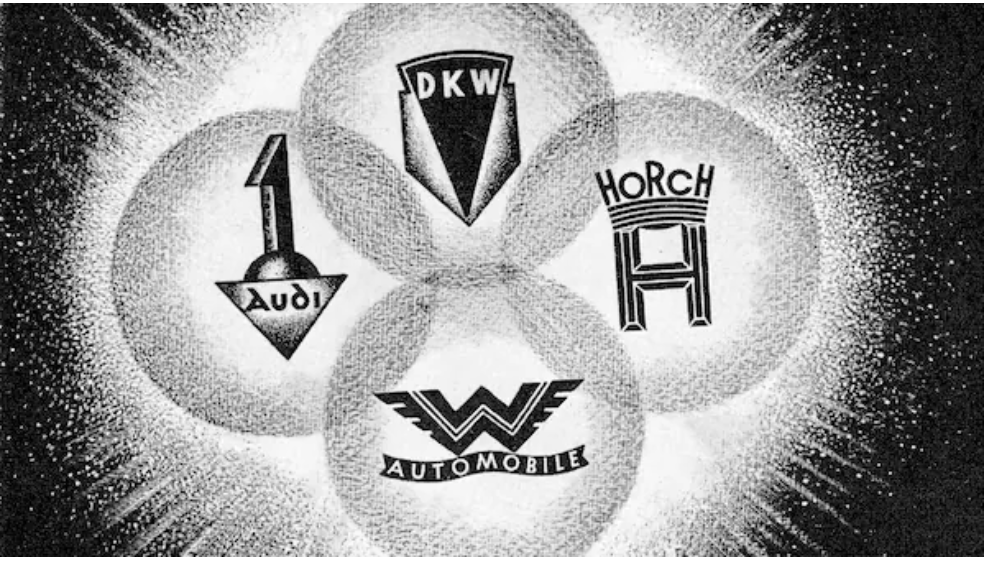
The four rings in the Audi logo stand as a reminder of the brand’s rich history and its crucial milestones. While we know it as a single brand named Audi today, it started with the merger of four automobile companies – Audi, DKW, Horch and Wanderer. And hence the four rings.
Design evolution
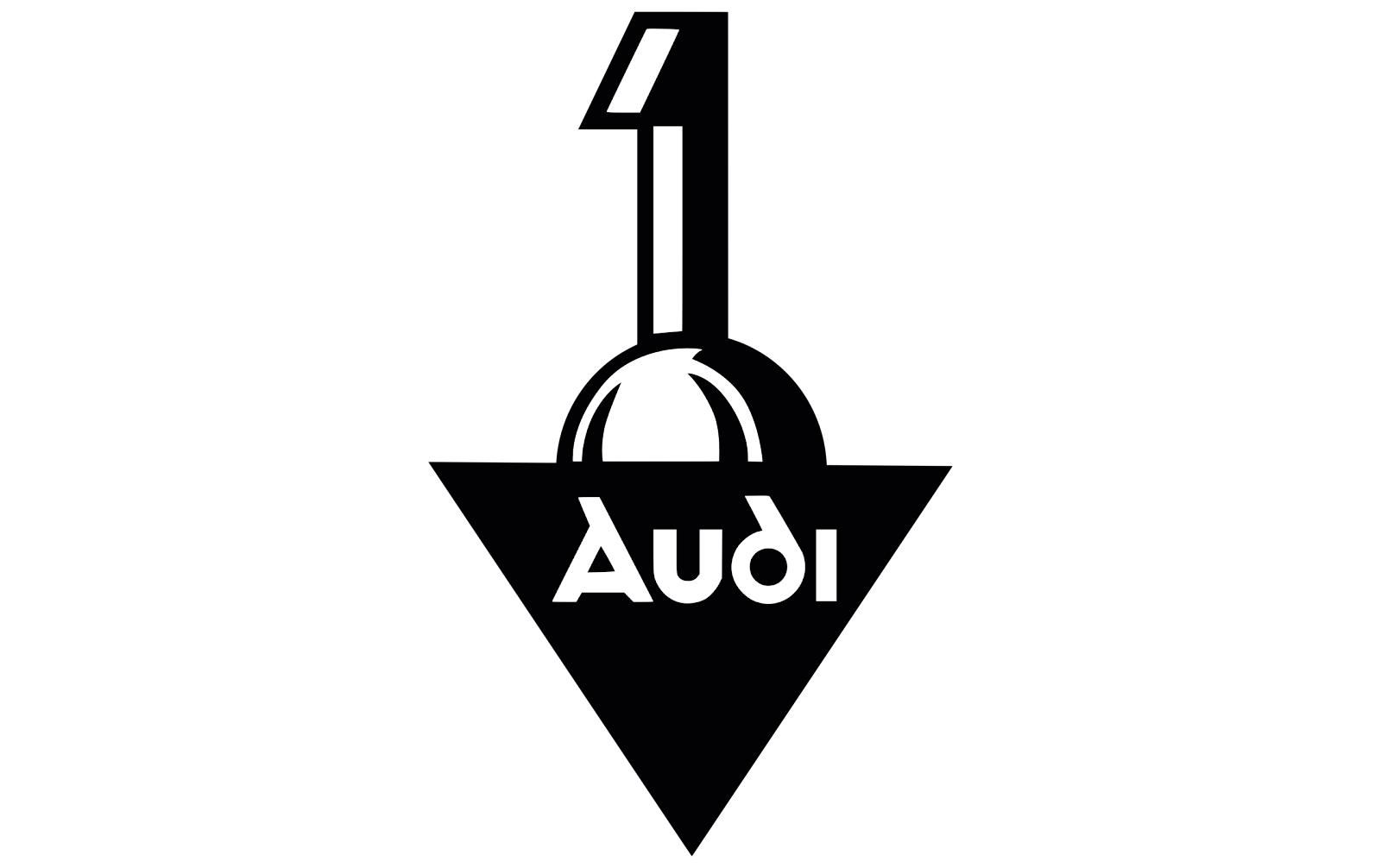
Before the merger, when Audi was a separate automobile company, its logo was a combination mark with an illustrated 1 above the brand name.

Post the merger, the logo incorporated the respective logos of all four merged brands within interlocking circles. The logos were retained for almost 17 years as an adjustment period for customers to get used to the fact that the brands were one.
After this the logo underwent a few iterations to make a transition to a cleaner, simpler and more memorable design. For a brief period between 1969 and 1995 the brand also went with a wordmark logo with just the brand name.
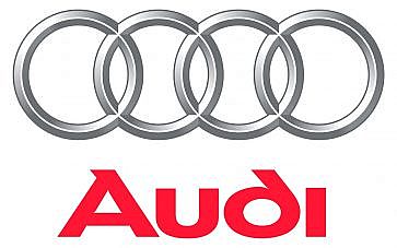
The rings were brought back in 1995 and have remained an integral part of the logo since then. Today, the four interlocking rings have become a memorable identifier of the Audi brand.
Design lessons from the Audi logo
- The Audi rings symbolize merger, union – another good example of the use of shape psychology in car brand logos.
- Silver stands for efficiency, quality, and technology all of which are the biggest strengths of Audi cars. The Audi logo in black looks more contemporary and simple – just what the brand aims for in its digital communication channels. And a silver logo detail on a car instantly evokes a feeling of sophistication which is the expected emotion while looking at an Audi car. This shows how the creative use of color can help car brand logos trigger the right emotional responses.
Kimp Tip: Another notable fact here is that the rings in the Audi logo tell the brand’s story. Visual storytelling greatly enhances branding and Audi knows how to establish that through its logo.
Need help creating car brand logos that tell a story? Get Kimp.
4. Nissan
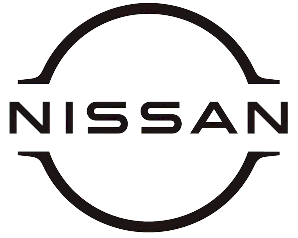
The Nissan logo is one of the most modern-looking digital-friendly designs in car brand logos. This wordmark logo has gone through several changes over the years but has retained the brand name as the core element in its designs.
Meaning
When brands rebrand or redesign their logos, they retain the most iconic element of the design. And in the case of Nissan, the brand name is one of the most crucial credentials to represent the brand.
The brand name itself is the combination of two Japanese words ‘ni’ (meaning sun) and ‘ssan’ (meaning birth). The word pays homage to the land of rising sun, Japan – the country where the brand was created.
Design evolution
When Datsun Vehicles evolved into the Nissan Motor Company in 1932, the first ever wordmark logo featuring the Nissan brand name was introduced.
While the iterations in between assumed a lot of different variations in terms of the font style and shape of the logo, the current-day logo is aligned with the first Nissan logo from 1933 in its use of a circle and the brand name placed on a prominent block.
The recent shift to a flat design and overall minimalistic look was the brand’s way of embracing the digital world. While retaining the traditional brand name the logo takes a more contemporary approach in design. This shows how the brand is adapting to the changing world of automobile engineering while preserving its roots.
Design lessons from the Nissan logo
- The use of geometric shapes like rectangle and circle represent balance, stability, and the forward-looking approach of the brand.
- To add an element of visual interest, the rectangle shape is formed in the negative space without the use of physical lines. This shows a creative use of negative space in logo design.
- Font choice is a deciding factor in car brand logos. The Nissan logo uses a casual, sleek sans-serif font that looks more approachable. This is much lighter and friendlier than the traditional serif fonts that brands like Mercedes-Benz use.
Kimp Tip: Confused about the right type of logo design for your brand? Identify the one trait or story or word that represents your brand or its heritage most accurately. With that you know whether your logo should have words in it or imagery or both. In this case, the word Nissan became a well-established marker and hence it has been consistently used in most logo designs.
And no matter what type of logo you would like for your brand, the Kimp team is here to create it for you.
5. Tesla

We have been talking about car brand logos from brands that are decades old. But for a fresh perspective, let’s also look at a new name in the world of automobiles, one that has made quite an impact within a short span – Tesla.
Tesla uses a futuristic combination mark logo that packs a lot of meaning.
Meaning
Most people think that the unique symbol in the logo is a T. But did you know that this one actually represents the cross-section of an electric motor? Nikola Tesla is a major inspiration for the brand (and the brand name) and since the electric motor is one of the main inventions of Nikola Tesla. The connection between the logo and the brand is therefore clear, isn’t it?
Additionally, this logo is also a fitting symbol to represent a car brand that manufactures electric vehicles.
By cleverly connecting the symbol with the brand’s initial “T” the logo creates quite an impact. Since the logo has remained the same from the time of its launch, there’s nothing to talk about regarding the design evolution of the logo. So, let’s talk about the design lessons to take away from the Tesla logo.
Design lessons from Tesla
- The use of the color red helps in brand differentiation. There are only a few car brand logos that deviate from the usual colors of silver and gold and Tesla is one among them. The bold red in the Tesla logo represents energy and excitement both of which are sentiments associated with Tesla cars.
- The fonts used in the Tesla logo are quite different from the common font styles you find in car brand logos. The futuristic font with the stylized E and A captures the fact that the brand is ahead of its time when it comes to the technology used in its cars.
Kimp Tip: As you see in the Tesla logo, simple tweaks to the fonts or even particular characters in the logo text make a huge difference. By using a custom typeface or working with a designer to customize a standard typeface to resonate with your brand personality, you are strongly putting your brand identity forward.
Execute your ideas inspired by the popular car brand logos
Did this list of popular car brand logos ignite your creativity? While there are several more car brands popular around the world, a lot of them have a similar approach to logo design.
Similar to the Porsche logo drawing inspiration from its place of origin, the BMW logo draws inspiration from the place of origin of the company (Bavaria). The Ford logo retains the name of its founder and uses a simple wordmark logo.
Similarly, most car brand logos have their own stories to tell or identities to represent. And they deliver the message accurately through the careful choice of fonts and colors.
So, when you sit to work on your logo, ensure that you understand the emotions that each logo color and logo shape represents. You will want your customers to feel your brand the moment they see your logo.
And one way to simplify your logo design process is to sign up for a Kimp subscription.
Register now for your free 7-day trial.