Design 101: 7 Useful Tips for Food Packaging Design
Packaging is more than just a tool for protecting your product. It’s more of a salesperson that convinces customers to pick your product on a crowded supermarket shelf. Packaging is a brand identity design that tells your story to prospective leads and converts them to customers. No wonder brands spend a great deal of time and money developing creative packaging designs. And when it comes to the food industry, packaging has a much more serious role. So, shall we discuss food packaging design today?

Struggling to come up with food packaging designs that are as delectable as the food inside? We got you. We’ll delve into the nuances of food packaging. But, first things first, why is packaging a deal-breaker for food businesses?
The Need for Good Food Packaging Design
- The global packaged food market value is projected to reach $3,407.2 Billion by 2030. Which means the competition is tough. Packaging design is one of the most influential ways to convince customers that you are better than your competitors.
- Accordingly to nearly 72% of American consumers, packaging design is one of the strongest influencers in making a purchase decision.
- Food packaging design acts as the first impression with potential leads and a way to effectively touch base with existing customers. When your packaging design is impactful and memorable, they recognize and connect with your brand every time they see your products in the stores.
- Good food packaging design ensures optimal storage conditions for the contents and delivers the expected shelf life.
For all these reasons and more, you need to be careful about your food packaging design. The material and the packaging graphics are both equally important. That brings us to another topic- the types of packaging that most food businesses use.
Common Types of Food Packaging
Good packaging design begins with identifying the right type of packaging. If you already have a design and would like to just modify the label, then it is a whole different thing. But if you are redesigning your existing packaging or creating one from scratch for your new product, go with a future-ready approach. Go with something that is more sustainable.
70% of consumers are ready to even pay extra for sustainable packaging. Considering the direction in which the world of packaging is heading, it is always a good idea to choose greener materials or at least recyclable materials. This way you have a strong foundation, to begin with. Then comes the question of types of food packaging based on the shape or the contents.
- Trays
- Boxes
- Cans
- Bottles
- Wrappers
- Aseptic packaging
Remember that your packaging graphics should be created to complement the type of packaging and the material. This way you will have a very practical design that is also aesthetically appealing.
For the material part, you can easily choose based on what works best to preserve the freshness of the food inside. Then comes the actual element that grabs attention – the packaging graphics. So, here are some tips to get it right.
7 Useful Food Packaging Design Tips
1. It’s all in the colors
In food packaging design choosing the color palette is one of the critical first steps. And here are a few things to remember:
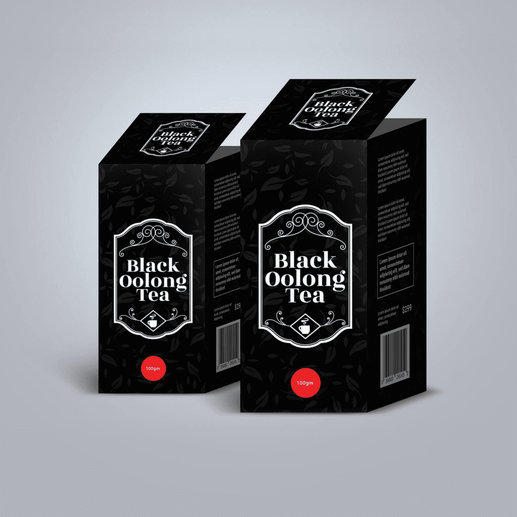
- Understand color psychology. Some colors excite customers and some instantly come off as reliable. Bright and bold colors like red and yellow work well in the food industry. But if you have to advertise in the premium segment, like gourmet food, darker colors like black, deep green, brown, and gold all have an air of sophistication about them.
- Prioritize your brand color. Treat packaging design as an extension of your marketing design and you won’t go wrong.
- Choose secondary colors that are harmonious with your brand colors. You do not want the combination to be an eyesore in your design.
- Use relevant colors. All-blue packaging might seem pointless when you want to advertise an orange-based snack or beverage.
- Experiment with unconventional colors. When all your competitors use neutral colors, if your packaging has a pop of color or vice versa, your product is sure to stand out. Most customers will be willing to stop and take a second look at a unique-looking product in a supermarket aisle.
2. Use imagery to grab attention
Visuals are very important in food packaging design. You need imagery of various kinds. The visuals that actually work in food packaging will be images of:
- What’s inside the packaging
- The ingredients
- And the recipes or serving recommendations


In the above examples, the visuals in the packaging keep the design straightforward. So, customers instantly know what they are buying.
Clarity is very important because customers do not spend a lot of time comparing their options and reading reviews before buying most products in the food and beverage segment. Do you spend as much time comparing and choosing a packaged beverage as you do while buying a smartphone? Probably not.
When you walk up to the store and find cans of similar-looking beverages, you might probably go for one that is from a brand you know. And then choose a flavor you like.
Say you find two brands you like. But one brand’s packaging has visuals of the ingredients. And with the other, you have to read the label to find out what variant you are choosing. Which one would you go with? The one with strong visuals, right? So, even if your brand has a strong presence in the market, if you want customers to choose your products, use visuals to draw their attention. And to keep the design clear and easy to interpret.
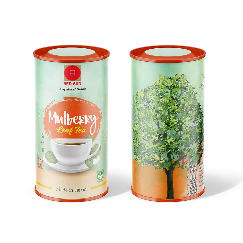
3. Wisely use it for branding
Sometimes, your packaging design is the first point of contact between your customers and your brand. So, you want to be sure that your food packaging design is on-brand. And that it makes a great first impression and thus sends your products off the shelves into the shopping carts.
Other times, they might have been exposed to your brand through ads but not have actually tried your products. In this case, your packaging will be the first tangible version of your brand they encounter. But there should be a visual consistency between your marketing designs and your packaging. Otherwise, customers will not be so sure that they are buying the brand they just saw online.
Here is an example:


The first image is the packaging design and the second one, is a social media design to promote the product. From the color palette to the overall mood of the designs you will notice a lot of coherence. This makes it easier for customers to make strong connections with your brand.
4. How much information is too much?
Too much information and too little information are both bad for food packaging. If you do not tell customers what your product is about or what benefits it offers, you might not be able to convince them. If you try to cram too much information in the little space, you end up confusing them. In both these cases, they might go with your competitors’ products rather than yours.
So, the key is to limit your packaging label design to three or five pieces of information.
5. Use illustrations to simplify things
Illustrations can be used to bring food packaging designs to life. Of course, food photos that make you hungry might work. But sometimes that approach might feel a bit cliched. This could be because there are too many products in the segment.
For example, the packaging of a lemon-based beverage might contain lemons. Well, we all know that! But you also know that you need to create a straightforward design that does not mislead customers. So, what can you do to stand out while using a common idea like this one? Use illustrations instead of actual photos.

On a shelf filled with packaging designs that have ‘photos’ of lemon in them, this one with illustrations is sure to grab attention, don’t you think?
One other very useful way in which illustrations can add value to food packaging will be to denote ingredients or even cooking instructions.

In the above example, notice the use of chili pepper illustration to indicate how hot the sauce is, Customers quickly grab the idea here. And you can convey the information while keeping the copy on the packaging design as crisp as possible.
Kimp Tip: Even when you have to use illustrations, stick with a simple color palette. Too many colors can cause a lot of confusion. Confused shoppers do not make a decision in your favor. If you do not know what kind of colors to use, try monochromatic designs like the one in the above example.
Want to create food packaging with unique illustrations on them? Get in touch with the Kimp team today.
6. Create templates to connect your products
Sometimes, you have a whole range of products within the same category. And sometimes you have products belonging to different categories. For example, a brand might be selling a wide range of condiments like mayonnaise and ketchup. Within the mayonnaise range, there could be different versions based on the add-ons. So, you need to come up with packaging designs that quickly tell that these are all different products and yet they are all products from the same brand.
Now, how do you do that? Work with templates. Templates indicate the kind of design elements in your packaging design and their placement.
We’ll explain this with an example.
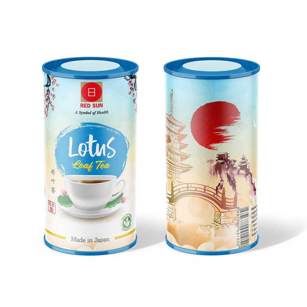
Without any explanation, you must have grabbed the idea that the above images are two different products from the same brand. And that they belong to the same category. You must have also come to this conclusion with a cursory glance, even without reading the labels. That’s the power of design consistency in packaging.
The color schemes, the copy, and the visuals are different in both designs. But the position of these elements and the presence of the brand logo are a few aspects that create a sense of connection.
Want to create consistent-looking packaging designs for all your product lines? With Kimp subscriptions, you can get unlimited designs every month.
7. Know what the regulations call for
There are general regulations and some local laws that tell what kind of information is mandatory on packaging labels, especially in the food and beverage industry. This includes details like the ingredients, allergens, and additives.
Depending on the type of product your brand caters to, come up with a copy that complies with the regulation. This helps in planning the layout for the label in a more effective way. Remember to use legible fonts and illustrations wherever applicable. This ensures that customers do not miss important things like allergens in the product. Like clarity, transparency is another very important element in food design. So, build your aesthetics around these essential details.
Kimp Tip: When you have several such details to include in the label design, you must be clear about the font and color based hierarchy. Bigger fonts attract attention. As do brighter colors. Accordingly, choose the right colors and fonts for the information that regulations call for. In the below example, you will notice the use of bold text to draw attention to cautionary details.

Create Appetizing Food Packaging Design With Kimp
Your food packaging design does not have to look like a piece of art that is ready to be framed. It should be simple, practical, and aesthetically pleasant. It should be designed keeping the end users in mind. Wherever possible, add visuals that make them hungry or tell them what they are buying. To execute all these ideas, the easiest way will be to choose a Kimp Graphics subscription.
Wondering if subscriptions will work for your business? Register for free and try our risk-free 7-day trial.