Food Packaging Design – 7 Mistakes to Steer Clear Of
Have you ever picked up a bag of chips enticed by the fancy packaging only to be disappointed upon opening it? Because what’s inside looks nothing like what’s on the outside? Or have you stood at a grocery aisle breaking your head trying to figure out what the product is? Both of these mean that you’ve encountered bad food packaging design. And we’re sure such experiences stop you from going back to the brand again, right?
Consequently, food packaging is not something that can be done on a whim. Instead, it is something that needs to be created with a lot of thought, and consideration for the target demographics, the target market.
In addition to this, we cannot deny that food marketing is tough. And the competition is fierce. Because brands need to compete with a variety of local names and some internationally recognized brands as well. Keeping this in mind, you cannot let poor food packaging design cause your product to go unnoticed. You cannot let misleading food packaging design elements bring your brand down.
That’s why we are going to talk about all the mistakes you should avoid in food packaging design. Let’s first establish the significance of packaging design in food branding.
Why is food packaging design a crucial element in food branding?
- Food packaging design stands as your brand’s identifier and helps attract the attention of the right audience. In fact, it does not just tell your customers about your product but also tells them about your brand.
- Additionally, a lot of shopping for grocery and food products, in general, happens offline. This means that your brand’s food products need to compete with plenty of others on a crowded store shelf. Good food packaging design is what helps differentiate your brand in such places
- Finally, transparency in food packaging design helps build trust. And we know well that people do not buy from brands they do not trust, especially food items.
For all these reasons and more, you need to take your food packaging design seriously. Even the slightest mistake can make your customers rethink their decision of picking your product from the shelf. Data shows that about 60-80% of consumers do not return to a brand they leave due to poor packaging. Therefore, let’s talk about some of the don’ts in food packaging.
Food packaging design – 7 mistakes (and tips to avoid them)
1. Cluttered design
Clutter is one of the unforgivable mistakes in food packaging design. Because when the design is cluttered it falls short of the mark even when it has all the essential information.
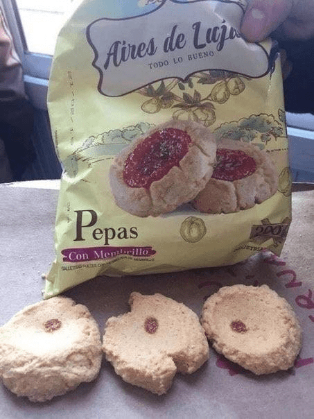
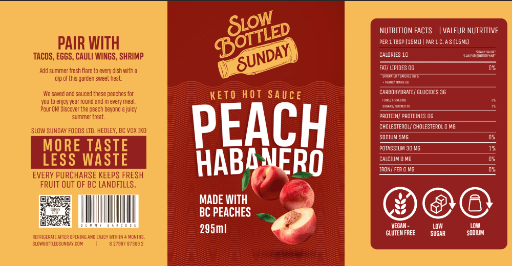
Take the above packaging label for example. It is a simple design and quite informative. It uses contrasting colors and a font that is easy to read. But the simple fact that the layout looks cluttered brings the design down. At least in this case, the text portions are not crammed up so you can still read them. But yes, they are all over the place. As a result, it feels strenuous to absorb the information that’s presented.
Why is this important? Because if customers do not notice any critical piece of information due to the clutter, it can affect the experience. For example, the warning in the above label says that it “should not be fed to infants below one year of age” but it’s hard to notice this important detail in the confusingly cluttered layout.
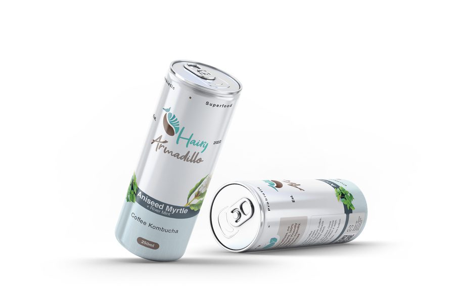
KIMP Tip: The one ingredient that can help you avoid clutter and create a clear food packaging design is visual balance. Here’s another example of an informative food label. But notice how organized the design looks thanks to the visual balance in it.
2. Deceptive imagery
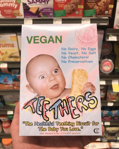
If clutter is one thing, deceptive imagery is another! In fact, if you look at brands that were ridiculed on social media for their packaging design, a majority of them were for deceptive imagery on the packaging. Some simply exaggerate the appearance of the food item while the contents of the pack have a whole different story to tell.
When such deceptive imagery fools a customer, it breaks the trust in the brand, therefore, affecting its long-term reputation.
KIMP Tip: What can you do to avoid the negative impact of deceiving product images? Use realistic product photos. If you think that they do not look fancy enough, find a more creative way to illustrate what’s inside. Customers do not always look for a staged product image. They look for an image merely to understand what’s inside and to get a brief idea of what to expect.
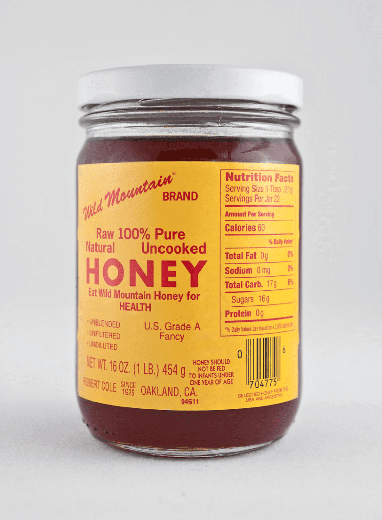
3. Not paying attention to the fonts
The below design contains a lot of information which is a good thing for a food label. But what’s one thing that feels off about this design? The fonts. Don’t you think the riot of fonts in the design causes a lot of eye strain?
Remember that food packaging design fits into the branding of a business. If the packaging design is bad or if there is a visible lack of professionalism in the packaging, it instantly brings down the brand’s image as well.
Another font-related problem in the above design is the use of too many font styles. This affects the overall harmony in the design.
KIMP Tip: Stick to one or two professional fonts for food packaging design. And remember that utility drives the design more than aesthetics. For that matter, elegant and clear fonts automatically enhance the aesthetic. Here’s a design that uses sleek fonts that are easy to read and look professional too.
4. Misrepresentation of information
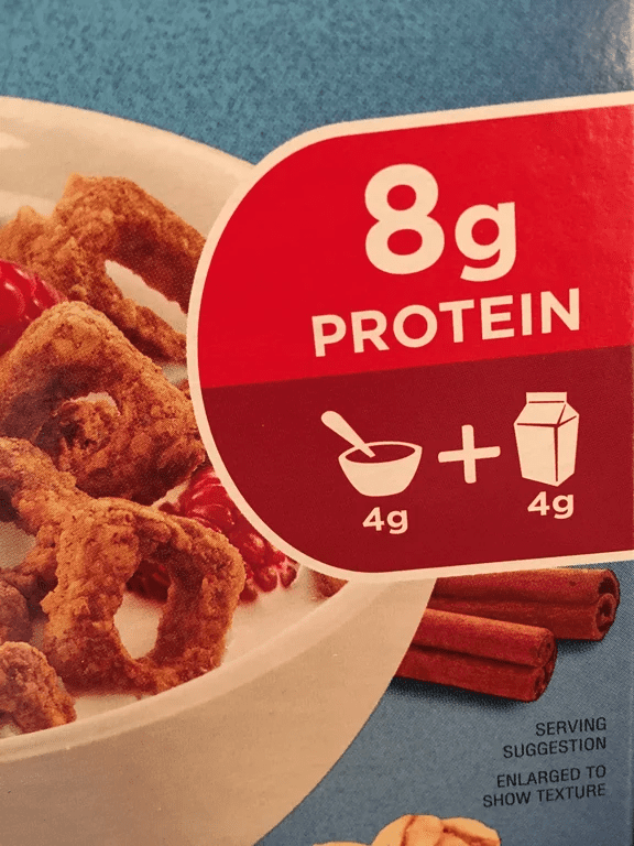
Visual hierarchy is a design principle that helps draw attention to different elements in the design in the right order. Why are we talking about this here? Because in food packaging, some brands manipulate visual hierarchy to misrepresent information. This includes using tiny difficult-to-read fonts to type certain ingredient names or disclaimers.
The above packaging design is a good example of using font size variations to manipulate hierarchy. Since the text in big bold fonts “8g” grabs attention first and the fact about where this protein actually comes from is in smaller fonts, the information is slightly misleading.
Here’s another example where the food packaging design misrepresents the information by placing the text “factory” in small fonts within the word “made”.
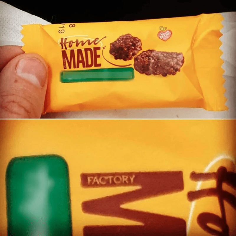
With misrepresentations like these, you are gambling with your brand’s reputation, and your customer’s trust in your brand. That’s not a wise move then is it? What can you do about it? We’ll tell you in the below KIMP tip.
KIMP Tip: Prioritize transparency and avoid ambiguity when you are working on the visual hierarchy of your design. Once you have given each element its visual weight, ensure that you observe the design to ensure that the important details in the design are not hard to grasp. And in the case of food packaging design, this includes information like allergen details, ingredients, serving recommendations, etc.
Choose legible fonts and colors that contrast with the background to make these details easily readable.
5. Confusing colors
A little while ago, we spoke about the damage too many fonts can cause. Similarly, too many colors can also bring down the impact of your design.
Since each color has a mood, you need to be sure that different portions in your food packaging design do not carry a different mood. In addition to all these factors, you cannot forget the need for incorporating color codes in food packaging design based on regulations. If the chosen packaging color makes these color codes hard to notice, your packaging design fails.
KIMP Tip: To prevent distracting color palettes from jeopardizing the effect of your food packaging design, here are a few things to remember:
- The colors should resonate with the nature of the product. For example, earthy tones for organic ingredients.
- Keep the preferences of your target audience in mind.
- Effectively use visual contrast so that the text stands out.
- Don’t forget color psychology and the cultural implications of colors
- Ensure that the chosen colors align with relevant regulations
It’s all about creating positive associations with your food packaging design while also keeping the design cohesive with other branding and marketing designs.
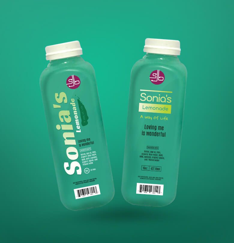
Simple color palettes like the one in the below design can be both visually appealing and effective in delivering the message.
6. Poor quality graphics
Sometimes, your design looks excellent on a computer screen but when you get the label or the packaging box printed out it’s not as appealing as it appeared in its digital version. Has this ever happened to you? If that’s the case, you need to talk to your designer!
Because the end results depend on the size of the actual printed design and the material of the surface where the design would be printed. Hence, you need to work with your designer to get the designs in the right resolution.
Poor-quality graphics and low-resolution images look really bad when the design is blown up in scale. As a result, the design on the packaging looks pixelated or grainy. Otherwise, the essential details do not look as crisp in print as they did in the digital version.
All of these issues can cause your customers to think poorly of your brand and you do not want that!
KIMP Tip: Want to know how to avoid quality-related issues in your food packaging design? Ensure that your designs are print-ready. To do that, here are a few things to keep in mind-
- Use the CMYK color model for accurate reproduction of colors in print.
- Pay attention to the image resolution
- Be careful about the bleed area because you do not want any design element to get cut off when printed.
Finally, use a mockup to visualize the design before printing it. And this will save you a lot of time and money.
Considering the number of revisions it might take and the many mockups you might need to visualize to finalize a packaging design, an unlimited design subscription, like KIMP, might be a practical option!
7. Ignoring the material of the packaging
Even the best design looks boring on the wrong packaging material. Furthermore, the packaging material also affects the actual experience. And therefore, with the wrong choice of materials, even the most visually appealing food packaging goes unnoticed.
To explain this better, let’s talk about the SunChips noisy packaging problem which once brought in a lot of criticism for the brand.
The brand went with an eco-friendly packaging material which is a good thing. But that’s not enough if the experience this material delivers does not meet customer expectations. Or as in this case, if the material is going to negatively affect customer experience.
KIMP Tip: Even when you make a smart decision to go with eco-friendly packaging, remember that there are plenty of options when choosing the material. Focus on the experience rather than just settling down based on the aesthetics. Your food packaging design is a long-term investment you make to preserve your brand image. So, you cannot compromise on quality or the experience.
Elevate your food packaging design with KIMP
Mistakes in packaging design can sabotage your brand image and send your customers to your competitors. And one way to avoid that is to pay attention to the design and ensure that it is both visually appealing and on point in terms of message delivery. And as you can see from the examples listed in this blog, most food packaging design mistakes can be avoided by working with reliable designers. So, now is a good time to sign up for a KIMP subscription.
Did you know? We also have a free 7-day trial. Sign up now!