Email Designs – 8 Mistakes Your Brand Should Avoid
Personalized customer experience, effective lead nurturing, improved website traffic, quality customer communication. Can one marketing tool make all of these possible? Email marketing can! Clearly, email marketing is one of the most effective marketing tools that businesses big and small can benefit from.

Did you know that the first email marketing blast happened way back in 1978? Fast forward half a century, marketers still consider emails to have the highest ROI among all other marketing tools. Some studies show that the returns can be as high as 4400%. That’s a pretty big number. Undoubtedly email marketing is a timeless marketing investment that every small business should consider.
So, if you have a tight budget and you need a marketing channel that you can trust for its long-term benefits, spend your budget on email marketing. This is a decision you will not regret. That said, you should also know that all of these strengths become visible only with good email design. Bad email designs can backfire. They can weigh down your brand image or in the worst case lead your customers to clicking the unsubscribe button!
Don’t want that to happen? Then avoid the email design mistakes that we are going to talk about in this blog.
Email Design Mistakes That Hamper Conversions
1. A confusingly cluttered design
If you receive the below email in your inbox, how would you react? Would you click the CTA or would you ignore it or delete the email?
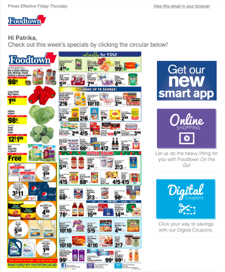
If you chose to ignore the above email design, we don’t blame you. Cramming up too much information within one email is one of the biggest design mistakes to avoid. Visual clutter is a big enemy of customer experience. And bad customer experience through email campaigns can be detrimental to your marketing efforts.
With the dwindling attention span, customers are not exactly patient when it comes to deciphering cluttered emails like the one above. Personalized emails make a better impact and improve conversions. When there is so much clutter, customers will not have the time to find out their favorite items from the large collection displayed. And for nearly 34% of users, receiving recommendations of items that do not align with their interests can be frustrating.
The key is to segment your target audience accurately based on various aspects of demographics. And then choosing only the relevant graphics to grab their attention.
2. Ignoring the header
From welcoming your email visitors to instantly convincing them to read your email fully, there are many roles played by your email header design. That’s why ignoring the header design can turn out to be an expensive mistake in email design. Here are a few header design mistakes to avoid:
- Using an irrelevant image for the header (if the header image conveys a different message than the rest of the copy or if the header image misleads customers, it can affect conversions)
- Adding a random stock image that holds no value (you need a branded header image that strikes a conversation with your customers, not some random image added there for the sake of it)
- Letting your header image take up too much space (customers do not always like scrolling down too much to gather information)
- Using drastically different header designs for your emails (visual consistency is the key to strong branding. You do not want your header image to look unrecognizably different on each of your emails)
With a poorly designed header, you lose your chance of making a strong first impression. So, what can you do about it? Create a stunning header design that grabs attention. Include your brand colors and your brand logo or brand name. Create a template that you can repeat in your other email campaigns by changing just the images or text in the header. This way you will have a consistent header that builds familiarity and strongly establishes your brand identity.
Here is an example of an impressive email header image.

For sleek email header designs like the one above, choose a Kimp Graphics subscription.
3. All text and no images
A crisp copy is surely enough to convey your message to your customers. But your marketing emails serve more than just for conveying information. You want them to act as markers of brand identity. You want them to enhance the customer experience. And to make all these extra benefits a reality, images are your best friends.
Text-only emails have a click-through rate (CTR) of 20% while adding images can boost the CTR to 27%. So, identify the portions in your email that can be better conveyed as images and the portions that are better left as text sections.
What’s more? Images make your emails look more attractive. Customers are less likely to interact with something that looks boring. An average consumer might receive around 100 emails per day. Amidst this lot, if your email grabs their attention then you should make the most of this chance by delivering engaging content.
Want to create fast-loading brand-relevant images for your emails? A Kimp Graphics subscription can take care of it.
4. Using too many images
Just because images are important in email designs, do not use too many of them. Remember we spoke about visual clutter earlier in this blog? Too many images can make your email look cluttered. Or sometimes it can be distracting. Like all other marketing designs, your email also should have a single objective. And your graphics should all work in unison to lead customers towards this objective.
When there are too many images customers will often find the email overwhelming. It could be worse if these images all seem to have no connection with each other. The key is to identify the right mix of graphics to include. If possible, capture the whole message in just one powerful image. If the information is short and sweet, customers are more likely to remember it.

5. When the CTA is not clear
CTA problems in email designs can come in the form of:
- Lack of clearly defined CTA (because the CTA button is too small or the text is not easy to distinguish from the rest of the content)
- Or because there is no proper hierarchy in the design that leads customers to the CTA smoothly
Do not assume that customers will know there is a CTA. If your email design is such that the first image they see conveys some information, unless you tell them what to do next, customers might go back without taking any step. Use your copy and design to maneuver customer attention in the right direction. Ask questions or give them a hint that there is more waiting for them at the other end of the CTA button.
An equally harmful approach will be when you have too many CTAs in one email. Would you not be overwhelmed when you have to choose from many paths each leading in a different direction? Customers are no different. When you offer them too many options, they might quit without choosing any of those options. Instead, identify one path for your email and add a clear and convincing CTA that leads there.
There is one kind of email where multiple CTAs works like a charm and that is when you include shopping guides. For seasonal campaigns, a gifting guide will make a productive email design. In such cases, your email recommends a few gifting options for your customers. And there are the corresponding product images and brief descriptions that say why the product is worth considering. And then you have a CTA that takes customers to the respective product page.

6. Ignoring the file size of your email graphics
Images and videos make emails more interactive and improve conversions. But you should be cautious about the file size of these graphics you add. Because 74% of email users delete an email if it takes more than 5 seconds to load.
You need to use high-quality graphics in your emails. But they do not always have to be of large file size. Ensure that the images designed for your emails are saved for web. To make things simpler and to come up with email designs that are visually appealing but also load faster, work with a professional design team that can simplify the job for you.
Kimp Tip: If you want to include movement and do not want to add videos, custom animated GIFs are your ideal alternatives. There is interactive animation to keep the users engaged. But the file size does not have to be as large as that of a video as well. Therefore, you do not have to worry about slow load times. Check out Kimp’s blog on using GIFs in email marketing for more ideas.
And if you need help creating custom GIFs for your email campaigns, get in touch with the Kimp team today.
7. Not optimizing the design for mobile devices
Nearly 81% of consumers prefer opening their emails on their smartphones. Email designs that are not optimized for smartphones can backfire. If you have a great header image that looks stunning on a desktop screen but lacks the impact on smartphones, then all your efforts are wasted.
Another problem occurs when you ignore the text in your email. If the fonts are too small or if you choose very light colors for the fonts then they might not be easy to read on a smartphone. Poor contrast between the fonts and the background can also affect the legibility and the overall experience the email delivers. So, when you create your email designs, be mindful of the smartphone users.
When we talk about optimizing email designs for smartphones, you should also consider designing for dark mode. Several people use their smartphones in the dark mode. Your subtle minimalistic email with neutral colors should not look dull or boring in dark mode. Or a vibrant and happy email should not look uncomfortably vibrant in the dark mode. The key is to identify the right shades and tints that look good in dark mode as well. We also have a blog that talks in depth about optimizing your newsletter design for the dark mode.
8. Incoherence in colors and fonts
Colors can make your emails come alive. But when you have too many of them, then there is more chaos than purpose. The same applies to fonts. Too many fonts that look unrelated might make the email look disorganized or even unprofessional.
We spoke about having a common goal for your email and creating a CTA based on this goal. Your colors and fonts for the email design should also be aligned with this goal. You must have heard about color psychology. And how each color has a different mood and a different interpretation based on cultural backgrounds.
The bizarre combination of colors on the left makes the email uncomfortable to read. Whereas the simple color palette on the right is much easier to read.
Fonts too have similar moods and interpretations. When you have to choose these elements of design, make sure that you choose them based on the theme or the objective of the email. Of course, you cannot ignore your brand colors altogether. Use them wherever relevant but without deviating too much from the core theme of the email.
Kimp Tip: When it comes to deciding the color palette for your email, stick with just two or three. You can always use slight variations by using tints and shades of the same color without creating several distracting elements. The same applies to fonts as well. Instead of working with different font families, you can use formatting variations like font size and bold vs regular font combinations.
Fonts and colors make or break email design. So, if you wish to find the right ones for maximum impact, leave email design to the professionals.
Create Stunning Email Designs With Kimp
Email marketing is not a cheap affair. So, to make the most of all the money you invest in email marketing, come up with designs that solve the purpose. Avoid these common email design mistakes in order to save your reputation. And if all that seems intimidating, leave it to us. With a Kimp Graphics subscription, you can take care of so much more than email design.
Start your free trial today.