How To Optimize Your Newsletter Designs For Dark Mode
Emails are a marketing campaign’s lifeline. No marketer will agree to launch a campaign without an email marketing strategy. And this is not because they are used to it or they don’t want to innovate.
But because it follows the age-old saying “Don’t fix something if it ain’t broke”. Email marketing or your newsletters can bring you the highest ROI you can ever imagine. And it works for consumers of every demographic – old or young.

The world of newsletter marketing has seen pretty much smooth sailing for a long time now. However, there is a slight issue cropping up because of a feature that came into play 4 years ago.
Yes, we are talking about the dark mode. But why is it a big deal now? It has been around for a while now? If you bought a smartphone recently, the first look at your email inbox would have made you go, “why is email background black”?
Smartphone companies have now begun to make dark mode the default which means the adoption numbers (which are already high) will just go up more.
So it is now time to create a design strategy to optimize your newsletters for dark mode. And that is exactly what this blog by Kimp will help you achieve.
But, before that, a little history and a quick recap on all things dark mode.
The evolution and growing popularity of Dark Mode
The internet’s favorite and our so-called health savior in this digital-rich time is still the new kid on the block. Even TikTok is older than dark mode and that is saying something.
If you want a little history on what started the whole Dark Mode passion episode, it all began with an Apple update. Yes, Apple is the reason dark mode exists. Apple launched dark mode during the launch of the 15th series of macOS Mojave in September 2018. Then, it was available on Gmail a year later for both Android and iOS devices including iOS Mail.
The update for Outlook came a little later in June 2019 with its version 1907 of the Insider channel becoming the first to get it. They later rolled it out for all products in June 2020.
But what is the dark mode?
We know we hear the term a lot but not everyone knows what it exactly is.
The dark mode is much more than the white space on a screen turning black. It is essentially a feature that inverts the color of any design or screen to make the background darker and change the color, UI elements, icons, and other designs into light-colored elements.
So now you know that it is not about just one design element. It is a whole experience in itself.
Why the sudden interest in dark mode all around?
Well, the buzz has been building for a few years now but the industry believes that the COVID-19 pandemic accelerated its growth. How?
Well, our screen time was always ridiculous but when the outside officially closed, people had no choice but to find solace in virtual experiences. This meant spending a long time on screens across devices. Eventually, this led to headaches, back pain, and many other complaints.
While most issues need long-term adjustments, switching to dark mode helped people avoid the screen’s bright light, glare, and the resultant impact on the eyes and nervous system.
This also meant that the dark mode was not just for mobile screens and extended its presence to desktops and other smart devices such as iPads and tablets too.
Why optimize newsletters’ design for dark mode?
We know that customers are loving it. Almost 92% of Android users and over 80% of MacOS users prefer dark mode. And this must be a major reason for you to look at optimization strategies for your newsletter designs.
But there is more.
Even if customers are not actively seeking out the dark mode. As we mentioned, the new smartphones are now delivering products with this mode as the default. And many of the apps and email clients are about to make this move too.
So when this is becoming the default, if your designs are not compatible, you run the risk of losing an impactful message.
The dark mode is not just inverting black and white arrangements. Many colors don’t work the same, some icons don’t look the same, and unoptimized designs can impact readability as well.
This is why a survey on dark mode shows us that 44% of email marketers are considering developing a darker UX and 28% of them are looking to introduce this soon.
You don’t want to be the only one delivering a subpar experience, do you?
This can result in a loss of subscribers, a hit in ROI, and a lot of rework when it is too late.
So start now and stay ahead of the curve.
7 ways to optimize your newsletter designs for Dark Mode
Now that the reason for Dark mode’s popularity is out, let’s get to the problem at hand. Working with the dark mode is not an easy task. Many of your design guidelines and templates have to either go out the window or adapt.
But as a business, it can be confusing to keep track of all the changes you have to make. Nor should you blindly trust what a designer may tell you.
So here is a curated list of changes and optimization techniques you need to ensure your newsletter designs work well with dark mode. With this blog from Kimp, you will be able to critique and appreciate the designs your team delivers.
Let’s get started.
1. Pick the right design style
If you are beginning your email marketing journey now, then you have a golden opportunity in your hands. You can model the design to make it compatible with dark mode. Usually, brands that have been doing this for a while have many constraints such as design style, mandatory images, or branding designs.
For your dark mode optimization to be a success, you need colors, images, icons, and other elements to work with it. But the good news is you can always update them. While the design style is a bit of an issue.
The design style is important because it decides the layout, organization of elements, and overall message delivery.
Usually, the best design style for dark mode is minimalism because of the abundant white space it incorporates. The designs look big and crowded against a darker background but the minimalistic design style does not hamper the user experience.
So, try to adopt a minimalistic or a dark mode compatible design style.
Kimp Tip: A minimalistic design style may not be every brand’s vibe. You may have had a retro or pop art-based newsletter design earlier. Switching is hard so work with a design team to see how you can tone it down to make it work in dark mode.
If you want to create a custom design style that is unique to your brand and takes inspiration from trending styles, try Kimp Graphics today!
2. Choose color contrasts as per standards

The darker background is a challenge for all designers. A white or light-colored background allows you to explore different colors, play with contrasts, and work on different alignments with very minimal constraints.
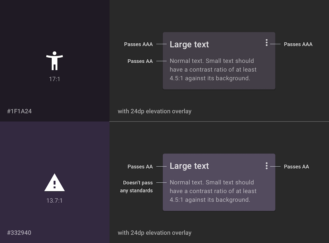
But the dark mode is completely different. The darker background makes it harder to discern some colors and hampers readability immensely. So irrespective of the colors you choose (more on this in the next section), the contrast plays a major role. This decides whether the email design is successful in dark mode or not.
Google Material design recommends that the contrast level between the background and the text to be at a minimum of 15.8:1. This applies to white text and black background indicating that white works best on dark gray backgrounds.
However, the thumb rule is that adjusting the lightness and saturation of your colors helps in readability. So, think of contrast and ensure you prevent visual vibration as much as possible.
Kimp Tip: Colors can be confusing when you want to work in dark mode. If you want to ensure that your designer gets the color right, preview and review the design in dark mode. Do not compare light mode colors with that of dark mode since achieving exact matches may not be possible.
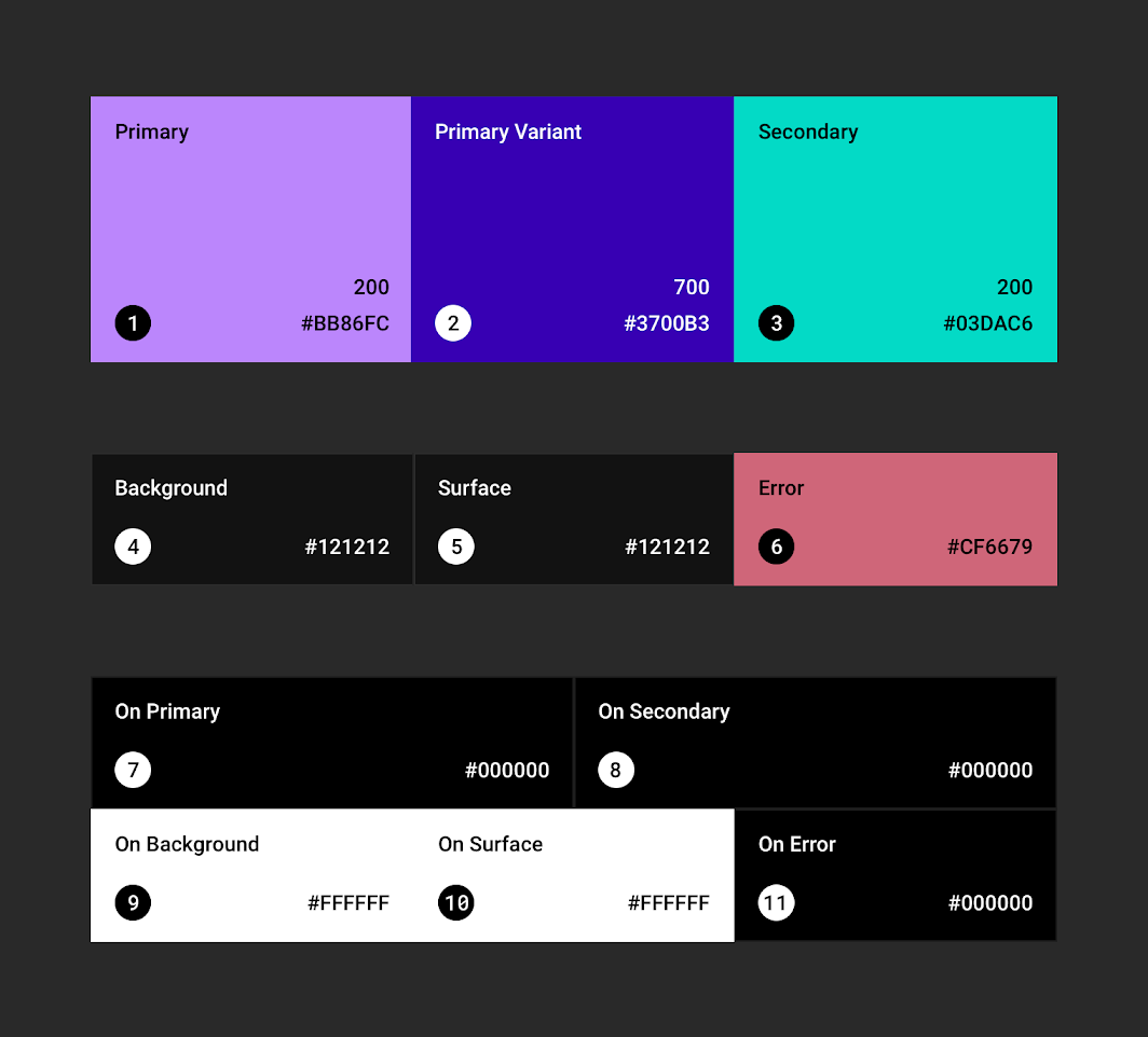
3. Build a color palette
We think the previous point on contrasts clued you in on the importance of picking the right color for your dark mode designs. Colors look different based on the background especially when you are designing for the web.
Colors in the RGB mode get their shade based on the percentage of each color (Red, Green, and Blue). The percentage that a designer must add for a black background vs that of white background will vary. This means that your existing palettes won’t work for dark mode.
That is why we recommend building a color palette that works best for your newsletter designs in dark mode. This way, you can maintain branding consistency and not worry about this more than once.
What colors work in dark mode?
Well, as a rule, too saturated colors clash with the dark black background and make it quite strenuous on the eyes. So instead of opting for bold colors, you can pick pastels for better contrast against the dark background. Since they will also look darker, the design style does not change too much.

Speaking of backgrounds, it is not necessary to pick dark black only. You can experiment with dark gray too, as long as the other colors work with it.
Kimp Tip: If you do plan to shift colors to make them more suitable for dark mode, do not make too many changes immediately. Test a few patterns across some transactional and routine emails. Analyze the impact in terms of CTR, read time, and so on before making the switch.
Also, don’t forget that the color inversion process varies across email clients, so ensure your design team designs for each platform separately.
With Kimp Graphics unlimited design service subscription, experimenting does not cost you anything extra.
4. Font selection
Every design has three principal elements – color, font, and images. We covered color, so let’s now move on to the font.
The biggest peeve that designers have with the dark mode is that it impacts readability to a large extent. And the biggest impact is usually on the text. White text on darker backgrounds makes the font look bolder and bigger. This results in a very jarring and crowded design layout.
This is why we recommend planning for dark mode in detail beyond the usual changes everyone makes.
So, in terms of font selection, we recommend picking a lighter font weight so that the result in dark mode is just the right amount of boldness. This way, the overall design style does not take much of a hit.

Kimp Tip: If you feel that the lighter version of the font you generally use does not work for your branding designs, then we recommend creating custom fonts. Yes, this way, you can take inspiration from the previous font but modify it to suit your branding and design expressions.
Avoid visual vibrations with thoughtful dark mode design and custom fonts. Sign up for a Kimp Graphics subscription to get this now!
5. Update design elements for working in dark mode
We have covered color and font, but a newsletter design has many other elements too. And that includes icons, logos, brand names, images, and so on. These too have to work well in dark mode for the design to be a success.
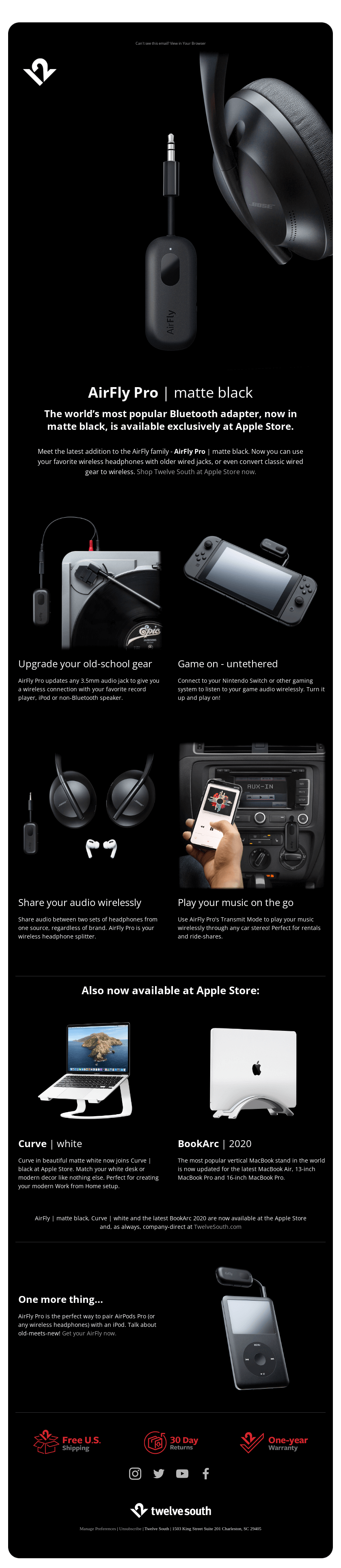
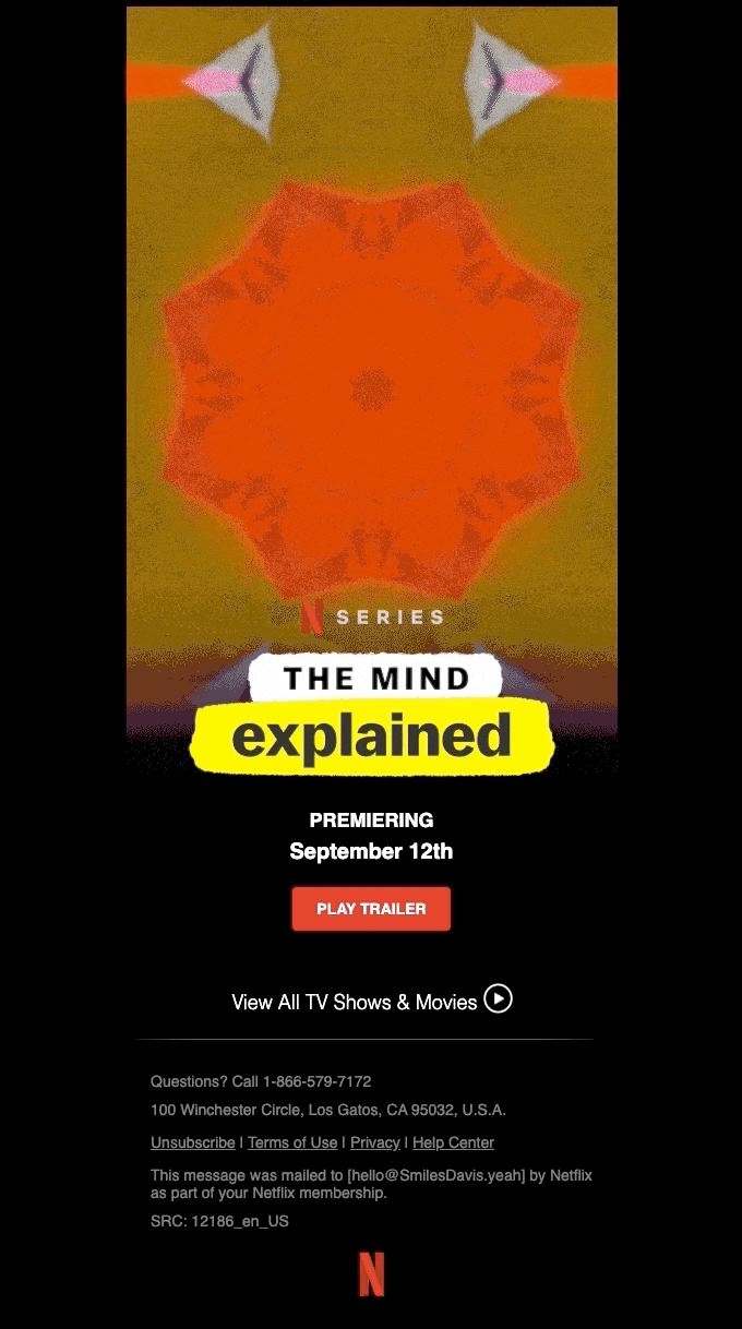
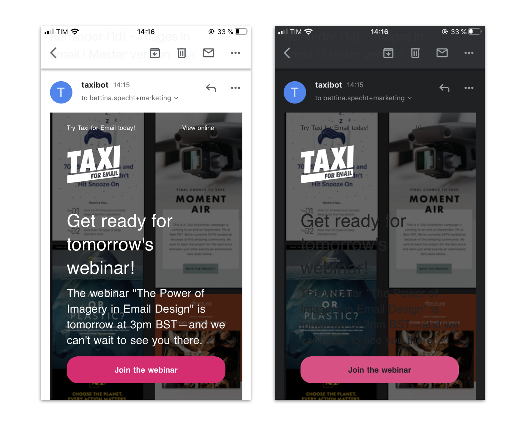
Now, if you look at the examples we have below, you can see how the icons with dark backgrounds look way different in dark mode than in light mode. Sometimes, your logo may also disappear when the consumer views the email in dark mode. So, your design must have elements that work well with this mode.
How do you do that?
- Well, for starters, start by using png files with transparent backgrounds for icons, logos, brand name styling, and so on.
- If the element itself has a dark background or comes in black color like the TikTok logo, consider adding a white stroke to the black design. This adds weight to the design and separates it from the background.
- Some newsletter designs also have text superimposed on background images. If your text is white, then the dark mode will invert to black. So pick a background image that does not clash. If not, consider adding a layer between them.

Kimp Tip: If you are a small business starting the branding designs, ensure that your design team creates assets that work well in dark mode. Not to say, you cannot have black logos, but ensure they give you the png file.
Did you know? With Kimp Graphics, you have complete ownership of all files and we share the designs across formats so that you can make the most of them.
6. Don’t forget your illustrations
We live in an age where graphic design has moved away from stock images or even photographs in emails. Yes, illustrations and doodles are the current trends, and with good reason. They showcase your brand personality in the best possible way and you must not forgo at any cost.
But since the brand illustrations come with preset colors, they do pose a challenge when you are optimizing your newsletter for dark mode. But not impossible to do. If your brand cannot withstand changing the color of the illustrations for branding reasons, a professional design team can help you.
They can separate the background with the foreground illustration and change the layers so that the design works well in dark mode.
And if you are designing new illustrations, ensure that you include dark mode compatibility in your design brief. And work with the design team to pick pastel and unsaturated colors for the illustration.

7. Test, test, until perfect
Last and the most important step in optimizing your newsletter designs for dark mode is to experiment until you get it right. Since each email client renders the dark mode email differently, it is virtually impossible to get it right the first time. Not to mention that color varies across screens and so will the user experience.
But if you commit to testing, analyzing, and experimenting, then you are on the right path.
Check the email for yourselves across devices and dark/light modes. Understand how the color, font, and image rendering varies. Go back to the drawing board or design team meeting to work on the issues.
Design dark mode compatible newsletters with Kimp
Are you proud of your newsletter campaigns? Do you love creating content for it every day? We are so glad to know this and you should continue to do so. Don’t be deterred by the changes in design styles or trends.
Kimp is here to handle all of that for you. Yes, we know that finding the perfect design style for dark mode is a long process but we are in with you. Our unlimited design services (Kimp Graphics and Kimp Video) are designed especially for these scenarios. So that you can experiment and get the best design without worrying about the budget.
So sign up for our subscriptions today and get optimizing!