8 Creative Packaging Designs To Inspire Your Brand
Visual cues are the strongest influencers in the war for attention. So, when people are browsing through supermarket shelves, creative packaging designs are what grab their attention.

Packaging design is often the first contact your product makes with your customer. Even before they use the product, the packaging influences their perception of your product. It tells them what the product is and how to use it. When designed with an impactful copy and convincing design, it will also be what influences their purchasing decision.
Product packaging has such a strong influence on how well a product sells and how it outshines its competition. That’s why brands spend a lot of money on getting the perfect packaging design for their products.
So, are you ready to ramp up your product packaging? We have some interesting design inspirations lined up for you.
But before we get there, the irony in the below packaging design is sure to amuse you.
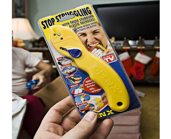
Now that’s why we reiterate the need for sensible and stylish packaging for every product sold at physical stores and ecommerce platforms alike.
Packaging Design: Starting Off on the Right Foot
Knowing the best practices in packaging design will be one way to be sure that you are on the right track. Here are a few things to keep in mind:
- Keep it simple – clutter is a big No-No when it comes to packaging. You should let the product speak for itself. Whether it is the main product packaging or the packaging you use to deliver your product as an ecommerce business, make sure that you do not overdo it. Both in terms of the amount of packaging material you use and the visuals on the packaging.
- Make it straightforward – customers should be able to easily understand what’s inside, from the contents of the label. And the overall design should simplify the unboxing experience.
- Keep it-on brand-your brand’s personality, the mood you spark through your ads, and other visuals should be captured consistently even on your product packaging.
- Know your industry standards- for certain basic details like the shape of the packaging and nomenclature on the label it is alright to refer to the “tried and true” ideas in your industry. This ensures that your packaging isn’t misleading.
Why are we saying all this? Because for 72% of American consumers, packaging design has an impact on their buying decisions.
Are you ready to transform your packaging design to make sure that your product gets picked off the shelves? Both by existing customers and those willing to try something new? Here you go. We have 8 creative packaging designs to inspire you.
8 Creative Packaging Designs To Inspire Brands
1. Minimalism says it all

Less is more they say! And the above packaging design perfectly depicts that concept. Legible text and a clear product image make sure that you can quickly grasp what the product is. And with such minimalistic yet practical designs, consumers will be able to read what’s on the box even from a distance.
With minimalism, you create memorable designs. And the design here will also be seen as a representation of how fuss-free and straightforward the product itself will be. The bold text for the safety certifications is another good thing about the design. Such details are particularly helpful for tech products like this one where safety is the top priority.
Another distinguishable trait of this design is that it makes the most of negative spaces. You see a lot of negative space around the product image and also around the product name. This makes both these details hard to miss. Thus the core message is conveyed, bang on.
2. Do not underestimate color psychology

Did you not guess that this was some “premium” product even before you read the label? That’s because we have gotten so used to viewing a combination of black and gold as a symbol of sophistication.
Color psychology is one of the most influential aspects of packaging design. On a large scale, colors trigger different emotions. But on a smaller scale like packaging design you should be more concerned about how people perceive color. There might be different associations with colors in different cultures. But the color of your packaging will be the first visual cue based on which customers judge your product.
Kimp Tip: Though it is important to prioritize your brand colors in your packaging, you cannot leave out, the essential colors based on the product. For example, an all-black packaging without the slightest hint of yellow might be difficult to perceive as packaging for a mango-based beverage.
Having trouble picking the right colors for your packaging design? Leave it to your dedicated design team at Kimp. Packaging design is a part of your Kimp Graphics subscription.
3. The power of contrast

Gray might not be on your list when you are picking colors for your packaging. You are not alone. Gray does have an unexciting vibe about it. But then, when you combine it with the right color, you end up creating a trendsetting design, like the above packaging, for example.
The cheerful hint of yellow and the contrasting white together make this gray packaging look unique. And the best part is that most brands stay away from this color. So, your product easily stands out even if the competition is tough out there.
If you want to try out something distinctive and visually memorable for your brand, use this idea and play with contrasts. That will give you a combination that people notice even in a crowded space.
4. Trust the power of symbolism
Visual metaphors, metonymy, symbolism, there are so many concepts that you can incorporate in your packaging design. All these involve conveying the message subtly with interesting visuals that make an emotional connection.
We’ll give you an example. One design includes the word “idea”. Another substitutes this word with a lightbulb symbol to represent the word “idea”. Which among these two designs might make the strongest impact on you within the shortest span? Probably the one with the symbol of a lightbulb. That’s the power of symbolism. What do you infer when you see the below packaging design?

Mountains, natural settings, and a soothing color palette with earthy tones. Together these make you think of nature, or “organic”. Or even perhaps “safe” and “healthy”. In a rack filled with food items, you will be naturally drawn to designs like this one.
Use the power of symbolism in your image. And this way you do not just convey a message but also evoke an emotion. When your label communicates information, people might buy the product. But when it communicates an emotion, people don’t just buy it but remember it too.
5. Go green
67% of American consumers prefer product packaging made of paper and cardboard. Most consumers are responsible shoppers. They are very particular about adding to the landfills. So, even big brands are bidding adieu to single-use plastics and switching to more eco-friendly materials.
So what’s stopping you? If you thought paper bags and cardboard boxes look plain, check out the below design.

Sleek designs can be added to paper packaging in order to add a subtle flavor of your brand. Being mindful of the packaging materials you use has a strong impact on your brand image.
With that said, you should also be careful about greenwashing. Which is falsely advertising or adding misleading details that represent a not-so-eco-friendly product as eco-friendly.
A South Korean brand, Innisfree, sold beauty products in what looked like a paper bottle. The packaging even read “Hello, I’m paper bottle”. But users found that within the paper bottle was a plastic bottle that contained the actual product. The brand acknowledged the fact that the label was misleading. In a statement issued in response, it said, “We used the term ‘paper bottle’ to explain the role of the paper label surrounding the bottle,” But the damage was done!
So, be extra cautious about what you promote on the label, your brand’s ideals, and what packaging material you use.
Kimp Tip: While working on packaging design for eco-friendly materials, choose colors that look good on craft paper and designs that stay clear and attractive even on flexible surfaces like paper.
Not sure how the end results might be? Leave the job to the Kimp team and your eco-friendly packaging will take your brand places.
6. Be mindful of the fonts
Colors and fonts are the two main aspects that make or break your packaging design. When you have got the colors right, then comes choosing the brand. This again depends on the type of emotion you want the design to trigger.
Want something playful and fun? Decorative typefaces or some freestyle script fonts will work. A more professional or premium vibe? Serif typefaces do the trick. And when it comes to displaying essential information on the label, sans-serif fonts that are easy to read even on a small scale are your way to go. The below packaging design keeps it crisp, clear, and aesthetically appealing.

It also incorporates typefaces from the same font family with the product name in bold. This helps in creating a visual hierarchy and makes the overall label design easy to read.
Kimp Tip: When you have to combine fonts for your packaging design, stick with two or three typefaces. Using too many font variations can cause a lot of visual confusion. Distracting the user from critical information will result in poor communication of the message.
Finding it hard to pair fonts for your packaging design? Try a Kimp Graphics subscription for packaging designs, product mockups and so much more.
7. Visual consistency for strong branding


Take a look at the above three packaging designs. Different colors and different visual elements in all three images. But you still recognize that these are all from the same brand. That’s the power of creating a visual style for your brand. When you have a wide range of products or different variations like flavors, scents, and others, then having a strong design template for packaging will be of great help.
This way the overall composition looks cohesive but your customers will still be able to distinguish one product from the other. To achieve this, establish rules on the font style, font size, orientation, and framing of the fonts and visual elements.
On a lighter note, consistency can sometimes be dangerous. Puzzled? Take a look at the below example.
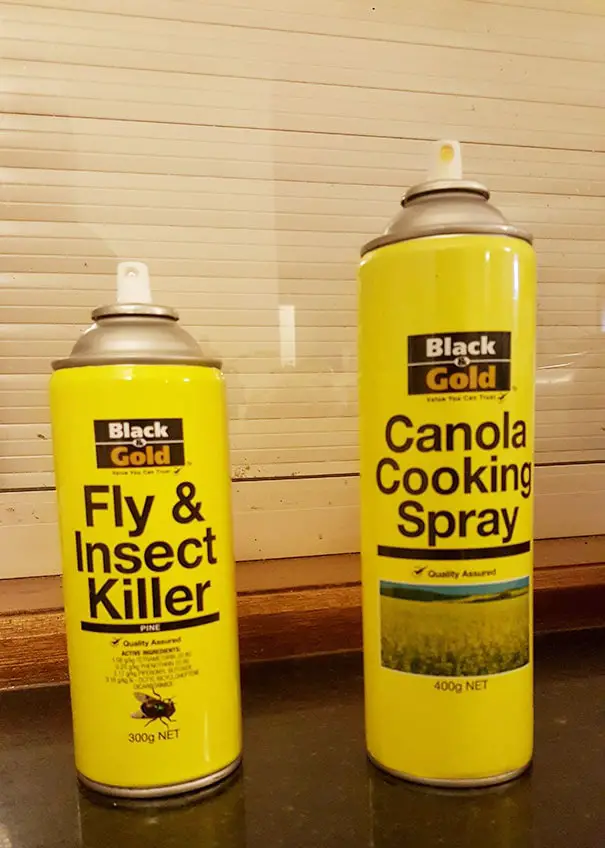
That brings us to a crucial fact in packaging design. Sensibility is much more important than the overall style. If your brand has a diverse range of product lines, then you should be careful about the colors you choose for them.
Choosing and sticking with one particular color scheme for each product line will be one way to avoid confusion. You should also be consistent in using these color schemes in the promotional materials for the respective visuals. That’s how you get people to connect the color with the product line.
8. A straightforward concept
As you focus on symbolism, fonts, and other visual styles, you cannot ignore the core objective of your packaging design. It should instantly tell users what the product is. Adding the product name in bold is good but adding an image of what’s inside is even better.

When you walk into a pet store there might be food and treats for animals big and small. Will you be patient enough to pick up each product and read the label to understand which animal it is intended for? Or will you like it if there was a picture of a dog or a cat indicating dog food and cat food respectively? The second option right? That’s exactly what the above packaging design does. It conveys the message loud and clear.
You see the picture of a cat, you know it is cat food. As simple as that. So, even if you have a design that looks frame-worthy, it is of no use if it does not make things simple for the consumers
Sometimes, as cliched as the symbol might appear, it is essential in your design. Simply because you are reducing it to essentials and helping consumers make a quick decision.
This concept also comes in handy when you have to convey the main ingredients that act as the differentiator in your products. For example, for a brand selling scented candles, adding images of jasmine, lavender, and rose to the candle jars of respective scents will make it easier for consumers to compare and select one.
Design Creative Packaging Designs With Kimp
From first impressions to customer satisfaction, social media unboxing videos to shaping of your brand image, a lot depends on the packaging design you choose. So, leave it to a design team who knows the ins and outs of packaging design best practices, and design trends. And if this professional design team happens to be one that is assigned to your project as a part of your design subscription, you can also work with them for your promotional materials. Your product mockups, listing images for ecommerce sites, advertisements and social media posts all look consistent. If you want to include demo videos and promotional videos as well, then there is also the cost effect Graphics + Video subscription to push your product ahead in a competitive market.
So what are you waiting for? Have you signed up for your free trial yet?