The Best Brand Colors: Using 2022’s Colors On Trend
When you look at an ad or even a logo, what do you notice first? The colors! The colors determine whether the design looks happy or fun or relaxing! And using the colors on trend shows where you brand stands in marketing.
Did you know that colors affect nearly 85% of purchase decisions?

So, the key to creating designs that evoke an emotional response from your audience is to use the right colors. But you cannot keep using the same colors again and again, can you? Every year trends change. And we see a different set of colors ruling the world of marketing. As a brand owner or marketer trying to brainstorm ideas for your next design, you might probably be curious about the trending colors.
w
We had spoken about the predicted color trends for the year 2022, a bit earlier here. Now several months into the year 2022, would you like to revisit these colors on trend? Perhaps see if the predicted colors did appear in ads and social media posts of big brands? And also to quickly check if there have been new trends? This blog has all the details you need, to understand marketing color trends in 2022.
So, Did We See 2022’s Colors On Trend In Campaigns?
1. Neutrals
Warm and earthy neutrals have their signature calming effect. That’s why we see them pop up among colors on trend now and then. You know what’s special about warm neutrals? You can use them effortlessly in vintage themes as well as in contemporary ones.
The below email from Sonder, a hospitality brand popular in North America, Dubai, and Europe captures the life in warm neutrals perfectly.
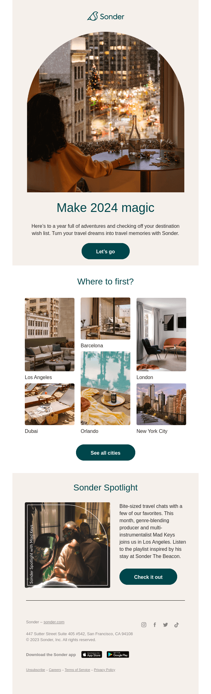
Neutrals are colors far off from the center of a color wheel. Given how less saturated they are, they are pleasant on the eyes. Therefore, using them in your design means that you are reducing the strain on the eyes of your target customers.
When you are looking to set the mood for your ad, if you want a calming vibe, you can choose neutrals. Sonder’s use of neutrals indirectly connects with the idea of how relaxed you feel on vacations. And since the brand deals with vacation rentals, neutrals help set the right tone.
Neutrals also look sophisticated. Therefore, they come in handy when you want to advertise premium content.
Here is a social media design by Kimp featuring warm neutrals.

2. Green
Vibrant neon shades, earthy neutral greens as well as signature foliage greens have been spotted in many ads and campaigns from brands big and small.
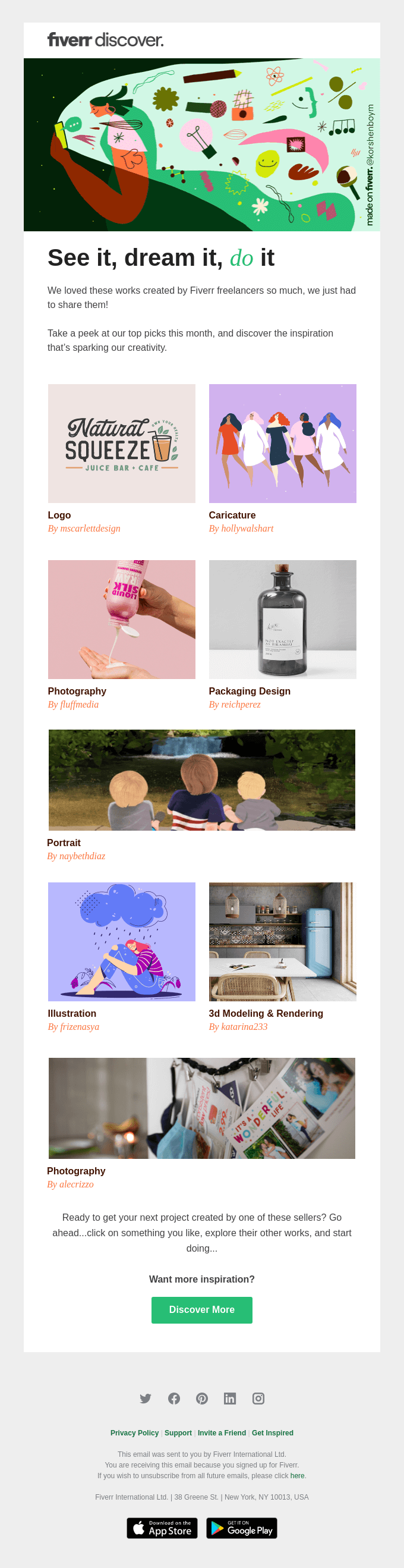
Fiverr, in this email, uses shades and tints of green to go with its brand color.
For brands taking a responsible step towards a greener approach, green is an apt color. Samsung had a lot of posts related to sustainability, with green as the primary color.

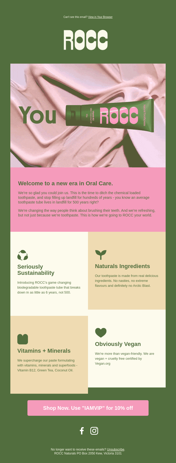
Even brands that deal with eco-friendly products have been experimenting with different shades of green as their brand colors. Rocc Naturals, a brand dealing with eco-friendly oral care essentials uses green in its packaging, website, and emails as well.
Website

Packaging

When you have to use trending colors like these figuring out ways to integrate your brand colors might be confusing. We get it. And sometimes the problem is that your brand color and the chosen trending color might not make a good pair. Either way, how do you use both?
Try to limit your brand colors to specific sections in the design. Or use it in details like border lines, text accents, and other places. We’ll look into a couple of social media designs by Kimp, for YSpace, an entrepreneurship hub.


And now here is the website of YSpace with the brand colors used prominently.

Kimp Tip: As you can see from the social media designs above, the brand colors can be limited to smaller elements like arrows. This way, you do not see too many clashing colors in the design. But you have both your brand colors and the trending colors of the year.
Looking to create eye-grabbing social media designs for your brand? A Kimp Graphics subscription is just what you need.
3. Violet
Violet is a color with a lot of character. Use it more to make your ad pop. Or use it less to highlight only the focal points.
See the many ways in which Instagram uses violet in its posts.
View this post on Instagram
View this post on Instagram
Come to think of it, Very Peri, a unique composition of violet-red is the Pantone color of the year 2022. This gives you another valid reason to start including violet in your campaigns if you haven’t already.
Why, even Spotify used it several times on its social media posts.
View this post on Instagram
View this post on Instagram
Want to know how to use violet in your designs? Here’s a packaging design by Kimp for inspiration.

The billboard below shows how elegant the color looks even in outdoor ads. You can therefore use it confidently and on large surfaces like billboards.

Even Headspace went violet in a few of its email campaigns. The color appeared mainly in the emails talking about Headspace’s sleep meditation podcasts. In the below image you will see a bunch of emails from Headspace. All the ones with violet talk about sleepcasts and the rest talk about the other meditation and features of the app.
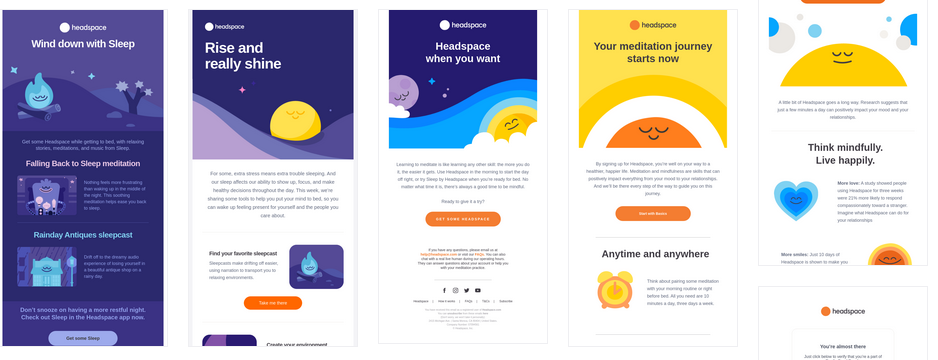
When you connect such specific colors to your campaigns, customers will instantly recognize content that’s relevant to them. In the above case, when customers open an email, they will quickly know if the email talks about sleep meditation or general ones.
Such instant recognition results in better conversion rates!
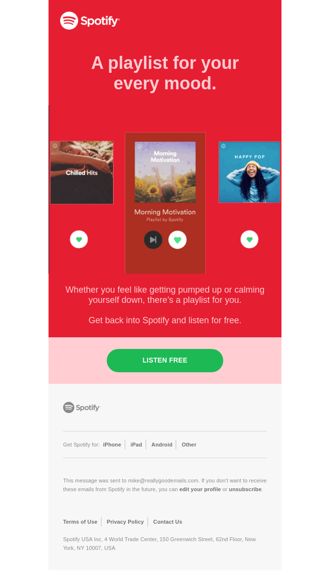
4. Calming coral
Corals and in fact, pastels in many forms, have been appearing in emails social media ads, and other places. Being gentle colors, they can easily be combined with other solid hues. And so brands love using them across their marketing designs. And we know that coral and similar subtle colors create a balance in the design. So, anywhere you think the design looks busy or the information is a bit much, a touch of coral can create a quick calmness. No wonder coral has been appearing among the colors on trend.
Spotify’s marketing prowess needs no introduction. Here is an instance where Spotify used coral in its email.
And the below Etsy post will definitely grab your attention. With such cheerful designs, you can easily attract more engagement on your posts.
View this post on Instagram
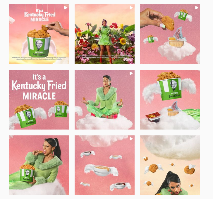
We also saw a lot of coral and other light colors in KFC’s Beyond Fried Chicken campaign. For customers who are accustomed to the bright bold red designs from KFC, these coral and green posts were eye-grabbers. Such small differences are enough to show customers that you are talking about something new. Something that deserves their full attention.
The below infographic designed by Kimp shows how you can use coral to create a quiet background thus letting the information speak louder.

And the sophisticated side of soft corals can be used in the case of beauty and wellness brands. Or even luxury spa services. The below business card design shows the elegant side of coral and its relevance in the beauty industry.

A Few More Colors On Trend This Year
Neons and loud color palettes
Bold color palettes are for brands that wish to make a statement. Because even when you scroll through your social media Feed in a hurry, you are least likely to miss an ad featuring an electric neon palette.
We saw the perfect example of full-blown pop-art retro style in Twitch Con 2022’s campaign.

The yearly TwitchCon event is something that most online content creators look forward to. And for this year’s TwitchCon, the brand went with high-voltage colors. Perfect to capture the energy and the excitement surrounding the convention.
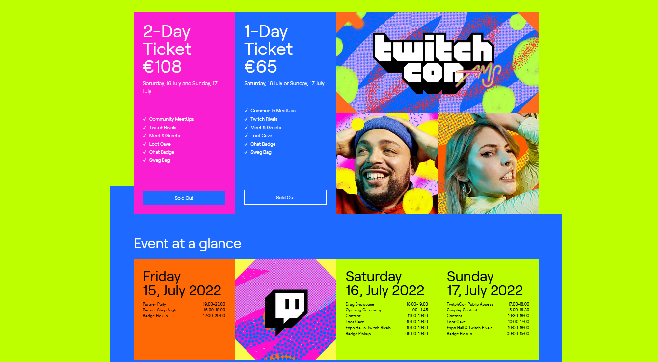
Kimp Tip: If you look at the above color palette, you will notice that Twitch’s bright purple brand color goes perfectly well with it. Similarly, when you choose bright and bold colors for your campaigns, choose triadic or complementary colors to go with your brand color. After all, you cannot leave your brand color entirely in your campaigns.
Want to create such statement designs for your campaigns? Book a call with the Kimp team today.
Pastel gradients
In addition to using solid pastels in digital and print designs, many brands have also been seen using pastel gradients. The below email from Google is the perfect example.

When you want your design to be simple pastel gradients can be of great use. They stay quiet in the background and let the product photo or the copy get all your attention. At the same time, they are easily noticeable. And thus they make an ideal palette for emails and flyers where you might have a lot of information to convey.
Since pastel gradients are in trend, you can also use them on social media. Both in your regular posts and in ads. Below are a few designs created by Kimp incorporating the pastel gradient trend into the design.


Adopt 2022’s Colors On Trend With a Kimp Subscription
So, how many of these colors have you already used in your marketing designs? If you have not used any, it’s not too late. Sign up for a Kimp subscription. Perhaps you want to use them as your brand colors and go with a rebranding campaign. Or use them for specific campaigns without leaving out your brand colors. We’re here to help you add them to your designs, just the way you like. So, what are you waiting for? Register for your free trial.