Canva Infographics: Visual Storytelling Made Easy
When you have a story to tell, visuals are the best option. And when it comes to visuals in marketing, infographics have their special place. Because they help tell a story in the most effective and engaging way. Additionally, infographics also allow you to capture critical data in an easy-to-grab format thus ensuring that the audience remembers the data you present.

Given all these benefits, about 60% of businesses around the world are known to incorporate infographics into their content strategy. Evidently, for yours to stand out, you need a clear idea and a unique design to communicate this idea. One way to do this more easily than starting with a blank canvas is to start with a catchy template, like the ones you find on Canva. Indeed, Canva makes it so much easier to design infographics for various occasions and in various themes.
However, here’s the catch – your competitors might also be browsing through the very same templates you are seeing on Canva. So, yes, there is a pressing need for customizing the template and tweaking every detail to ensure that it looks unique and on-brand. How do you do that? We’ll cover that in this blog.
But first, let’s quickly understand why infographics are important marketing materials.
5 reasons why brands should use infographics
While there are so many visual formats in which you can convey the intended message, why should you go with infographics? Are they worthy additions to your content plan? The following facts have all the answers.
- When there are instructions to convey, adding images improves the understanding by about 323% than when there is only text. When you are assembling a piece of furniture, wouldn’t an illustrated user manual make things simpler? That’s precisely why infographics work. Because when you are conveying data, numbers that show your brand’s performance or somehow prove your point, adding visual representations makes it easier to process and remember the data.
- Additionally, people are 78% more likely to retain information comprehended from an infographic. Therefore, when you manage to create on-brand infographics, they tend to remember your brand and your brand’s message more effectively.
- Data shows that posts with infographics are about 45% more likely to be clicked meaning that well-designed infographics can increase your conversions.
- Infographics are easily shareable. In fact, infographics are known to be 3 times more likely to be shared on social media when compared to other visual content formats. More shares mean better reach for your brand.
- They are not just useful as standalone content as in social media posts but also as add-ons to make your other marketing designs stand out. For example, infographics make presentations nearly 43% more persuasive. You can even use infographics to quickly and clearly communicate critical details in print designs like flyers.
In conclusion, infographics are highly beneficial and so versatile in marketing. So, if you are planning to start using them, then you will love these Canva infographics design tips below.
6 essential elements of an infographic + design tips for Canva
The core message to convey
Infographics are created with a purpose – to convey a compelling message. They go beyond simple statements, aiming to tell a story that persuades the audience to take action.
The goal is to visually communicate complex concepts or elaborate on processes in an engaging way. Infographics serve to educate, present convincing statistics, build trust, and ultimately influence the audience to take the next step. Therefore, the initial step in designing infographics is to establish a strong narrative or core message that effectively conveys the desired information.

To understand the main story in the infographic, it’s important to know the situations or applications where infographics fit into marketing. Here are a few to begin with:
- Industry trends and statistics – to talk about shopping patterns, demand for a particular product or the popularity of a service.
- Product or brand comparisons – to gain a competitive advantage
- Depict workflow – to establish transparency
- How-to-guides – to show your expertise in the industry
Once you pinpoint the core message or story within your infographic, choosing the suitable template on Canva is easier. And selecting appropriate visual elements to convey this narrative becomes more straightforward. In a moment, we will delve deeper into the topic of selecting visual elements. However, it is important to emphasize the necessity of establishing the core message from the outset. This crucial step sets the correct direction for the infographic and assists in guiding subsequent actions.
Segregation of information
What common trait do you observe in all the Canva infographics templates in the below snapshot?
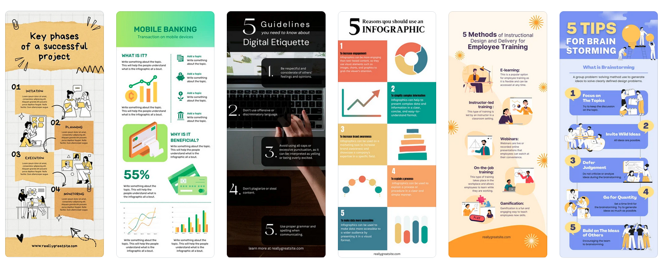
Did you notice that there are segregated chunks of information in all of them? That’s one of the prominent details in most infographics. In fact, most part of the design process goes into identifying the best way to differentiate and organize these individual sections. Therefore, the second step in designing an infographic is to segregate and organize your information into meaningful segments.
These could be various steps of a process if your infographic outlines the procedure to do something. Or they could be details elaborating various categories in a list or an expansion of various tips presented in the infographic. So, to create clear Canva infographics, analyze the information at hand and break it down into sensible sections. Once you know the differences and similarities between these sections and the sequence in which they need to appear, you can organize your infographic and create a balanced aesthetic.
This organization also comes in handy in clearly defining the visual hierarchy in your infographic. Naturally, this is the step where you define the priorities of the various segments. You separate them into basic categories like title text, subheading, and body text. And then identify elements that need to be emphasized and the order in which the details need to be read.
The right colors
Once you have the information to be presented and the organized copy, the next step in designing your Canva infographics is identifying the right colors for the design. Because the wrong color choice dims down the emotional impact of your design and its relevance to your brand and topic as well.
The first question – how many colors do you really need in your infographic? While there is no hard or fast rule, it’s good to stick with a limited palette. Too many colors mean a lot of distraction and the likelihood of the core information being missed. Besides you do not want to overwhelm your audience.
But at the same time, using just one main color or a monochromatic color palette can make it difficult to emphasize some details. For example, when you have a pie chart with 5 different parameters to highlight, a monochromatic palette will make it difficult to comprehend the chart. It affects readability.
To tackle this, you need a simple color palette consisting of contrasting colors that allow the design elements to stand out from each other.
If you do not know where to start, browse through the standard color combinations available on Canva. These contain 6 colors that will be applied to the chosen template.
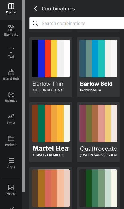
For infographics embedded into your branding materials or advertising designs like flyers and posters, using your brand colors as the primary colors in the infographic helps with establishing your brand identity strongly.
The below infographic uses a simple color palette based on the brand colors.

Not able to choose the right colors to make the maximum impact while staying relevant to your industry? Work with professional Canva designers who can help sort this out for you.
Fonts that are simple and practical
Font selection plays a critical role in the effectiveness of an infographic. Even with valuable information and appealing colors, the wrong choice of font can hinder its purpose.
So, what font mistakes should you avoid to prevent ruining your infographic?
- Opting for illegible fonts
- Styling fonts in a way that compromises readability
- Using too many fonts that cause a cluttered appearance
- Poor pairing of fonts that disrupt visual harmony
To ensure font success in Canva infographics, draw inspiration from relevant industry templates that feature well-matched font combinations. If you wish to experiment with more ideas, explore Canva’s existing font pairings for a solid starting point.
When uncertain, opt for font families that possess similar characteristics, maintaining the design’s overall mood.
For instance, the design below exhibits a simple font combination that prioritizes readability. Hierarchy is established through diverse formatting techniques and varying font sizes.

All these factors matter because infographics contain a lot of text and numbers. Even the smallest setback in readability can lead to wrong information being conveyed. Consequently, both the efficacy of the conveyed message and the brand’s credibility are compromised.
Visual elements that simplify the idea
If you haven’t already observed, the word infographics is a combination of information+graphics. We have covered various aspects related to the information side so far. However, all of these efforts will be in vain if the graphics component doesn’t receive adequate attention.
So, what kind of visual elements do you add to your Canva infographics? You need elements that simplify the message and not complicate it. You need elements that make the content more engaging without cluttering the layout.
When in doubt, stick to a single core graphic that tells what the presented information is about. For example, the below infographic only uses one key illustration that instantly tells you that it is about walking. As for the rest of the text you might observe that illustrating the ideas feels a little complicated. In such cases, sticking to one main image helps.

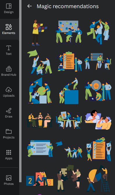
Or if you think each section in your infographic will benefit from a supporting graphic, go with simple vector illustrations that seamlessly blend with the design. Canva has plenty of them in its stock elements collection.
Other than this, you can use simple line-drawing style illustrations or even illustrated icons that enhance engagement and help with the clarity of presenting the information. The key is to use only relevant graphics that add value to the text content in the infographics.
Data representation
When you have unrelated elements to present, plotting them on a graph simply does not make sense. But when there is information that you can compare side by side, related components that need to be weighed against each other to comprehend the meaning of the data, then data visualization elements like bar charts, pie charts, and others can help.
One of the biggest challenges in using data visualization in infographics is choosing the right format. Adding data visualization to Canva infographics is easy because of the readily available charts on Canva. You will find bar charts, line and dot charts, pie charts, and other infographic charts.
When you have numerical data comparing two or more parameters, line charts, and bar charts might be useful. But when there are a few different categories and each is a percentage of the whole, a pie chart is a great option. Other types of icon charts come in handy when you have to compare different demographic elements like gender, age, etc.

The below design uses a balance of data visualization and illustrated presentation to clearly establish the message.

KIMP Tip:
In all such graphics that represent your brand, you need icons and various kinds of illustrations that visually elaborate on certain ideas. One way to tap into this to establish your brand identity will be to have a set of custom illustrations and icons designed for your brand.
Wondering how to design them? Get a KIMP Graphics subscription.
Give your Canva infographics an edge with KIMP
Summing it up, a lot goes into designing Canva infographics. And every single design decision you make can make or break the effectiveness of your infographic.
From colors to fonts, icons to charts, and the overall visual hierarchy and balance in the design everything influences how your audience perceives your design. This means that even though Canva lets you create stunning infographics without prior design knowledge, knowing design principles and how to apply them gives your infographic a boost.
To achieve this, if you want to work with professional Canva designers, book a call with the KIMP team to know all about KIMP’s Canva plans.