Canva Presentations: Elevate Your Business with Impressive Slides
In the world of business, presentations serve as the gateway to sharing ideas, pitching proposals, and winning over audiences. But creating something creative to keep your listeners hooked is not an easy task, is it? The reality is that poor design can lead to a promising idea going unnoticed. So, how do you create a design that engages your audience and instills trust in your ideas? We’re here to uncover those design secrets today.

It’s not just about business presentations that we’ll be talking about about Canva presentations in particular. Because among the many options you have when it comes to designing presentations, using Canva is one of the simplest. But the possibilities are endless with Canva. So, we’ll talk about a few general presentation design tips and some Canva-specific tips as well.
Let’s first quickly go over the benefits of using Canva to create business presentations.
Creating presentations – the Canva benefits
- Often, despite having brilliant ideas, creating a presentation design from scratch can result in a lackluster outcome that resembles a school project. If you’ve experienced this, rest assured that you’re not alone. Many marketers and business owners face the challenge of finding a visually appealing theme that exudes professionalism. This is where Canva’s wide array of business presentation templates comes to the rescue. There are thousands to choose from.
- Since your presentation represents your brand, you should be Dotting the i’s and crossing the t’s when it comes to brand elements. With Brand Hub on Canva, all your brand assets are easily accessible. So, you can effortlessly infuse your presentation with your brand’s distinct identity and characteristics.
- Canva makes it easy to collaborate with your team and quickly review the design without too many back-and-forth communication chains. When you add team members, you can add comments to the design or particular aspects of it so that the team can come up with ideas and answers right there. This gets even better when you collaborate with Canva Designers. They work on perfecting your designs with their design experience and creativity but you still have full flexibility to make changes from your side or even directly add comments to tell what needs to be revised.
For all these reasons and more, designing presentations feels like a breeze on Canva. Let’s look at some tips to help you create stunning Canva presentations every single time.
Canva presentations – 7 useful design tips
1. Use Canva templates
Canva does let you start from a blank template and work your way through the slides. However, extra ideas never hurt. Browse through the templates, and narrow them down based on the format (Canva lets you design in 16:9, 4:3, and mobile-first formats). To further narrow down the options you can choose visual styles like “elegant”, “professional”, “gradient” and so on.
Sifting through all these filters is possible when you clearly know the goal of your presentation and a brief outline for it. Those are the two parameters we’ll be discussing next.
2. Clearly define the type of presentation you want to create
In the benefits we outlined the first one was about the ready-to-use templates. This also happens to be one of the key reasons people choose to design with Canva. Because it helps you browse through plenty of ideas instead of staring at a blank screen.
However, to skim through the options and find the ones that perfectly suit your needs, you need to get more specific with the search term you use on Canva. Define the type of presentation you are working on.
- Would it be a pitch deck to present a startup idea in front of investors?
- Or internal presentations displaying the progress of teams?
- Will it be educational presentations to train employees?
- Or maybe presentations shared with everyone in the organization to announce important company updates?
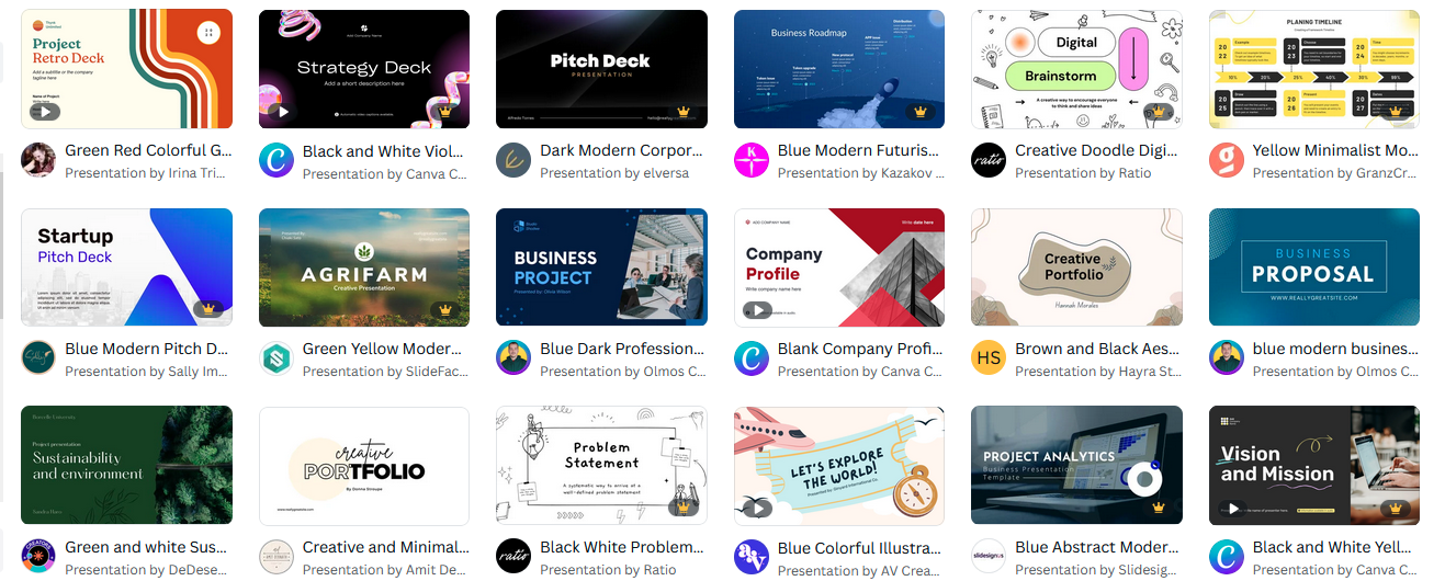
Why is this step important? Because when you search for “business presentation”, you get diverse choices like the ones below. Shortlisting from this seemingly unrelated mix can be time-consuming.

However, when you search for something more specific, like “pitch deck presentations” you get templates where the goal is the same but the difference is just in terms of the industry that you are focusing on. Therefore, it’s easier to pick your options.

As you can see, defining the purpose and using the right term ensures that you get templates in visual themes that get the job done.
3. Don’t start without a concrete draft
Not having ideas is one thing but having too many of them is an even bigger challenge when creating business presentations. To avoid cluttered presentations and to avoid missing out on critical details start with an outline for the content.
You can always work on updating the copy later but having a draft makes it easier to think of the best ways to present the idea. Remember, the goal is to present the ideas so your audience does not get bored. And also to be sure that the message is crystal clear.
When you browse through Canva templates, you will notice that there are all-text options, designs that put visuals front and center, and those that use images as aids to build on the content. Altering these nuances means altering the visual theme. That’s why it is important to have the draft and a brief idea of how much content will go into each slide and what portion of this will be text and images.
4. Choose the right layout for each page
Once you choose to customize the chosen Canva presentation template, you are directed to the edit page that you might be familiar with if you have worked with any Canva design. This is where you can tweak every single detail about the design – from colors to fonts, text, and layout.
You can choose to add all the pages in that particular template or select ones that contain elements relevant to your presentation – like images, graphs, illustrated icons, and text.
One of the main areas of customization with Canva presentations will be rearranging the various elements on a page. But then you need to do this without messing with the visual balance. To simplify this, Canva now lets you explore standard layout options. Once you select a page you wish to customize, in the Layouts section, you will see different variations in terms of arranging the text and visual elements on that page.
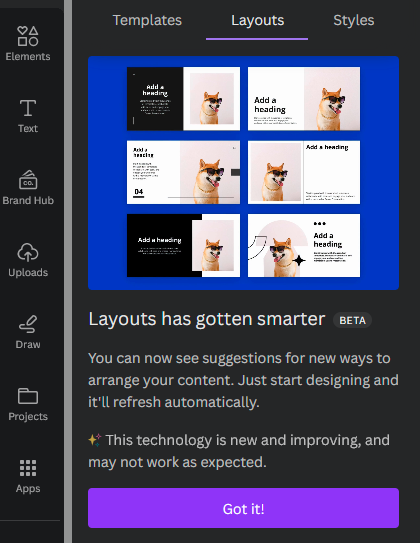
KIMP Tip: Layouts determine how the various elements are arranged with respect to the page and with respect to each other. Making the text or images on the slide bigger or smaller or aligning them to different margins can all affect the visual hierarchy in your page. In other words, the layout of your page influences where the user’s attention is drawn first.
5. Add visuals to keep it interactive
To keep your presentation engaging, you need visuals. These can be in the form of images, and charts.
Images can be used to illustrate the idea presented or even as a tool to evoke an emotional response. Charts, on the other hand, make it easier to grasp the presented idea easily. They make it easier for the listeners to make more sense of the numbers and facts displayed. So, in most presentations, you need both images and charts. Let’s first talk about choosing these images and editing them on Canva.
When it comes to images, Canva has a huge collection of stock photos. But yes, you can also upload your own images to include in the presentation. Additionally, Canva now has a text-to-image app that comes in handy for those times when you cannot find the most appealing image to include. Search for “text-to-image” in the Apps menu.

While adding images is good, adding too many of them can distract your audience from the core message. So, choose only the most relevant ones that feel absolutely essential.
With the images sorted, let’s talk about graphs. If you are unsure about the most suitable format to capture the data in the slide, browse from Canva’s Charts templates in bar charts, pie charts, infographics charts, etc.

With the data in place, you can also switch back and forth between formats to see what works best.
KIMP Tip: When you use images and charts in your Canva presentations, consider how well they sit in the chosen template. These should not look out of place in the chosen visual theme. Keep this in mind when changing colors in the charts or when choosing the image color themes.
6. Keep it cohesive
On Canva presentations you can change the themes, colors, and layouts on each slide. But when you do this, do not compromise on the cohesiveness of the presentation.
For the presentation to work, you should build a story one slide at a time. Each slide should add to the information presented in the previous one. Without a consistent visual style, telling a solid story becomes difficult. This is one other reason why starting with a template makes it easier. Because when you start from scratch, copying the format and recreating different variations of it for the slides can feel tedious.
To achieve cohesiveness:
- Stick with a color scheme – preferably your brand colors taking priority especially if it is a business presentation like a pitch deck where your brand identity needs to be established strongly. Stick to just one or two colors to avoid a cluttered inconsistent look.
- Use the same font combination and font styling across slides. From the size and orientation of the title text, subheading, and body text to the font formatting options everything should be consistent.
- Along with all these you also need to include your brand name and logo in the design in order to achieve strong branding.
Having your Brand Hub ready makes customizing the slides for consistency so much simpler because you have your brand logo, colors, and fonts easily accessible.
7. Use animations but do overdo them
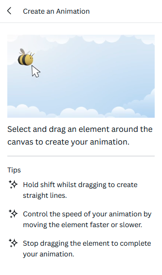
Simple transitions are the key difference between a presentation and a simple text document. Like most presentation design tools, Canva also allows for easy transitions and animations in slides. You can choose to animate text, individual design elements as well as the whole slide. To add animations, click on the element or the page you wish to animate.
Choose from the available text and page animations on Canva.

Now you can also add custom animations by dragging the respective element in the intended direction.
With animations too consistency is a factor you cannot ignore. When each slide has a different set of animations or every single element on the slide is animated it creates a lot of distraction. In all this, the idea in focus is forgotten. So, stick to simple animations that keep the audience’s attention on the screen but avoid adding too many of them.
Don’t know what elements to animate for maximum impact? Leave it to professional Canva designers to perfect your Canva presentations.
Canva presentation made simple with Magic Design
The above steps outlined the process of creating Canva presentations the traditional way. But ever since Canva started incorporating AI into its interface, a lot has changed. So, why don’t we talk about leveraging these changes to create presentations faster? To do this, you’ll be using Magic Design and Magic Write to simplify your job.
Magic Design is Canva’s AI presentation generator where you can instantly create the whole presentation, with the text and graphics laid out for you, in seconds. All you have to do is to describe your idea in 5 or more words and your presentation is ready. You can later customize it the way you like. All the editing options available for traditional Canva presentations are available for those created using Magic Design as well.
And the coolest part is that Magic Design is available even for those using the free plan. But yes, to access more stock elements and to customize the presentation with your brand elements more accurately, you might still find the Pro and Teams plans to be better options.
To access Magic Design, select the 16:9 presentation format and look for the Magic Design option in the Design tab.

While Magic Design feels like a fancy idea to save time, there are some limitations you should know about. Because with business presentations you simply cannot compromise on the little details.
A few reasons why you might not like Magic Design for Canva presentations
- Canva underlines the limitation that the presentation designs generated through Magic Design might not always be unique. Evidently, you cannot have a presentation that lacks originality representing your brand in front of your clients or business partners.
- Currently, Canva only supports Magic Design for the 16:9 format which is not the only format you might be using in a business scenario.
- One of the notable limitations here is that the data that Magic Design populates in your presentation is not always accurate. Additionally, it was trained on a dataset that contains information up to 2021. So, the details are not current.
All of these points clearly depict that while using Magic Design for Canva presentations might look easy it’s not the most practical approach to take. Instead, go with the traditional presentation design process.
And to add an even more unique touch, work with Canva designers so that you can put all the Canva editing features to good use and know the right elements to incorporate. Your knowledge of your business plus their design expertise can create magic in your business presentations on Canva.
Create memorable Canva presentations with KIMP
Once you have shortlisted the templates you like and gathered all the text and images that should go in the presentation, putting them all together might seem like a huge task. Then there is the task of customizing the templates to resonate with your idea so that it is a unique and accurate representation of your brand. Collaborating with Canva designers makes all of this much easier.
Book a call with the KIMP team to understand how we can help you take your Canva designs to the next level.