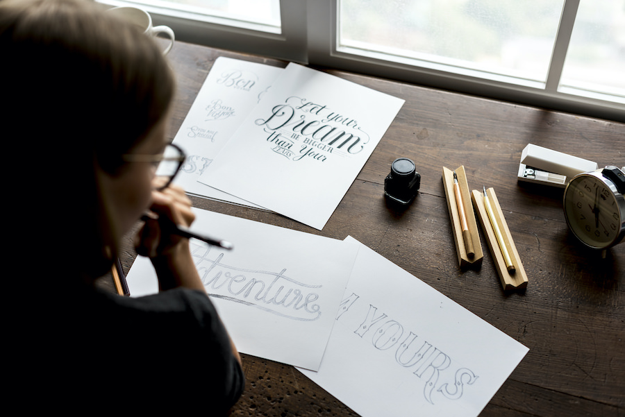
How To Choose The Best Fonts For Print Designs
The fonts you choose can make or break a design. They play a big part in how much your designs stand out, how your messages are conveyed – and whether they can be read at all. To help you navigate all this, in this blog we’ll be focusing on how to choose the best fonts for print designs.
The best fonts for print designs
When you’re working on a print design it is important that you know which fonts work best. Here are some of the main categories of fonts that you need to know about:
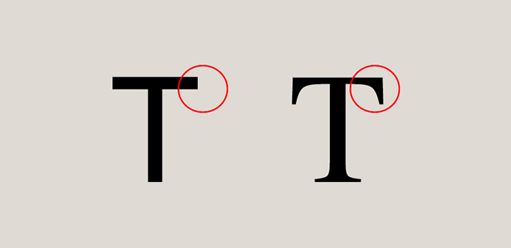
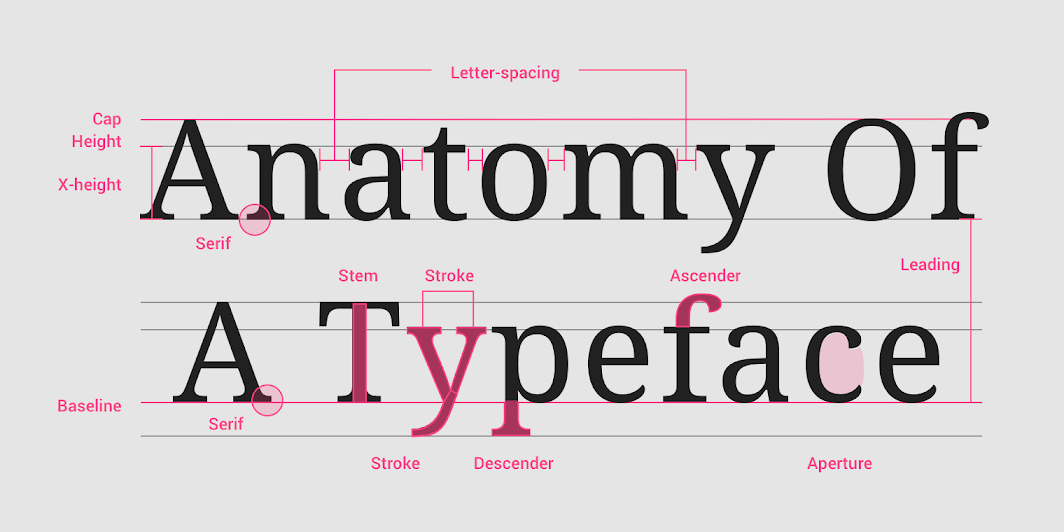
- Serif – this family of fonts has small lines or feet attached to the ends of the letters and they are considered as being a traditional font. These fonts are known to make long passages in print easier to navigate visually. This is because they help your eyes move easily along the lines.
- Sans – serif – this literally translates to without serif, or in other words, letters that do not have the little lines at their ends like the serif ones do. These fonts are chosen to look more modern and also streamlined. These are known to be used much more for web use as they are crisp and are effective even in small sizes, like for logos, for instance.
- Script – these types of fonts are cursive and resemble calligraphy or handwriting styles. They have letters that connect with each other and come in many different variations. They are rather elegant, fun and casual at the same time. And they emanate that handwritten feel with lots of swashes and tails that contribute to a calligraphic look.
- Decorative or display fonts – if you see a font that has been categorized as decorative or display, or even novelty, it all basically means the same thing. The font has been designed to get your attention. You should only use such fonts in very small doses for special effects and the likes, and one could say that these fonts are more unusual than they are practical.
What are the best fonts for print designs?
There are many different types of fonts that can be read easily no matter what medium you will be using them in. That said there are also some fonts that have been created specifically for print designs. Using these fonts means that you are avoiding the risks of ink bleeding and this is even more important when you are printing on absorbent paper types.
Some suggestions for your print design’s fonts:
- Century Gothic Helvetica and Verdana because of the fact that they are remarkably versatile and they even look good on digital media.
- Times New Roman and Garamond are also great choices as they are serifs.
Not all serifs are created equal
A word to the wise, not all serifs are created equal and have the same effect. Serif strokes can actually be thin, thick, subtle or even robust. The more delicate a serif, the more challenging it can be to reproduce sharply in some use cases. The most common would be reversing them out of dark colors, photography, or patterns. In these cases, and when printing in CMYK, the edges can look fuzzy or weak. Opting to print them in a solid, spot color can be more effective. So try to choose a serif with sturdy features.
For example Chaparral a font with ‘abrupt’ serifs will help to improve the flow of the eye along a line of text when you read it. They will not dissolve when they have been printed as a light text on to a dark background.
Thinner and more delicate serif typefaces like Garamond as well as Dubiel will give you the benefit of helping you save ink. Ultimately how the font is used, and the particular format it’s printed in, can really affect the quality of output. So your best bet is to do a test print to see if you like how your fonts read.

Tips for choosing the best fonts for print designs
Picking the perfect font for print designs can be challenging when you’re juggling all of the different goals you have for your designs. We’ve put together some questions and factors you can evaluate to help you choose your fonts.
Do the fonts reinforce your brand?
How would you describe the personality of your brand? Is it fun or is it sophisticated? What are the values that your brand stands for? How does your brand appeal to your audience? With the answers to these questions in mind, you’ll be able to choose the fonts that reinforce these ideas. Below are a few more tips to keep in mind.
- Pair up script and display fonts with something more simple so that they are not competing elements.
- Determine which fonts will connect best with your audience and then shortlist using the considerations below.
- Make sure the font is clear and also follows the regulatory standards for the product.
- See how the various fonts that you pick for print will work with the images and the graphics that you have so that you know what works out the best.
Do the fonts work together?
As we have said in a few of our blogs, using too many different types of fonts in one design will make the effect overall busy and cluttered. The temptation can be there when you have a lot of different messages you want to get across. But this is where you need to work closely with your designer to explain the hierarchy of information that you need included. And what you want your audience to feel when they read your text.
The best practice here would be to minimize the number of fonts used, and to use fonts that come from the same font family. You can then play with different weights as needed. For example, you can use one font for the headline and one for the description text of the design. Or simply just use different weights and sizes for the same font.
Are you using the correct size?
When we talk about print designs, they can range from massive billboards to small leaflets and brochures. This means that the size of the font that you pick can be drastically different based on what your design is. A few things to keep in mind here:
- Traditional printing will use 10 – 12 pt font for those large text blocks.
- The font size for headlines will need to balance the text being with the convention of keeping the headlines limited to just one or two lines.
- The subheadings need to be about 10 points bigger than the body text as well.
- Depending on the size of your design, and the size of your font, you may need to limit or expand your text copy. Be sure to check in with your designer to find out what will look best.
Have you left enough space?
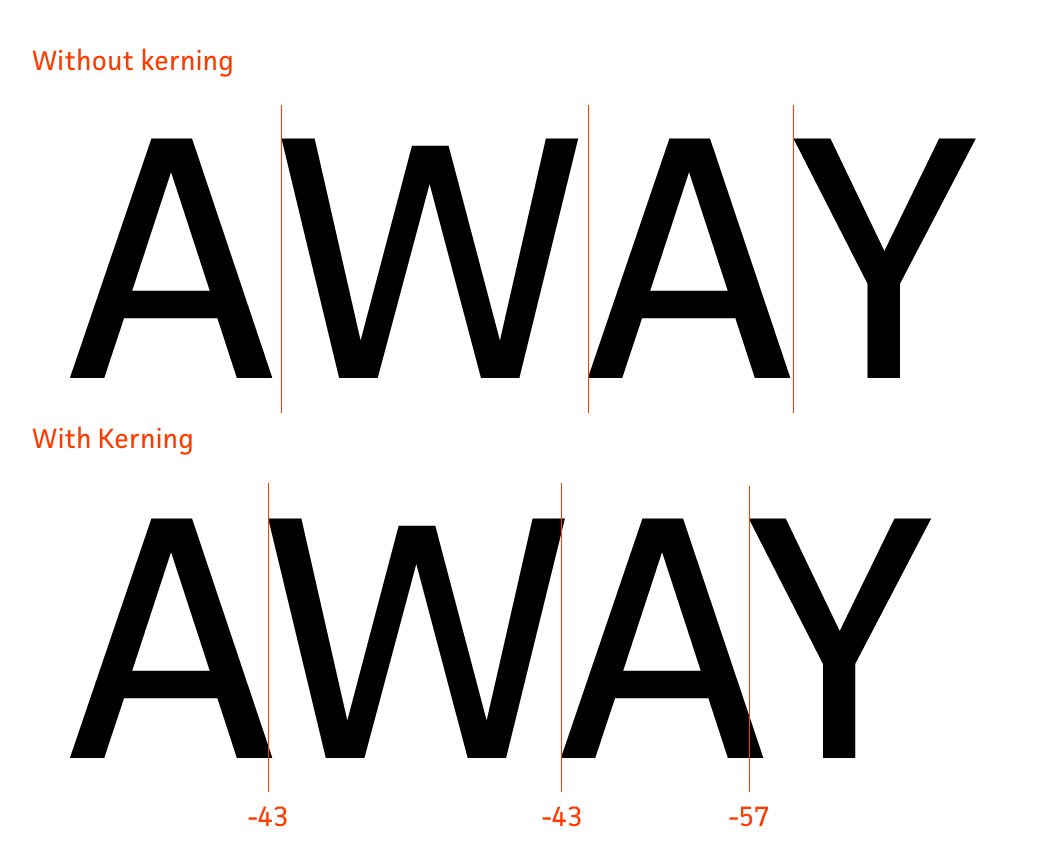
You need to pay attention to the margins. The more text that you have, the more of a margin you will also need. Thinner columns are much easier to read and that too when they have enough white space separating them. And kerning plays a role in legibility as well. Kerning is essentially the spacing between letters or characters.
Now it’s easy to get invested in a certain amount of copy. You might feel like it’s an absolute must that a certain phrase or set of words is included. But here’s the thing, if no one can read it, does it even matter that it’s there? Be receptive to your designer’s feedback and advice when it comes to the appropriate amount of text for the dimensions of your design.
Is the font too crowded?
The leading, or vertical space, in between the different lines of text in the design should be just enough and not too little. If the print has a lot of text in it, this becomes even more important. If you feel that the readability needs to improve, do not hesitate to increase the amount of spacing between the lines as you need. You may need to add or remove text in order to make this feasible for your designer. Be as ruthless as you can when it comes to deciding what’s essential to your design.
Are you shouting?
You should try and avoid using upper case treatments as much as you can. In other words, do not print using all capitals in the font. Use sentence case which will come across as calm. When you use all capitals, it comes across almost as though you are shouting and that is something that you would want to avoid at all costs. Especially because it won’t get your audience’s attention so much as confuse them. When everything is highlighted with upper case treatments as important, there is no hierarchy. And it all becomes irrelevant instead.
Can the font be read easily?
Black and gray font on white pages would be the most readable and clear. After that, the next option would be black pages with white text on them. The general rule of thumb here is that the more the contrast between the text and the background, the better the readability will be.
Examples of some of the best fonts in print designs
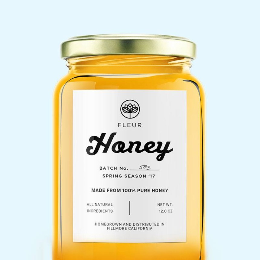
The honey label below is a great example of how you can create a look that is clean and also understated. It actually brings together a sans serif font with a script font. The script font is the focal point, and as it’s large and bold, it’s easier to read. This allows for the name of the product to stand out well. And the rest of the details, which appear in smaller sizes, are conveyed with simpler fonts that are easier to read.
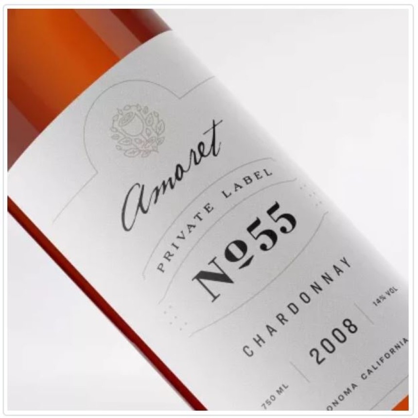
In the example below the use of script font for the brand name and then the display font for the wine label, brings sophistication and emphasis to the label. All this while still ensuring the details are legible!
Avoid these fonts at all costs
Before we wrap up, we wanted to give you a bit of a heads up on the worst fonts for print designs. Here they are:
Comic sans
This used to be a font that was rather popular and over time it has gone into the ‘I hate this font’ category. Almost every designer will just steer clear of this font. Though it holds appeal to a young demographic. It can also be really difficult to read when printed and doesn’t hold colors such as yellow well. The font was designed to mimic the effects of comic book fonts. But it’s now just mainly associated with being amateurish. Steer clear!
Segoe Script
The biggest problem with the Segoe Script font is that it is not easy to read at all. There’s one strike off the bat. It’s also difficult to combine with other types of fonts. Strike two. Sentences written with Segoe Script can come across as continuous lines of text, without breaks for clarity. As a whole, handwritten and cursive style script fonts can come across as stylish and elegant. But in this case, we would suggest that you avoid this font at all costs.
Impact
Impact is a sans serif font that was first designed in 1965. The name was derived from the fact that it was made to create an impact when it was printed. It comes with ultra-thick strokes and a very compressed letter structure. So it’s actually really hard to read. In most cases, you’ll want to avoid this font if you actually want to make a good impact.
Which fonts will you use?
Deciding on the fonts you want to use in your designs isn’t just a fun one-off exercise. In some cases, it might feel less fun and more maddening. But that’s where working with a designer comes into play. Let them know what you’re looking to get done, and the impact you want it to have. They’ll be able to provide you with options that you can then use on an ongoing basis in your designs to make sure that your brand is consistently represented and reinforced.
Speaking of consistency, once you find the best fonts for your designs, be sure to add them to your brand style guide. Include preferred sizes and weights. And if you don’t have a brand style guide just yet, this can be your first step. It’ll go a long way with helping your designers create the right designs for your brand.
Don’t have a designer? Need help with choosing the best fonts for your print designs? Sign up for a free trial at Kimp and see how a dedicated design team can help you with getting your designs done!